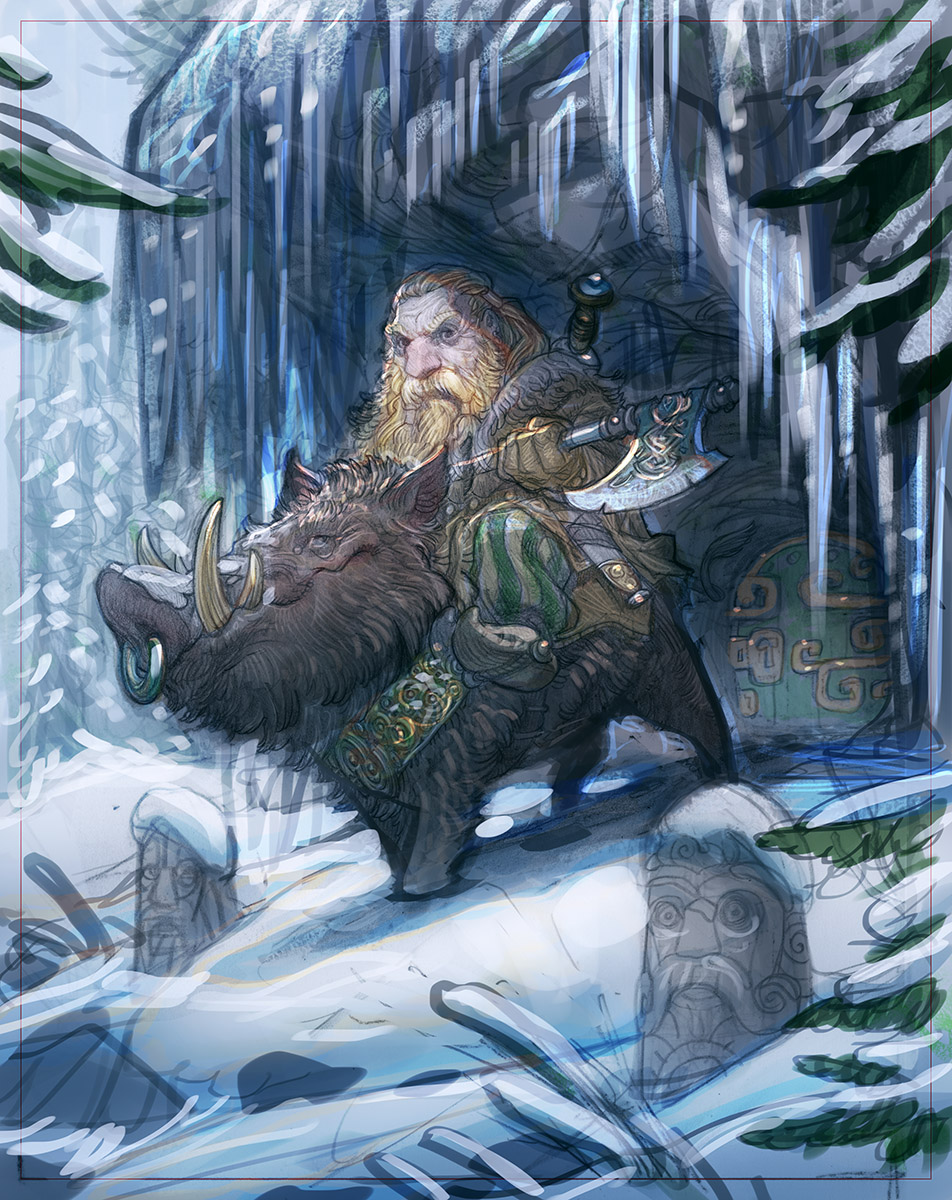
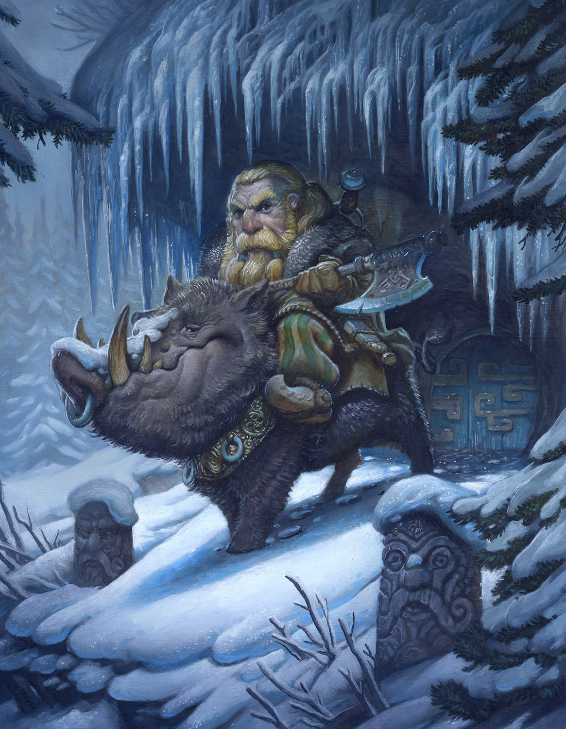
In my last post, I went through the layout phase of the boar-rider. Today I have the finished oil painting and for comparison, my initial color comp.
This color comp is a little unusual in that I took it really far, and I did it over top of drawings that were already pretty tight. This tightness in a color comp can be dangerous because it can make me feel a little locked in and there are less happy accidents and explorations that go on. It trades the energy of spontaneity for an idiot-proofed coloring stage.
As you can see I ended up sticking fairly close to my initial color comp. The only major difference is the heavier glazes that darkened the image overall.


Hahaah that intro video to Your course gave me good five minutes of laugh. You are awesome! 😀 (Also this painting is gorgeous etc. etc. ;D)
Beautiful painting Justin, those icicles must have been time consuming, well worth it though. I just wanted to say your course is terrific so far. I'm learning how to digest things much easier in the illustration process and be more open to how a final piece may turn out rather than locking myself down too early with only a few ideas. I highly recommend the course to anyone!
<3
This is amazing. Wow! Are there online classes in using Photoshop to enhance illustrations? I'd like to learn some of those techniques.
http://katherinet@live.com
Sold!
Justin, that is hands down, your best oil painting ever. I think you've hit your stride in the oil arena (not that I'm the best judge of that, but, still!). And that's quite a feat – oils are incredibly difficult. And what a cool concept for a piece!
The LPG class has been great so far! I'm still trying to come up with a piece I'm happy with, but I hope to move on to the thumbnail stage soon.
Cheerio!
Will.
Outstanding work once again, Justin. Particularly impressed with the foggy background, the depth it creates. Love how the snow on the dwarf statue's nose mimics the snow on the boar. Wonderful stuff!
RAAAWWRRR…..Dude! if I did not have so much Homework at the moment I would jump right into my new painting's color studies because of your painting. Awesome stuff as always! (I stalk your work like crazy lately haha) Your lamp post guild class sounds like a great Idea for my summer break, since I have been hearing great things about it. Please keep posting your process, I truly appreciate it as an Illustration student :]
Man, Justin….I just adore your work. Love the drawing. It's funny….years ago I did some 'fat warriors'…..but you've taken it to the best level! I wish I had continued, but seeing yours just feels dead on right!
Love it!
Greg
I would love to see a series on 'fat warriors' done by you! It sounds awesome. Any chance of it ever surfacing??
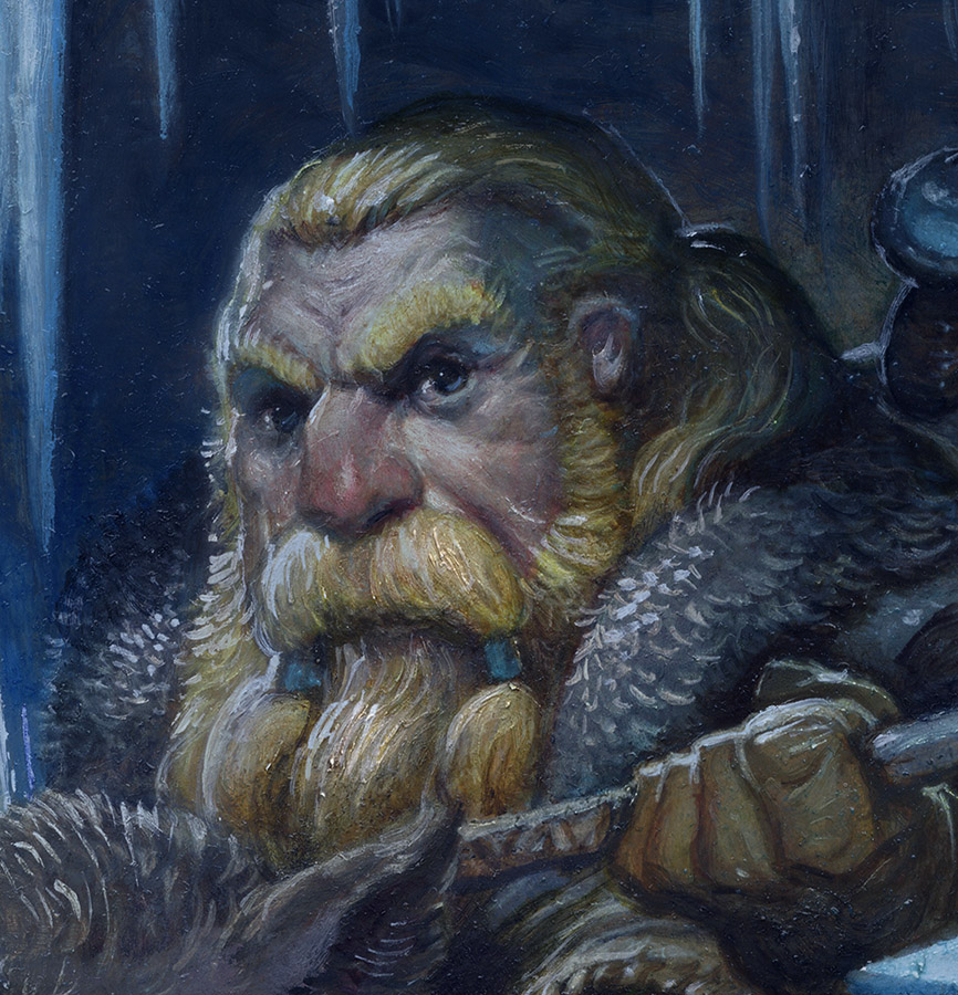
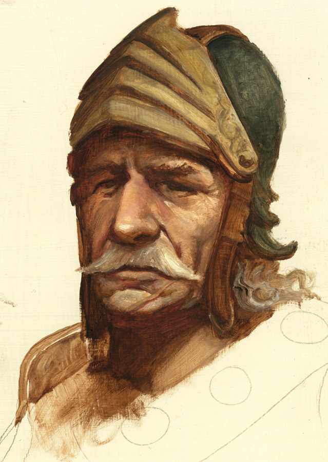
Great painting- it brings to me that cousy Xmass feeling 🙂 I like the initial dwarf head more though, it had stronger character imo.
Excellent work of yours, Paintings are good example of art works. Thank you for sharing your ideas about coloring this is can also apply to photoshop classes. Congrats!