I have had the good fortune to do several covers over the last couple years for Michael McCloskey, an independent author. Working for indie authors is a little different than working for a publisher. For one, there is a lot more input from the author and I really enjoy that collaboration. A downside is that there isn’t an Art Director involved. A good AD can help you lift a piece from good to great, and without that, you have to be very diligent in your self-critique and/or solicit the input of friends.
A focus of mine over the past few years has been on process. It started with the recognition that nearly every one of the artists that I admire: Caravaggio, Rubens, Bouguereau, Waterhouse, Leyendecker, Rockwell… they all used essentially the same process to get from A to Z. This is outlined in a great book, Norman Rockwell: Illustrator. (You can get the book on Amazon for pennies, literally. As of today, there are several copies for 1 cent and few dollars for shipping. Go get one. The really good stuff is in the back of the book!)
Their process is:
• Thumbnail
• Larger drawing
• Value and/or color study
• Head/hand/feet/fabric studies
• Full sized drawing
• Final painting
If it was good enough for them, why not me? More importantly, if they thought it was important enough to do all those steps, then how can I expect to paint to their level if I don’t even put in the same work?
I was delighted when picked up James Gurney’s book, Imaginative Realism a few years ago and saw not only the same process outlined, but some additional steps that aid in the rendering of the impossible and how to make them appear real. It is hands down the best book on illustration I have read. It changed they way I approach the fantastic. Go get Gurney’s book too, you can’t go wrong.
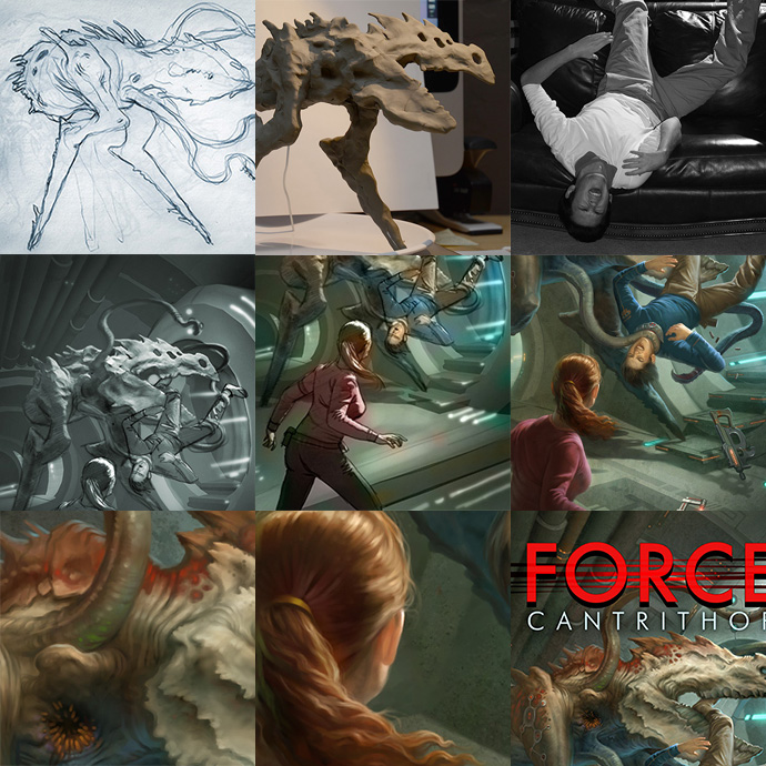
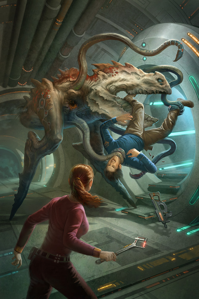
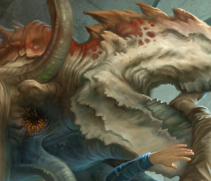
For this cover, done for the book Force Cantrithor, I needed to invent a new creature called a vothrile. I started with a series of small sketches like this:
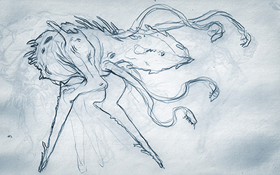
Once I had the creature approved, I did a small quick sculpture:
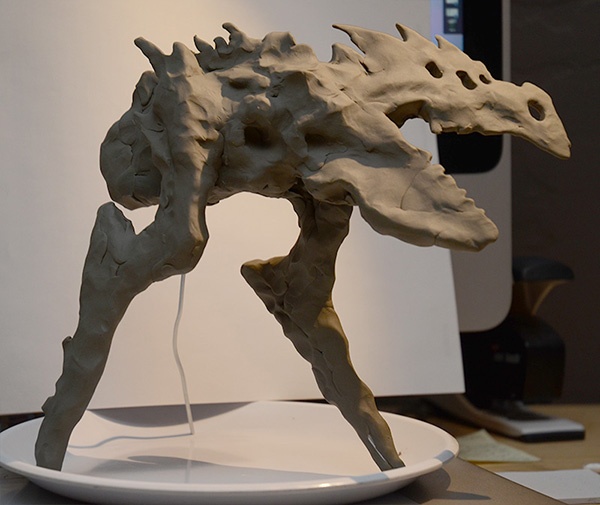
With the sculpture available for reference, I did a small thumbnail for the cover layout and created the background in 3D. I have been using Blender for my 3D work lately. It is free and has enough features for the simple backgrounds I need.
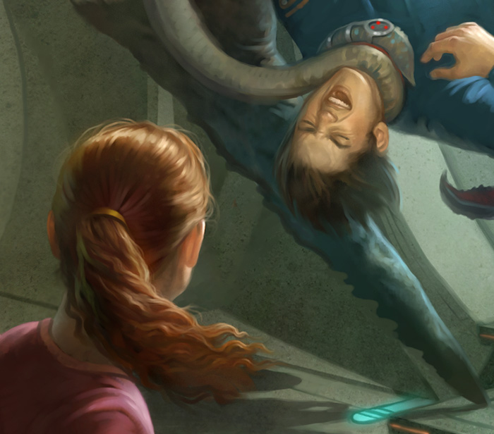
Then I enlisted my son and wife to stand in for some photography. My son is a good sport, it seems most of the time I paint him, he is getting eaten by some monster. I used a small strobe placed at a high angle above him to get some raking light and used the ambient light in the room as the fill light. Nothing too elaborate, but sometimes that gets the job done
With all those elements, I put them together in a final value sketch that gives a good idea where the final will go.
After the value study, I do a quick color study, and then it’s on to the final!
I also had the chance to do the layout and typography for this book.
Howard began his career studying illustration with artists such as Don Seegmiller, James Christensen and Robert Barrett. Over the past 15 years he has worked in the video game industry as an Art Director, a concept artist, and freelance illustrator for clients such as Wizards of the Coast, Blizzard Entertainment and Electronic Arts.
Howard’s work has been featured in collectable annuals such as Spectrum, as well as Ballistic Publishing’s Expose, D’artiste Digital Painting and Painter. Howard is also a featured artist for Corel’s product “Painter
You can see more of Howard’s illustrations, and check out some of his amazing personal work, at his website: www.howardlyon.com






Nice to hear about a fellow Christensen student. I took a class or two from Barrett too. Great post, thanks.
Bill, I don't know how I didn't know that before now. Very cool. Great teachers. Did you happen to have Barksdale as well? He was a great teacher as well. Thanks for the reply!
Suhweet.
That was very interesting, Howard. Thank you for the behind the scenes look. You are very talented. (My son does that pose all of the time and I yell at him to get his feet off the couch…)
No Howard, I believe he was after me. I'm an old guy. Of course if you had James you can't be a spring chicken. Keep up the great work.
Great post. Just went and ordered one of those Rockwell books, and also the James Gurney book. Been putting that one off for a while now. Thanks a lot for the inspiration! Now I have to go buy some Sculpey and camera lights 🙂
Eric I did a blog on you and your work today. It's nothing special but if you want to stop by and read it, http://bekkieswonderland.blogspot.com/. I'm a big fan of yours, although a new fan and I linked back to a few of your websites. Love your work and am waiting to see what you do with the Oz characters. Your work is awesome! Here's what I said about you; “His stuff is what dreams are made of. People seeming to fly through the landscapes of their perspective lives.” Peace! (Blog will be up a half hour from now.)
I was lucky enough to have James for the last semester that he taught. Lots of fun! Thanks for the support. I need an original of yours. Something tells me they are great reproduced, but really great in hand.
Great piece, Howard. And thanks for the shout out. If you're going to IMC this year, I owe you a Starbucks deluxe.
Howard,it's great to see this post – and thanks for turning me on to Muddy Colors, I've become a regular reader! As I mentioned at your home, I've had a copy of Norman Rockwell, Illustrator since I was a kid, and have learned a lot from it. I hope to see you around AZ soon.
Thanks Adam! We (me and my family) were sad that we couldn't make it to Changing Hands when you were recently there. My kids are looking forward to meeting you and we have a stack of books to get signed. My youngest had a birthday recently and I gave him “Cold Cereal” and “Lucky Charms”. He took 3 days to finish them both (he loved them)… so you are really going to need to write faster. 🙂 Looking forward to reading them as well.
Thanks Steve! Art can be tough on couches, be careful not to stifle your son's artistic expression… 🙂
Thank you. You are really going to be in for a treat with those books. Follow all the steps with the creation of your next illustration. It will feel like a lot more work, but when you get to the final, things go quickly (you will have eliminated a lot of messing around at that point) and the final will be much stronger for your efforts. As for the lights, it doesn't have to be fancy to get good results (I have used flashlights) but if you want to get some entry level strobes or hot lights, search for CowboyStudio on Amazon. They have cheap gear, but a good place to start!
Thanks you James! I wish I were going to IMC. The last one I attended really pushed me to do more and do better. Thank you for being so generous in sharing what you have learned!
Doug, glad you have started to follow Muddy Colors! Lots to learn here and much inspiration. Keep me updated on your plans.