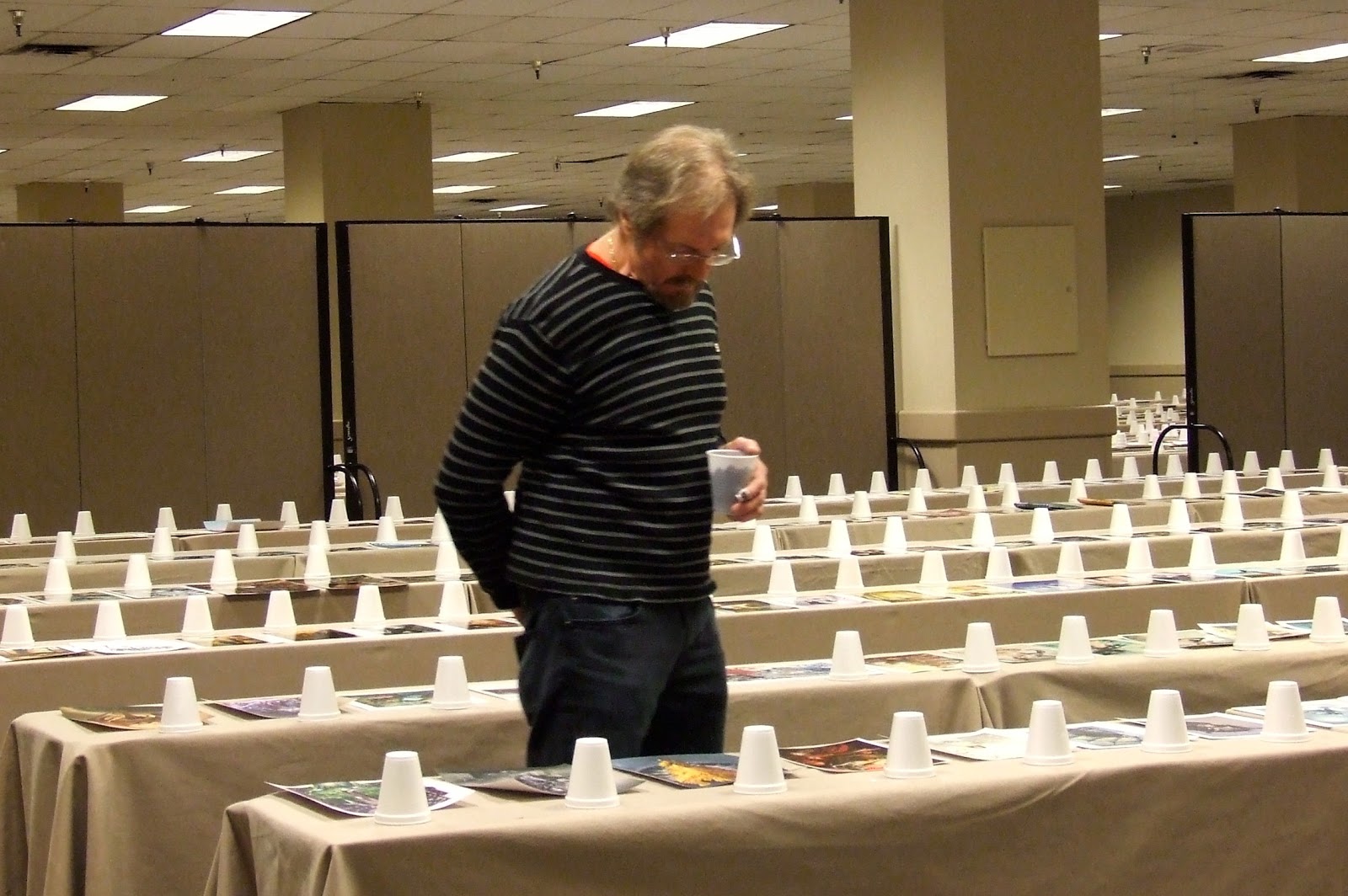
Taking off from the tarmac at MCI, I leaned back in the seat and closed my tired eyes with a sigh. They had been through quite a workout in the previous 24 hours, examining literally thousands of images submitted by artists the world over, each one hoping to snag a spot in the next SPECTRUM annual. Behind my eyelids, however, my thoughts were awhirl with the fabulous images I had taken in the previous day. There was enough sense of wonder and masterful technique on display in that room to impress anybody, however tired they may be.
All the more reason, then, that I harbor a sense of regret for the occasional works on display which made it hard– if not impossible– for judges to fully appreciate their quality. Some of the defects on view came from simple things easily rectified, so for what it’s worth I thought I would note some of them for anyone interested in making sure his or her work gets the attention it deserves.
1. Size Counts
In the submission guidelines, a preferred size is mentioned but not strictly adhered to. You can stretch things a bit as necessary, and no one is going to disqualify you if you add an inch or two to your printout’s dimensions – to accommodate unusual proportions, for example. Yet I seem to recall seeing panoramic landscape images [for example] shoehorned onto an 8.5×11″ sheet of paper. When such a piece is placed next to a larger scale image of equal merit, which one do you think will get a higher response?
Even worse were the few examples that didn’t even take advantage of the full paper size to expand out to the maximum width of the paper they were printed on. Unless you are painting true miniatures and are hoping to dazzle the judges by exquisite detail squeezed into a small space, this serves you little good. Especially when you keep in mind that some of the judges are creaky oldsters carrying two pair of reading glasses to even see the works submitted [I’m talking about myself here!].
Now all the judges are aware of this tendency, and I know from talking with each of them that we strove to guard against such instinctual responses. But human nature is human nature after all. Just sayin’.
2. Quality Counts
This seems so obvious it hardly needs mentioning, but I can scarcely see the point of going through the trouble of entering if you aren’t going to submit the best representation of your art that you can provide. It might be helpful to remember you are showing your work next to examples from many of the best fantasy artists alive.
And I’m not just referring to the color accuracy alone. It is inadvisable to submit overly shiny or curled prints as well. You wouldn’t believe the glare in the judging room, especially when a glossy piece curls into a tube. At times I had to use two hands to flatten out a print on the table just to be able to tell what i was looking at. With so many works to review that gets old, quick.
In short, if is very much to your advantage to make it as easy as possible to see the work. Though it’s natural to go for a glossy look in order to achieve higher saturation and contrast in your art, keep in mind it’s going to be laying on a table, not propped up on an easel.
I’m as guilty as anybody when it comes to putting things off until that last minute, and I know how frustrating it is to get a good quality reproduction out of a work. Speaking personally, I’m pretty bad at it myself. Fortunately I have opinionated friends who aren’t shy about telling me a print sucks and needs to be done over, no matter how much groaning and whining I do. You might seek out such people for yourself if you don’t have one or two already. Spouses are unusually good at this job, if popular wisdom is correct about such things.
3. Originality
A big plus for me this time around as a judge was the notable absence of character portraits from movie stills culled from the most popular franchises; Star Wars, Star Trek, Dr. Who, and so on. There were some to be found among the entries, but those I did take note of were largely real standouts, showcasing remarkable skill and technique, or a new treatment of the subject, which made the best of them well worth considering.
With SPECTRUM, command of technique and materials is a given. It’s the unique vision that stands out, so even if you are doing a piece that involves a familiar subject , it sure helps to have an approach, style or treatment that we haven’t seen before. Even better is a new idea altogether, masterfully rendered.
Though we’ll all maintain a fondness for the classic themes of our genre, it often seems that some things have been over-represented. I know I saw a LOT of the following:
(Need I say?) Dragons
Tentacles
Perverse little girls with big eyes
Pierced n’ punky tattooed girls with big guns.
Glowing eyes
Winged women
Cats
Wolves
Finally, the ever-popular “absurdly huge armored galoot fighting side by side with an elfin female in scanty but strategically placed chain mail”. Usually standing on a heap of bodies.
Fashions and fads come and go, and this list will doubtless change with time. And yes, I suppose there are new avenues to explore or ways to update elements in all of these themes. Perhaps you could be the one to do it.
One last observation: For some reason there are always submissions that seem to have fallen into the mix from some other dimension, a place where fantasy and SF [or even imagination] don’t seem to exist. In other words, pieces of art without any discernible fantasy element. I always find this puzzling. Some of them are admirable pieces of art in their own right and worthy or notice in some other show. It makes me wonder if the person submitting them made a mistake, put the wrong prints in the wrong envelopes or something. But hey, the entry fees they pay help to support the event, so who am I to complain? It’s just weird, is all.
Well, good luck to everyone who entered and here’s to the next SPECTRUM annual!
-Michael


Oof! I think I'm guilty of putting at least 4 of those tropes into a single painting!
Well, I'd just like to say to you, Michael, and to the other judges: I had your gloss/glare issue firmly in mind this year when I set out to make my entry prints, and I spent the better part of two weeks trying to get matte-finish prints that I felt were even reasonably close to being color-correct (Dan, your guide was most helpful!).
When I finally gave in and ran some gloss prints, suddenly everything was in the 90-95% accuracy range. At that point I was so frustrated that I decided to just roll the hard six and use the gloss prints. My apologies to you all, but I was ready to snap. 🙂 On the plus side, I think I managed to avoid everything on that trope list!
Oh and Michael, I have a question for you: were you not one of the judges of the convention art show at the Atlanta Fantasy Faire in… ermm… I think… maybe 1981?
lol. Know what you mean- funny how, for what is supposedly the “imaginative” genre, so much work seems unimaginative or rather drawn from the imaginations of other artists. It's especially tragic when god-like skills are devoted to these overdone subjects.
That said, this post does remind me of a more recent one here “Objectify”, where it was made clear scantily clad figures are also the responsibility of the Publishing Houses, the Public and the Art Directors. I'm assuming a lot of the folk who submit work to these events have one eye on the Industry.
I have a fledgeling IP in progress now that requires a female lead character which avoids the clichés. It'll be interesting to see how the propective client steers my own ideas one way or the other.
I can't believe zombies aren't on that list. Must have run their course int he last three Spectrums.
Hee! This is really funny because about, oh, ten years ago I had a conversation with a bunch of fellow artists about the best painting to create in order to sell lotsa prints a conventions, and we came up with “sexy winged goth catgirls”. Not much has changed, eh?
Whenever I see paintings of girls with donkey ears, I immediately move on.
Though I'm concerned about my semi-glossy prints now, at least I avoided most of those themes in my work. Well…except the tentacle thing, however minor. lol
I submitted my finely-detailed painting on an 8.5 x 11 glossy print with .25″ white borders… That's two strikes! lol Oh well, rookie mistake. Thanks Michael!
So in order to win, not only craftsmanship is important, but…
-flat
-non-glossy
-original, AKA non-fandom related (maybe that could be a subject of a future blogpost)
-unglorified male
-in a full pessant garb (tunic and pants…?)
-presumably UNDER a heap of dead bodies
Interesting to see the observations from a judge's point of view. I gave up sending stuff to Spectrum a few years ago when it seemed all I saw in the pages were your list of over-representeds and that's NOT the kind of stuff I do. So, I figured my stuff wasn't “original” enough… after all, if everyone else's dragons, big-eyed girls, and handle-bar-eared-scantily-clad-elf-warrior-girls were getting in, clearly I was doing something wrong.
I also notice there was no mention of style… some artists who repeatedly end up in the pages of Spectrum have personal styles that are so easily recognizable that I find it hard to believe the judges don't automatically know who did what piece.
Thanks for sharing your observations Michael!
It is helpful to see things from the point of view of the judges -at least one of them. 🙂
Excellent post! Creating new conventions for fantastic art is surely the hardest thing to do. On the one hand, there are the over represented subjects, and on the other, subjects that have no obvious (dare I say conventional?) fantastic element. Is a painting of a goth girl in an alley by herself a member of the former or latter category? Does the addition of a glowing object move it from one to the other?
What i don't mention is that, of course, I myself made many of the errors I mention in this piece. It grew out of notes I wrote to myself on the airplane coming back from Kansas City. This biggest note to myself: don't put off getting the prints done until it's too late to do a good job of it! Like many others, I rushed through the printing and had to settle for pretty crappy representations of the actual artwork, I'm embarrassed to say. You'd think I would know better!
As for tentacles: well, let's be honest. they are just too irresistible!
It seems we could make a strong argument for submitting art digitally. Perhaps it wouldn't be as much fun for the judges, and obviously the tradition has proven successful, but I bet it would even the playing field. Not everyone has access to quality prints, certainly not on a tight budget. Any thoughts on this?
Let me weigh in briefly. Viewing entries digitally would not necessarily level the playing field because [1] the computer can actually create something of an artificial “barrier” between the juror and the art, allowing for a certain amount of disconnect over a period of time, and [2] most anything can look decent in RGB at 72 dpi on a screen. Seeing it printed on paper not only allows the judges to examine it closely but also to get a feeling for how it will appear printed in a book. Remember that ink-on-paper is the final presentation of the selected work (and there are no plans to offer e-books or other electronic versions of Spectrum).
Walking the room, casting votes in a single day may be fun for the jury, but it also keeps them stimulated, focused on the task at hand, and engaged with the other judges: all of the experiences combined give the entrants a much better chance at being evaluated equally and fairly. Sitting in front of a monitor clicking through 6000 images in isolation would be incredibly mind-numbing. We used to allow slide entries early on and it quickly became apparent that the jurors quickly became disengaged (again, because of the artificial barrier) and began to make judgements at an increasingly faster pace—which wasn't fair to some pieces that required some extra time for deliberation. Going to all-print removed the barrier…and it's worked pretty well since. No one will ever be 100% happy with the results of any competition (especially if yours is the art not selected), but when it comes to “fair” I think Spectrum has always done a pretty good job.
I'm with Arnie. At least in that room we can walk around, look at things from different angles etc. Though it may have been difficult to see some prints it's not like we walked past any of them without giving each one a good going over. It's part of what makes the judging fun and fair as it can be.
My comments above were not intended to sound like a gripfest. I still regard the SPECTRUM annual review as the best in the world, other wise I wouldn't have been a judge three times in past 20 years.
Hey, Lane, I can recommend this company for really nice results at fairly reasonable prices. And no, I don't work for them! 😉
http://www.americanarteditions.com/