 |
|
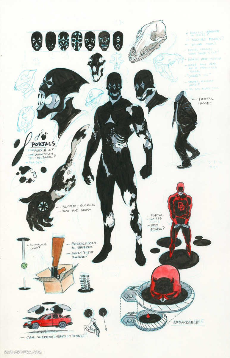
Coyote Studies. 2012.
Ink, blue pencil, and watercolor on bristol board, 11 × 17″.
|
If you’ve ever drawn a comic (or any large project, really) then you know the most fun part is doing preparatory sketches and studies for it. That’s where the ideas happen — the rest is just execution. You need both, of course, but a solid foundation is key; it bestows purpose to each of the hundreds of hours needed to give true life to a project.
Pictured above is a page of studies for a new Daredevil villain, Coyote. He wasn’t “brand new,” as his powers stemmed from an existing villain, the Spot, but he was meant to be a sleeker, more menacing version of the classic Spider-Man foe. Furthermore, his powers and relationship to the Spot were not to be immediately apparent in the narrative, so I wanted his look to have subtle cues to his origin without revealing his true identity.
 |
|
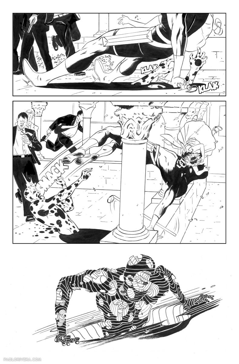
Daredevil #1, Page 4 (The Spot Attacks). 2011.
Ink(ed by Joe Rivera) on bristol board, 11 × 17″.
|
To accomplish this, I inverted the old costume: mostly black instead of mostly white, his portal spots dominating to the point where the negative white shapes became positive. This left me with a pinched triangle motif that I employed on the eyes, hands, and chest. Eventually, I treated the spots as giant discs that were draped over his body, peeling up to form sartorial embellishments.
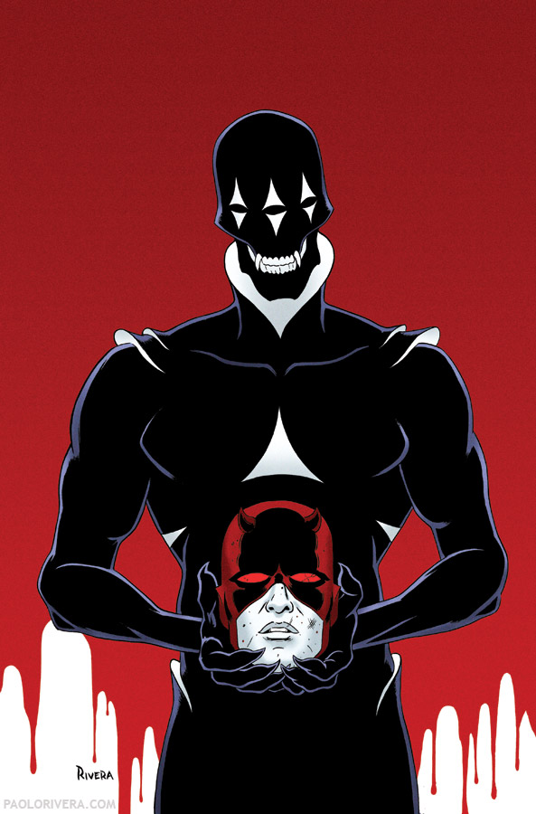 |
As things turned out, I ended my exclusive contract with Marvel before drawing the 4-issue arc that featured the villain. Fortunately, I was still able to contribute covers, and the story, written by Mark Waid, was beautifully rendered by current Daredevil artist (and one-man factory) Chris Samnee.
 |
|
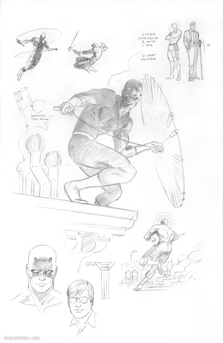
Daredevil Character Sketches. 2011. Pencil on bristol board, 11 × 17″.
|
As for our eponymous hero, I didn’t deviate much from the classic interpretation of the character, just added a few touches here and there to make him my own. In order to update his white cane, I elongated each section and added a crimson spare, 3 in total. The other major change was making the cane rotate into a square hook. (Part of me still wishes I had use the curved version, which makes less sense when it transforms, but looks more elegant. At the time, I didn’t realize it worked like that in the earliest issues.)
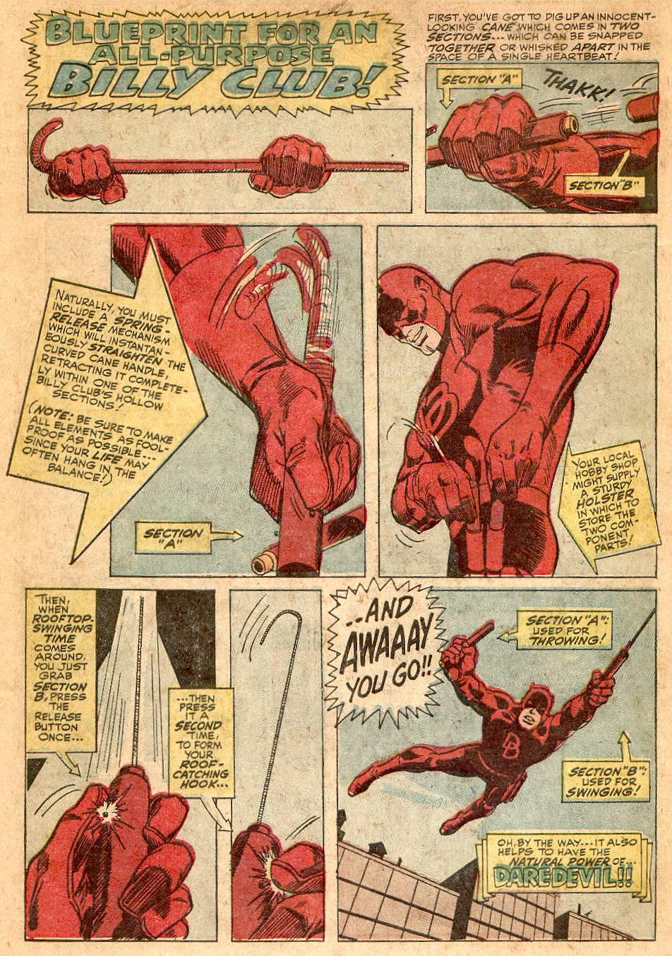 |
| by Gene Colan (words by Stan Lee) |
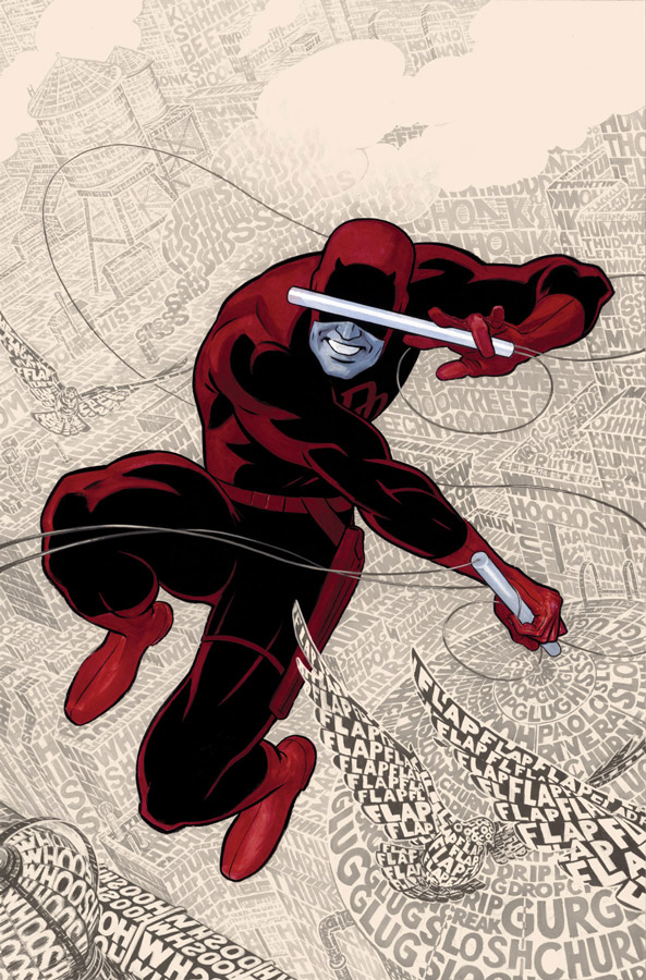 |
| Daredevil #1 Cover. 2011. Gouache and acrylic on bristol board, 11 × 17″. Time Lapse |
I also changed his belt slightly, having it hang at an angle across his hips, alla Han Solo. I changed it yet again in later issues, extending the diagonal across his body for a more swashbuckling look (example below). Again, these were very subtle changes — I really just copied my predecessors: David Mazzucchelli, Wally Wood, and Gene Colan, among many, many others.
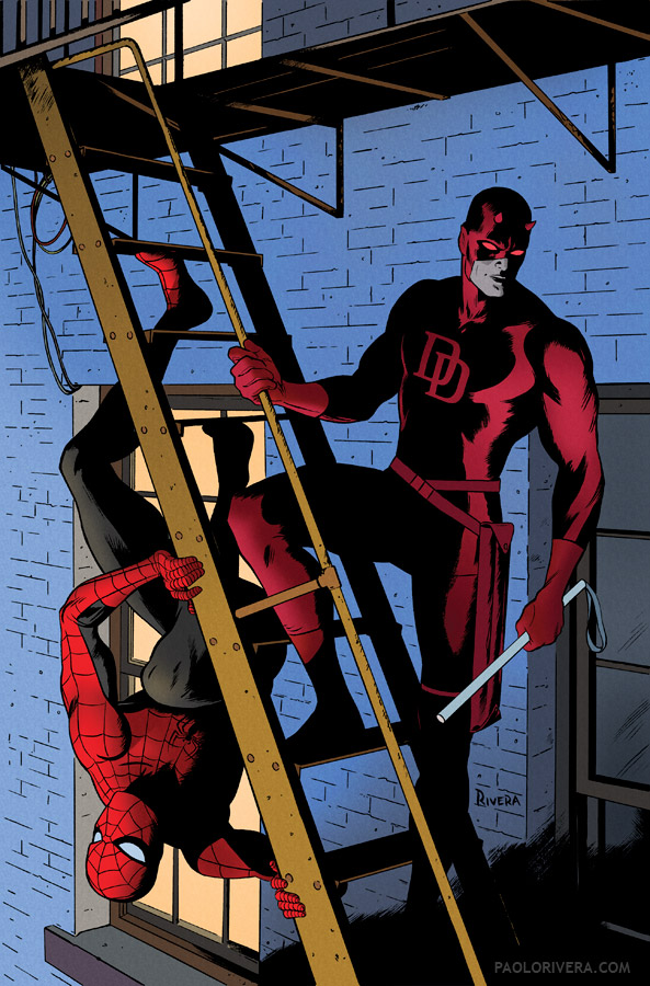 |
| Daredevil #8 Cover. 2011. Ink(ed by Joe Rivera) on Marvel board, 11 × 17.25″. Step-by-Step |



I agree, simplicity is vastly under appreciated. It's so much harder than it looks!
Great post as usual, Paolo.
Thanks, Dan!
Such a great character design on Coyote. Knocked me over the first time I saw that cover to #19.
Thanks, Adam! I hope he makes a comeback at some point.
I love this post. I don't know how many other “comics” folks there are out there reading, but I get a lot out of your “how to” stories, Dan.
Thanks, Douglas!
This Coyote character is BADASS. I strangely always loved The Spot, even though he lacked a little something. I guess it's because I loved his power maybe 😛
So this guy is just awesome. Good work!
Thanks, Marc-André! Yeah, I was happy to draw the Spot in the first issue, and was dying for a chance to do it again. His power, I thought, was always underused, and way more of a threat than the way he was usually depicted.