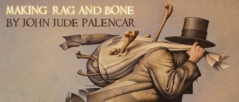
Here’s a recent process post. This painting was commissioned by the good folks at Tor.com.
Tor’s Creative Director, Irene Gallo cautioned me not to give away the surprise ending of the story. So you’ll have to read it HERE. The story “Rag & Bone” has a steampunk feel with a little Charles Dickens thrown in for good measure.
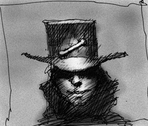
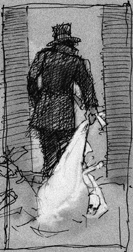
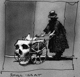
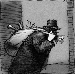
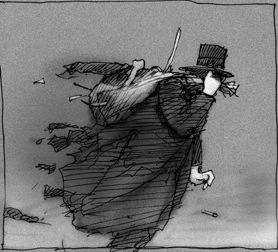
I set about creating some quick sketches. I prefer to keep them rough. This allows for additional creative exploration when working on the final art. Having the added opportunity for creative discovery when working on the final painting is another catalyst that fuels my inspiration and staves off boredom. If I would have an overly finished drawing at this stage I think it would be like doing the art a 2nd time. Almost like a paint by number painting or a kids coloring book with no mystery. I think of these sketches as a launch point.
Irene Gallo and I have done many covers together so we can work in this visual shorthand method for concept sketches. Irene chose sketch number five. At this stage I go directly to the final drawing on a plate finish board. I had my son pose for a few quick reference photos and set about working on the final art. I do have to say that having a secret internal image of the final painting does help. I always work toward this internal image. Sometimes I get close and other times I miss the mark. I do like the elusive nature of working this way.
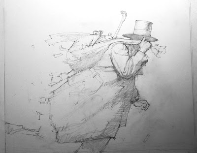 |
| Pencil |
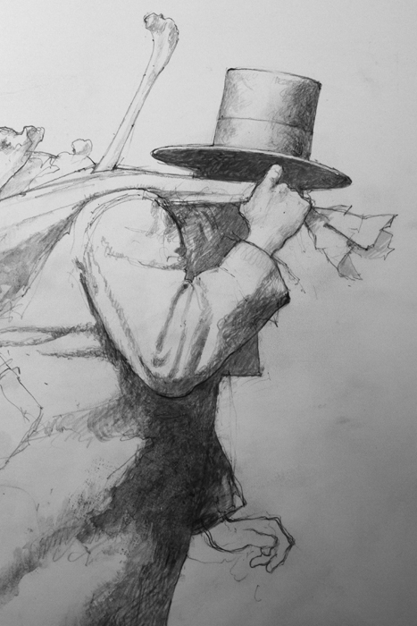 |
| Detail with first wash |
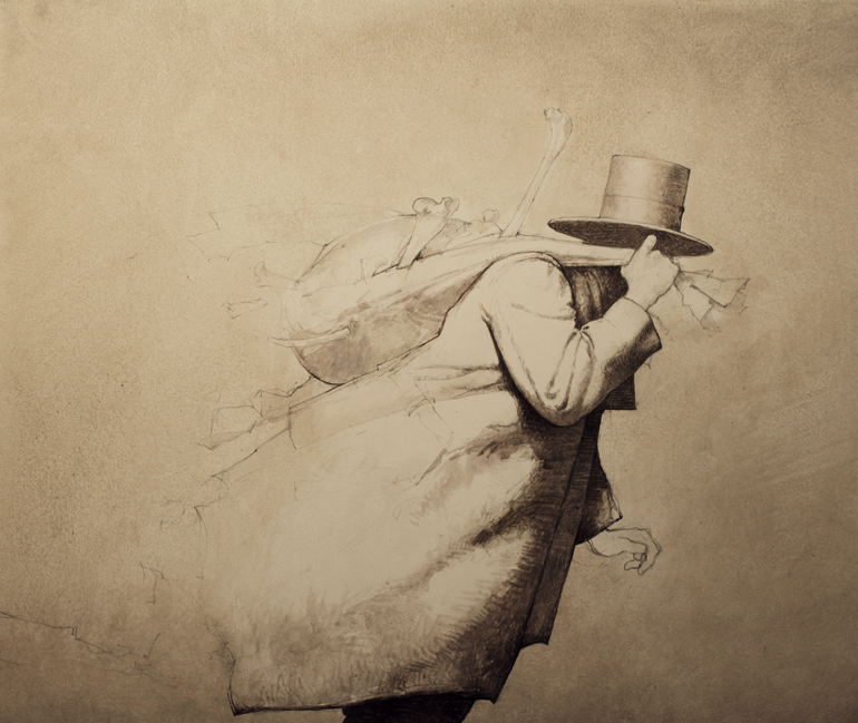 |
| Additional establishing washes |
Pencil drawing first with subtle shading. Just enough to indicate general shapes. I do however render some areas to function as a guide when establishing the image in paint. I also keep the rendering fairly light at this stage because I do work with transparent washes at the beginning.
Since I’m working in acrylic in a watercolor fashion the initial washes are laid down – wet into dry and wet into wet. Over the course of developing the image, many layers and subtle colors are then woven together. This is where I begin to introduce opaque and semi opaque washes. Veils of color and value for lack of a better description.
These veils are also intermingled with transparent glazed colors. This back and forth method begins to build the form. Using washes and lots of small strokes the subject starts to almost paint itself. Each layer is contributing to the layer underneath. Each color, value, and layer shines through the previous layer to create some unexpected textural effects. Working in this manner borrows technical approaches from oil, watercolor and egg tempera mediums. It’s not for everyone and can be tedious. For variety I will sometimes have areas of larger simple washes.
I work on a variety of surfaces. I typically prefer a surface with a plate or smooth finish. If I’m working on a wood panel the gesso is always sanded to a smooth finish. In some cases I will build up a physical texture to enhance a particular area.
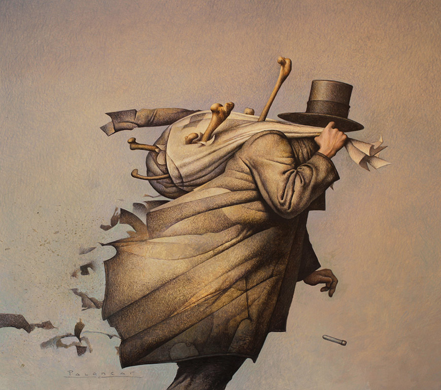 |
| Rag & Bone, 15.50″ x 13.75″, acrylic on board |
I do have to apologize for not taking more photographs of the progression but when your rolling along it’s hard to interrupt the creative flow. If you have any questions I’ll do my best to answer them.



This is a great painting! Ty for the wlakthrough! Can I ask how is this mat texture achieved- the cloth looks as if it was built up from dots-almost tricks the eye as it shivers around. Is there a poantalistic aproach behind it or it is the side result of other factors? Ty
Gollorr – Thanks!
Funny – I was just asked the same question by another artist. The dots are actually the spaces between the strokes. This effect can be controlled by adding or adjusting the opacity/ transparency of each layer using washes and glazes. In some cases I can achieve a near airbrush quality in transitions without showing any texture. I prefer to show the hand-work in this case. In some instances I will glaze with polymer medium for more jewel-like appearance. There does have to be forethought on which colors (warm or cool) when applying the layers. There are a few areas where a stipple effect occurs – I just spatter with a toothbrush for those sections.
JJP
You are my acrylic guru John, and have always set the standard. Hope you will be at SFAL2? I really would like to meet.
o_0
As someone who uses acrylics, I really enjoy your posts and the insights into your techniques, John – such gorgeous results! I've just started experimenting with thin “wash” layers as you describe, and it's pretty exciting so far… a whole different mindset from how I was approaching things. Tricksy, but very intriguing.
Just out of curiosity, may I ask if you use any blacks in your process, or do you build up the darks? Also, when you say “wood panels”, do you mean masonite panels or is it something else?
That is beautiful!
The texture and subtle color really sell this painting.
Hey Bill – I'm blushing… fan of your work too… love the dark whimsy!
dorobo – Sorry – I'm not up on the emoticon thing. Is that a zombie face?
Hi Dave – Thanks for the compliment.
This layering technique can also be used as foundation/ under-painting for more robust paint work. I did use black in this painting but just small amounts added to a very dark colored transparent mixture.
Most of the time I try to created a black using a number of deep transparent colors. I plan on experimenting with other colored and lighter base washes. I initially was going to make the coat much darker but opted for a patchwork of cool and warm brown grays.
Wood panels- In the past I used masonite but the debate over which type to use was always a frustrating. I now use birch panels -AAA grade and 3/4 inch thick. They weigh a ton! I was speaking with Dave Palumbo a few weeks ago after seeing one of his beautifully cradled panels. He turned me on to a company that produces them in a variety of sizes and will do custom sizes as well…. and they weigh significantly less! The surfaces can be in maple or bass wood. You have to gesso and prepare the surface yourself but I think they offer pre-gessoed (acrylic) panels. What's cool is that you can also use them for egg tempera. Of course you have to use the animal hide glue and true traditional gesso for that medium.
Thanks Nicolay – Glad you noticed!
JJP
Wow I think its brilliant as well cool you make it looks easy. your very unique and quite stylish id just prepare that simple stroke you do on pencil drawing im already amazed. thanks for sharing. hifive to your highness.
Love.
Hey John, Do you controll the Gloss or Matte properties of the paint at all, or just let the natural characteristics of the paint determine that? Do you make use of a Sta-Wet Palette, or do you just mist it with a spray bottle. Also, how do you prepare the painting for the client, do you scan it or photograph it? Finally, we miss you out here in California. I've got to take you out for a deep dish pizza and a pizzookie again when you're in town.
Every time I see one of your paintings I almost want to go back to painting with acrylics- but so far I'm content to look at your beautiful work, John.
I personally prefer to paint on wood panels, but I've lately been questioning the Baltic Birch plywood I get in the local fine wood retailers. Would it be possible to learn the name and website of the company you mentioned? I'd really like to see their products.
Keep up the great work, John. I'm sorry you don't post more often.
Quite happy to finally see and learn how you achieve your trademark texture as commented too by Gollorr. I have long wondered. Have had your book Origins for years, thoroughly enjoy it. Love this cover painting.
Hey David – Good to hear from you. I really had a great time at LCAD.
In answer to your questions: For this painting I just used water – no mediums. I use a butchers tray for paint and keep it covered when not in use. I do use a spray bottle with distilled water to keep the paints on the palette wet. In this case I took several photographs and transmitted the image to an FTP.
I'm still thinking of the deep dish pizza as I write this! Take care.
JJP
Hi Jeff – Thanks! I once threw out all of my acrylic paint in anger. Once I learned to settle down and keep it simple – I'm also a bit stubborn and had to return to the medium and figure out what I was doing wrong. It turns out that I just needed to observe what I was doing wrong and note the methods I was using.
What surface you choose is a personal preference. I really like the birch that I've gotten at the local lumber yard. It's already sanded so it's not much more work to bring the surface to a smooth finish. I do apply many coats of acrylic gesso in a variety of ways to get the texture smoothness that I require.
Here are a few sources for cradled panels:
http://www.art-boards.com
http://www.utrechtart.com/Utrecht-Art-Wood-Panel–1-5in-Cradled-
Profile-MP28820-i1004762.utrecht
You're welcome David. Thanks for buying “Origins”. I'll sign it for you if we ever meet!
JJP
Also – sorry that I didn't respond quickly to the comments but I pulled my computer off the net due to storms and lighting strikes in our area yesterday.
Thanks Marion!
Also thank you Gianluca!
JJP
Thanks for the info, John. I'll take a look on those sites. I painted 12 years w/uils, got sick a lot–turpentine–and switched to acrylics, which I never really liked, but went at it for 25 years, finally hit the wall, and went back to non-turpentine oils. Learning curve always. Lately acrylics catch my eye, especially when they're done at your level. But oils own me, now. Life is good.
Best wishes!
Oh the texture is wonderful; it still boggles my mind even after you explained it. I'm glad that you posted this, thank you!
Thanks, I'll be sure to have it on hand.
The tone of the background is awesome, create an atmosphere and a light really great.
The texture, is wonderful.
It is a pleasure for the eyes see something like that.
Hey Jeff – I've been back and forth on oils. I'm still trying to develop an approach where I can meld my acrylic sensibilities with a oil technique that suits my working methods. Hopefully in the future I can post some of my explorations. I love the smell of oils in the studio.
JJP
Erica and Andrea – Thank you for the kind words … the texture was something that developed over the course of my art school years. I've been a fan of Andy Wyeth for years! He employs the same method although his brush work is far more organic and less decorative then mine.
Erica – The base washes were done with a cream yellow (semi- opaque) that graduated into a orange pinkish raw sienna. Over those layers (it's hard to see in this scan) I glazed and hatched in a light blue-green, cerulean blue… moving clock-wise to cobalt blue, ultramarine and finally ending in blue- purple. A subtle spectrum effect.
JJP
Thank you! It was a good call- showing the hand-work, I like it too 🙂
This is beautiful!
If you don't mind me asking, from start to finish, how long would you say it took to finish the whole painting? (Between sketching, getting reference, panting..) I'm trying to gauge myself time wise to finish my own paintings, and a ball park estimate would be helpful.
Hi Cristina – This particular painting took about a week and a half, from the time that the sketch was approved. Sketches took part of one night. Since I work traditionally the time it takes can vary greatly depending on the image. It's not always this quick … it usually takes me a little more than two weeks in most cases. You have to remember that we are sometimes juggling a few projects and some projects are overlapping. Getting the right model is also very time consuming. You make choose a model that shows up and is completely wrong for the assignment (looks markedly different from their portfolio) and lacks the “vibe” you're going for.
Thank you for the reply, I really appreciate it. This was helpful. 🙂
Cristina – You're welcome – Keep up the good work.
JJP