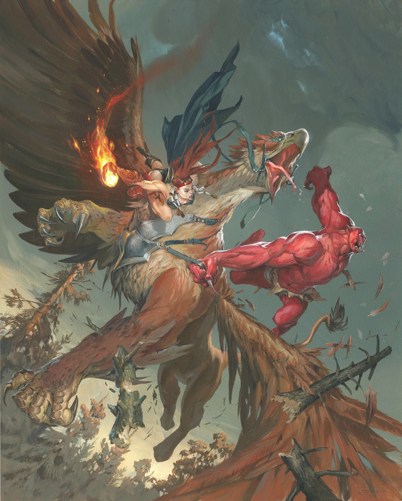
This article is a continuation of the one a couple of weeks ago concerning my painting: “Griffin vs Blood Demon”.
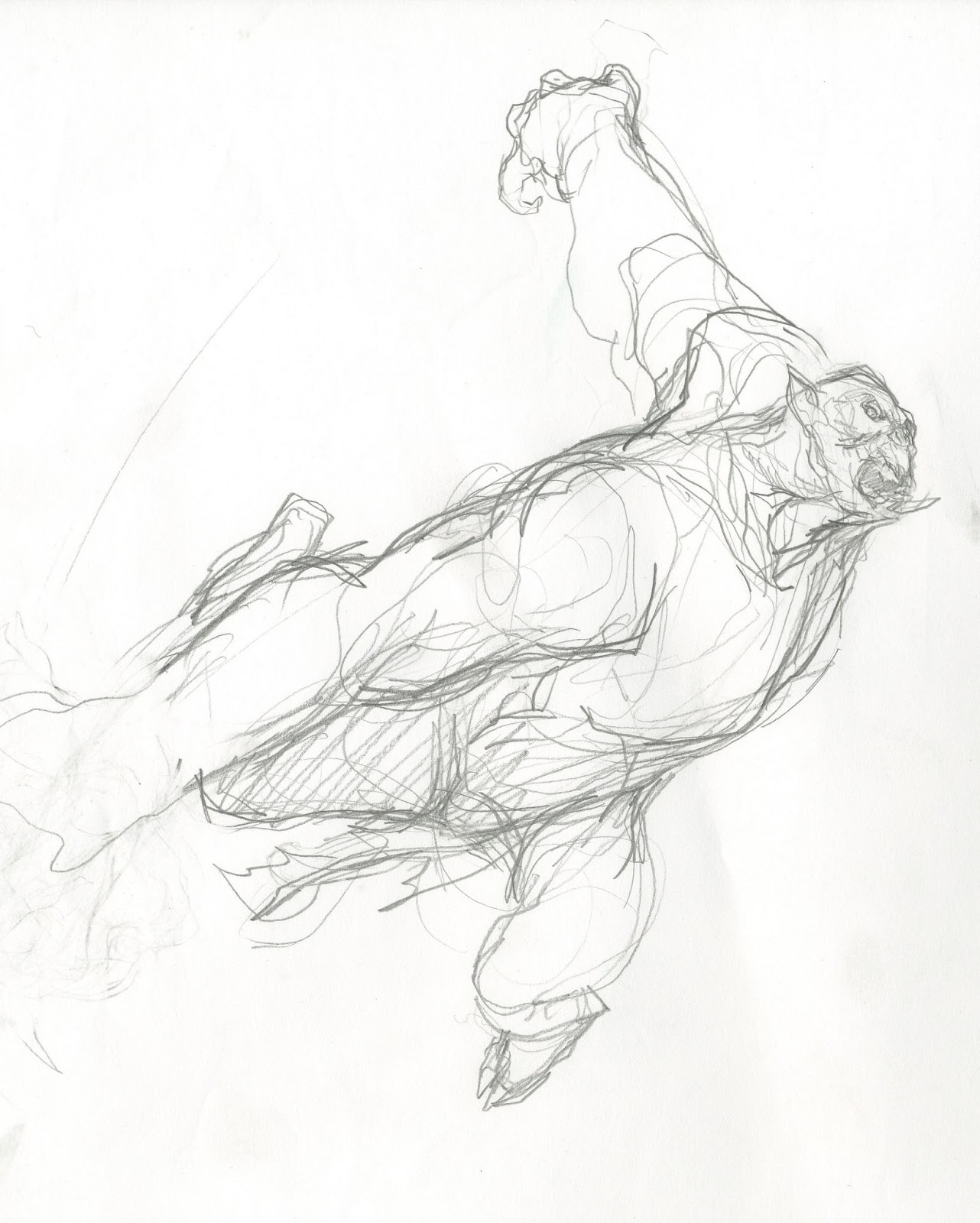
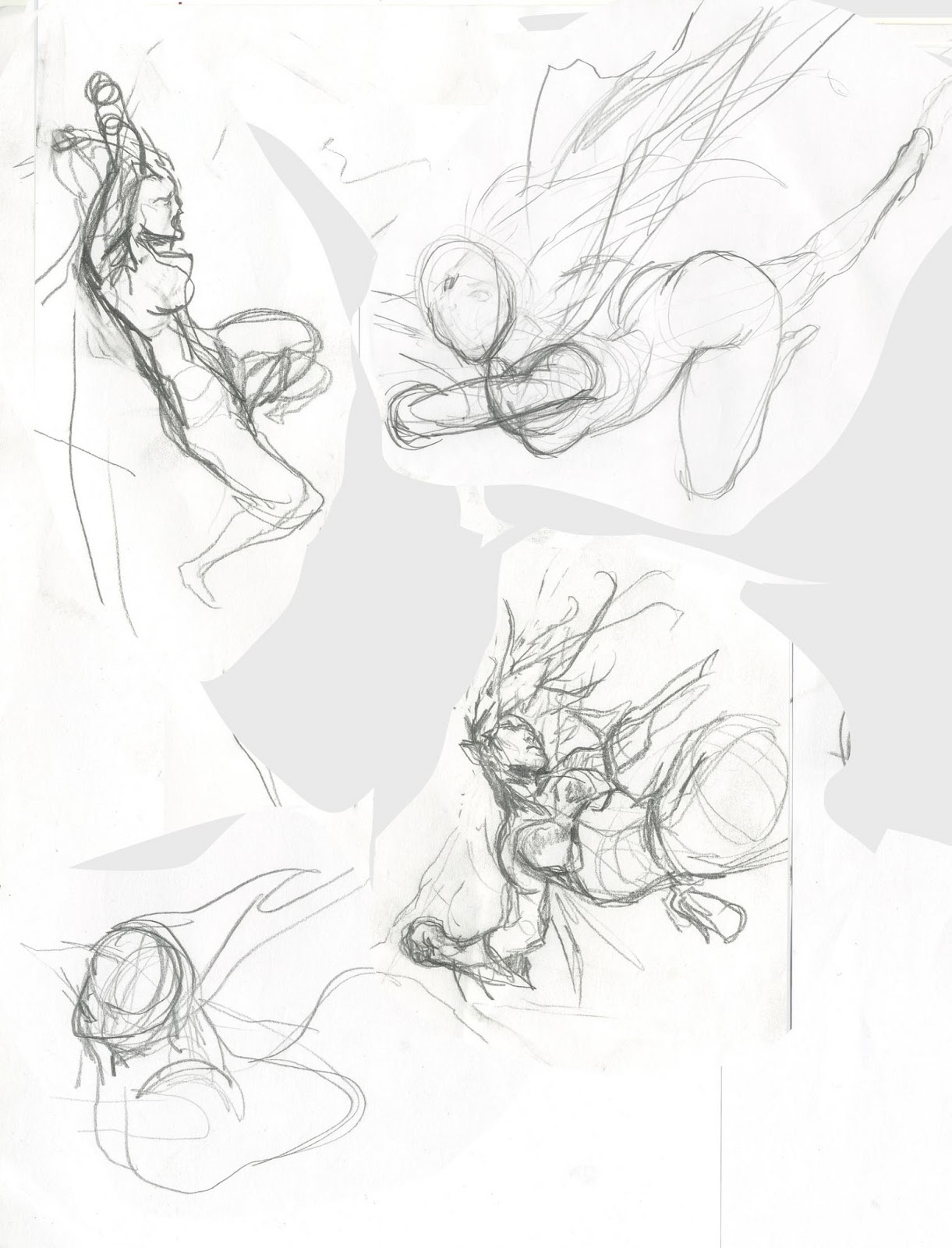
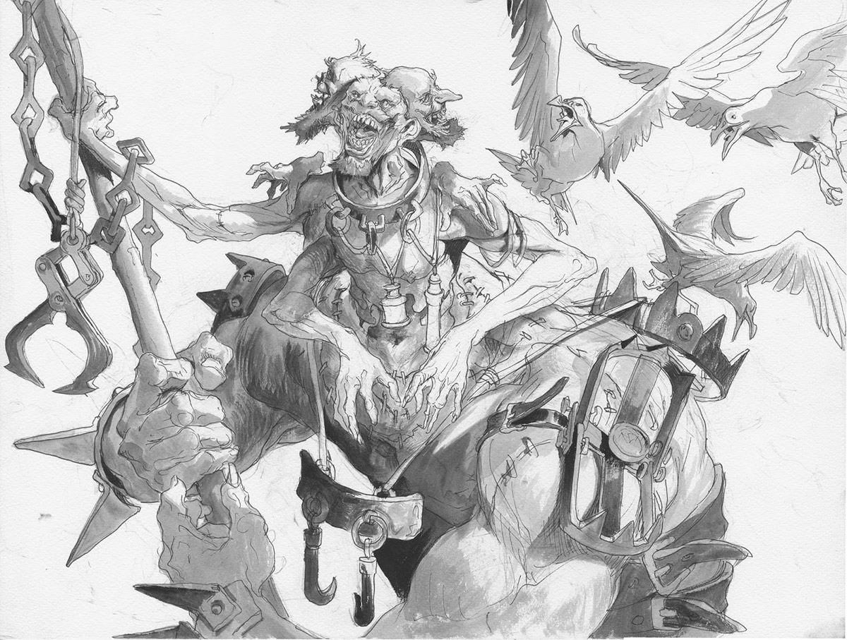
I was afraid that the logical interpretation of the sketch was: Demon riding his griffin friend with a female sorcerer as the intruder. No good. I wanted the demon to be the intruder, the one clinging to the griffin while fighting it. I tried to place a sketch of him hanging underneath it pounding up into the mane, but he then looked too much like an underdog. I realized that the image needed him to hang free of the griffin to show that they were not a unit. and I needed him to also be more thrown around due to the action of the griffins body. So I ended up with a very dramatic pose, by twisting he body and using a lot of foreshortenings.
I was still very little in love with the sketch of the girl. I tried different versions of her clinging/hanging to the demon or the Griffin, but none seemed close. As you can see I abandon sketches very quickly ( perhaps too quickly sometimes ) But when I placed the Demon onto the board, and saw it as a whole without the girl, I noticed the curving half circle line the demons arm was describing, semi-framing the griffins head and I right away knew where I should place the girl. The sketch of her is lost, but most of it was done on the board anyway. I used the flame trail of the fireball and the blowing cloak to emphasise the circular lines of the demons arms thus actually framing all of the point of interests.
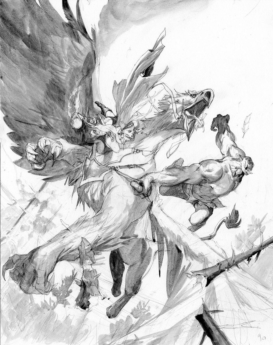 |
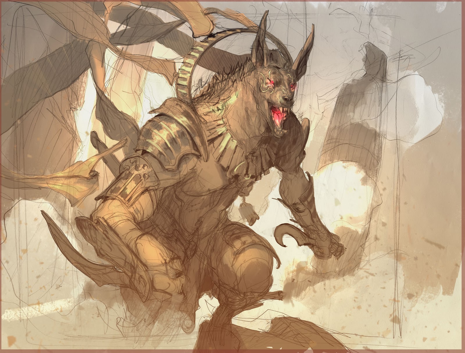
| After all was pencilled in on the board, I ink it in waterproof ink and grey toned it with acrylics. |
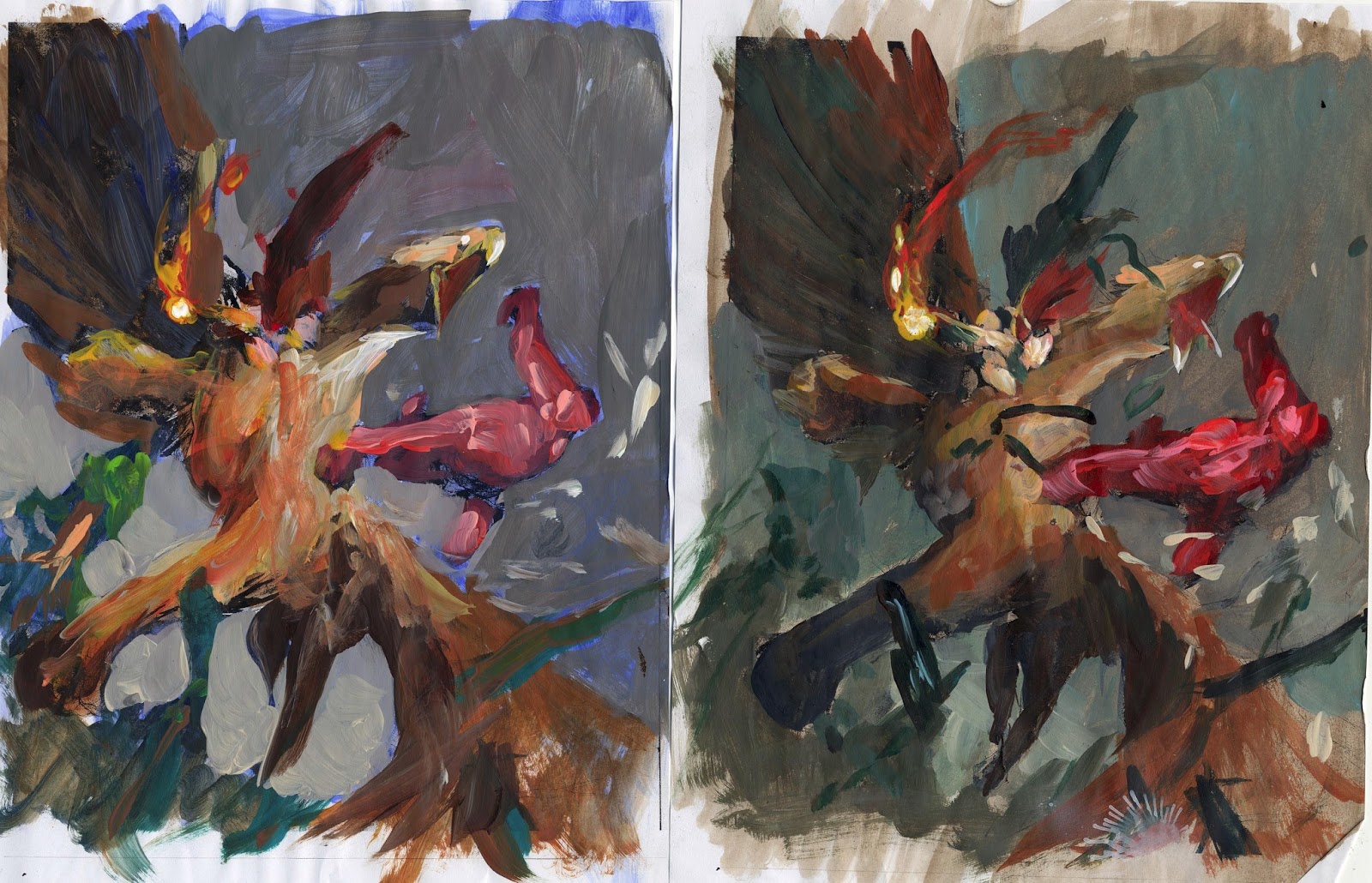 |
| I use the greytone version for colour roughs. |
I had to make the demon bright shiny red, that was the only giving thing. A big red blotch on the middle of the image. The painting before this was pink/purple and orange, so bright that it almost hurt your eyes, so I guess the greyness of these 2 color roughs was a reaction to the weeks that came before. But also the large seemingly flat surface of the sky, creates a very neutral area that lets the red come to its right. My choice stood between warm/greenish grey or cold bluish grey. The more flat and simple solution of the greenish one struck me as lending the most focus to the figures, so I went with that one.
I chose the costume color of the sorceress to be green and then made the straps and harness the same green to make sure you would be able to see that she and the griffin were friends.
When I started painting the sky, I was afraid it would become too flat so I added the warm light in the bottom to create a depth and a logic reason for the light on the tree tops.
When looking at it again I really dislike the way I drew the lowest wing, how it joins the body. I had so much going on in that area that I couldn´t cover up by making a large muscular joint, but I whish I had done something else now. It looks weak and thin.


Love this!
Great work, thanks for the detailed explanation. 🙂
i really like it impossible but imagine
can u follow me 🙂
I turned out rly dynamic but I wish the Demon head was looking towards the girl, grinning back at her. i think it would have been better since now all 3 figures r looking in the same direction. As for the wing -I personally didnt see a problem before you noted it, so I guess it's not smth most ppl would find disturbing
thanks for interesting post… i really enjoy to visit this site 🙂
please, visit my web:
obat asam urat