Illustration is easy!
You toss armloads of passion, paper, paint and frustration into a single-minded person and let the dough rise for 25 years.
I think that every good illustration stands on the shoulders of all the successful ones and the failed ones that went before. Our ability to improve lies in the way we learn from mistakes and happy accidents, sprinkled with glimpses of greatness. We all know that feeling when a brushstroke just land particularly right, or when a series of seeking strokes suddenly makes us achieve the effect or look we have been trying to nail for weeks months or even years.
After a while we build up a list of things that we KNOW must be solved or at least be taken into consideration when pursuing this career called illustration. Here is my checklist of subjects that I try to keep my mind wrapped around while painting a piece:
1. Story
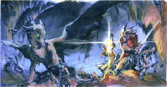
Something needs to happen in an illustration. There need to be a little story within the image sketching for that right moment within the story is crucial. I find it the most rewarding if I capture the moment while it is taking place rather than before or after. Let us say a knight and a dragon. The image “snapshot” could be taken after the battle is done with the dragon dead and the wounded knight gasping for breath, or when the knight enters the cave and the dragon wakes up to meet the challenge, or, as I prefer: when the knight is dodging flames from the mouth of the dragon straining his body to get that deadly strike in.
I am not saying the other 2 images could not hold a story. My point is without story there is nothing to aim the rest of my checklist at. Story is where it starts. Without it, you are just drawing stuff.
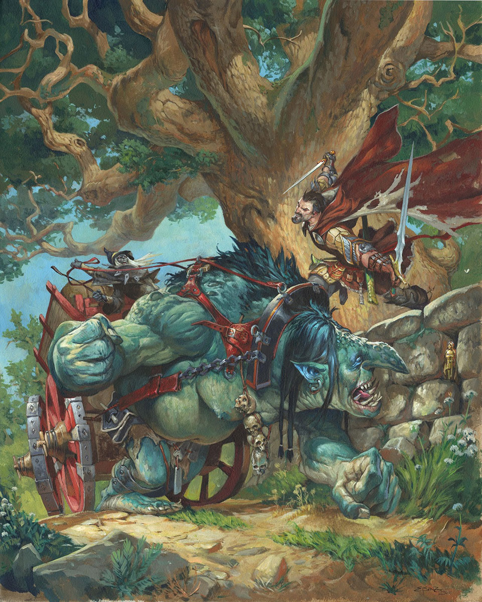 |
| Elminster´s forgotten realms |
2. Composition
Composition is all about staging the story right. It is about chiseling away noise until the story is told by fewest lines as possible. It can be very useful to sketch thumbs and compositions in greytones too to establish value for clarity. This step is the hardest part for me and where I spend the most energy. I often go through 10 to 15 thumbs before deciding on anything.
3. Action
I was showing a fighting scene I just painted to a fellow artist Todd Lockwood, many years ago. He was very polite and said he liked it alot, but…” you know what Jesper? I always try to capture the figures out of balance while fighting as if they were in the middle of a movement”
I noticed that I had drawn a barbarian fighting with the feet flat on the ground. If you want to capture a story while it is taking place action is needed.
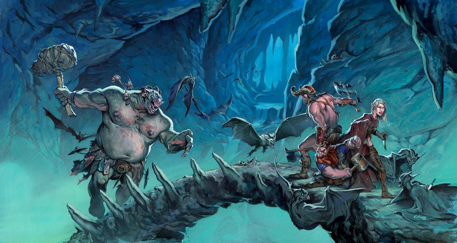 |
| Decent journeys in the dark |
4. Posing
To show action, you need to pose the figures right. I have always been a huge fan of extreme foreshortenings, but overdoing it can make a figure unclear to read. Finding the right and especially interesting pose, takes a lot of sketching and oftens drag you out to the floor acting it out yourself to get the feeling of it right. I remember one time where we discussed how much shit a role playing character drags along. So we fitted me up in a chainmail, put a backpack on the back and strapped swords, axes and shield on. In the end I was not able to move at all let alone pose cool.
When trying to find the right pose for a figure I focus on the emotion of the character and try to avoid too theatrical solutions.
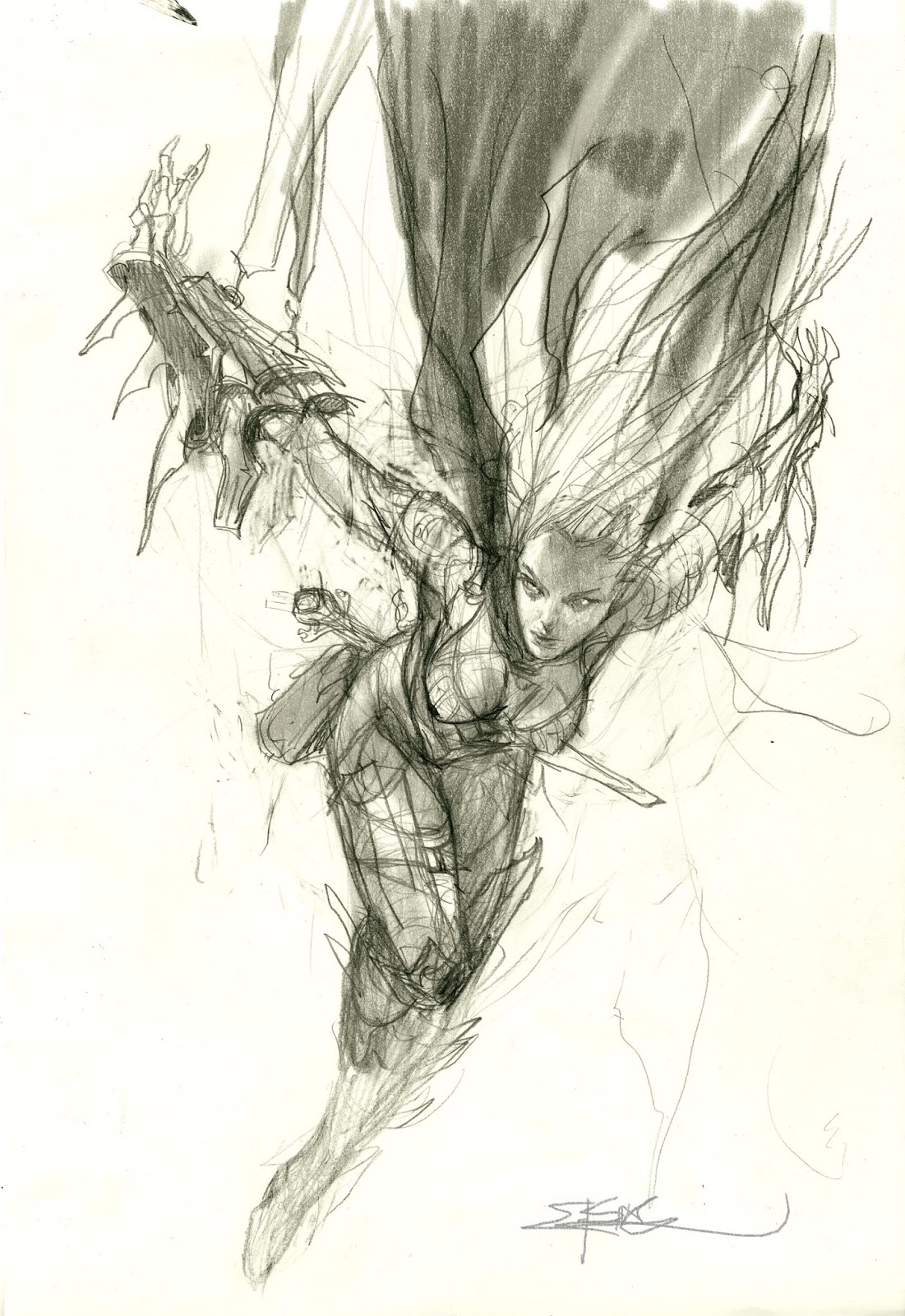 |
| Menzoberranzan |
5. Expression
Expressions is by far my weakest point. I envy artist who can capture emotion in gestures and facial expressions. My brother tells me that all my figures have the same scowling glanze. At least I make a point to have the face convey some kind of emotion.
 |
| Wren´s Run Vanquiser |
6. Design
There is in fantasy an archetypical set of stuff that the different classes has equipped that signals who or what he is. Maces for clerics, staffs for wizards and so on. bending the rules is often more interesting. I think the key teori is to know and study historical costumes and weapons, knowing how the work in order to invent your own versions.
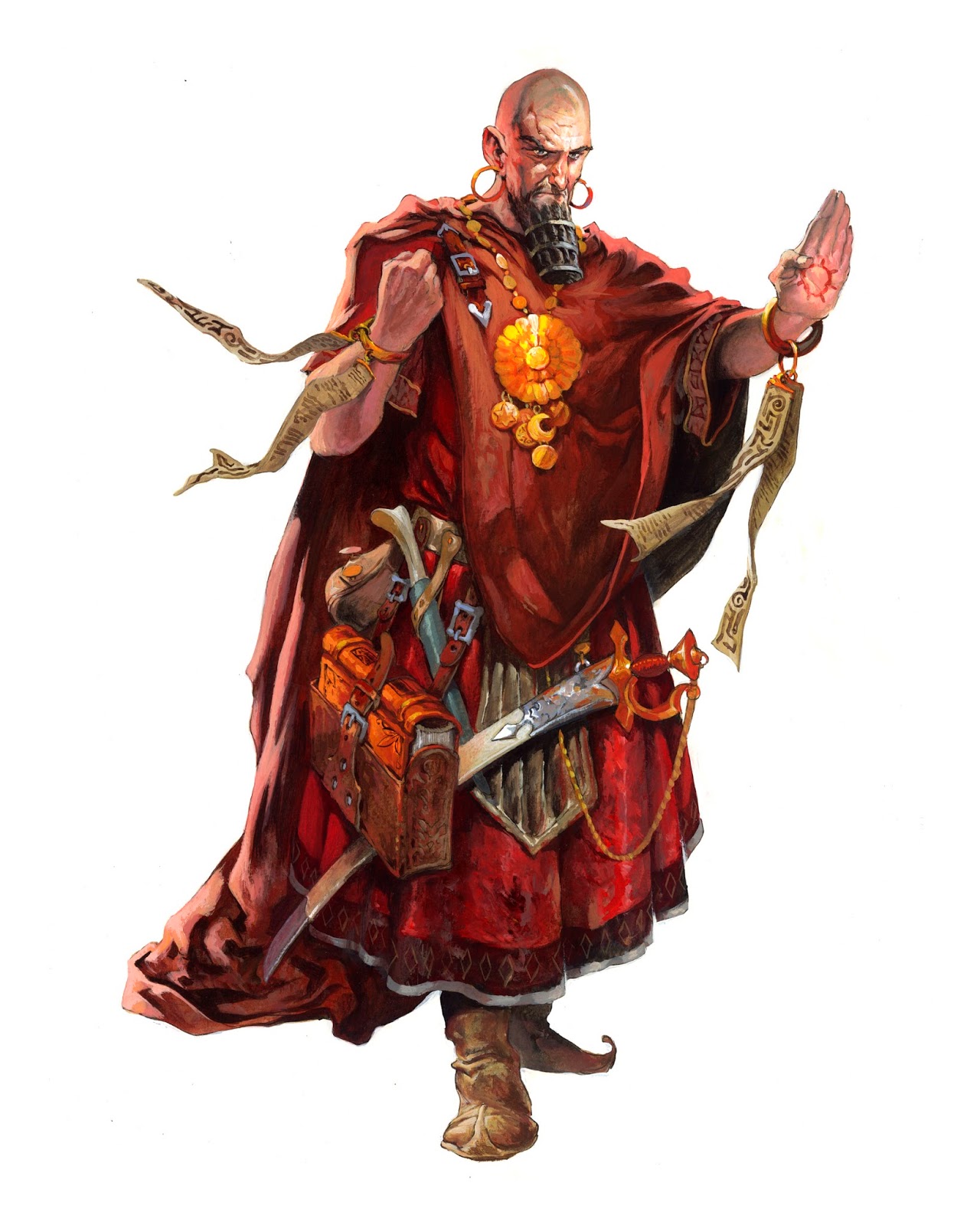 |
| Figure for Paizo cover |
7. Details
I heard Paul Bonner say once “When in doubt; add more details” Details makes the eye go on a little trip of experience. Needless to say, that it is a thin line between overdoing it and creating a too busy image. But I do think that details add a credibility to a figure. Who really thinks that Conan can manage himself out there in the snow only wearing a loin cloth and some boots?
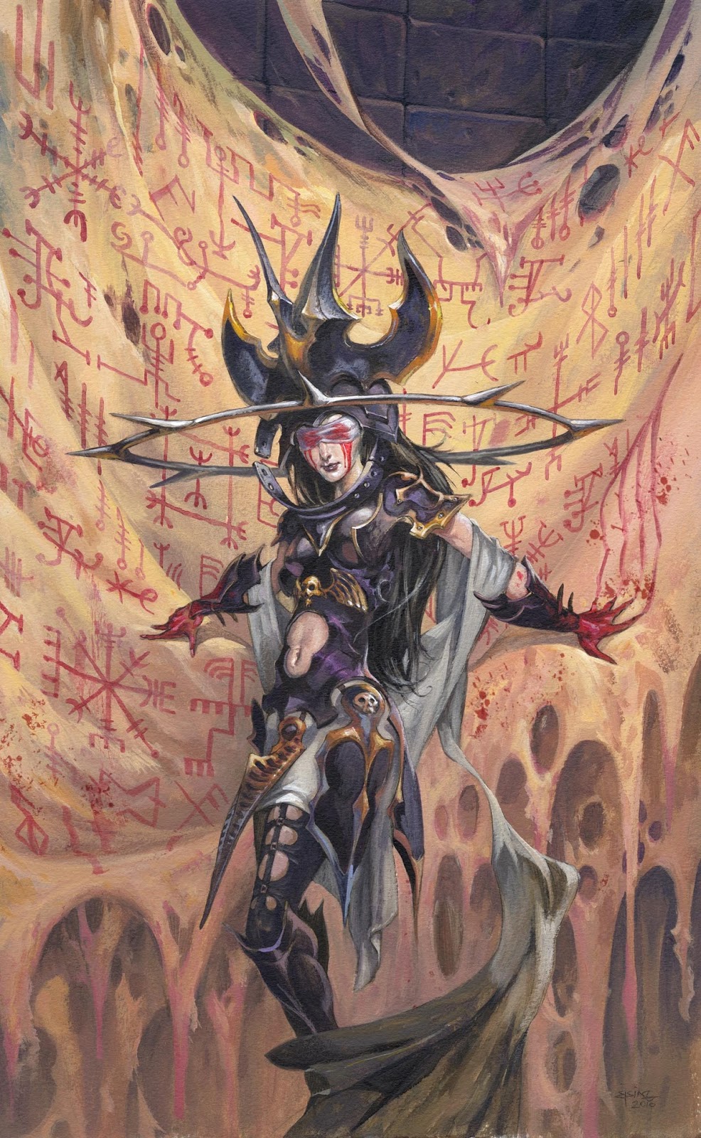 |
| Plots that span centuries |
8. Colors
Colors makes the mood. staying within the grey or darks is the easy way out. But I always try to replace dark or black areas with a vibrant color instead. Creating color schemes, testing them in numerous color roughs is what works best for me.
9. Silhouette
Everything in a drawing needs to have a clearly readable silhouette. Doesn’t matter if it is a light figure on a dark background or a dark figure on a light one. I learned this very early on by coloring comics. having only the colors to focus on I could concentrate on telling the story clearly that someone else had already gone through all the turmoil of drawing.
 |
| Wow of Malice |
10. Personality
When you mix all of it together it still can be a little ordinary. What is your personal style? your edge, your trademark? All I know is: as soon as I stopped looking for it, people started telling me they could recognize my style.
Playing your weaknesses, emphasizing your strong assets, I think is the start of a personal style.
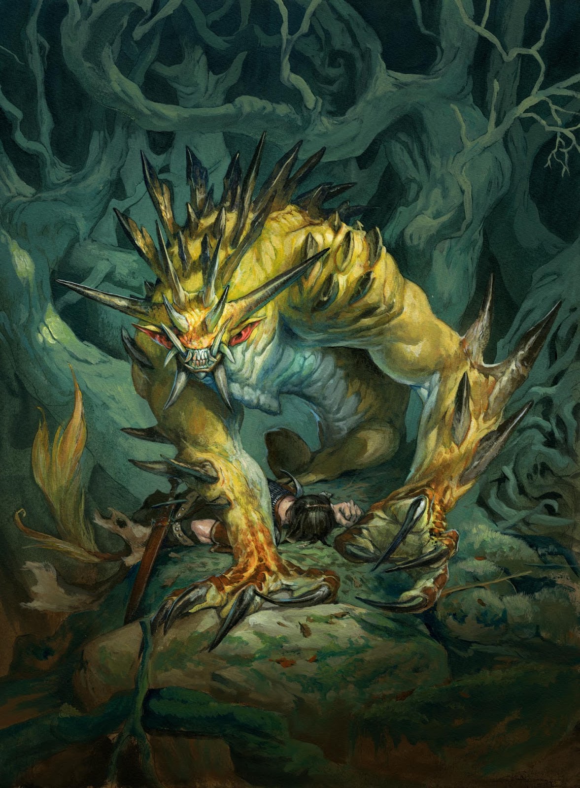 |
| Beast Token art, magic the gathering |


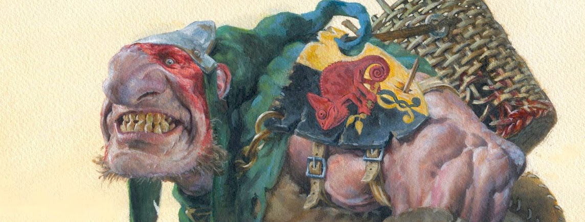
Really good post jesper!
It's always good to remember the basics, and especially coming from someone like you.
By the way I love the last artwork you've posted,have you done it for MTG?
I think I've got the ingredients, it's the 25 years of dough rising that I am working on. Useful advice—much appreciated.
James Gardner Art
Great Blog Post!
So simple and yet I still struggle to get it all done.
Really great post yet again! The first two is definitely my weak spot I get caught up in thinking about the design and all the artists tools and I forget the basics that I'm trying to convey a good story over everything,
I know my composition is bad because of my lack of understanding of perspective.
That last painting is awesome first time I've seen that colour pallete from you
Thanks this was really helpful.
good advice 🙂 interesting to see how you approach your illustrations
I second Kimberli's post – such simple points but mastering them is a whole other ballgame! Still working on my 25 years of prep too. Great post, Jesper, thanks for sharing your great work and insights.