 |
|
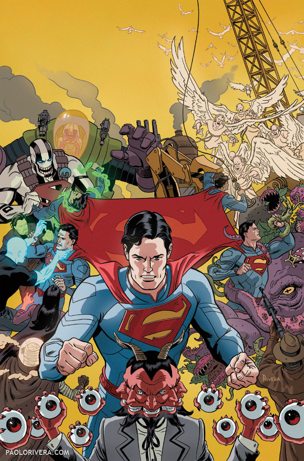
Action Comics #18 Variant Cover. 2013.
Ink(ed by Joe Rivera) on bristol board, 11 × 17″.
|
One of comics’ most tried and true tropes is the massive montage, a writhing throng comprised of every character that appears in the story, or is even tangentially related to the mythology. They are, by nature, epic in scope and meant to transform the casual browser into a devoted reader. It’s certainly what drew me in as a kid and, as a result, what I wanted most to draw.
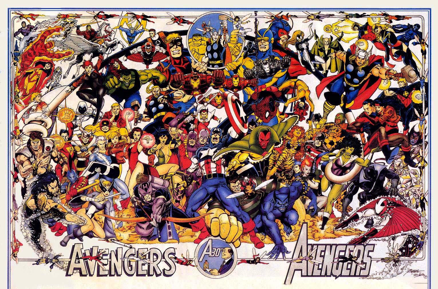 |
| George Pérez. Avengers 30th Anniversary Poster. 1994. |
George Pérez is, for me at least, the undisputed king of this approach. He even covered the topic in a how-to article for Wizard magazine (to which I was a devoted subscriber). What I love most about his compositions is the underlying sense of hierarchy. Despite the sheer number of figures, each gets their own starring role. The overall effect can be somewhat overwhelming, but the details are what always drew me in.
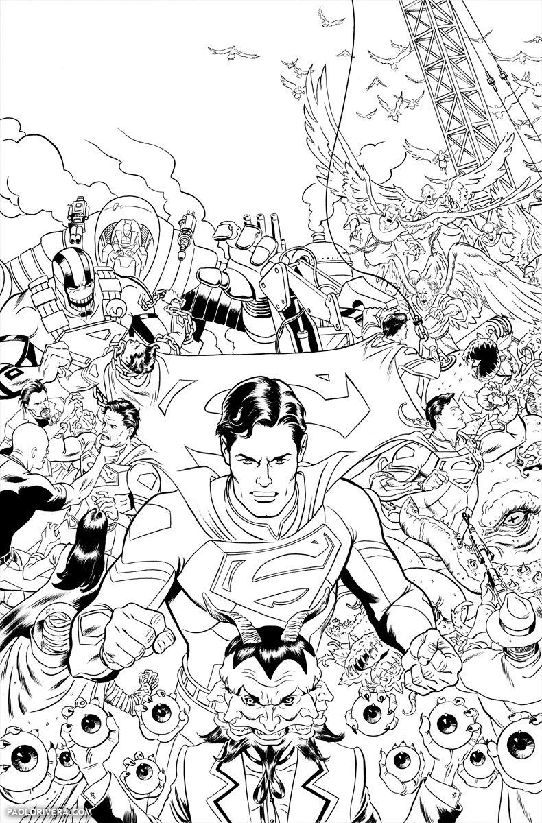 |
| inks by my Dad, Joe Rivera, over blue-line print |
The variant cover to Action Comics #18 was my own attempt at this motif. Being the last issue of Grant Morrison’s run on the series, I wanted something that encapsulated the entire arc in a single image. Without getting into the minutia of the plot, Superman does battle with a 5-dimensional villain that attacks him at different points in both time and space. I used that theme to structure the composition around 5 separate struggles, all tied together through his iconic cape, which doubles as the pentagon of the “S” shield.
Once the concept was approved, I used Photoshop and my Cintiq to make a digital sketch. The accompanying video records that process at 10x speed. I organized each “battle” on separate layers so they could easily be scaled or rotated. The layers are also color-coded so I have an intuitive sense of which strokes belong to which group.
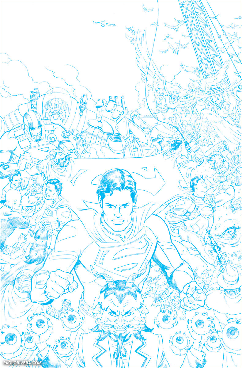 |
| blue-line print of pencils |
I use this technique in practically all my compositions, each character getting their own layer. Just double click on the layer and select “Color Overlay.” That will cover the entire layer in a color of your choosing — the opacity can then be lowered according to taste. Even though I only draw in black and white, it appears as through a colored film.
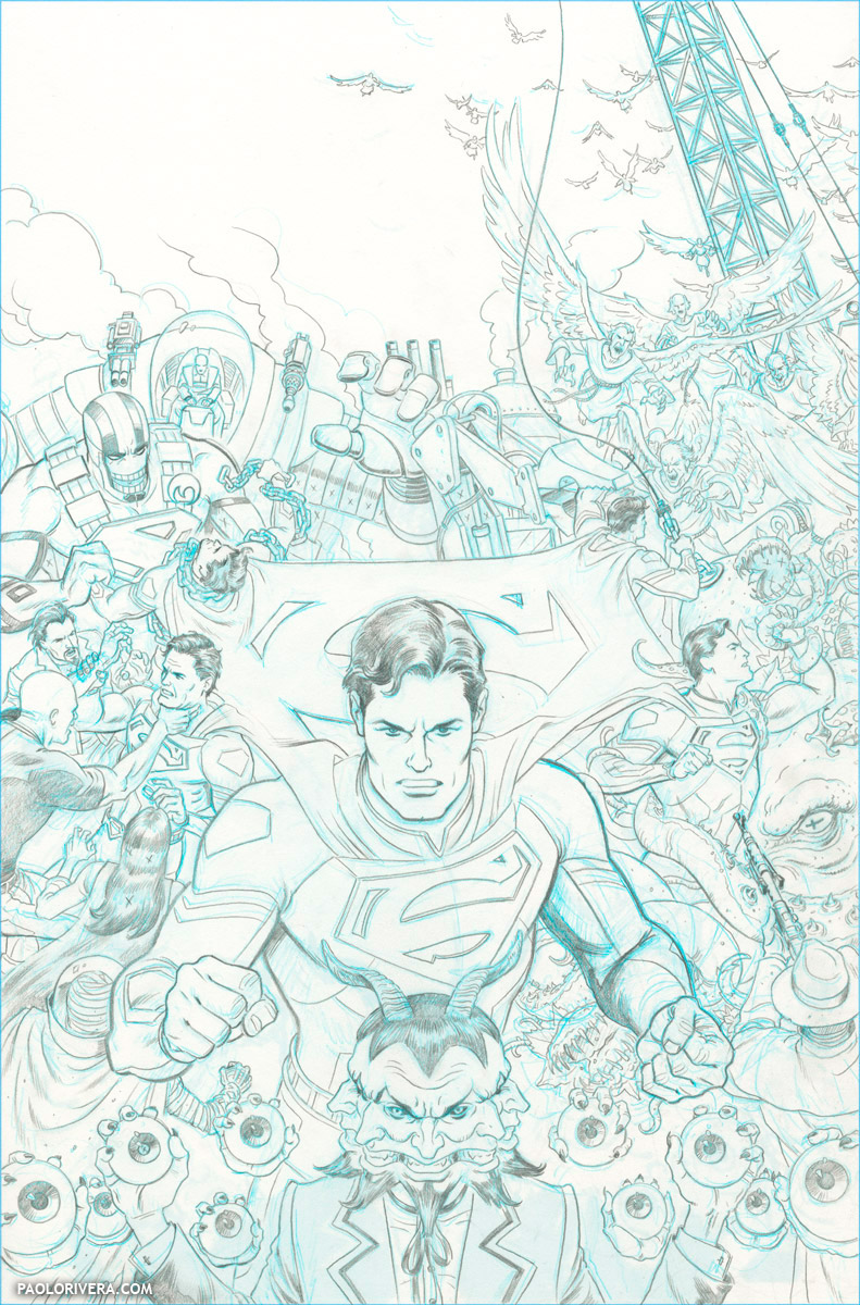 |
| pencils over blue pencil |
Although I often referred to the comic, penciled by Rags Morales, for costume details, the figures are drawn “from imagination.” (All that really means is that I’ve copied so many figures that I have a little 3D model of the human form in my head.) The purpose of the digital sketch is to solve issues of proportion and overlap, so the figures aren’t particularly “tight,” just enough information to indicate gesture and identity.
 |
| blue pencil over digital sketch |
As I’ve covered here many times, the rest of the process is just refinement, each stage an improvement over the last (at least theoretically — I almost always like my roughs sketches better). Pictured above is the blue pencil I often use to work out details. In a less detailed cover, I would probably skip this step, as the digital sketch would suffice.
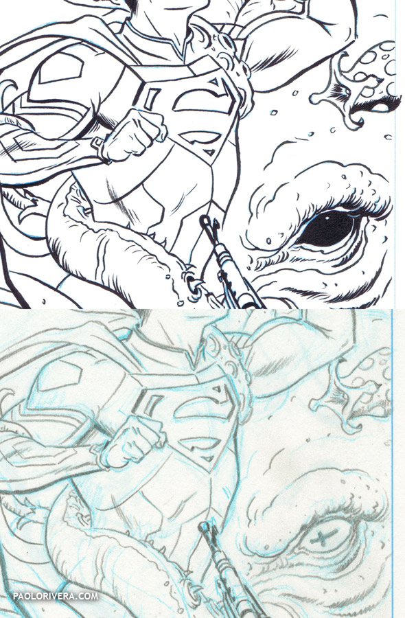 |
| whoops! |
(Fun fact: I draw an “x” wherever I want my Dad to fill in an area with black. Unfortunately, the giant octopus had an “x” for a pupil and so my Dad gave him a black eye. Nothing a little Photoshop couldn’t help.)
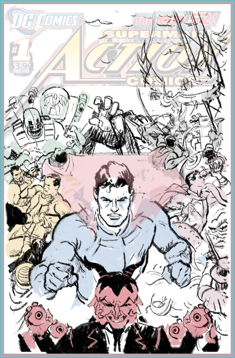 |
| digital sketch |
Pictured below is the first and only sketch I sent to my editor, just to get the idea across without having to show every detail. Luckily for me, he trusted me enough to run with it. Admittedly, it doesn’t look much like the final piece.
As involved as these massive montage covers are, I find they’re actually much easier than rendering figures in a cohesive environment where each element is subject to overarching rules of perspective and logic. The only real challenge is finding space for everyone and making sure they overlap in a pleasing way. And since many superheroes can fly, there’s no space on the page that can’t be utilized.
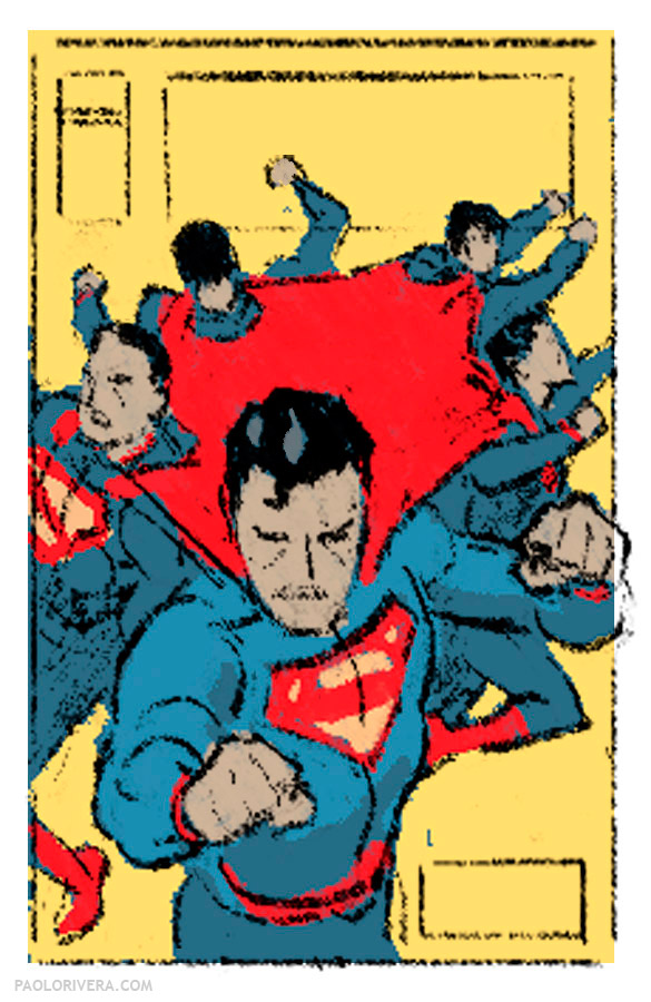 |
| digital layout |
I hope you enjoyed this behind-the-scenes look. I’ll be taking a Muddy Colors blog break for the next month (or so) as I take care of some personal business (all good). Thanks for reading!
Total hours: 32 + inks
digital layouts: 1
digital sketch: 5
pencils: 15.5
inks: 7.5
digital color: 10.5


very cool post. It was fun to watch you draw on the cintiq. I'd really like to try that sometime myself!
I used to get lost in those types of covers and posters myself. Infact I have a pretty old Marvel Puzzle somewhere that reminds me a lot of the cover you posted here that I had forgotten about!
Thanks! It's definitely a fun exercise to record the process. I've been doing more and more of it lately.
Great breakdown! That overlay trick seems really nice for the sketch stage. Ill give that a try. Thanks!
Thanks, Luis! Best of luck with it!