If you are a fan of Norman Rockwell you probably know that he was involved with and supported the Boy Scouts of America. In fact some of his earliest work was for the BSA and when he was 19, he worked as their Art Director for 3 years.
As a boy, I was involved in the scouting organization and earned my Eagle Scout award. I have many fond memories of being on campouts and learning to do things that I might not have otherwise. Rockwell is also one of my favorite artists so when I saw that the LDS Church History Museum in Salt Lake City was hosting 23 of Rockwell’s scouting paintings while I was in SLC, I made sure to stop in.
One of the first things that struck me was the variety of styles and techniques that Rockwell used. Almost every painting in the exhibit had a different feel to it; using a little texture or a lot, smooth painting surface or rough weave, limited palette, high key or low key, all of them felt like Rockwell, except one, but I will get to that.
Photographs of paintings can never capture everything that you see when viewing a painting in person, but I find that when I take notes, along with photos, many of the observations I made while at the museum have more meaning when I go over them back in my studio. Also, if my photography is good, I often find some details or insights that I missed in person. Let’s get started.
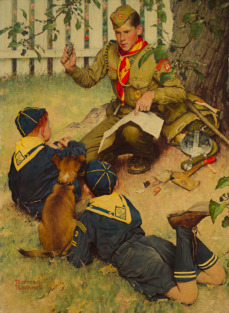
This was one of my favorites in the show. I love the rich colors and surface of this painting. For me, it is Rockwell at his best. Always the master storyteller, there are many clues to guide the viewer through this painting.
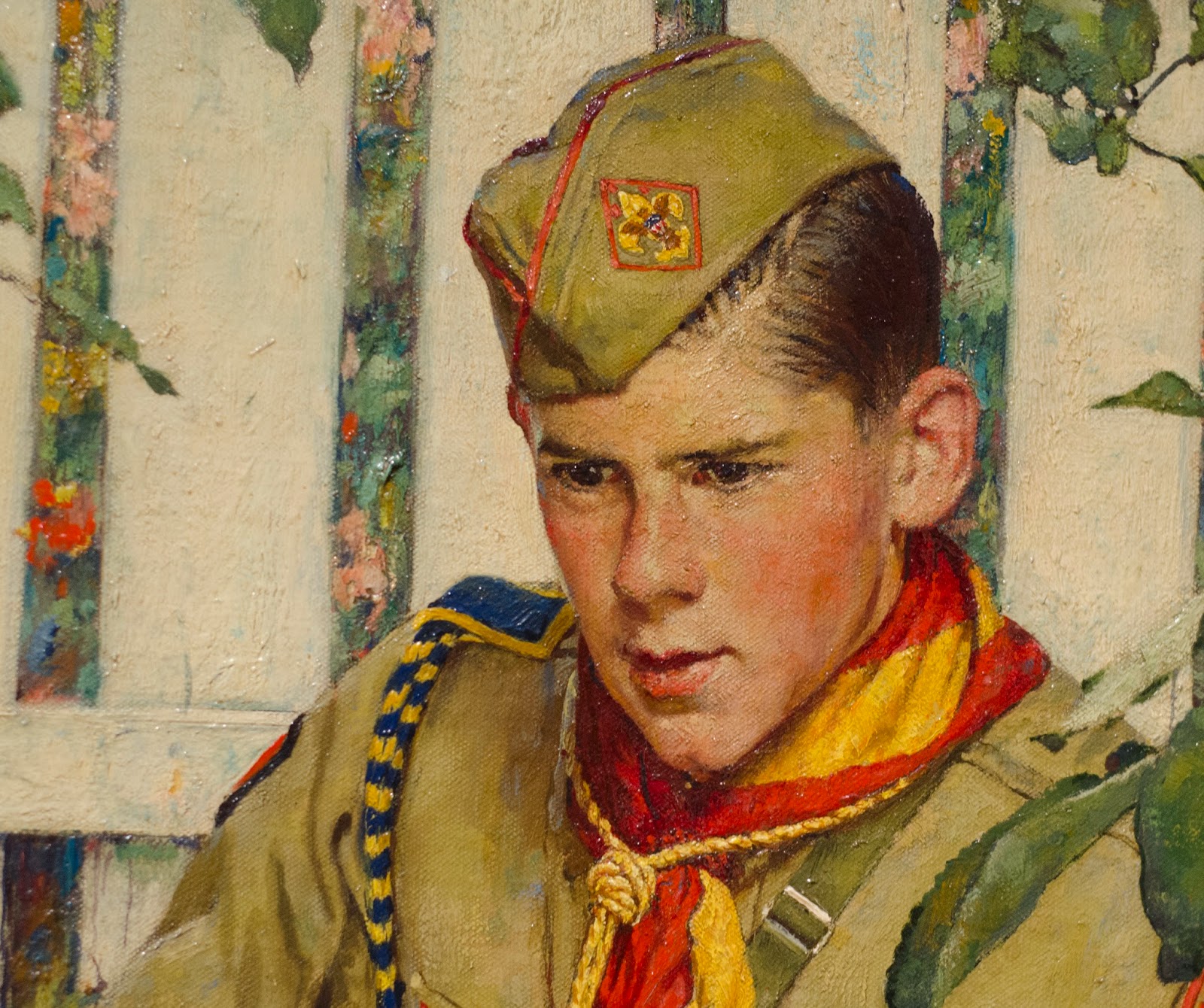
Look at the great color in the scout’s cheeks. Note the variety of colors in the olive green clothing and hat. I love the rich oranges, yellows and reds of the neckerchief and lanyard around his neck. Look at the simple almost abstract flowers peeking through the picket fence and the small hints of blue on the white fence boards. Nothing feels overly rendered and much of the painting is very loosely indicated.
Check out this texture. Looking closely, I think that much of the larger impasto was done before paint was put to canvas. Not all of it, but I do think that for much of this texture Rockwell created it in the ground applied to the canvas. He talks about this in his book ‘Norman Rockwell: Illustrator.’
Rockwell mentions using Benjamin Moore’s “Sani-flat”, “pouring off most of the liquid and stirring in the remaining paste.” After brushing the paste on the canvas, he says it is “possible to do all sorts of things to it to create interesting textures.” Looking at some points of texture here, it doesn’t relate directly to the paint strokes on top, revealing that it was either the ground or thick layers of paint underneath, but I am quite sure it was the former. He uses this often in his work, and to great effect!
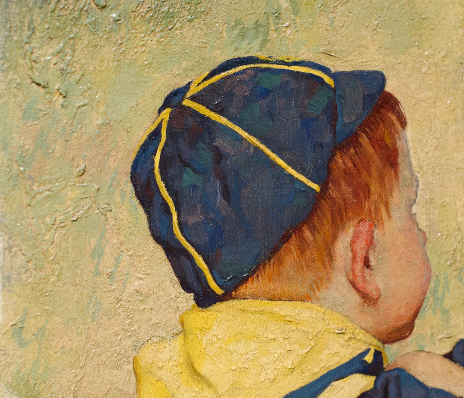
Observe the variety of colors in the blue of the boy’s hat and how simple and vibrant the ear is!
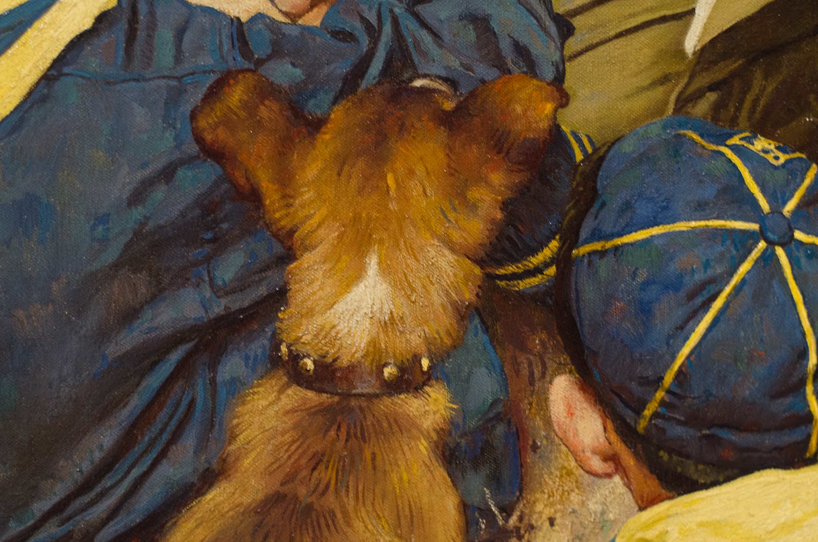
One last shot. Rockwell often worked from photos (the exhibit included shots from the modeling session photos), but there is nothing overtly photographic about the final result of this painting. Look how stylized the fur of the dog is and the little bit of ground showing through the boy and dog is nearly abstract. Just enough information to convey the idea.
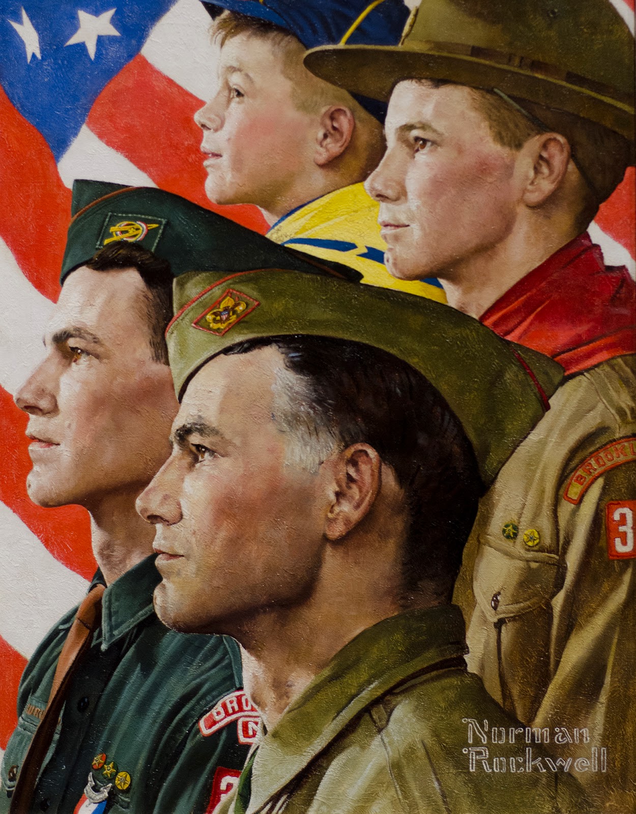
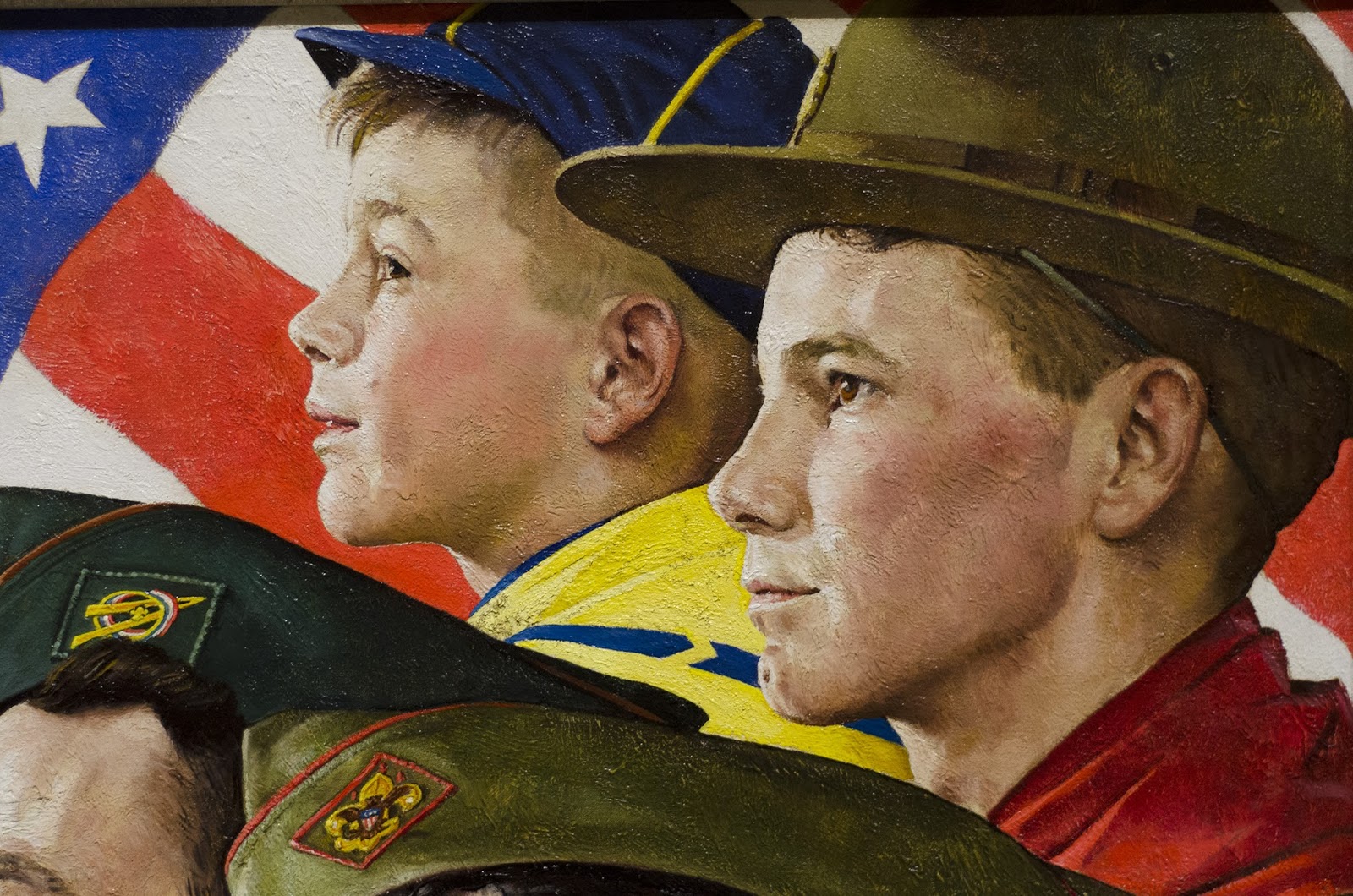
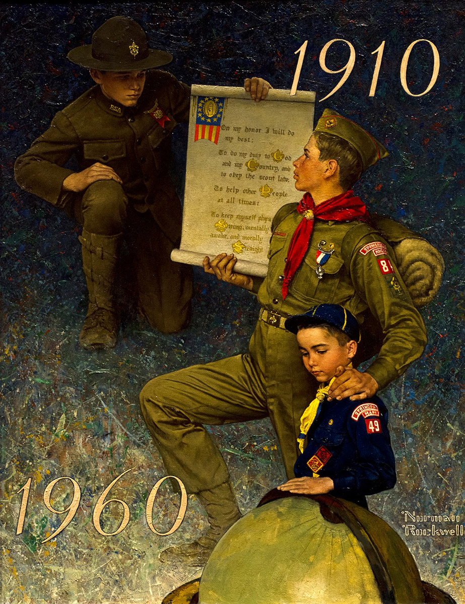
In this painting, the heads were about life sized. It depicts the progression of a boy through scouting to leadership as an adult.
This is another great example of Rockwell ‘pre-texturing’ his canvas to create interest and then painting into it. Some of the texture comes from the paint layer, but the uniform texture comes from the canvas ground. Rockwell talked about taking a piece of paper or plastic sheet and laying it across the wet ground and lifting it off to create texture for some paintings. You can read about that again in his Illustrator book as well has his autobiography, My Adventures as an Illustrator: Norman Rockwell.
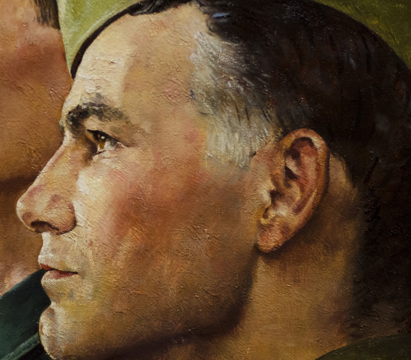
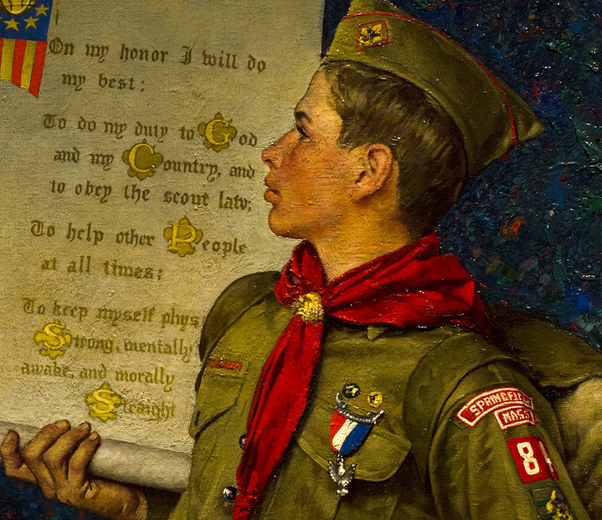
One last shot where you can see the paint strokes working across the texture underneath. Look at the neat spot on his cheek, right at the bottom of his cheekbone where he has wiped out some of the paint down to the ground beneath. It makes a nice peachy set of marks, but the darker rosy paint of his cheeks stayed in the lower grooves of the texture. Note the quick brushwork in the hair, adding some sharp lines and edges over softer larger shapes to create the impression of hair. Your mind does most of the heavy lifting here, filling in lots of detail.
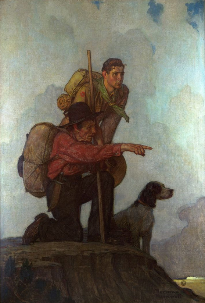
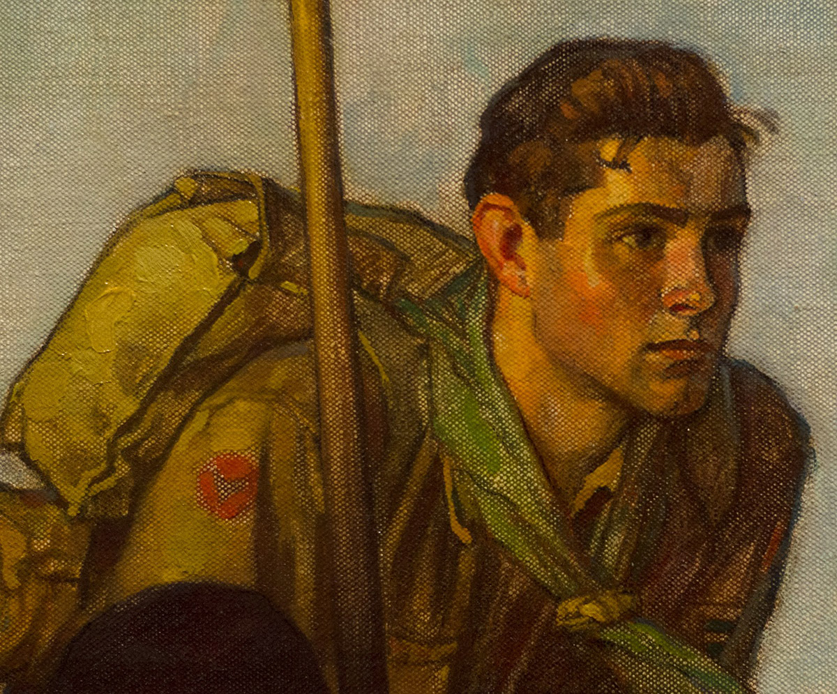
This painting stood out, because it looks more like an N.C. Wyeth painting than a typical Rockwell. Muted colors, strong outlines and the strong silhouettes of the figures against the flat clouds create strong contrast with the first two paintings. Clearly, Rockwell was either trying his hand at Wyeth’s style, or paying homage to one of the giants of his age. I love it.
Look how thin much of the paint is. Gone is the texture of the ground and instead, he used a larger weave canvas. In a few places did he paint thick enough to cover it, like the side of the backpack, but for most of this piece the paint was very thin.
Looking at this close up you can see how Rockwell would lay in a color and then rub it back out in places to create highlights and texture. It almost takes on a kind of reversed ‘ben day dots’ or Roy Lichtenstein effect. It just speaks to Rockwell’s artistic versatility that he can put on a different hat and still pull off a strong painting.
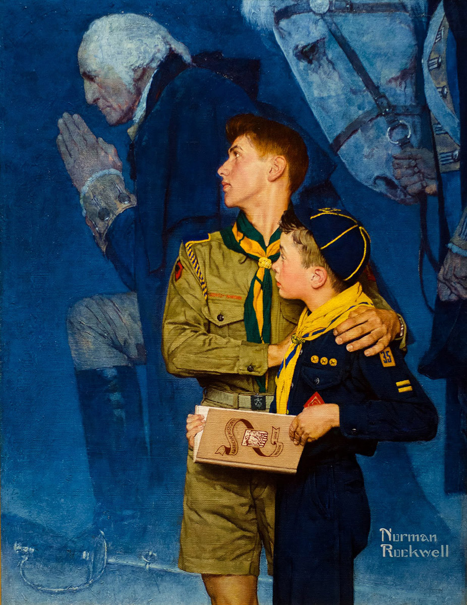
Rockwell’s patriotism is on display here showing the scouts looking back through history to be inspired by George Washington and his prayer at Valley Forge. When you see this painting in person the first thing that will stand out is the intensity of the color. The blues and yellows are as bright and saturated as any oil color I know of right out of the tube. The next thing is the pronounced texture of the canvas. It was the roughest of any of the paintings on display. It looked more like canvas for murals than work this size.
The temperature contrast between the warm background and cool background couldn’t be stronger. Add to that the strong values of the composition and this painting reads from 100 yards away.
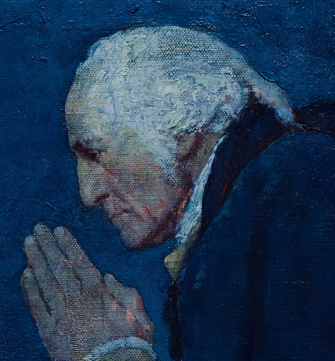
I think from now on, if someone disparages Rockwell as a painter, I will show them this shot of Washington’s head and tell them they can’t stop looking until they change their mind or agree to never comment on art again. There is so much artsy magic going on here, I don’t know where to start. The way he used the canvas texture, the paint texture, the color of the ground, the splashes of color throughout the flesh tones (look at the daub of yellow on his forehead) and then the glazing and wiping out that left intense blues in all the valleys creating a strong relief of the paint texture. Admire the hands and the economy of brushwork. Bow down to the vibrancy in the shadows! Build a small shrine leave a bowl of fresh cherries for the way he handled the impasto in the hair!!
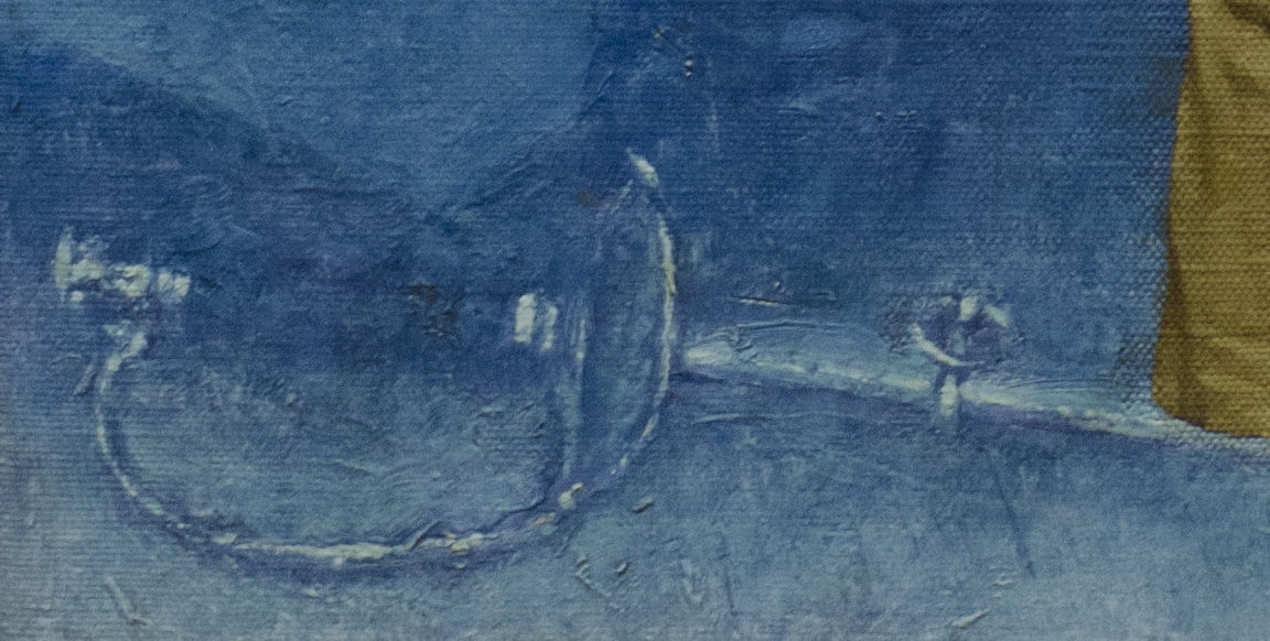
One last shot. I love the way he indicated this sword. Some of it was rubbed out to create highlights, and some of the highlights were painted thickly, but then the whole area was glazed with intense blue and wiped out again to keep the texture strong.
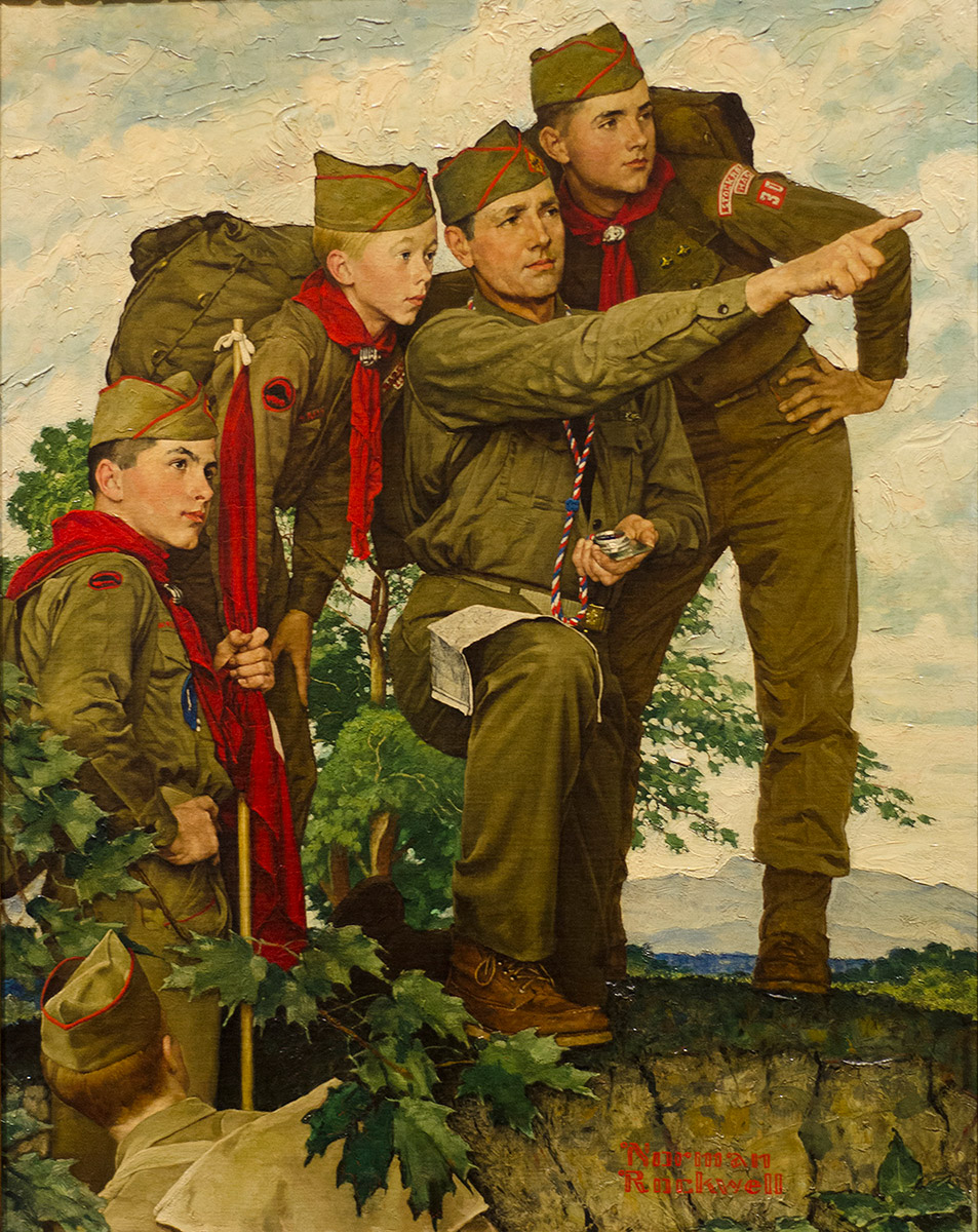
This painting had a flatter style to the rendering, kind of like the Growth of a Leader painting. Rockwell simplified the shapes a little more than usual and there is more of a local color rendering. Compare the nearly monochromatic clothing in this piece to the clothing in the first painting, The Adventure Trail. Almost like a tinted black and white photo, at least for the clothing.
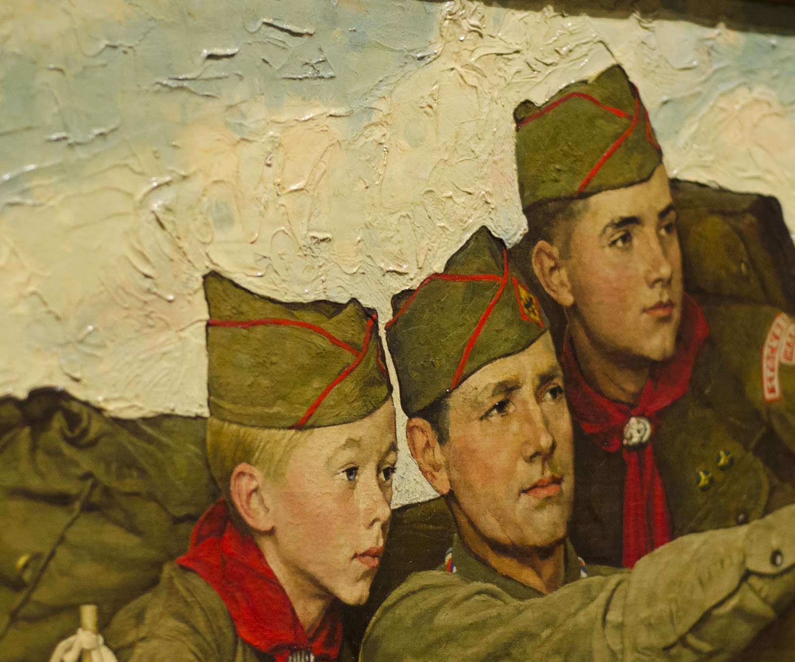
Look at the texture in the sky! You can see how he worked the texture around the initial drawing, limiting it to the sky and background and keeping the figures pretty much smooth. You can see again how the texture was done in the ground, as the areas of color are independent of the texture beneath. I am inspired to do this on my next oil painting!
A good look at the masterful way Rockwell could paint a face. Look at the light filtering through his nostril and bouncing warm light around and the way he broke the eyebrow and hair down to simple shapes. You can also see clearly how the reds and greens of the clothing are very localized.
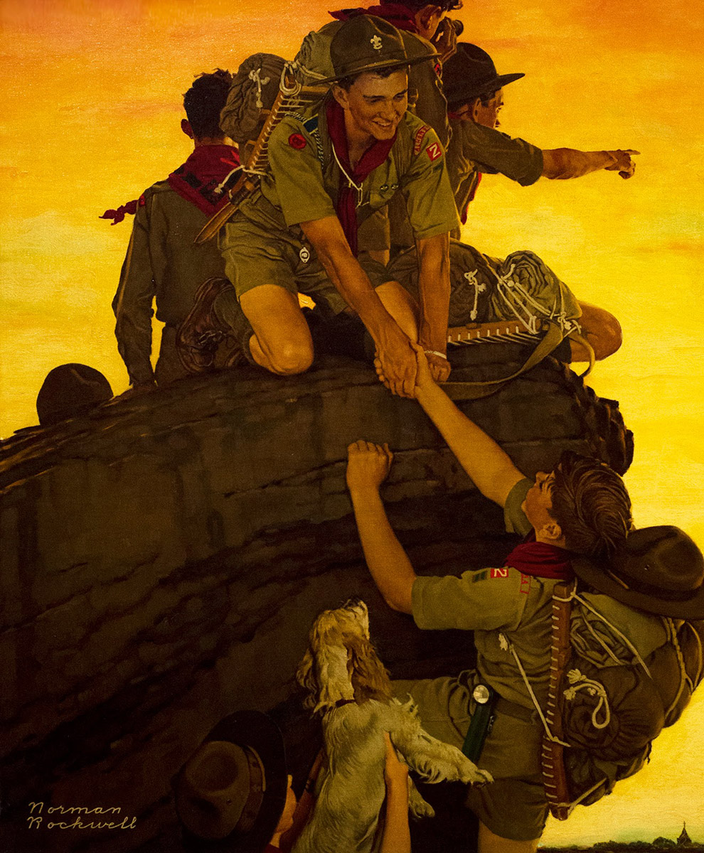
Yet another approach for Rockwell. We get the intense colors like we saw in Our Heritage but the palette here is analogous color. The surface is very smooth on this piece with very little texture of canvas or paint. What stands out to me is the way he used the silhouetting and shape welding to forge the composition here. Look at how the boys in the foreground are set apart from the darker rock and the boy on the top of the rock is just slightly set apart from the darker boy in the middle-ground, who is very nearly the same value and color as the rock. Squint down at this painting and it makes a wonderful complex and interesting shape.
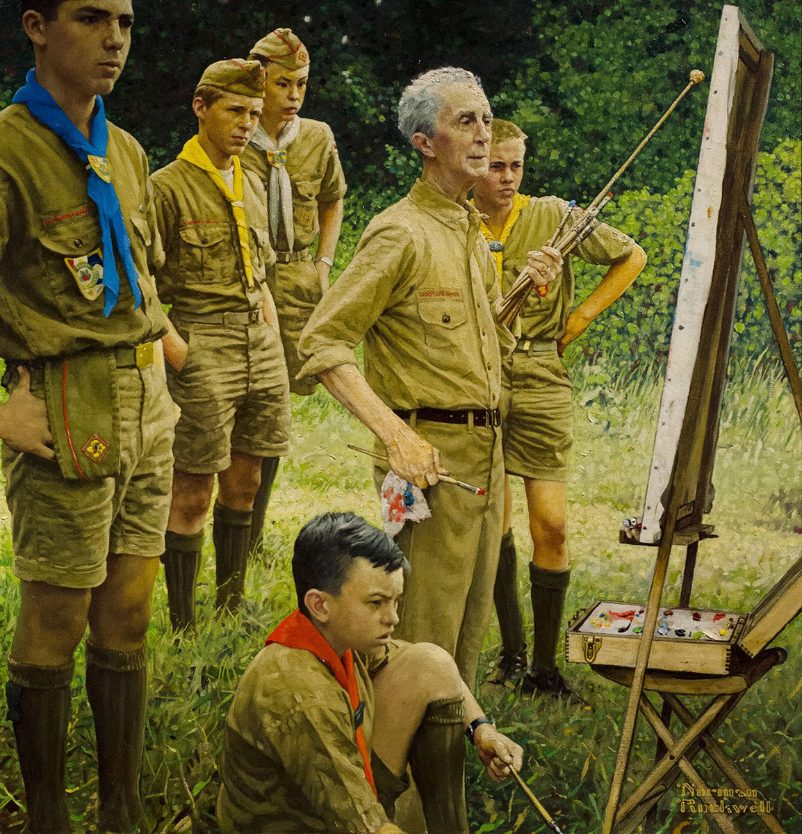
This is the least favorite of the styles that I see Rockwell work in, but still much to enjoy and observe. This feels more like a copy of a photograph than his usual carefully arranged narrative work. Still, look at the way he handled the grass in the foreground, especially in the lower right. Rockwell himself looks sharp and spry, ready for a new challenge. Some of the boys that are depicted here talked about the excitement at having the legend there to paint.
I love the contrast in this piece. Rockwell was experimenting with Pollack’s drip painting style in the background. The mimicry wasn’t as successful as his later piece, “The Connoisseur” done three years later in 1961, but it still provides an interesting backdrop to his beautiful rendering of the figures and an insight into Rockwell’s thoughts during what were turbulent times in the art world.
A great shot of the beautiful textures and the great lettering work done in this piece.
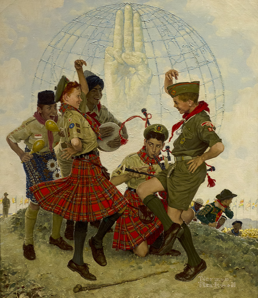
One last painting. I love the storytelling here. Scouts from around the world meeting and all bringing their different cultures together. It is a great uplifting painting with a wonderful message. Simpler times maybe, but I admire Rockwell’s espousal of the good and the ideal. He managed to do it in a way that I find admirable and not kitschy.
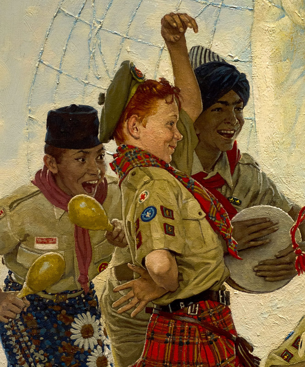
Note the interesting way he used heavy impasto to create the globe in the background and the thick white paint in the lower right making a great contrast of texture with the fabric and figures. This time it appeared to be all paint texture and not texture created in the ground.
There were lots of other great paintings in this exhibit, so if you get the chance, definitely visit. The exhibit will close on the 31st of December, 2013.
In conclusion, I think the thing that I took away from this show, apart from more admiration for Rockwell, was the desire to explore texture in my paintings. Seeing Rockwell’s use of heavy canvas, textured grounds and thick impasto right along with smoothly polished, rendered surfaces was exciting and inspiring. Thanks for letting me ramble on.
One more thing… I used a Nikon D7000 with a 50mm lens to shoot this exhibit. I will usually shoot at f8 or so and as low ISO I can and keep my shutter speed at 1/60th. I shoot in manual mode and in the RAW format so that I can tweak the color a little more back in the studio. I find that I usually underexpose on site but I can get sharp pictures and there is enough information recorded to still get a good shot.







What a great post! Thank you for this. I am reevaluating Rockwell even as I type. I have never seen images of these paintings before. Wish I could see this show!
Thanks again – John
Thanks for this post, Howard. For some reason, I expected to see tight paintings with smooth brush strokes. As you pointed out his paintings are filled with texture and obvious thick strokes of paint. The closer you get the more you appreciate his genius.
What an incredible post. Thanks for this Howard.
I think this is a guest post, but without the normal guest post preamble,
you should guest post more frequently. you, know, kick down the door, and such, nevermind waiting for an invitation >.<
Great post! I have always been a fan of Rockwell. He captures expression and emotion so well. Such a great story teller with his art.
Fantastic post, Howard! Love hearing your thoughts on each painting. Did you notice the Dean Cornwell painting of the Lincoln Memorial they had tucked away on the side?
Thanks for the great post…..Been a great fan of Rockwell for many years.
I saw the show in SLC Utah, Loved it, Rockwell never disappoints.
Awesome images! Thanks for the post.
Speaking of, Deborah Solomon's long-in-the-works Rockwell biography comes out next month, and Smithsonian Magazine has excerpts: http://www.smithsonianmag.com/arts-culture/Inside-Americas-Great-Romance-With-Norman-Rockwell-224937822.html
What a fantastic post, Howard. I will definitely try to get up to SLC to see this in person.
Howard thank so much for this excellent post. Norman Rockwell is probably my all time favourite artist, so firstly thanks for providing pictures of his art that I haven't seen before. Secondly thanks for your insights into his numerous approaches. A wonderful read.
Thanks also Tristan for the link to the new book about Rockwell. Definitely a must buy for me.
Thank you very much for this post.
Thank you everyone! It was a neat opportunity to really study some of Rockwell's work. When I visited the museum, I knew that I wanted to write about it, and I found that I made better, more observant notes because of it. I highly recommend doing a written observation of a show when you attend. It added a lot of depth to my experience.
@Ryan Wood – That Cornwell was awesome. I should have included it here! I am going to repost this on my site and when I do, I will include it. I have some good shots of that one too.
– Howard
Wonderful post with great pix! Yes, Rockwell had amazing talent and skills, good to see them examined here!
Great breakdown, Howard! I got to see the exhibit in person and it really is as stunning as you described.
Thank you for posting this. I'm a huge Rockwell fan and any insight in can get into how he did what he did is like gold.
Howard, this is very well done. Thanks very much!
I am very glad I checked out this post today. I also just happened to see the Rockwell that Gregory Manchess had posted as well (Ichabod Crane), and I am very impressed. We are so used to seeing the Saturday evening post type covers, that so many other paintings are obviously overlooked. You write with passion, and it has been translated well to the readers. Great blog, and good observations.
I loved as much as you'll receive carried out right here. reference The sketch is attractive, your authored subject matter stylish. Related Site nonetheless, you command get got an shakiness over that you wish be delivering the following. resource unwell unquestionably come more formerly again as exactly the same nearly a lot often inside case you shield this hike. redirected here
Most of these paintings I've never seen before and I was at his museum this past July! I never tire looking at his work. When I was a kid I got my hair cut often, this being back when Mr. Rockwell was still painting covers for The Saturday Evening Post. When I would go to the barber it was always my pleasure because in the stack of magazines was a new Post cover to look forward to seeing.
do you know what type of paint he used for “after the Prom”? painting?