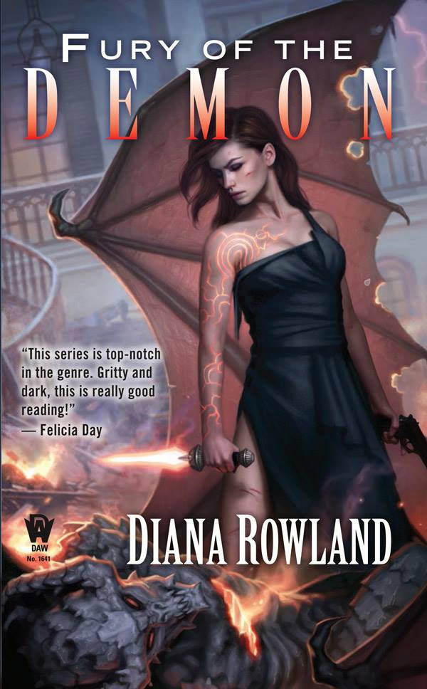
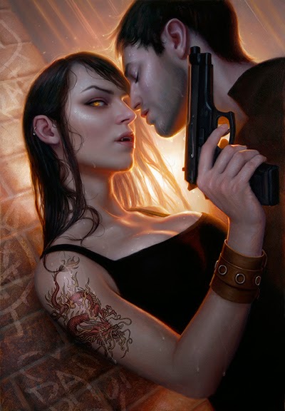
Here’s a new cover of mine that was just released. This cover is for the latest installment of Diana’s Rowland’s ‘Kara Gillian’ series.
Time was short on this one, so I ended up painting the image digitally, something I don’t do too often.
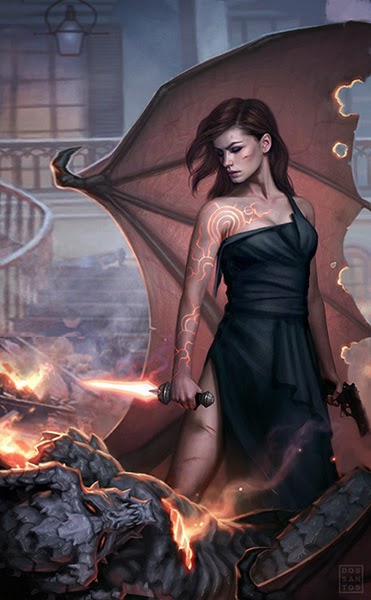
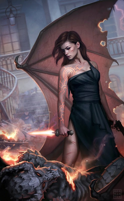
This cover is a good example of utilizing a tilted horizon line.
Even though this image has quite a bit of ‘action’ potential, often times I am commissioned to paint relatively static portraits. One of the easiest ways to add excitement to an otherwise boring picture is to tilt the horizon line.
Here is the image with a straight horizon line:
Here is the final image, with a tilted horizon line:
It’s not a huge difference, but tilting the horizon line, even a little bit, can instill your image with a greater sense of drama.
I actually use this trick fairly often.


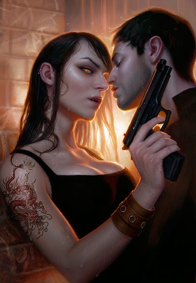
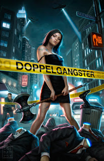


I use the tilting trick a lot in my CCG card art. Helps to add a little flair into the very small format.
Have you noticed yourself tilting in one direction more often than the other? I look back at my work and it's funny how often I tilt to the left.
I can't distinguish the difference between your digital work and your oil paintings. Could you give a brief description of how you did it? PS? PS and a bit of Painter?
Great cover! I've always really liked the way you paint monsters. The translucent quality of the wing in this one is so nice 🙂
Hey, I recognize that wing! 🙂
Great tip Dan, and a beautiful cover, too. Big fan of your work 🙂
Nice trick. 🙂 I always feel my backgrounds aren't too engaging, I think this tip will help.
I love this trick, but it is funny how often I forget to see if it's the right choice for the piece I'm working. I suppose that tells me I should spend more time on thumbnails.
Unrelated, I wonder who is going to pay for the years of therepy that kid on the steps is going to need… 😉
foto payudaraThe translucent quality of the wing in this one is so nice 🙂