Almost every painting starts with a picture in the mind, fully formed with line, depth, shape, value. We see it in a flash, and we strive to capture that vision.
The amateur usually goes with this first instinct. To the seasoned professional it is merely a starting point, an impression, a guide. From there, principles are applied and dropped, added and rejected. The amateur believes the image is gospel, unchangeable. Seen so clearly, they are tempted not to divert from its clarity. The professional sees it too, but then fights to get it out, knowing it is generally false realism.
First impressions are good, but they are not always correct, and rarely fully formed. They are not pictures, no matter how clear they feel. Recent studies have shown that the mind will access different parts of the brain, even olfactory senses and sound, to build an image. It constructs these visions from multiple levels of information. Even from multiple points of view at the same time.
The artist works to distill these varied aspects into one, concise, visual slice. A moment. This moment becomes the picture you want others to see and understand. It’s built from many principles.
It starts and ends with value.
1. Time of day.
When you picture the image or scene, determine whether it’s daytime or nighttime. Immediately. You can see it right away. I know you can. Somewhere in your foggy mind you know what time the scene occurs. You can always change your mind. But decide. Early.
Either condition will give you instant impressions about the light in your picture. If it’s night, you have to find ways to illuminate your subject. Nighttime is one giant stage play and you can light it however you want. Street lights. Sirens. Firelight. Explosions. Candlelight. Computer monitors. Lamps, etc.
Daytime is not as controlled, but remember it is not always high noon. Stop doing that. Use morning light, afternoon light. Overcast light. Bounce or reflected light. Window light. Use the Sun as a spotlight.
Even an indoor scene is affected by the light from outside. Game of Thrones watchers: all that sunlight beaming in through windows, bouncing off characters? Yeah, you know what I mean.
2. Contrast.
Dark foreground played against light middle ground. Vice versa. Also light-against-light areas in the same painting. Dark against dark. The back and forth play of light in a scene, chiaroscurro, adds depth, design, and interest.
3. Direct the viewer.
The eye moves instantly to the highest contrast in a picture. It uses areas of similar values to rest. Yes, the eye rests before it moves on. That’s because it’s processing. It needs time to absorb. Hit it with too much detail, too much contrast up front, and it has to rest. If it can’t find a place to rest, it looks away.
Yeah, I know, there are plenty of busy, complicated paintings in the world. You can take all the time you want to study them, but they are not a quick read. Their enjoyment is the time you get to stay with them to figure them out.
Simple paintings are fast to read. Aye, but simple can be an even longer read as they stimulate with impact repeatedly. The contrast between sharp and soft, dark and light, entices our minds to explore, rest, explore, rest. THAT grabs and holds the viewer.
4. Add interest.
Let the constant play of values add interest. You can make a painting 90% grey tones, then have one area full of contrast. Wham. Drives the eye to that area. Overall dark piece, lit by one light source? Same deal.
Or just the opposite: overall light painting, all values in similar percentages, then one area with a dark passage. Zap. Eye goes right for it. 90% greys, with a dark spot. Or 90% dark with a grey area. Again the same. Contrast the value range and you build movement through the painting.
5. All color is value.
You can paint any color you want, if the value is correct, the affect will be correct. You don’t have to nail the color all the time (although I like to), but you must be able to nail the value. Otherwise, unfocused. Mud.
Think of this: you can make skin green. If the value is right, the skin is right. Look at people lit with colored gels from spotlights, like rock bands in concert. Study how the colors don’t change the subject. You’ll come to realize how setting sunlight on skin changes it’s color, temperature, and certainly value, but you’ll still know it’s skin.
6. Mood is value.
Light paintings raise emotions. Dark paintings lower them. Of course you, ya nut, might be excited by dark paintings. Or you may actually be bored by bright colorful paintings. But if you get the values right in your painting, and by that I mean working well within the context you’ve set for the piece, i.e., candlelight vs moonlight, you’ll get the painting to have mood.
I love me a moody painting. It lingers on the nerves. You can control what people feel about it. So cool.
7. Control related values.
All elements are related by value in the same picture. Controlling the values through light in one part of the picture determines the affect for other parts, if not the whole. Unless you are painting a stream of consciousness where all bets are off and rules are skewed, the feel of the light is determined by how well one controls all the subtle value ranges throughout.
And no, there’s no getting around it. Even abstract painters, good abstract painters, must know value first.
8. Subtle vs Bold.
Think graphically. Bold paintings are controlled by value. The best graphic paintings have subtle values played against striking, edgy values. Study at Mucha. Study Ludwig Hohlwein. Yoshida Hiroshi. Edwin Dickinson. Bold. Direct. And oh, so subtle in it’s madness to control your eyeballs.
9. Photographs lie.
Never believe a reference photo. They are representations of reality. NOT reality itself. Yeah, I know. But get over it.
The camera is a box with a hole in it that let’s light in briefly so it can expose a moment. But it’s a contraption. It records crudely, no matter what the techies say. Your eye is connected to your brain and breaks an image into thoughts, feelings, smells, sounds, and who knows what. What you see is not necessarily what you can count on. When you make a painting, it has it’s own life and is not a poor excuse for the lack of a camera.
Then again…photos can lovingly manipulate value. They can simplify reality so that you can detect the right values to put beauty into your pieces. I love photography.
But I never trust it.
10. Finish with value.
Step back from your work. Look it over. Pull it all together by refining the values so they control, manipulate, and interest your eye. If they interest you, they are likely to interest others.
But you have to decipher when you’ve looked at it for so long that the values appear correct to you. You must be able to remove yourself from the world you’ve created and be able to look at it with a discerning eye, a ‘fresh’ eye.
Like color, the values should move in and out, with rhythm. Like families of color, values need similarities as well as contrasts.



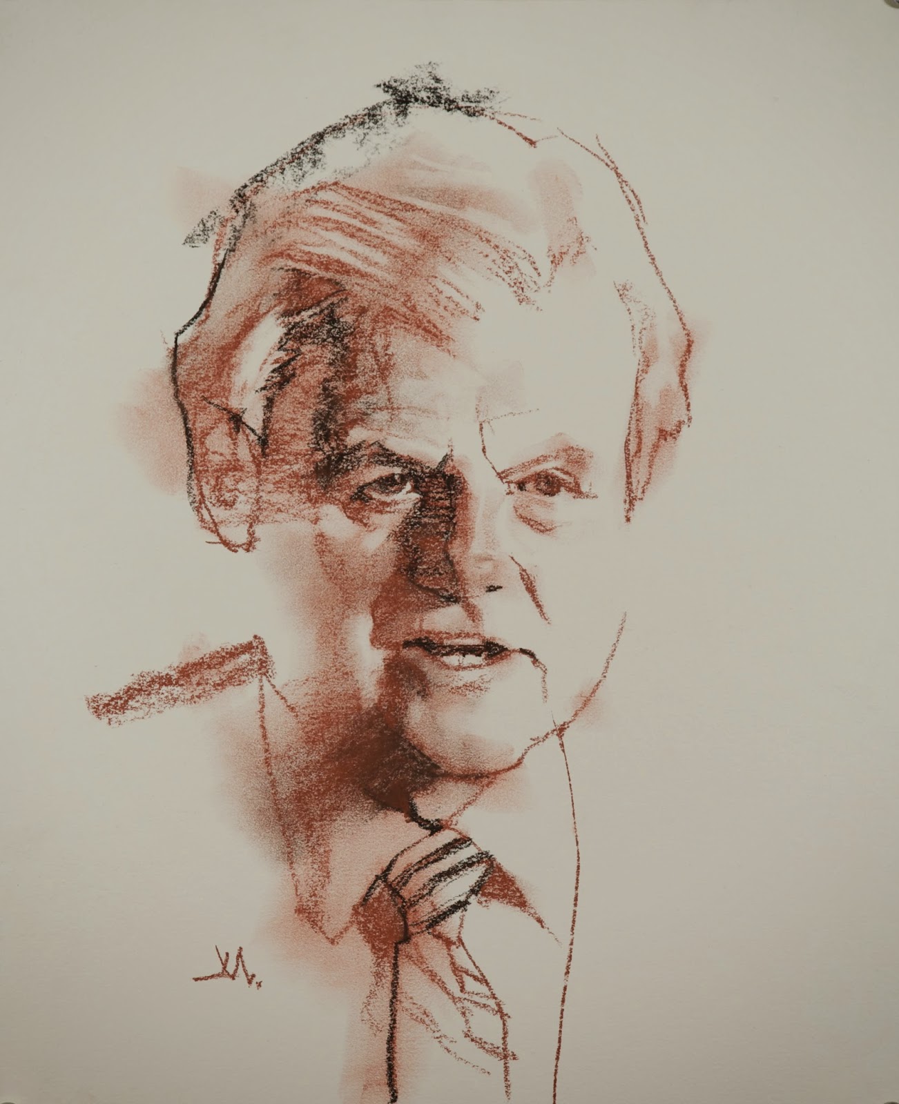
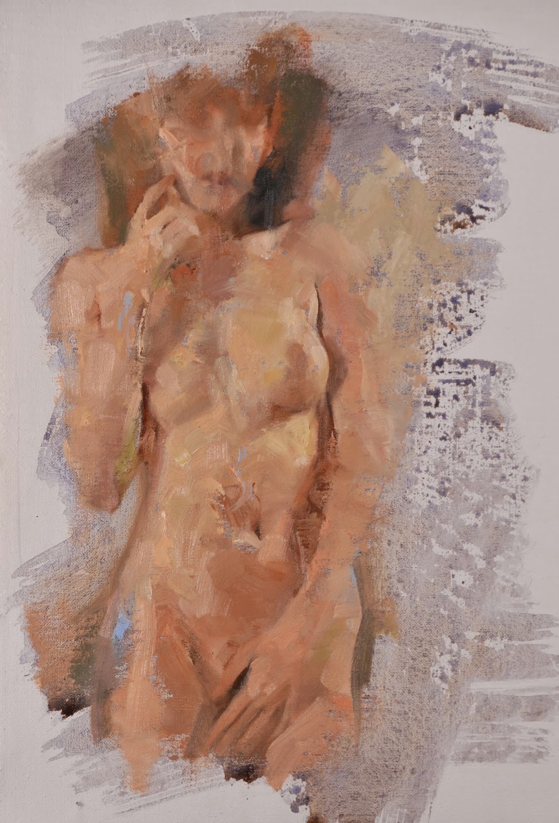
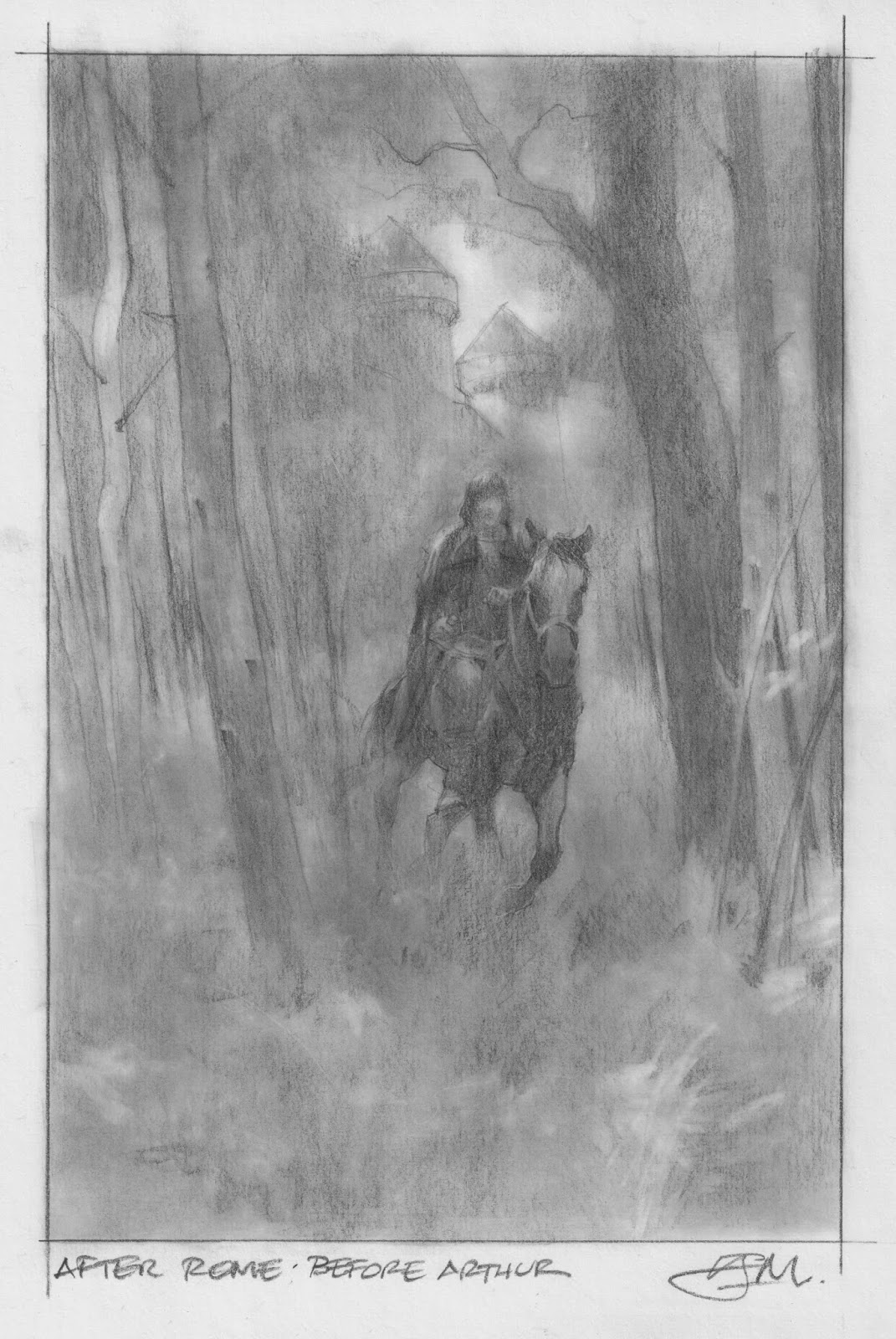
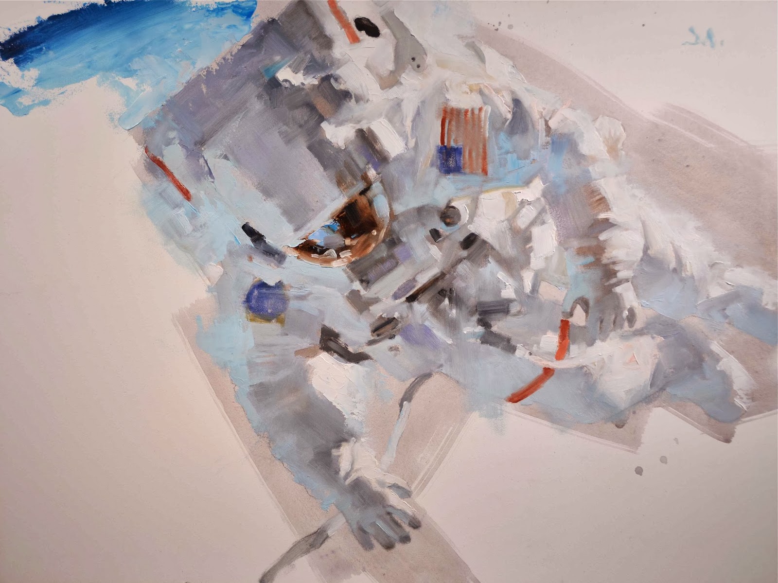

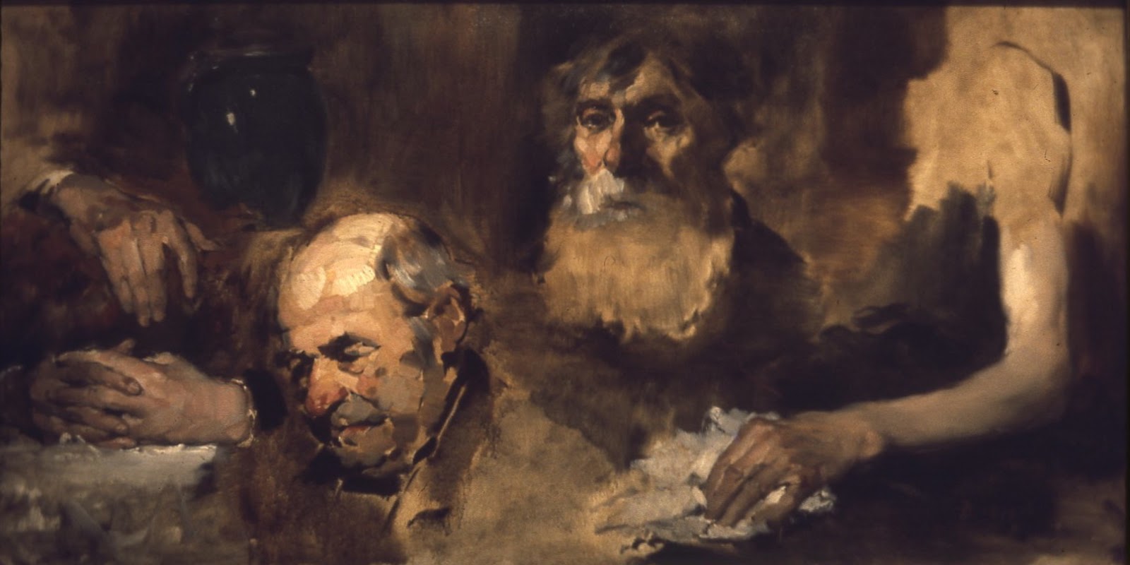

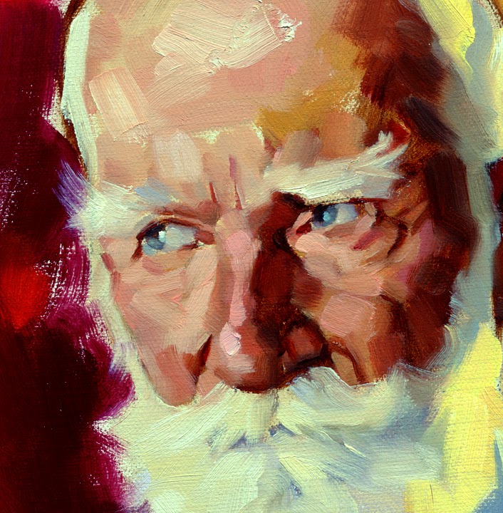
G'day Greg,
Thanks again for another “10 Things” post. I enjoy reading and absorbing what you have to say.
I've always wished to be able to attend one of your thumbnails courses but I live so far across the pond it's but a fools dream. Please continue posting more of your insights, I enjoy them very much.
Cheers,
Rick.
Thanks Mr. Manchess, this is a definite keeper. I love to look at JC Leyendecker's paintings to see how he handled values. One of these days I hope to attend one of your workshops.
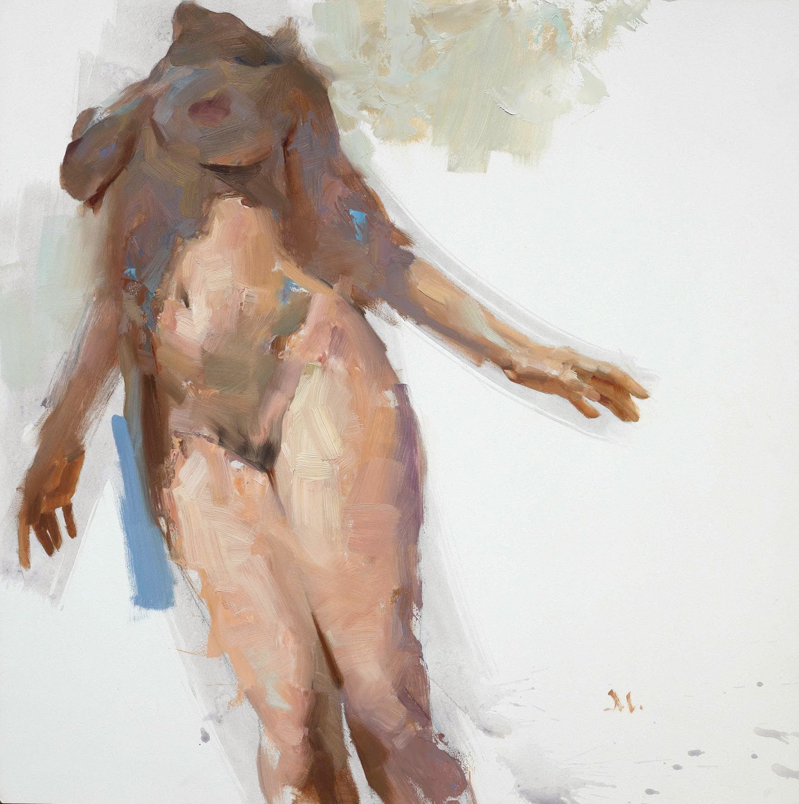
What an illuminating post, Greg. Lots to learn from and take away here, thanks! I'm a big fan of your work and that first nude image is a killer.
Thanks for your wonderful posts. You should really consider making a book out of them. Here you have your first client 🙂
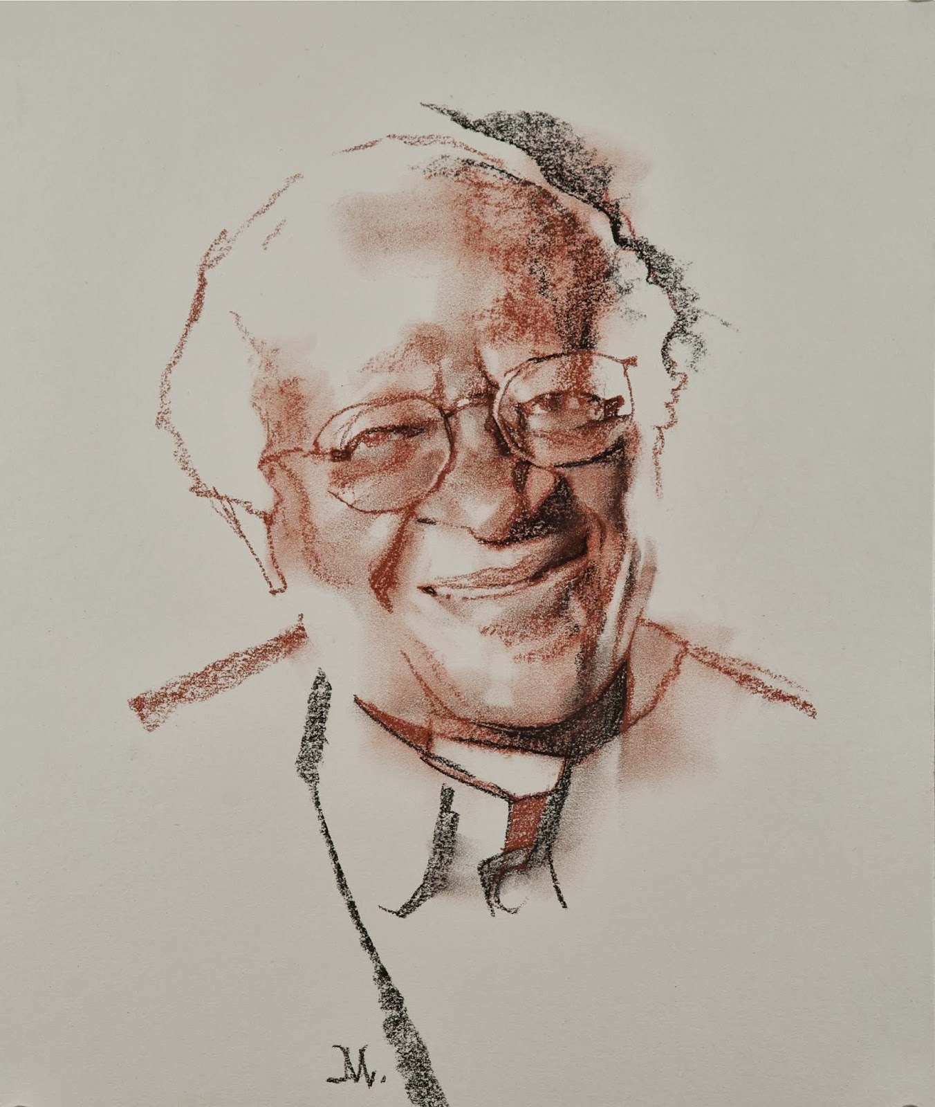
I am in utter awe of those portraits, Greg. And oh my gosh, yes, second the comment on a book of '10 things' posts.
This whole post (and ALL “10 Things posts) is so good. Often when I'm working on a piece, I lose sight of my value structure. It's never hurts to be reminded of what's most important.
(Also, “Game Of Thrones watchers” – totally called me out. Sheesh.)
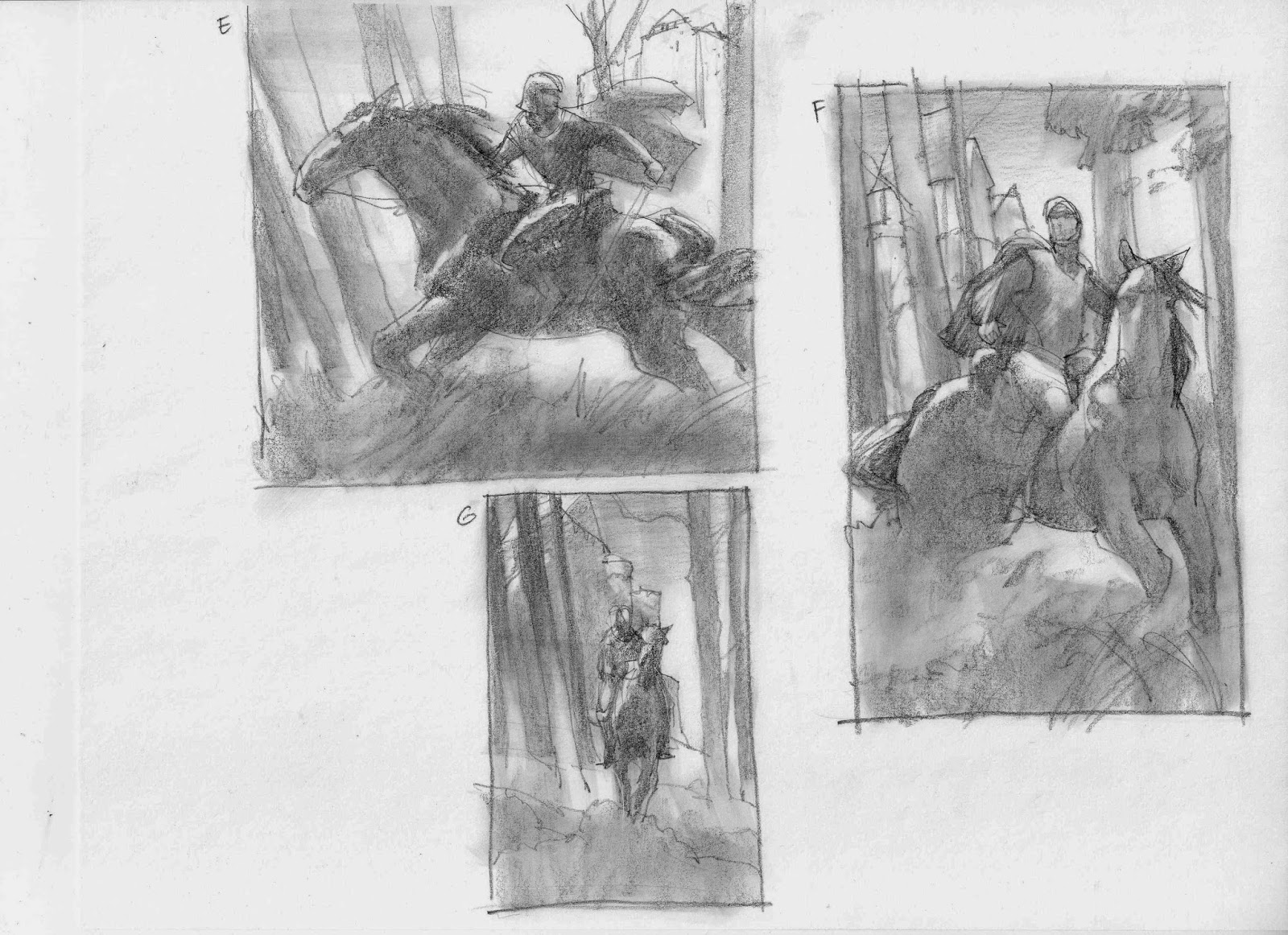
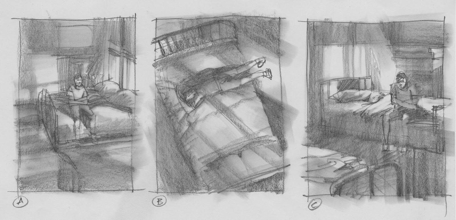
always a treat to see your amazing thumbnails, sir!
My entire art school education, summed up in one blog post.
Oh, yes, values … this post really drives home some points that I have kept telling myself lately. I have realized that for me, at the moment, it's crucial to start with a monochromatic underpainting to get those values in place. I have seen a lot of step-by-step demos all over the internet with all those people who can just hit the right value, hue and chroma all at once and thought 'hey – I can do that'. And sometimes I can do it somehow decently, if I am painting something that's right in front of me. But if I am painting an imagined scene based on a variety of studies, photos, props and maquettes, I just need to get the exact value scheme of the whole damn thing down on canvas before I can even think about the other aspects of colour.
I always love checking in here to see what's new, but I have to say that I get a special “Yay! This is gonna be extra informative” feeling whenever it's one of those 10 things-posts …
Thanks all! When I started out, I was coming off a very poor art education, so I really had no clue what “value” even meant at that point. I learned by doing. Then later I stumbled over all the terms and techniques and realized, oh–right….people have been painting for a long dang time. They probably know a thing or two about image construction.
So I started going back and looking at the basics. I had quite a bit of experience by that point, but learning in the opposite direction helped out a lot.
I like doing these posts because I know most, if not all of you, think in similar directions and have had or are having the same experiences as me. This stuff is universal, not special. It's for everyone.
That's why I'm so glad when artists respond so positively. Again, thanks to all who commented here. Means a lot!
And yes, thinking about doing a book sometime in the next couple years. Wish I could go faster, but hey, I gotta work, too! : )
There will be more. I mean, c'mon…painting just wants to be talked about!
Thanks a lot: This is pure gold.
I love your “10 things …” series. It is my Bible and I think soon it will be considered a new “Creative Illustration” guide like Loomis'.
Thanks a lot for your teachings.
This is possibly my favorite post so far, and goodness knows there have been some good ones =) Very helpful and inspiring, thank you very much for taking the time to write.
This is so helpful Greg, thank you for sharing this knowledge with us 🙂
Incredible post! Thank you!
Wow! I'm going to need some time to process all this information. This is terrific!
You are one of my heroes!
very Useful Article, thank you. 🙂
Excellent insights, Greg, and terrific work. That first nude is a dazzler.
I've been a self-taught artist, and the ideas I get from practice by illustrating (1 year as illustrator) is captured in a single thought:”familiar scenes makes illustrations look more interesting.” “Familiar scenes ” is my phrase for adding light and shadow and capture wonderful indoor and nighttime scenes..which leads me to explore on the right and much broader subject which makes a painting look “interesting”. This blog post is such the perfect coincidence of my new learning articulated from an educated and more experienced artist. I got to learn “values”.
OHHH! THIS IS THEEE JAM!