 |
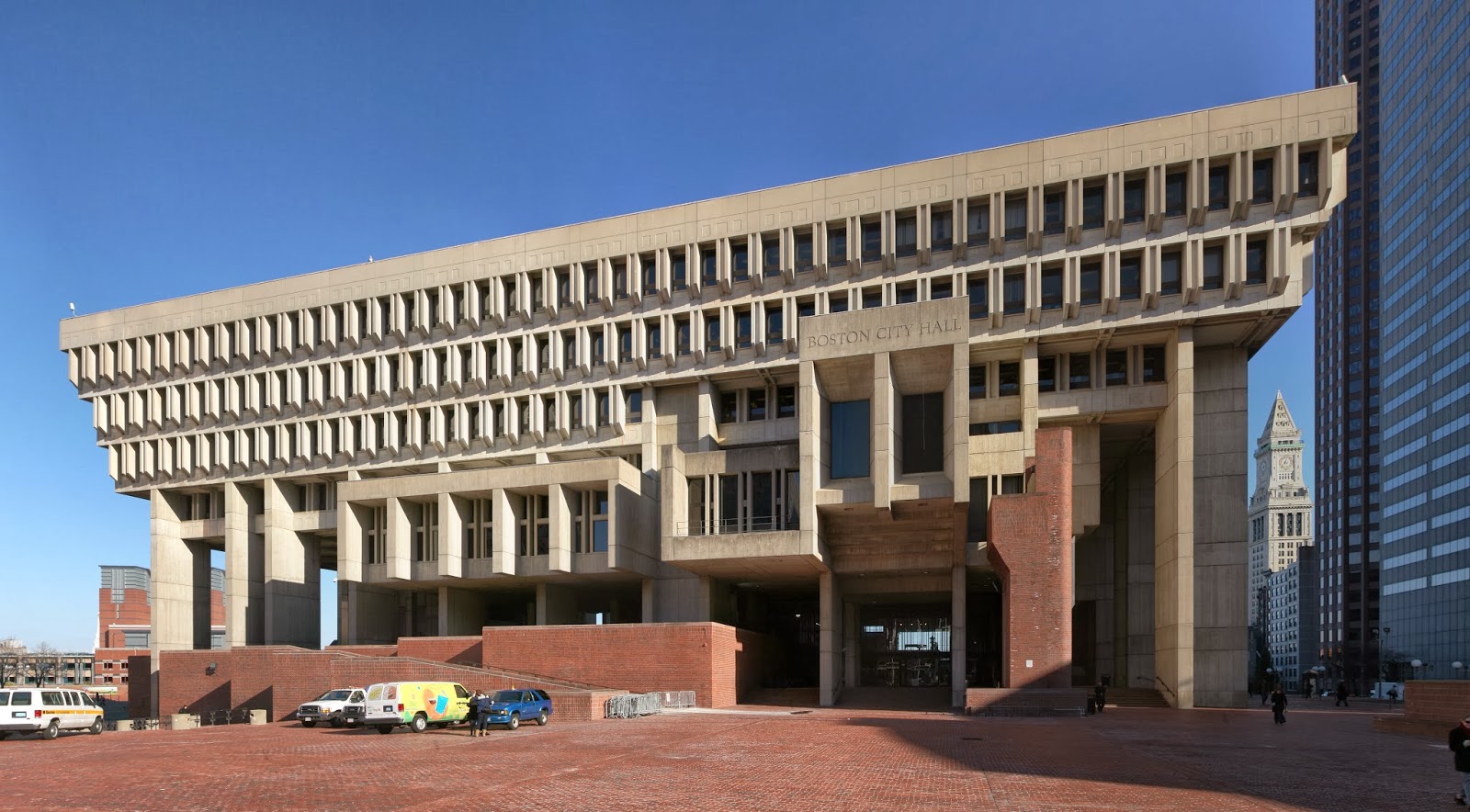
| Boston City Hall. Boston, MA USA 1968 |
Unless you went to a posh school like Princeton or Oxford dripping with ivy covered gothic architecture, chances are your higher education was done on campuses that evolved after WWII and the massive baby-boom of students in the 1960’s and ‘70’s. To keep up with demand many of the libraries, administrative buildings and offices built all over the world at this time embraced the Brutalist Architecture movement. Cheap, big and modern. I can still remember the massive bunker-like concrete walls of my university art school with its arrow slit windows, coffered fluorescent lights, minimalist Norwegian furniture, and sun-scorched concrete plaza where no living thing could survive. I hated it!
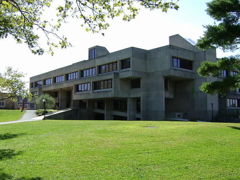 |
| Folsom Library. Troy, NY USA 1976 |
Brutalist Architecture grew out of the International Style that had seen its beginnings in the BauHaus school in Europe between the wars. After WWII new materials and construction techniques, as well as constrained budgets, and more emphasis on social homogeny than aristocratic grandeur, encouraged minimalist designs of form strictly following function. A style that had no style. Overpowering the landscape and dominating their environment these buildings were monuments to post war modernism. Glass curtain walls, exposed concrete pillars, and no ornamentation of any kind best exemplified by architects like Van DerRohe and Le Corbusier became the standard. Because of its inexpensive construction the Brutalist style was used heavily in government buildings, housing complexes and throughout the former Soviet Union associating the style with large government projects and parking garages.
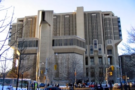 |
| University of Toronto Library. Toronto CA |
With the beginning of Post Modernism these monolithic eyesores came to be derided by artists and architects alike. In 1977 the Brutalist aesthetic became the very embodiment of oppression in the form of The Death Star as the ultimate bureaucratic government building the size of a planet, literally teaming with a population of clones. Many Brutalist buildings were redesigned in the 1980’s and ‘90’s to give them a touch of color or ornament, while some were just pulled down to make way for shiny curvilinear post modern edifices.
 |
| Depart of Health and Human Services Bldg. Washington DC, USA 1975 |
I’m still not a fan of Brutalist Architecture, but as an artist, I am given to pause anytime a major art movement goes out of style and is tossed aside by the mainstream as worthless. In recent years some Brutalist buildings have come under scrutiny as possible monuments to the style that should be protected for posterity. My first reaction is incredulity, but then I cannot help but think of how many magnificent Victorian buildings were torn down in the second half of the 20th Century to make way for new modern skyscrapers. At the time it was thought they were merely old, ugly, out of date behemoths from a previous century.
 |
| J Edgar Hoover Bldg: FBI HQ. Washington DC, USA 1970 |
I’ve tried to take a second look at Brutalism, to try to find any redeeming qualities instead of simply casting it aside based on first impressions. Recently I’ve discovered a hesitant appreciation for the designs, not completely disassociated from my daughter’s interest in Minecraft, with its titanic designs very reminiscent of the style. Their strong fortress like lines put me in a mind of ancient castles, Aztec pyramids or even a Dwarven citadel or SciFi bunker. Their simplicity and monumental heaviness conveys stability, permanence and strength. When I showed my daughter the pictures in this blog she loved the buildings, not because they are pretty (they aren’t), but because she can see their structure and understand how they were built, and she digs that. It may be forty years afterward, but The Brutalists have a new generation of admirers.
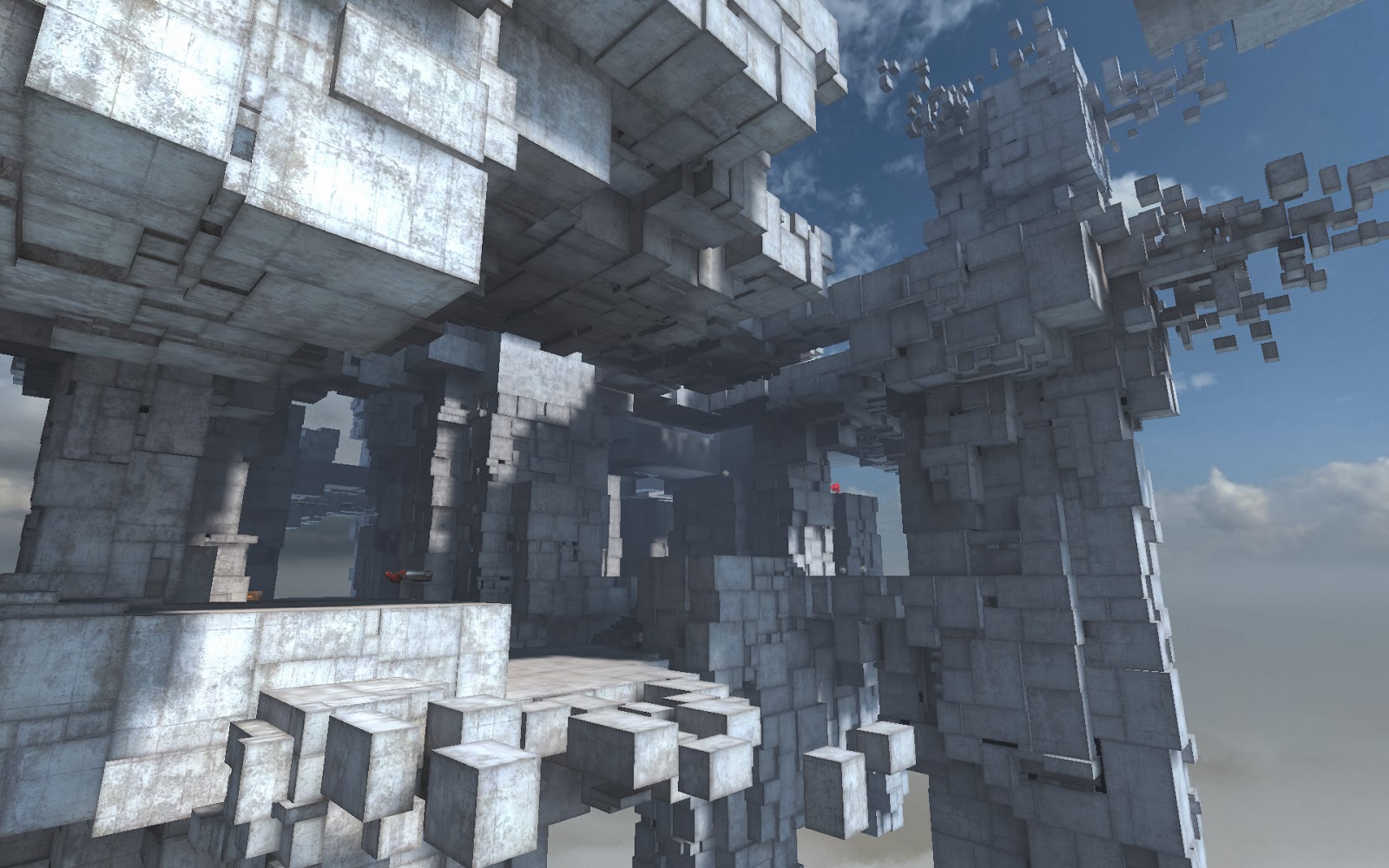 |
| Quake 3 |
Text © 2014 William O’Connor. All images are used for educational and editorial purposes only as outlined in the US Copyright Code of Fair Use.




One of my high schools was built like this – its called Hobart Matriculation College. The whole building is apparently riot proof and its big and square and spread out over the hills of Mount Nelson like some cyborg parasite.
I guess it has it's charm! Haha.
Though I can't imagine any of the residents and students of Hobart to be incited to riot – its such a small town! 😉
Great article, but the picture at the end is certainly not Minecraft. I did a search but I couldn't find the original source. Minecraft doesn't have irregular shapes though – everything is perfectly cuboid.
More like Communist Architecture… I mean note this Terran command centre- http://www.izvestni.bg/pic/NDK.jpg – and that is the 1st that came to my mind, if I do a research I can find 100s of those monolithic streight-edged structures in Russia and ex-communist countries. Cool nevertheless, I've always liked the style
Yeah, it looks like a custom Quake map. There's a rocket launcher on the platform middle left. Doesn't affect the point he was trying to make though.
I'm under the impression many 'riot proof' colleges were build during the 60's ad 70's, during the rise of counter culture. Was you building constructed 'round that time? My 'ol city college was constructed in the 60's, and it was designed with narrow hallways and thick doors and walls.
The map is from Quake 3, since the designer of it used to be a minecraft afficionado, I can guess where the google search engine got confused… Here it goes the link for anyone curious:
http://lunaran.com/page.php?id=218
Hi, first of all its a great blog, congratulations! Like many modernist movements the brutalism rejected the ornaments with no function from earlier “styles” and wished to create an architecture that was new and made sense to the modern way of living and building. The goal for brutalism was to expose the “brute” materials as they were, with no disguises and explore that aestethics. As well as seeking beauty not only in the materials themselves but in the very organization of the necessary elements of the buildings like beams, pilars windows, walls, etc. these elements shoul express themselves for what they were, this was architecture talking and telling of itself, of what it had of more true: the creation of a built eviroment for humans and try to crate beauty with the very necessary elements for doing that. In some of the pictures you've shown for exemple the rhythm of the façade is created by the modulation of the construction elements of the building and probably expresses also the inside division and use of te building.
Sorry if I talked too much, here there is a video showing the building of the Falculty of Architecture of Federal University of Bahia, in Salvador, Brazil, where I study. It's a project by Diogenes Rebouças done in the sixties and it's kind of a more tropical brutalism i guess: http://www.youtube.com/watch?v=p_-a2e42Qeg
Thanks for catching that. Ironically, I had at first mistaken it for a Peter Gric painting!
http://www.gric.at/gallery/bilder/bild211.jpg
They are strikingly similar.
I never realized the style had a name – was recently trying to describe it to a friend. We were talking about some of the squat, blocky govt buildings both here in Richmond and overseas – particularly in cities like Berlin and Warsaw – where you have that division of old and new. At least some of the examples here have some interesting qualities.
Hi
It feels so nice to find somebody with some original thoughts on regarding Really thankful to you for starting this.dave burke
Hi
I read your post and it contains very useful information.Thanks for this useful article.dave burke
Thanks for all the comments. Sorry about the quake image not being Minecraft…but it gets the point across. The more I'm looking at these buildings, the more I'm appreciating them.
Thanks for all the comments. Sorry about the quake image not being Minecraft…but it gets the point across. The more I'm looking at these buildings, the more I'm appreciating them.