-By Howard Lyon
I feel like whenever I do something for Dungeons and Dragons, especially Dragon Magazine, it feels like am visiting my youth. I remember sitting around the table, playing D&D (which for me, consisted mostly of drawing characters and creatures) and thinking that if it were possible to do this for a living, that is what I am going to do. I was 10 at the time. By the time I was 12, my ambition included wanting to paint like N.C. Wyeth, Howard Pyle, Arnold Friberg and a few others, but my roots were in D&D.
My very first freelance illustration was for Dragon Magazine, then produced by Paizo Publishing. I can’t help but cringe looking back at the illustration, but I remember feeling like I had finally arrived upon receiving that commission. So, here I am, again fulfilling the ambitions of my youth, painting for Dungeons and Dragons.
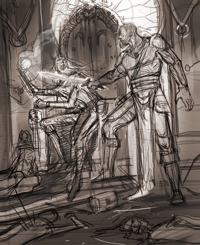
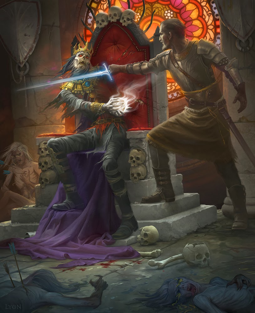
I start with some rough sketches… I hope that at least some of you can tell what is going on in here. It is rough! The loin cloth hanging down is so long would have been a terrible liability in battle, and the Lich King looks more like he is playing keep away than surrendering the orb.
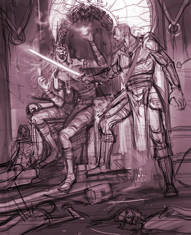
A little closer to the target, but still not quite right.
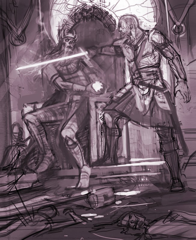
Here we are. Still some work to do on poses, but this sketch is close enough to the vision that I move forward.
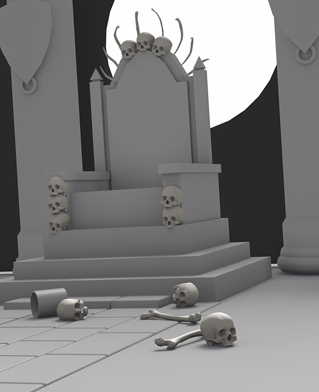
Sometimes I will build clay or wood and foamcore models to paint from, but sometimes 3D is nice too. I built this little set out in Blender. I used to use 3D Studio MAX and then Maya, but Blender is free and does what I need it too. I am actually finding it very powerful. I build out the basic set and add in a few skulls and bones from a skeleton model.
I knew that the stained glass was going to be an important part of composition. So many dungeon paintings can get really grim. In this case, the illustration needed to show that the Lich King had taken over this throne and that it was formerly a place of light and beauty. I thought the colored light and saturation of the stained glass would provide a nice backdrop and framing element for the foreground and figures. Taking advantage of the digital toolset, I designed out the stained glass straight on and then positioned it in the scene.
After a quick photoshoot, I was off to the races painting the characters and details. I wanted the fighter in the scene to feel grounded, armor simple and believable. I kept his palette very warm to contrast with the cool colors of the Lich. I was aiming for a character out of early Hollywood adventure movies, like Ivanhoe or the Sinbad movies. Another nod to my youth and watching Adventure Theatre on Saturday mornings.
Thanks for letting me share a little nostalgia with you along with the process for this painting. Also, thank you to the lovely Kate Irwin for this fun commission!
I am off to New York this week and will be taking lots of pictures of the great art there. If all goes well, I will have a few blog posts from the trip!





I really enjoy the opportunity to see what goes on “behind the scenes” in the creation of a painting, and this post certainly provides that opportunity. I also think that adding the stained-glass window was a wonderful touch–it definitely conveys the feeling you were going for. Thanks for sharing!
Have fun in NYC. Hope you get better weather than I did a few weeks ago. Thanks for the post Howard!
So… I wrote the post last week, I was being extra efficient and had it ready to go. I should edit the post, I have actually been there and back again. It was an amazing trip! The food and the art were both inspiring and filling. Seeing Bouguereau's Nymphs and Satyr was a life highlight and then we had the best Indian food that I have ever tasted. Many other great experiences and I will have a few good posts from the trip I think. Can't wait to go back. We did get out of there just in time to miss the nasty weather they were hit with.
Thank you Seth! I hoped that seeing some of the process would be useful. Reading Lauren's post yesterday, I feel I need to share some of the reference photos too! 🙂
Sweet painting! Thank you for sharing your progress and the methods you used for the different elements of the scene. Nice big shout out to Blender!
-N
NYC=Disneyland for adults (Those who don't live there)
Totally awesome as always, Howard.
Really gorgeous. I love the colors in the stained glass. It adds so much to the image.
I was inspired to download Blender and am currently attempting to figure it out! Thanks for the inspiration!