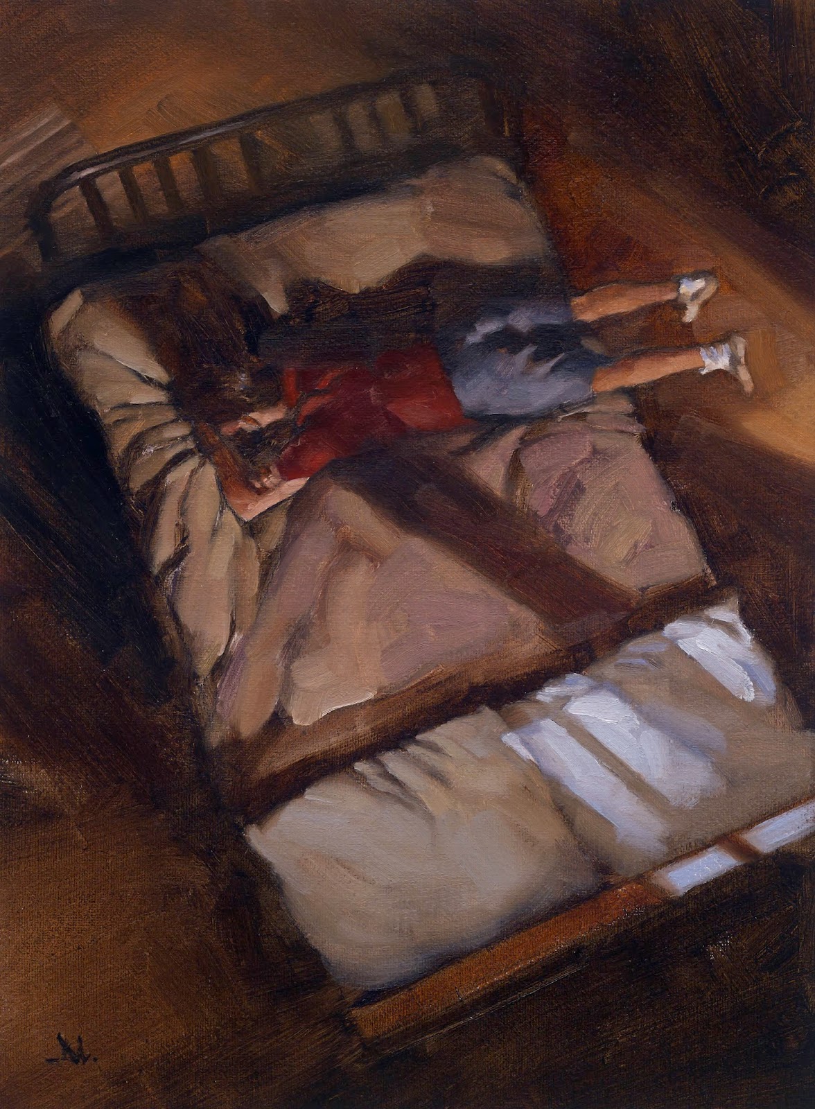
My latest assignment from Eric Skillman at The Criterion Collection was a cover and inside illustration for the dvd package for the film, “King of the Hill,” by Steve Soderbergh.
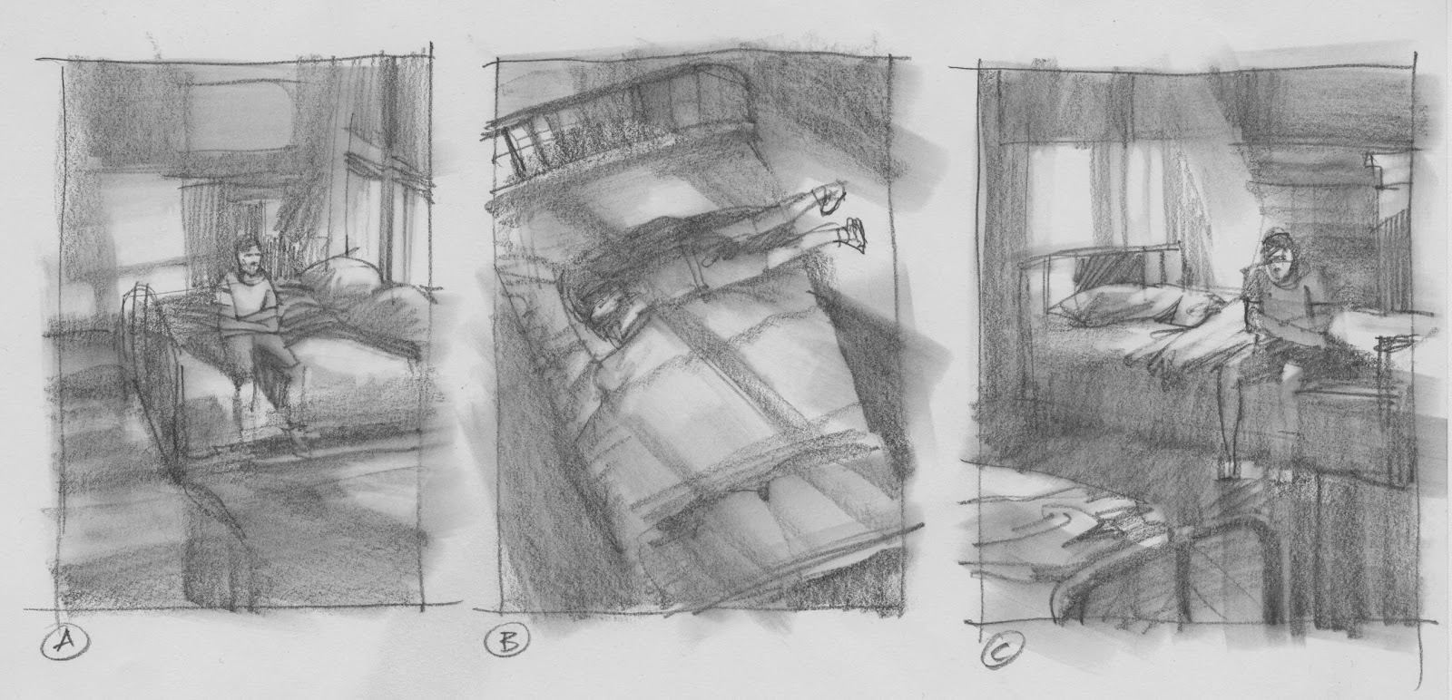
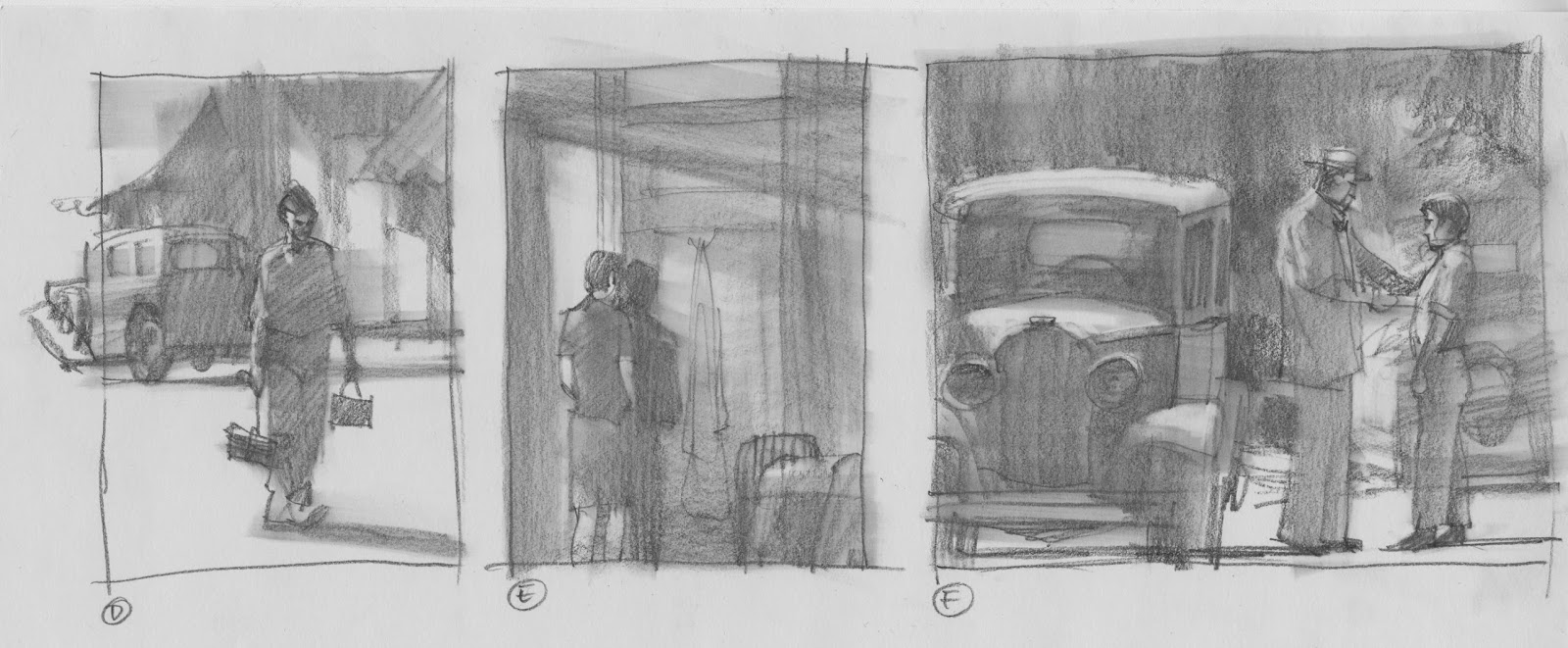
Eric wanted to set a mood for the cover that reflected the film’s depression-era time period, carried throughout the movie. I studied the film, and developed thumbnails based on his suggestions for imagery.
I gave Eric a range of scenes that I thought might capture a moment, or many moments in one, striving to bring out the plight of the young boy. I searched a scene that described many scenes, as he wanted the main image to capture the overall feeling of the film.
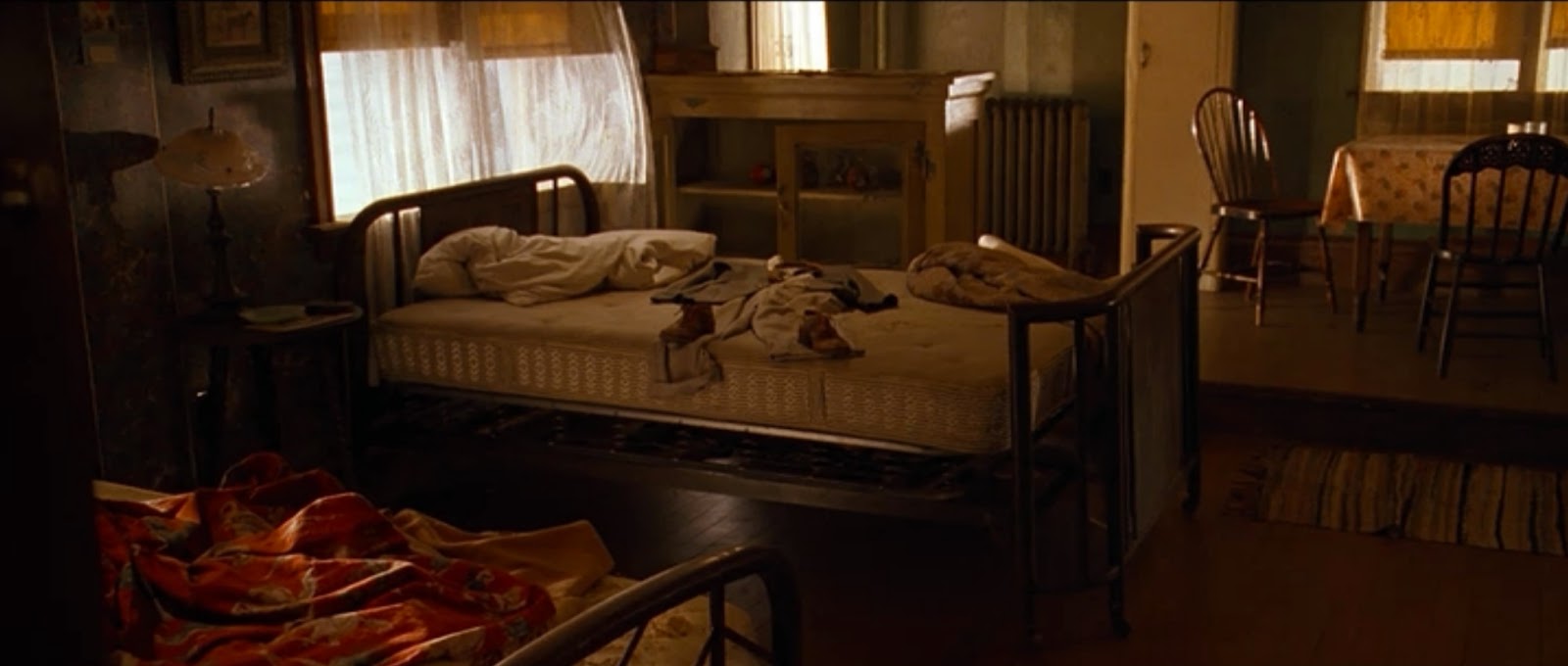
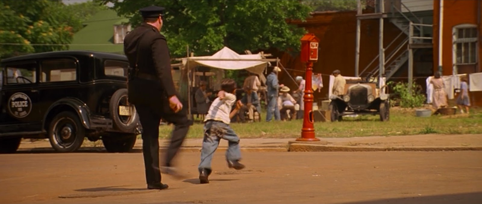
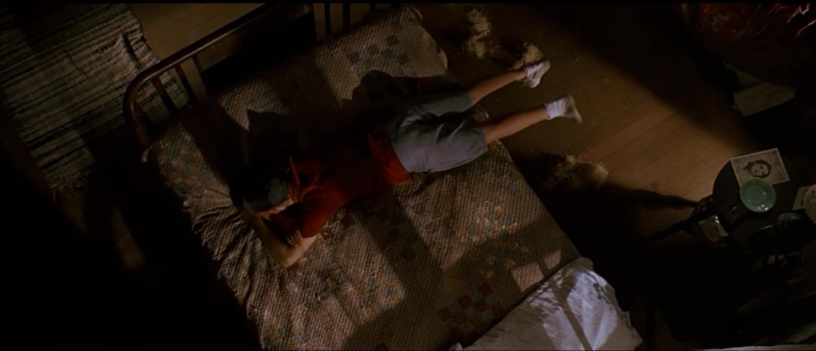
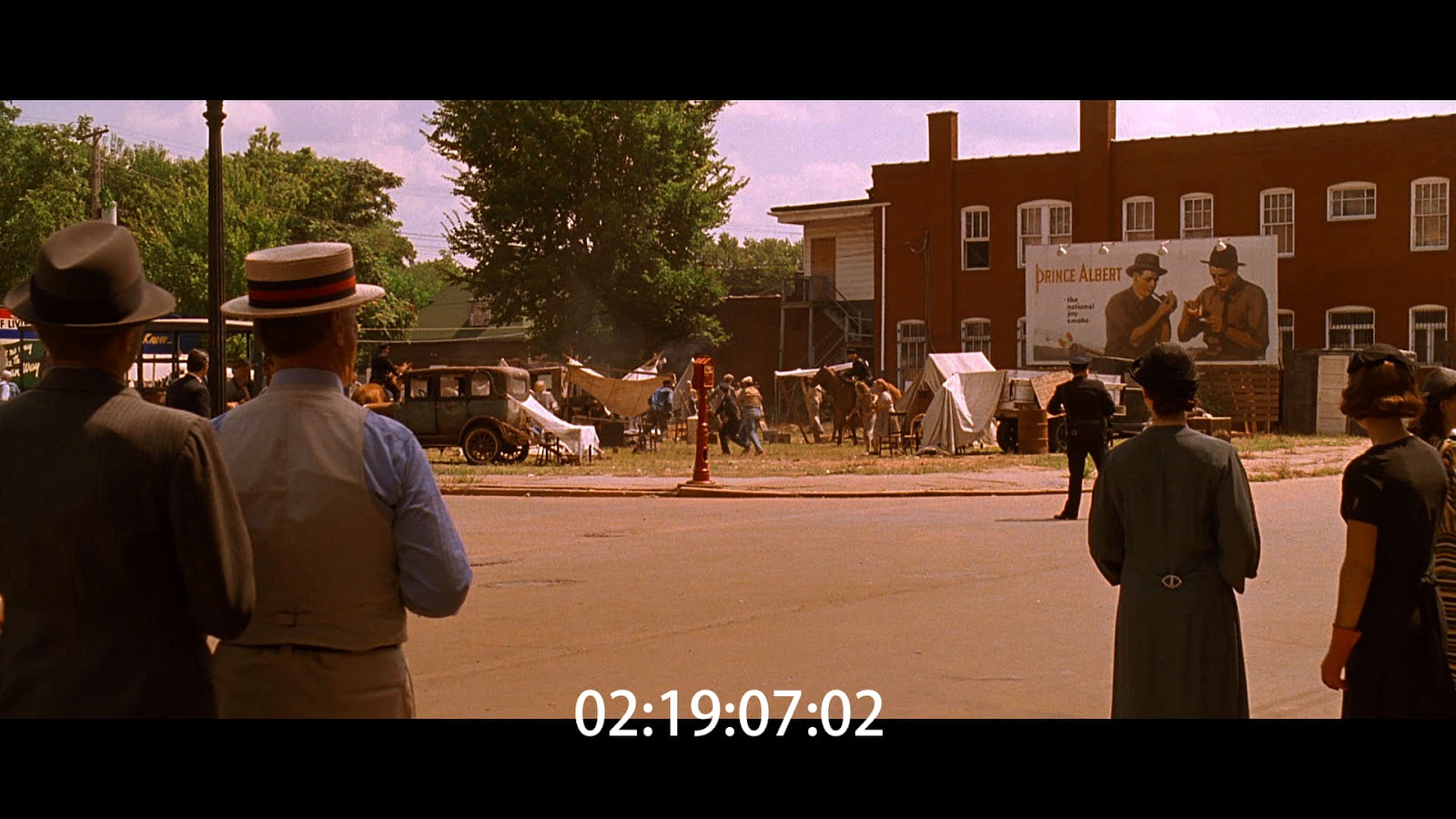
Here are a few screen captures that I used as reference. I didn’t need an exact shot to work from, but one scene was almost exactly what Eric suggested I bring across. Based on a brief, revealing shot, I shifted light shadows and other items to enhance the image.
This became the cover idea.
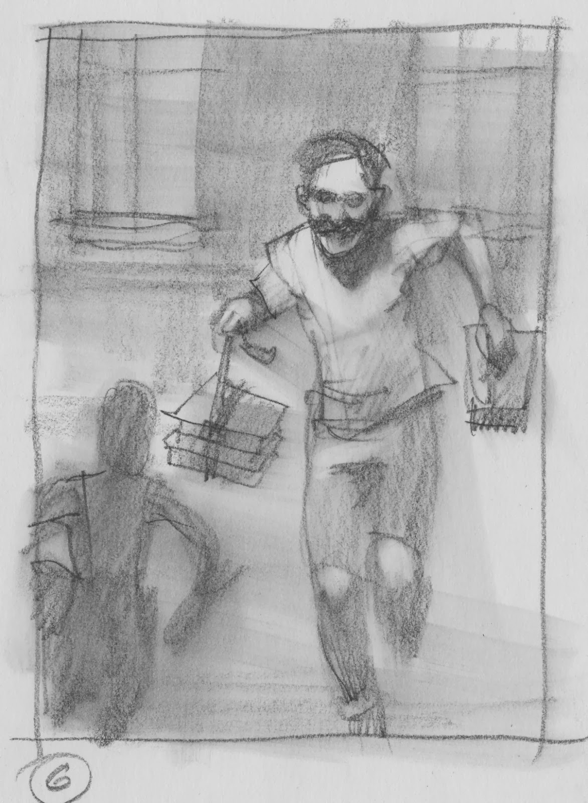
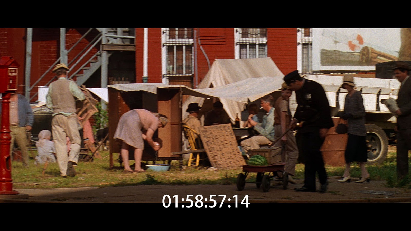
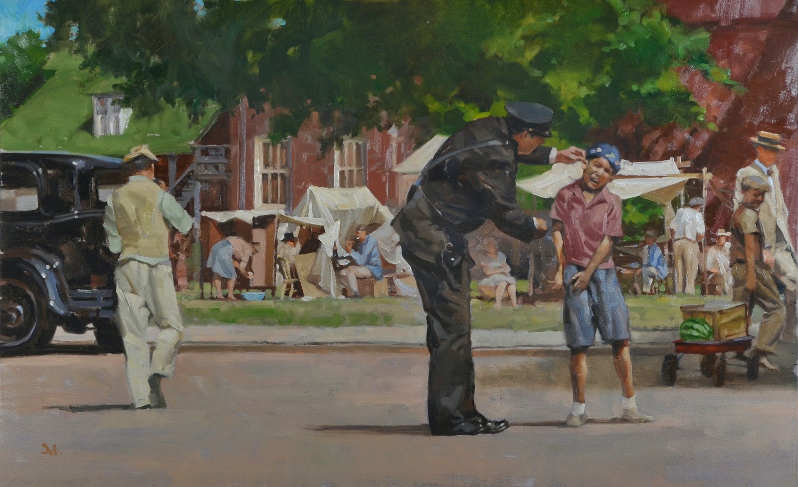
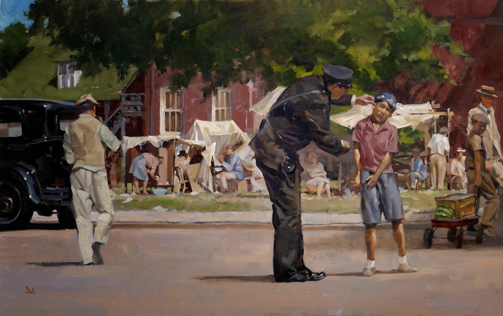
The spread for the dvd booklet inside the package would be much more broad in scope, but still needed to capture the prevalent feeling of the movie. A policeman walks his beat terrorizing and threatening the street kids, and gives poor folks hanging out around a shantytown loads of grief.
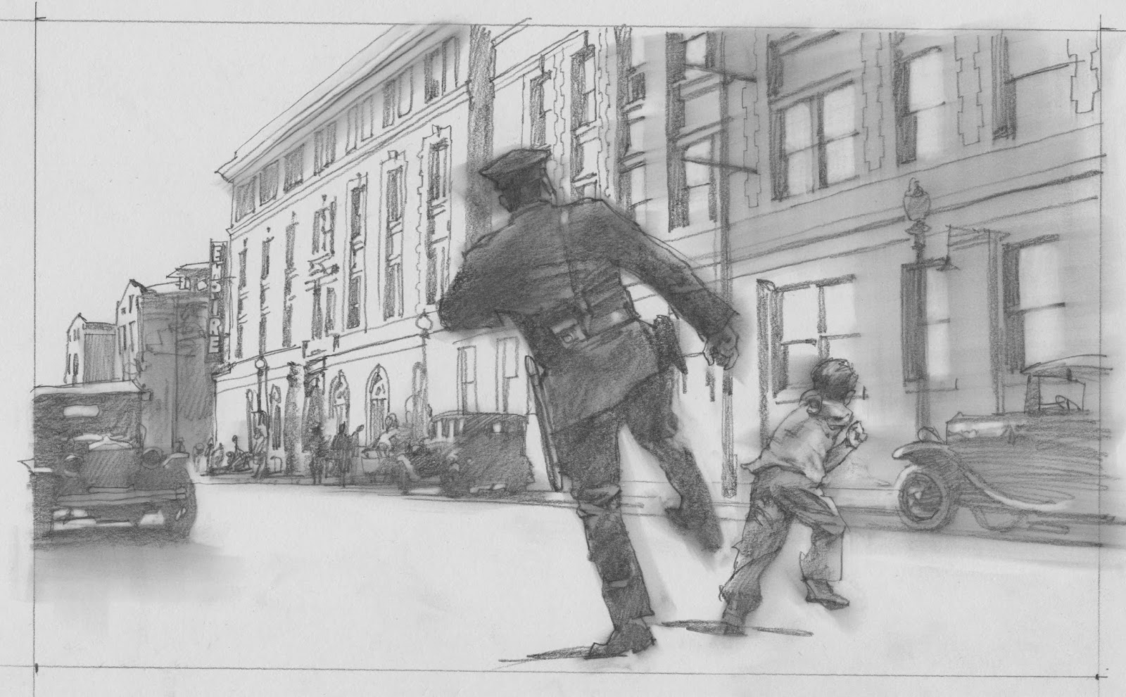
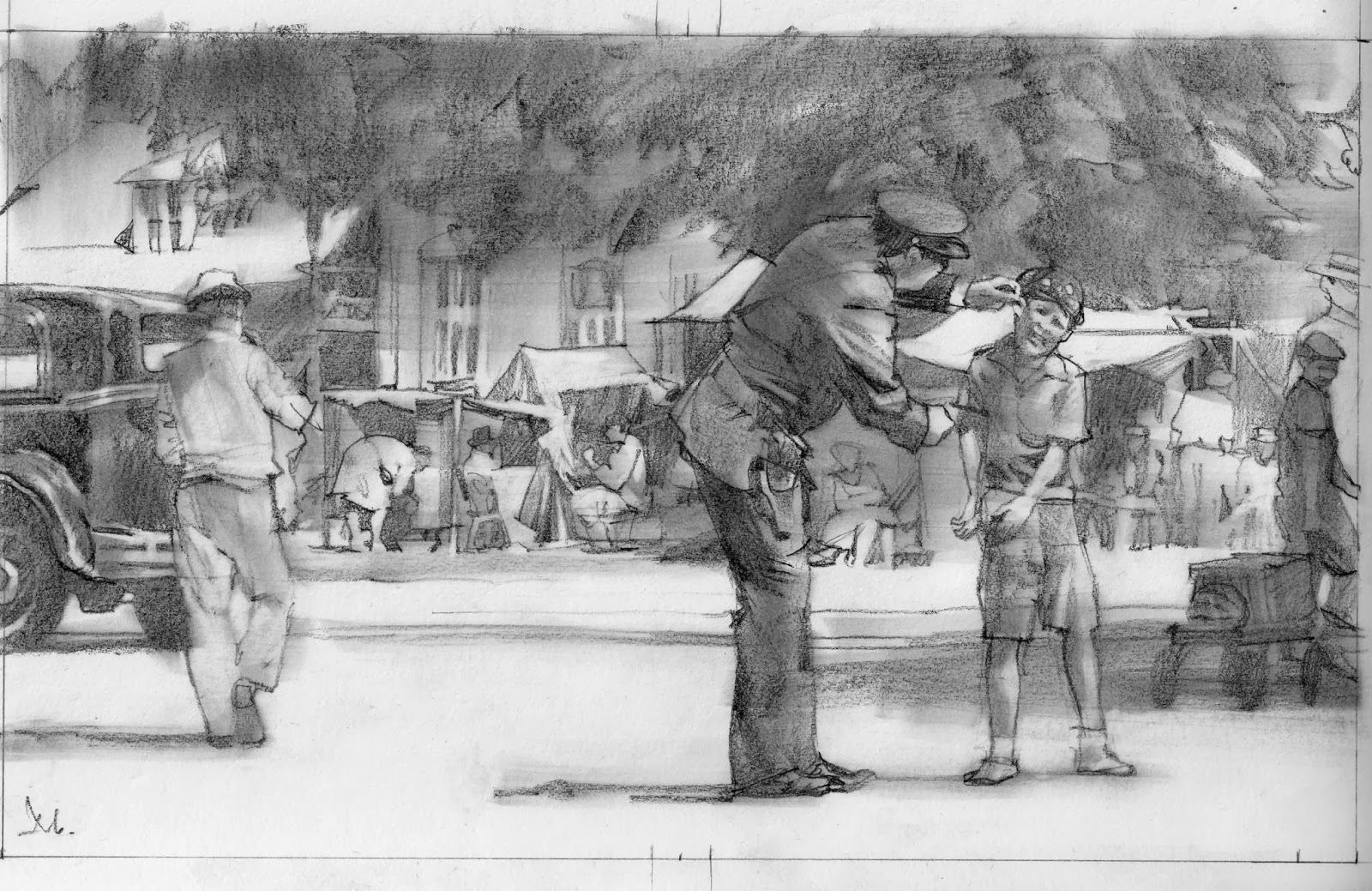
Using several shots and redrawing them together, I built a moment that is familiar to the film, but not directly from it. The first sketch was not quite it. You can see the different elements I worked from for the second sketch. I loosely drew them to see if they might fit together, then once I was satisfied it might work, I projected the actual photos and finished the drawing from there.
The process is similar to digital artists painting over their reference, but with the oil, I can keep the feeling much more spontaneous.
Eric liked both paintings, but he had a minor revision for the spread. He felt that the camp was just a little too clean. It needed to look used and shabby. I went back into the painting and added loose papers here and there, and tore up some of the canvas tents to give it more of a lived-in look.
This type of assignment is a lot of fun to develop. I like working with mood and character, as I believe people respond to that approach much more rapidly, with longer lasting enjoyment.



Nice article after really I enjoyed while reading this article. Thanks you muddycolors. I am looking these type article for my blog http://www.guruofmovie.blogspot.in
Beautiful art work, from the thumbnails to the finished paintings. What are the sizes of the finished paintings out of curiosity?
They're not in front of me, Sam, but the cover is not all that large, in order to bring out the brushwork. Otherwise, it might look much more detailed. If you nail the values, then most times you have to push the looseness as it will come off photographic. It's about 14×17″
The second painting is larger but within context of the first. About 14×24″
I luv your paintings but I enjoy your pencils much more. Lights and shadows brings a white sheet of paper to life. Thanks for sharing your visions.