Nearly every new painter has been told to avoid the color black.
Some instructors insist that students not use it at all, and to eradicate it from their palette. To forbid students from using black is as damaging as telling them to avoid using white. And this really cannot be done. It reminds me of fanatics that seek to avoid what they fear most. The fear built up around black pigment is as serious as the Salem witch trials.
You’re headed to Hell if you use black.
Black is necessary. Black is dramatic. Black is essential. Black is natural. But the key to using black is in learning to use it. It’s a matter of how much the practitioner wants to master it.
I went straight for the black once I got away from that kind of stilted thinking. I never trusted someone telling me to avoid something as benign as pigment. The paint does what you tell it to do. It responds to your every move, twist, stroke, and scumble. One doesn’t learn to handle something by avoiding it. Push through, not around.
I rejected the fear of black. You can learn to use it. The sooner, the better.
Black made from black.
Black is made up of natural elements. As you might expect, burned elements like wood, vine, or even bones. Ivory black is made of burned ivory. (Don’t even ask about brown and black made from Egyptian mummies in the 18th c. No, not kidding.)
Nearly every idea starts with darkness. To bring it into the light, we use black to draw it, shade it, model it into the base layer of nearly everything. The plain, dull, muddy colors give us the platform, the stage to express bright color against.
Black is the absence of light that we breathe life, breathe light, into.
Black lives.
Black occurs everywhere in nature. Crows. Cows. Charcoal. Caverns. Pine forests. Soil. Rocks. Cracks. Sand. Reflections. Deep water. Hair. Fur. Silver. Jewels. Pupils. Lakes. Oceans. Skies. And yeah, shadows.
Look around you. Look for the range of blacks around you. The idea that black ‘doesn’t occur in nature’ is absurd. Paint a nocturne and notice how dark the ground objects are against the sky. Incredibly dark.
Black, actually.
Study black.
Instructors generally don’t want students using black because at first the student can’t see anything else but black. They see a shadow and think that they must use black to capture it. So they put black into a color (often any color) to paint a shadow. The ensuing mud looks nothing like that shadow.
That’s because the new student doesn’t know how to observe what’s IN the shadow yet, let alone mix it. They think shadow, so they paint shadow. Shadows are dark to us as students. So we use a little black to grey a color. And that’s when the trouble starts.
In a darkened room, turn on a flashlight and point it at a subject. The shadows will be fairly black. Now turn on a second flashlight pointed away from the subject. Notice how the shadows fill with light. (the light bounces into the shadows from the surrounding walls.) You remember that trick when shooting a subject against a setting sun? Called “fill flash.” The flash fills the shadows with light…so you can see what’s in the shadows.
Study shadows and identify the color that lives there. One must observe and mix what is actually there. The first part of learning to paint, and learning to use black, is identifying what you are looking at.
Color killer.
Mix black with flesh colors and watch the figure die on the canvas. Notice how it deadens the luminosity of skin. It’s like the opposite: mixing white with one other color. The result is a pasty, ugly color.
This is why instructors don’t want students near that tube of black. The student can’t resist. But you should resist, at least until you know what it does. Instructors would do better to tell students to avoid ultramarine blue. It’s just blue, right? How can you not use blue properly?
Ever watch a student try to mix colors with ultramarine? Disastrous results. Nothing but mud.
Tinting with black.
This is a high form of working with black. One learns from experience what colors they’ll get when mixing black to tint or grey a color. I generally do that for inanimate objects, but it takes accurate observation to get that to work, and should only be used sparingly.
Want to capture the color for a gold ring in shadow? Mix ivory black into yellow ochre, or yellow cadmium. You’ll get close to capturing that slightly green gold reflection. Experiment with mixtures and see where they can be used before you throw them into a painting.
Mastering black will eventually allow one to use it in skin! But it’s a beast to learn and takes time.
Avoiding black.
An artist can avoid using black all of their career. No problem. Some people paint in pastel colors, or bright primary colors. Love it. But that’s not exactly avoiding black. That’s using and expressing a different sensation of color, for a graphic or abstract effect. Painting natural things demands the use of very dark colors. Most dark colors take on the contrasting effect that black has.
Avoid it all you want, but painting nature, including people, will benefit from a masterful use of black.
Mixing black is still using black.
Some have said that they don’t use black paint. That they have thrown out their tubes of black. Then they proceed to say that they mix their blacks from other deep colors.
Mixing black or getting it from a tube is still using black. (insert break here.)
Add color for a better black.
Yes, mix a rich black from other deep colors. It’s a good practice. But I also don’t use black without mixing transparent colors into it to achieve magnificent depth to the black. Alizarin crimson, ultramarine, dioxazine purple, permanent green, earth reds, burnt umber. Depends on the effect one wants to achieve. As with other colors, you can have warm blacks, or ice-cold chilly blacks. Depends.
Learn when to use it.
When a painting has lost it’s pop, and many times, it’s definition, it suffers from a lack of contrast in the focus of the painting. Deep, rich values can enliven a flat piece of pasty painting. Sometimes, a nice black can bring it back from the brink, but a little goes a long way. Pick and choose where to place it. No, not straight from the tube. Work with me.
Building excitement.
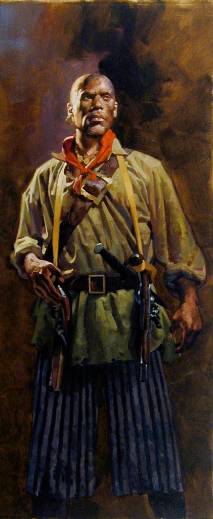
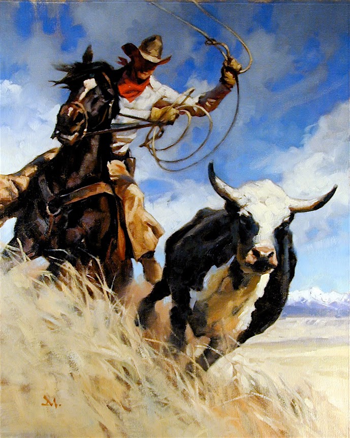
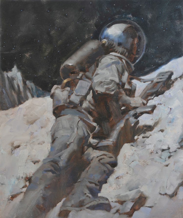
Big, bold passages of dark colors, even straight black, can be exciting to encounter. When someone can use black to it’s ultimate strength, give it character and meaning, drive depth into a scene with it’s contrast power, the viewer feels the emotion very quickly.
Use it poorly, or overwhelm the piece, and a painting can just as easily shove a viewer away. Currently, many digital paintings suffer from too much black in the shadows.
Asian painters a thousand years ago preferred to paint scenes, landscapes, nature, in black and white. The painting was a suggestion of nature. The observer was expected to see the color in their minds. They felt this allowed them to get closer to the essence of color.
Paintings are not reality. They are representations, interpretations of things that are real. They are illusions to illicit a response in the viewer. You have only to get the observer to feel reality, not duplicate vision or photography.
A painter learns to use black by studying and practicing black and white painting. Or brush and ink. Pen and ink. Line work. Calligraphy. Charcoal drawings. It’s all related.
Using black as focus.
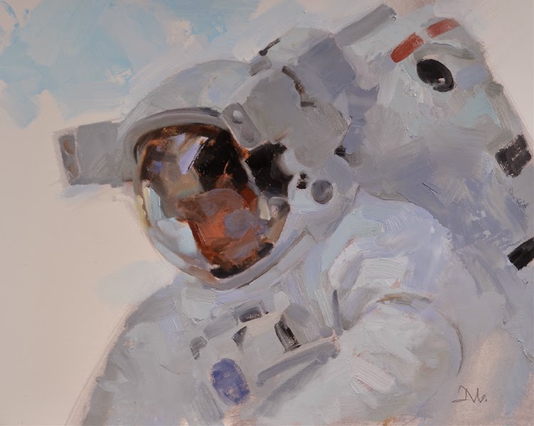
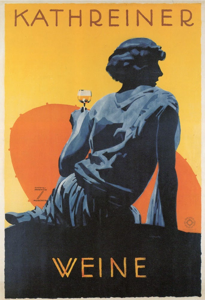
Control where the viewer looks in a painting by using contrast built from values. Contrasting values. Our eyes go to the sharpest lines, the sharpest edges, the sharpest contrasts, first. Use that to rhythmically move the viewer around the canvas. A few strategic (repeat: strategic) strokes or passages of black can add life to a painting.
Study how well an artist uses black in their work. Use the best examples as training for your future mastery of this amazing color.
Don’t avoid it. Embrace it and learn.




I completely agree with your comment about ultramarine. I remember vividly from my first year in school when I “discovered” ultramarine… lets just say that my blue period didn't last too long. Another great post as always Greg! Your “10 Things…” posts never cease to inspire.
Thank you for this. Black is essential to my paintings. I disagree about the opinion of ultramarine blue, though. I mix it with alizarin crimson to make a beautiful purple. I have used it for “blacks” as well as other things. I love the green it makes when combined with cadmium yellow.
Great post, Greg. When I was in art school I was lucky enough to have an instructor that said not to use black straight from the tube necessarily, but to use it mixed with blues or reds. Of course the choice of reds or blues was dependent upon the color scheme being used (warm or cool). Black is also important in retouching a black and white photo. This is where I learned that mixing orange with the black gave me the proper tones to match those in the photograph. Black is necessary!
Someone just saved me an entire SmArt School lecture!
You nailed it here, Greg.
Very nice article! My wife (watercolorist) and I have had “friendly” discussions about this as she was always trained to mix her blacks.
I don't use straight black from the tube either – I pick a suitable warm or cool black, and mix with or glaze over it with another color. Sometimes I glaze layers of black over an undertone color to leave the color impression beneath.
When I teach beginning painters they often don't realize black has it's own “warm” or “cool” toned pigment. It's a shock to them to see it mixed with a little white to make a warm or cool grey!
I think this is very true also:
“Currently, many digital paintings suffer from too much black in the shadows.”
A lot of the digital work is so dark – it's like the painter didn't know what to do with the shadows so he just darkened the whole thing down… I see this esp. with photomanipulations as it's an easy way to hide sloppy photo montages.
This holds true in other arts also. I do a lot of needlepoint, and a lot of needlepointers use solid black for a night sky. It just looks so flat! I learned to mix the black with a dark blue on the bright sky, in a 3black:2blue proportion – it really makes the sky come alive!
Great comments, all!
ces….now that's really using the whole concept! You simplified it even further to express it. That's phenomenal. And thanks!
Thank you for sharing your knowledge! It's so helpful for young artists like me too poor for art school. I had heard that one should avoid using black, so I've always rather vaguely avoided it without questioning why. So thanks for enlightening me on the darks. I'll give more thought to it now.
I definitely agree that the blacks and whites are a part of the process but…I don't feel that instructors are wrong in telling their students not to use black. Maybe my experiences are very limited but…in my time in school the only time an instructor would urge students not to use black is when the student is CLEARLY too inexperienced to know how to properly use the color. Seriously…some of the kids in art school REALLY shouldn't use black. Maybe in an intro class it's a prereq to never use black but from my experience, as a professor gets to know you and your skill level, they will insist upon the PROPER use of the blacks and whites….So basically what I'm saying is there are definitely people that should heed the advice of professors in not using black if they're inexperienced. A limited pallet will serve them much better.
Hey Stuart….I hear you. I've often thought that it might be easier for a beginning student to use only pastel-like, or lighter colors of oil. No darks at all! No browns, or dark blues, or greens, unless they are lighter in value….around 40%. Even the mud would be lighter! : )
I'm certain that teaching students to hear what you say about proper use of blacks is enough of a challenge right there. So it makes sense to pull back on black. But at the same time, we should pull away ultramarine and viridian as these colors are all difficult to work with, in the beginning.
Everyone is inexperienced at some point in the beginning. I'm in favor of not limiting color from the start. The experience of mixing ugly color and mud is part of the training and a student won't really know it until they mix it. The failure is key to understanding the difficulties of dark values. But so many think because it's oil and it's on the surface that it's unchangeable. It can easily be wiped off, remixed, and re-applied.
Hope you weren't offended!
Great read, thanks for posting this in-depth article. I definitely heard the “don't use black” during introductory painting courses, and I'm not sure the next level of instructors ever took time to progress to “here's how you use black carefully”. This should go in a book…
…say, there isn't a Greg Manchess technique/theory book in the works, is there?
I (like many others) was taught by Brent Watkinson at the Illustration Academy to paint with a primary colour palette. It served me well back then and continues to do so today.
I do see the limitations of the system when it comes to achieving a more dynamic colour range, though. Even when I add one of Brent's “guest” colours, I know there is still only a certain amount of colour that is possible in my work.
Despite this realization, I still teach the primary colour system to students. There is something to be said for limiting the amount of colour one is able to use in order to teach the subtle nuances of shifting colour, especially as it muddies across the colour wheel.
Some people learn to swim by getting thrown into the deep end of the pool, while others learn in more shallow water. In my experience, the more tubes of paint a beginner has at their disposal, the bigger the challenge. Today, I would love to spend days, weeks or years experimenting with an unlimited number of tubes of paint because of the grounding I have in the primaries. I get how colour works now.
P.S. Greg, you have been my painting hero/mentor from afar since I found you within the pages of Step-By-Step back in 1996. As someone who could draw well enough in college, but was a terrible painter, your process was invaluable at the time. Thank you for sharing back then and thank you for sharing again today. We all appreciate it.
P.P.S. Thank you for the recent 'Friending' on Facebook. You're awesome.
I love this topic! There's so many mixed views, and profs and teachers who tell us to avoid black but don't explain WHY or that it's merely for the time being, so that we can properly learn colour.
The time I learned most about colour mixing was when a teacher taught us to use the Zorn palette, which, surprise! Includes black! It forced me to observe and was super intimidating, but I learned so so much. With black. Whereas before, using a double primary palette, with no black for years, I still struggled!
These days I don't think of black as black. I see it now as a very low chroma blue and just consider it as a blue on my pallet. For someone to say you should never use black in painting is just revealing that that person has a limited knowledge in colour and should do a little more research in colour theory. For the student(and we're all students) I believe it should be in their own interest to do colour studies with 'black.'
Another good post Greg!
Cheers,
Rick.
Personally I use a palette that imitates the likes of Lucian Freud and Velasquez. I tend to mix my blacks from burned umber and burned sienna, coupled with blue, red and yellow. (whichever colour I prefer to have a slight upperhand in relation to others). I like the interaction that a mixed black creates with its surrounding colours. Especially when working with highly thinned paint or painting in washes. But it's all personal preference!
Definitely not, bud. ^_^
I agree on the ultramarine part, I would say my early work was just as clumsy with ultramarine as it would have been with black lol. Experience with making those mistakes is a great point. I've made mud so many times that eventually I could see it coming.
Hey Greg,
I am new to this site and just wanted to jump in. Fascinating post! I am one of those instructors who say 'no' to black. I understand your logic here, but my preference is to teach students to experience color with a warm cool of each primary. When they develop a “feeling” for the way colors work, then they can add additional colors to their palette, it depends on the painting. I once read that “artists must try to look for light in everything, especially the shadows.” For me using black is a shorthand way for making the value darker… and it always makes the colors muddy.
Then again, great art is great because they break all the rules , and they always seem to get away with it!
Keep up the great posts!
-William
Hi Greg,
I apologize in advance for the length of my comment. Just chiming in with my two cents (possibly 4) as a University Professor who teaches students to use black and teaches them not to as well for me it isn’t an either or. Why do we call Rembrandt, Caravaggio, Rubens, Velazquez, Leonardo, Vermeer, Titian and so on and on and on to Zorn, Sargent, Boldini, Whistler, Mancini and on again. Were they masters because they didn't use black or because they knew how or because it was cheap and available and they had fewer options to get rich, deep darks than we now do. Whatever the case they used black exquisitely.
By the way, I think burnt umber may kill color faster than black, ultramarine, white or any other color. The only painting error possibly more egregious than getting muddy colors is having too much intense paint right out of the tube on the canvas, which usually beginners are more guilty of prior to mixing mud. As Dean Cornwell so aptly expressed, ” A great colorist is known for their grays just as a chef is known for their gravies and sauces. The grays are the sauces that flavor all the other colors on the canvas.”
I give my students a range of color schemes to use that require them to figure out how to maximize color in an otherwise very muted palette; then onto colors so intense they must be extinguished before one can tolerate them. I will list the first two schemes I begin with in portrait and figure courses (color charts are quite revealing and invaluable when discovering the potential of a specific scheme):
Black (W&N blue black yields a tiny bit more color), terra rosa, yellow ochre and white; it is amazing how many beautiful flesh tones can be mixed with this “dead palette”. These colors are used as primary colors (black is used for blue, terra rosa for red, yellow ochre for- obviously) to yield greens, violets and oranges.
Black, alizarin crimson, yellow ochre, white; another color scheme in which black is used as blue.
I also require them to mix flesh tones using the closest colors to primaries I can find and with out the addition of black so they learn how to neutralize colors without it. With the colors listed below you can mix amazingly intense hues, but in mixing flesh tones the trick is to neutralize them sufficiently that they work as flesh tones.
Phthalo(cyan)ine blue, W&N permanent rose (the closest thing to magenta I can find, most rose colors work but you are looking for the pigment PV19), Cadmium Yellow Light and White. Anything that resembles black in the painting must be mixed using just the primaries. Rich darks are very limited in part due to the fact they are being mixed using yellow; which over lightens them. Usually I recommend mixing a dark purple or green and adding enough yellow/magenta to dull it down but not to change the hue.
Black is a beautiful color and amazingly versatile. One should learn how to use it so as to make a conscious choice about whether it will be used or not dependent on personal likes/dislikes and not the biases and fallacies of uninformed teachers and artists perpetuating myths.
One of my favorite Dean Cornwell paintings is painted primarily with black, white browns and a couple touches of color. I am sure you have seen it. Enjoy again! http://www.pinterest.com/pin/397372367093900435/
What would a Rembrandt painting be without those amazing blacks, particularly in his formal portraits.
Thanks for the fabulous post Greg!
wow… really thanks Gregory Manchess, really thanks Muddy colors. i always learn from your good ARTicles. and they are just always at the right time.
I love the 10 things series of posts, they've taught me so much! I was wondering if anybody could anybody go into a bit more detail on the point about ultramarine though, I don't really understand.