For the last ten years Paul has been employed at Weta Workshop as a concept designer on film, television and computer game projects. He has most recently completed work on Sir Peter Jackson’s The Hobbit trilogy and also worked on James Cameron’s Avatar (2009) and Andrew Adamson’s The Lion the Witch and the Wardrobe (2005) and Prince Caspian (2008).
In addition to his role as a concept designer Paul also conceived, art directed and designed Weta Workshop’s book The Crafting of Narnia and co-designed The World of Kong, A Natural History of Skull Island.
In 2009 Paul created White Cloud Worlds – science fiction and fantasy art from New Zealand, which comprises of two art anthology books, a touring exhibition and workshops.
Hi there, having been a big fan of Muddy Colours for a few years now its a real honour to be asked to contribute a piece on concept design – so thanks Dan 🙂
Typically, I am working full-time at Weta Workshp, and in the course of my job (and running my own workshops), I end up reviewing a mountain of student concept design portfolios. Over the last few years I have noticed a lot of portfolios are filled more with concept art rather than concept design and for me that raises a rather good question: is there a difference between the two?
Of course, for many people, there is no difference between concept art and design, they are interchangeable terms. And that’s cool. If you were embarking on a portfolio for concept design, however, it might be worth thinking of them in a different light. I love concept art, I have folders upon folders of it. But I define it very specifically as a visual exploration of an idea where the concept starts and finishes with the artwork. The artwork is the outcome.
Concept design is about exploring ideas visually through a design process to a brief. If successful, the outcome continues past the design or art phase and into production. A piece of concept art might explore what an armoured character looks like, but concept design would be focused not just on what they look like but also the required outcome for the armour. For example, for a live action film, a piece of armour would need to be functional and further designs would be required to resolve details and cross sections to enable someone to build it accurately. As a newbie, my earliest armour designs featured big, wide breast plates, because it looked more powerful. But in the proto-typing phase, the actor could not close their arms to hold a weapon two handed. It looked great on paper, but all that power the design suggested was lost when the actor couldn’t act in it. It was embarrassing, but you learn from your mistakes and the process. So with the process in mind I thought it might be helpful to run through a typical example of how to step beyond the art and into design.
Research:
It’s hard to generate ideas for a brief without learning about the design subject matter and that’s where research comes in handy – especially when you are dealing with a property as beloved as The Hobbit.
I always start with the descriptions from the book.
“Two caught their eyes particularly, because of their beautiful scabbards and jewelled hilts.”
“These are not troll-make. They are old swords, very old swords of the High Elves of the West, my kin. They were made in Gondolin for the Goblin-wars…This Thorin, the ruins name Orcrist, the Goblin-cleaver”
“…but the goblins called it simply Biter.”
I also draw upon my own experience as well. If you are designing weapons its useful to know how they work in the real world. I joined a medieval martial arts class for a couple of years and came to appreciate how heavy armour was and how important blade balance and shape can dictate fighting style and energy conservation.
Mood Boards:
I went beyond just Tolkien’s books and looked at weapons from the cultures he was inspired by and the previous LOTR movies. I pile all my notes and reference images into ideally a single page so I can reference it at a glance on my second monitor. If your reference is not available at a glance you tend not to use it or waste a lot of time rummaging to find it.
Shape Language:
You can explore a lot of ideas just in silhouette studies and its amazing how a silhouette can also convey culture. For example organic forms for elven, geometric for dwarves or spiky for Orcs.
Options and Variations:
The most common line from a client in concept design is, “Give me something I have never seen before”.
You don’t get to that place without working up plenty of options. Options need to be different approaches to the brief rather than just working up variations around one idea. Both myself and Daniel Falconer wanted to offer options that related to the previously existing Gondolin Swords. We also had to take into consideration the end outcome that Orcrist is an elvish weapon that would be used by a bulky, squat Dwarf who in wide shots shrinks down when standing next to a human. It was for that reason I played off the heavier blade shape of Sting and the idea of more of a “cleaver” blade. Otherwise the sword in Thorin’s hands looks less imposing and when Elrond handles the blade in the film it would look like he was handling a letter opener.
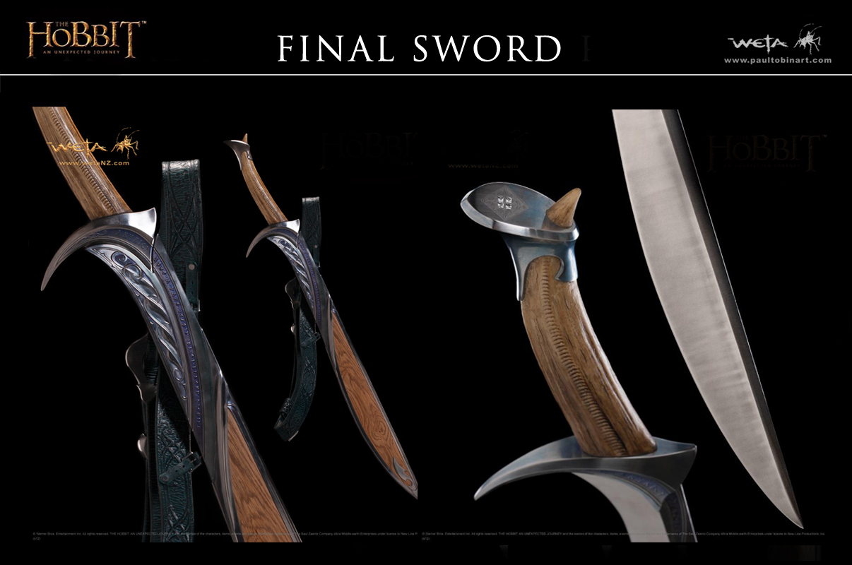
For my options I tried all manner blade shapes and materials and finally tried a more wild card idea based around the description of “biter” where I offered up an ivory handle, perhaps a dragons tooth (which, given the dragon-themed story, had a nice sense of symmetry). Peter loved the idea , possibly because it was so different to any other Elven swords we had seen before and, after looking at some historical ivory handles and a t-rex tooth, I worked up the preliminary designs.
Prototyping:
I made cardboard cutouts to explore size and function along with wooden versions that we sparred with. When it came to the scabbard I made no designs at all until I had a functional cardboard mock up that I could use as a starting point. The scabbard design was inspired in part from other designs John Howe and Alan Lee were creating for the elves. As you are part of a larger team you want to approach culture design holistically and sharing ideas and design aesthetics is important.
Detailing:
Good design is in the broad strokes, great design is in the details. I still wanted to get more of the original description from the book into the piece. My research lead me to the likelihood that Ethalion of the Fountain was the original owner of Orcrist. I designed a pommel detail that was his coat of arms, using diamonds to describe the fountain water.
Production:
No matter how good your design, an amazing artisan can always improve it. Our master sword maker Peter Lyon carefully captured all of my work and then, with his expertise, excelled beyond it. Its a great moment when after spending weeks on a design you get to handle something that had previously just existed in your imagination. I just wish I had a spare $10,000 to buy the Weta Collectible…..
If you want to see a whole book full of design process from the Hobbit, check out the awesome Hobbit Chronicles my friend and fellow designer Daniel Falconer has put together. I will also be at Spectrum Fantastic Art Live again this year so please drop by the White Cloud Worlds booth and bring your portfolio if you would like some feedback.
I am also running a TLC Workshop in Seattle in May 16-18 with fellow Weta Workshop Designer, Nick Keller. For More info, or to purchase tickets, visit their website HERE.
If you made it this far, thanks for reading 🙂
All images © Weta Workshop, Wingnut Films and Warner Bros, respectively.




Nice to read the thought behind Orcrist's design!
(I apologize for nitpicking, but it's “Ecthelion of the Fountain”, bit of a typo there.)
Thanks for the neat look into the creation of Orcrist, and for pointing out the differences between concept art and design.
Well done Paul and thanks. Look forward to seeing you in May.
Excellent article Paul….really enjoyed it, lots of great info.
Just finishing up a class with Andrew Baker…..he can't say enough about your great designs.
Looking forward to reading your next post…when Dan invites you back to write again:)
Great article!! very insightful and helpful! And I have a question for you… When you work full-time for a studio like Weta, how much time do you have to dedicate to personal projects?
Thanks Paul!
Nice to meet you Paul! Thanks for this timely post as it will really help with my work. Hope to hear more from you.
Awesome to see a post from you here!
It was amazing to have you come into class (massey, wellington) to give critique on our works a couple of years ago, has always inspired me to push harder and further with all my work, and to really try an put myself in the scene, which has greatly helped!
Thanks for giving us that time!
Ha, well spotted, dam those typos….
Hi Seth, glad you enjoyed the walk through. Its more a personal take on art and design but hopefully it helps.
Cheers mate, was a bit nerve wracking writing for Muddy as the posts set a high bar. Lets grab dinner and a beer again 🙂
Man you are in good hands with Baker, he knows his stuff 🙂 and I do have another idea for a post as well….
A great question. We are contracted to work a 50 hour week 8-6pm. So its a long day every day. Other studios might be different, but the film industry typically works long hours. This does make it hard to fit in personal work. The good news is that you need to be a driven person to make it in this kind of career and passionate driven people make time for themselves. Sometimes teaming up with other artists with your personal work is a great way of making more from less time. Its actual the subject of another post I would like to do 🙂
Good luck!
You are very welcome and its always nice to head back to the old art school and see whats happening there.
Great post! Looking forward to seeing you at Spectrum again!
Hey Paul! Nice article though. Quite interesting thoughts and design process description. Especially liked your words about design and details. Heard the same thoughts when I was listening to The Collective podcast episode with your colleague Greg Broadmore. You guys at Weta are doing great job while creating design, art and props!
Lucky those people who could receive feedback from you on their portfolios. I wish I could attend this art event…
Looking forward to more posts with your thoughts on concept design and art.
Hey there Lauren 🙂 yeah I am super excited to be heading over again, its so much fun. Just petrified by all the amazing art on sale and what the credit card will look like at the end of it…
Cheers mate, yeah Broadmore (or Beardmore as we call him) certainly knows his stuff. Its a great podcast for sure!
I'm signed up for your workshop in May and have gotten two of my other friends to do so! CAN'T wait!!! Thanks for an awesome post!
It's always fascinating to see how much goes into a quality design. Great post Paul!
See you there!!!
Yeah the irony is sometimes you might spend a few hours designing a background weapon and it ends up getting more screen time then something you laboured weeks over 🙂
Thank you and I look forward to reading your next post.
Hi Paul, great post. It's always enlightening to hear about the work that goes on behind the scenes.
Any plans on releasing a third white cloud worlds? The first two were fantastic.
Thank you for explaining the differences between concept art and concept design :). Really interesting post!
Hey there, we are certainly keen on doing a Volume 3 and awesome that you enjoyed the first 2. I am not sure when it will be out as all the artists are slowly rebuilding their art stock so I can loot it off them 🙂
Thanks 🙂 So people could equally argue there is no difference but the main thing is you enjoy making art and design!
Cool read 🙂
I’m really thankful for this list, it helped me save time searching for blogs that accepts guest post as I’m writing some inspirational article for my site and for the readers out there who wants to know about my topics. Cara Mengobati Alergi Cara Mengobati Nyeri Pada Payudara
Keep it up brother, I salute you for this share.
Cara Menyembuhkan Mata Katarak
Obat Rabun Senja
That was a great article on concept art design. I simply loved it. I’m a designer at NexGen Innovators.
good article for design concept very simple to understand.