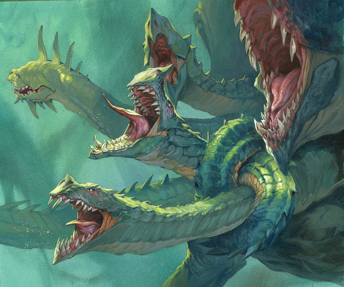
Here is another Hydra Magic card from the “Face the Hydra” deck expansion. When I first got the assignment I thought it would be very simple and easy. The description asked for a hydra with 2 heads entangled so that they were out of action.
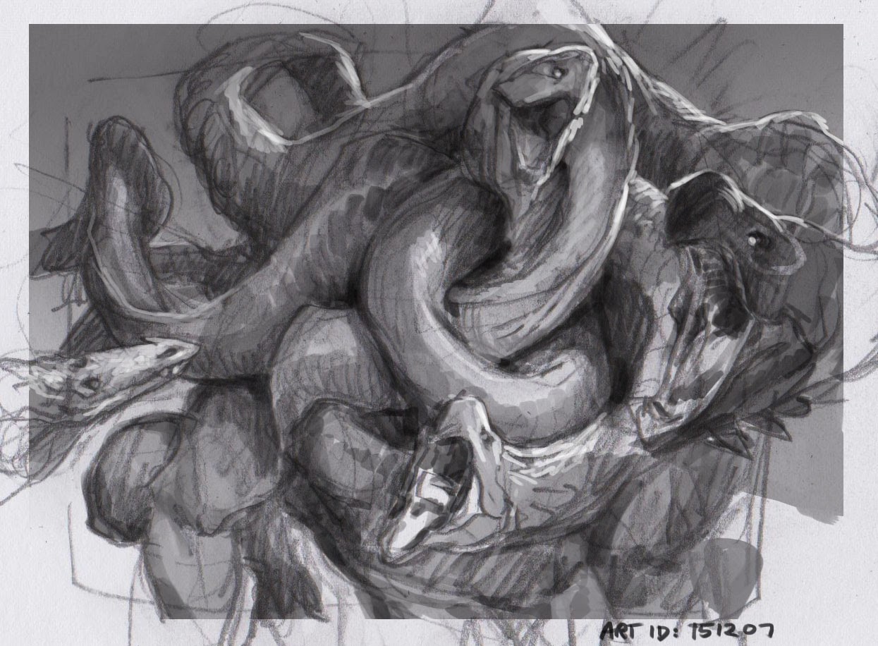
I did a sketch that turned more into a pile of tangled heads and not just 2 being affected. So I sketched endlessly trying to come up with a composition that was clear enough that you could see the tangled heads and some necks that were free, and still very much kept in mind that the illustration needed to look cool. No matter what I did, I think I ended up with either the one or the other.
When I started the colors I had this idea that I would try to make it a bit more Kev Walker than I am used to. The way to go about that I thought was to make the background very watercolor-like. So ai added thin washes to the whole surface. I sprayed the acrylic with water from my airbrush to keep it from drying too fast. That way I could obtain the soft fadings of the color in the background. It looks like a camera out of focus. I am pretty sure Kevin does not use an airbrush, but basicly just paints it very wet using stunning brush control. I also saw Eric Fortune do these impressive tonal fades in thin washes using tremendous patience and lots of time. But my “Hacked” way of forcing the acrylic to act less acrylic-like, fits my temperament, and gets the job done in less time but without the finesse and control.
After I painted the background in, over all of the image I start painting the figures in thicker paint going on top of the background color. Instead of painting the background around the figures or masking them out I just did the whole background over the full surface. I do this only when the background is kept watery and is kept to washes or else I will cover up too much of my inked drawing to be able to see anything. The benefit is also that the background fades and strokes actually is going behind the figures with no strokes or texture kind of bending away from the figures as it tend to do when you have to paint around things. This way the technical use of the brushstrokes ends up enhancing the feeling of depth creating a layer upon layer effect.
In fact this image is almost monochromatic with the red acting as a splash color. I tried to have the greenish/yellow rimlight fill out more of the figure than just the rim, using it more as a strong effectfull tool to gain focus. The 2 heads most in need of attention got the brightest rimlight color and everything less important got less light. Pretty simple. I think of myself as the guys in a theater in charge of the spotlight following the actors around. As an illustrator you can put the light exactly where you want the attention and not necessarily dictated by realistic light sources.
In this painting I really like the top left head. It is build up with very few strokes, shape is mostly defined via cast shadows from the “fins” of deep shadows like the eye sockets and the mouth. Also I think the facial expression is less typical and the fact that it is seen three quarter from behind is also less obvious. It just adds to the everyday-like feeling of the scene that not all the heads are equally dangerous and conveniently facing the camera.


Thank you Jesper!
My favorite piece by you. Sweet design!