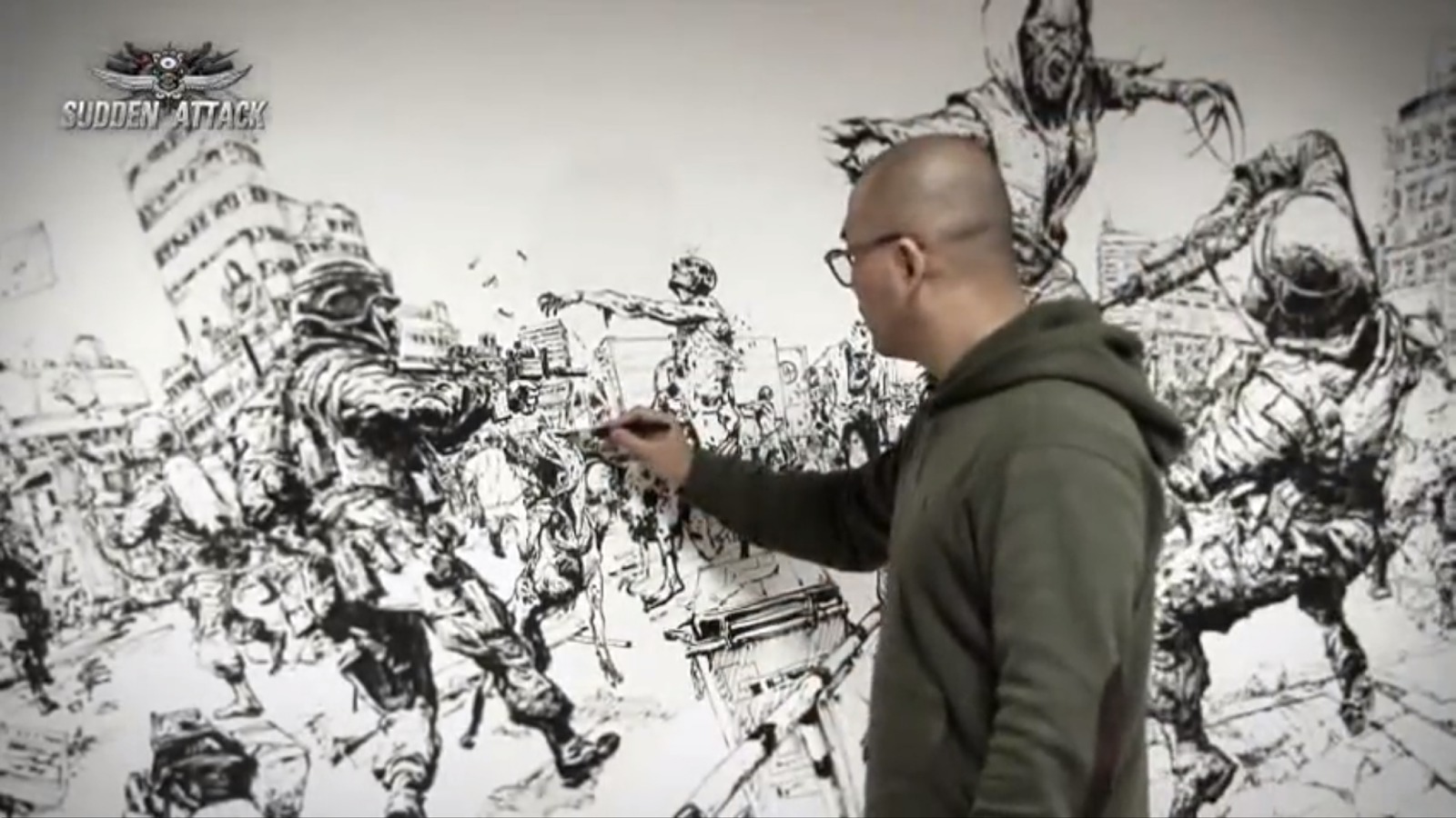
Many of you already know of Kim Jung Gi‘s work from some of his large scale stream-of-consciousness drawing videos, and from his immensely popular (and immensely large) sketchbooks. But for the most part, there is not a lot of commercial work available from him. Apparently, that’s changing.
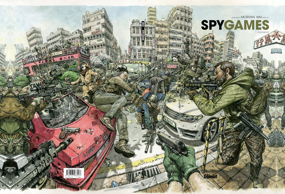
Kim Jung Gi is currently collaborating with writer, Jean-David Morvan, to create a new comic titled ‘Spy Games‘. Although, the comic is in French (produced by the French Publisher Glénat), the odds are good it will eventually reach an American audience.
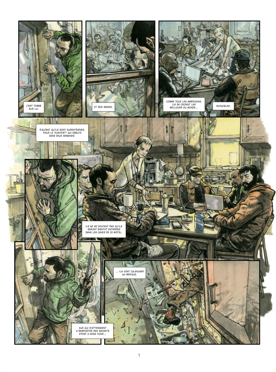
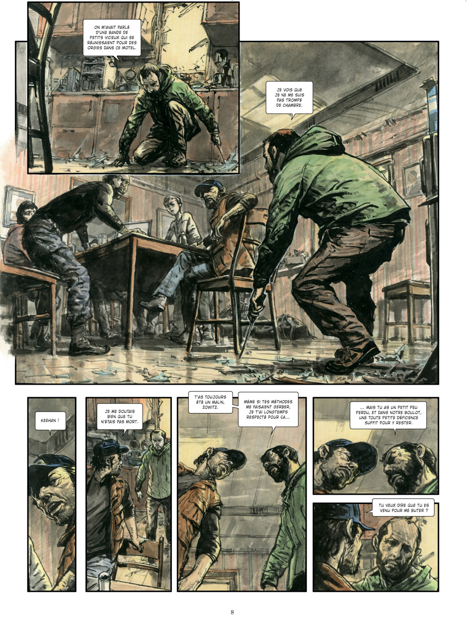
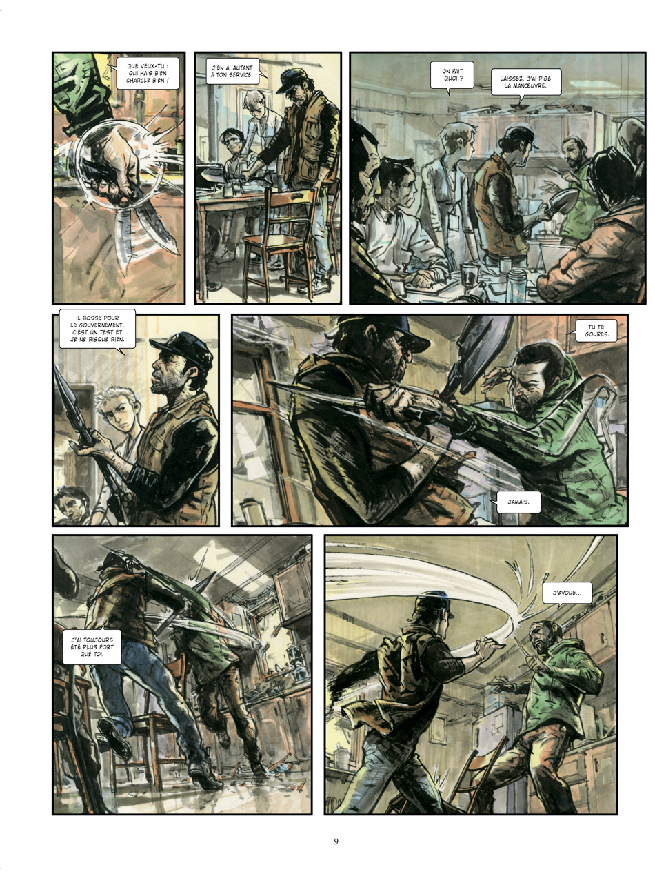
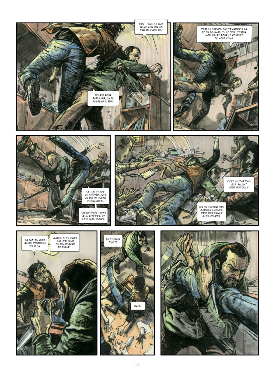
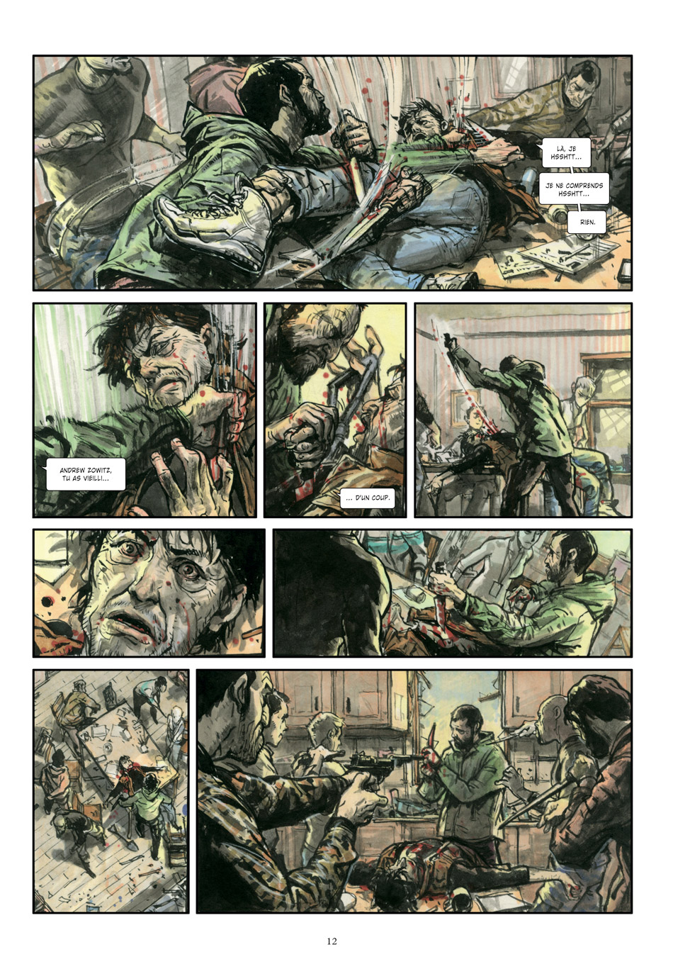
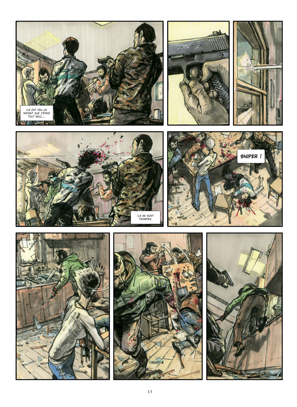
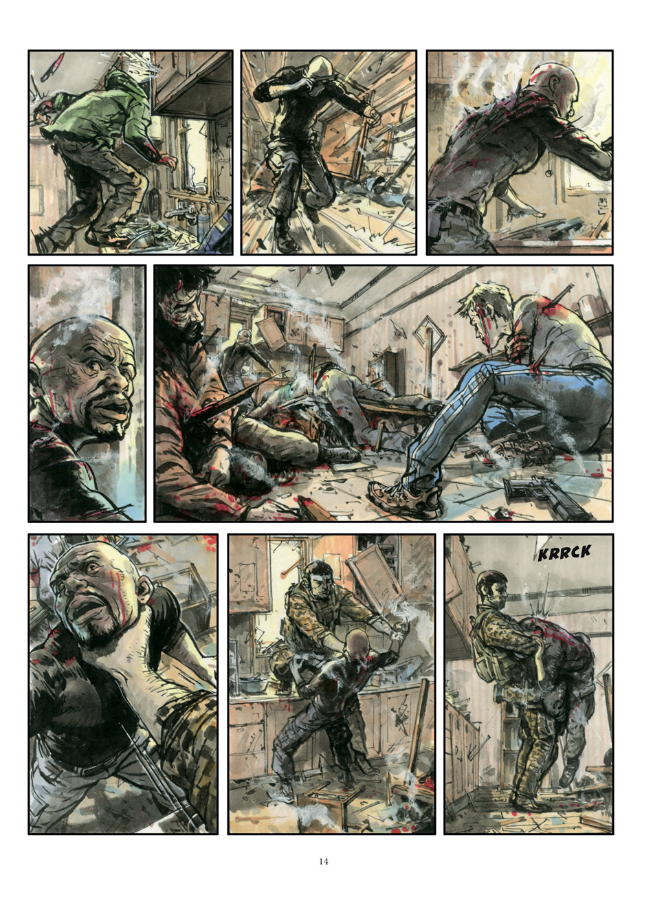
Glénat has recently released an 11 page preview of ‘Spy Games’ first installment, ‘Dissidents’, and it’s precisely what you would expect from Gi… beautifully drawn, with an effortless grasp of anatomy and perspective.
The actual 46 page comic will be released sometime next month. Until then, here is a small preview. Enjoy!







I find it funny that we just had a post about the traditional illustration process 9http://muddycolors.blogspot.com/2014/04/process-to-people-part-1.html) and now we have Kim Jung Gi who draws all over that process with a sharpie marker.
Ha! I can see your point. Though really, Gi does SOOO many life studies, it's like he's essentially doing none stop preliminaries.
Comic guys are a different breed. They need to rely so much more on their imagination, mostly out of necessity because of deadlines. But look at their cover art more, and you'll see they usually do thumbnails and studies for that.
I feel like they could use a better colorist or something, the color does not do justice to his artwork at all, Dave Stewart would be a fantastic fit, but cost so much more, or better yet keep it black and white!!!
I expected something totally different considering Kim Jung Gi does those amazing hallucinogenic perspectives in his other art. His angles and page layout seemed a bit too grounded and straight forward for such an artist. Any one else agree? Nonetheless he remains one of the best. I'd also recommend checking out Greg Tocchini's comics they are a real thrill (http://gregtocchini.blogspot.com).
I do agree that this is interesting but somewhat disappointing. Given the amazing off-the-cuff draftsmanship demonstrated on his videos and in his sketchbooks, I've thought “what could he do if he took more time to create a real comic/graphic novel?” These pages look like he did his normal sketchy routine and then someone went over the sketches with muddy colors. I know he can do refined drawings from the sketchbooks – these would have benefitted from having him do them in tight pencils and having someone else ink them, IMO, but maybe that wasn't the look they were going for. The perspective and anatomy is still there, but the finish is lacking.
Probably the worst drawing I've seen either of a Graphic Novel or a Mural. As usual in social Media land “all hype little content”. Truth be told, drawing without a prelim in this case still produces dire results. As a publisher I certainly would NOT want this style or standard in any books of ours.
Not that I suppose my comment will be included as most bloggs these days seem to have an agenda; but I couldn't agree more. If you make the mistake as I did of going on youtube comments and pointing out on his videos that despite “mark making” with out a prelim the result is nothing special you will be insulted and receive endless hate comments…
Can you tell us wich books you publish please ?
Kim himself does the color work.