Here’s a recently released piece I did for an upcoming Patricia Briggs novel, called ‘Shifting Shadows’.
Because this book is a collection of short stories, and not strictly a part of the Mercy Thompson series, the client wanted something a bit different than what they usually do. They specifically requested a close-up of Mercy’s face, and that was it.
Since the stories are short, I felt that a looser, more “brief” style of painting would be appropriate. I decided to play with some brushy paint textures, palette knifing, some digital effects, and little gold leaf on this one.
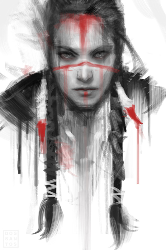
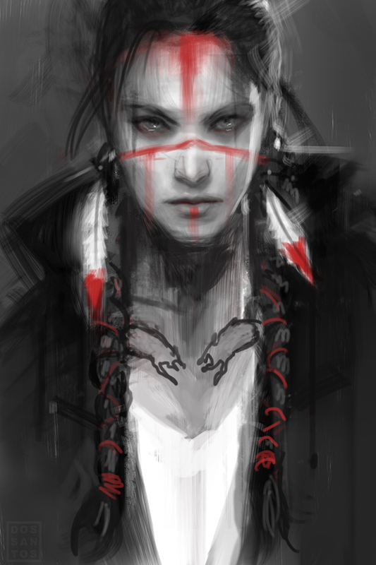
I also proposed some much bolder approaches as alternate sketches…
I really liked these alternate sketches, not only because it would have been fun to get back to painting looser, but because they also showed off Mercy’s Native American heritage, something we don’t get to do much on the current series of covers. Fortunately, some good clients liked them as well, so the sketches may yet see fruition in the form of a private commission.
I will be displaying this painting, along with several other originals of mine, at next month’s Spectrum Fantastic Art Live. Be sure to stop in!



This looks fantastic. I have to say I am particularly fond of the colours in the shadows of the skin. Love that little blue area where her braid casts a shadow. Really fun stuff!
Love the final. Love the sketches, particularly the one on the left. Hell, that's not a sketch: it's ready to go to press as a cover as is!
Dan.. I must say something. Painting loosely suits you REALLY well… I think I like this image better than most of your regular super-rendered pieces…
Thanks, Arnie. Yeah, I liked that sketch too. I was a bit disappointed they didn't let me run with it. Though, I can understand why. It really doesn't look typical of the genre.
Thanks, Louis. I actually used to paint much looser, and have been trying to get back to it recently. I'm sure you'll see more in this vain from me soon.
This is fantastic, Dan. Really like what you are doing with the abstract design elements and chopping up that space. Would love to see that white background alternate finished out.
I discovered your work via these books, and love your other works too. Do you get to design Mercy's tattoos or does someone at the publisher dictate her ink?
This is great, GREAT news! =)
If we ever meet for more than 20 seconds (you ARE in demand in conventions, after all), I'd love to hear why you ended up rendering tighter and tighter over time instead of keeping that loose touch…
Dan, your covers for the Mercy Thompson series have always deeply enthralled me and drawn me in to the books. The combination of Patti's fantastic writing, great characters and fantastic story telling combined with your covers have always brought that extra bit of magic.
Thanks, Erin. The tattoos usually tie into the narrative of the story (when possible), so the Publisher will often request a certain theme. But most of the time, it's up to me.
Thanks! That's actually my favorite spot too.
So glad to hear it, Raeanne.
I'm fairly certain ill be painting it soon. Maybe even at the IMC.
How did you paint all those incredibly straight, crisp, lines in the design?
The middle one was added digitally. All the rest were simply masked off with tape. I'm touching up the piece now, and doing the same with the middle one.