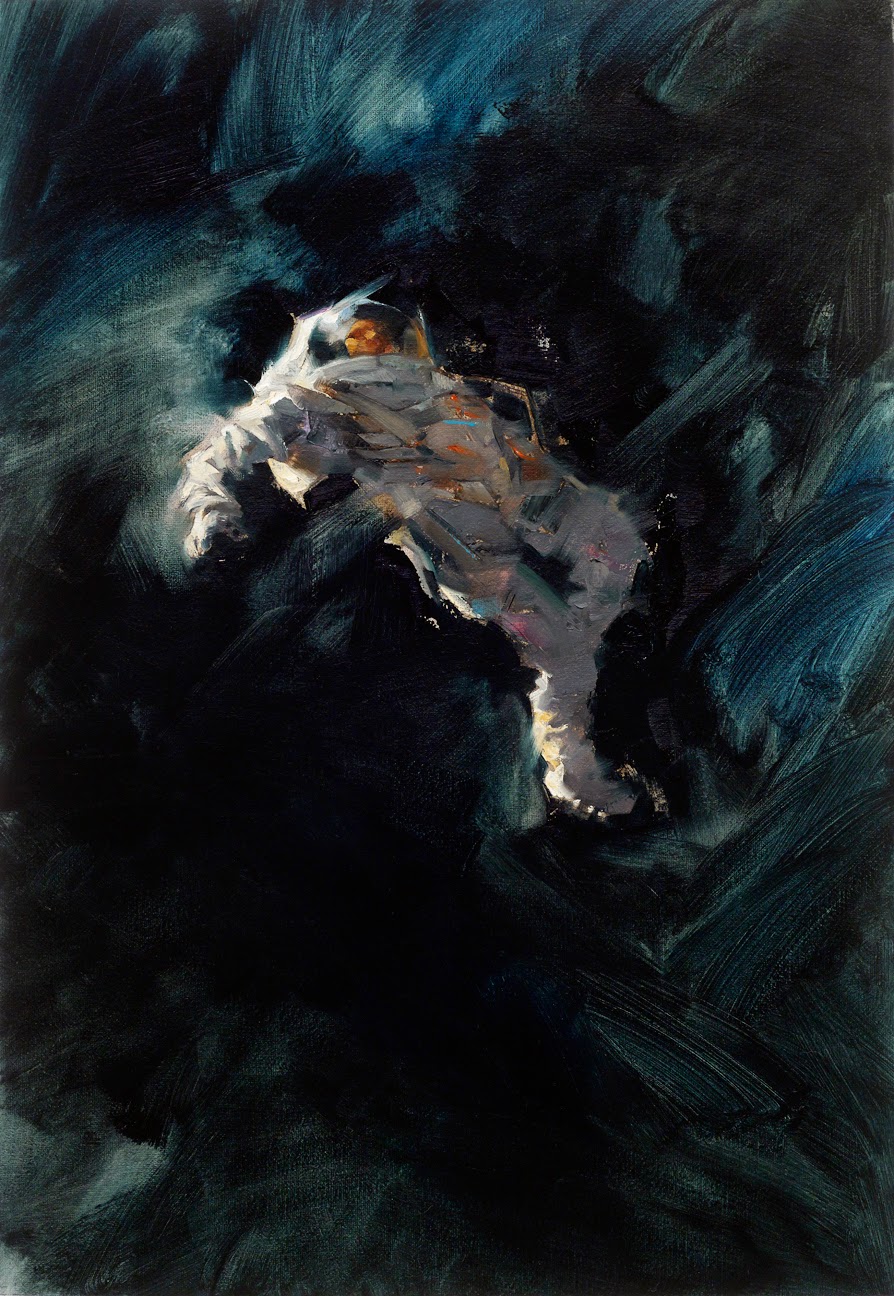
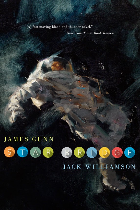
A distressed astronaut against the blackness of space.
As simple as that sounds, it takes a lot of time to get a piece like this to work. It has to read fast, it has to read emotionally, and it has to read as paint.
As a follow-up post to the latest 10 Things Using Black, this is a good example of using black in nature. Certainly some will laugh and remark that the black of space is of course a natural aspect, and using black to capture it would be a no-brainer.
But using straight black here is exactly what I did not want to do. Painting a typical star field with toothbrush flecks of paint for stars would not be the answer either. This cover idea is not about reporting what space looks like. We as viewers and potential readers already know this. It doesn’t need to be repeated.
How much time would that take to come up with? And how commonplace would that look on a cover? On science fiction book covers, very commonplace.
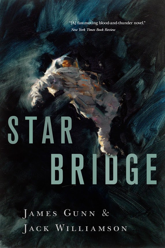
For Starbridge, by James Gunn and Jack Williamson, the art director, Irene Gallo wanted to show the astronaut’s helplessness through body language, and also the blackness that would surround a solitary figure adrift in space. Can you imagine that? Seriously. Nothing around you, at all degrees of vision, nothing but emptiness. Forget the stars. They’re just backdrop at that point. Scary.
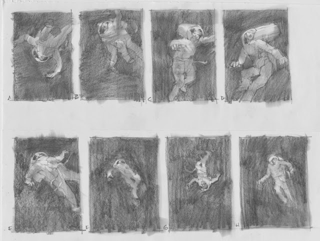
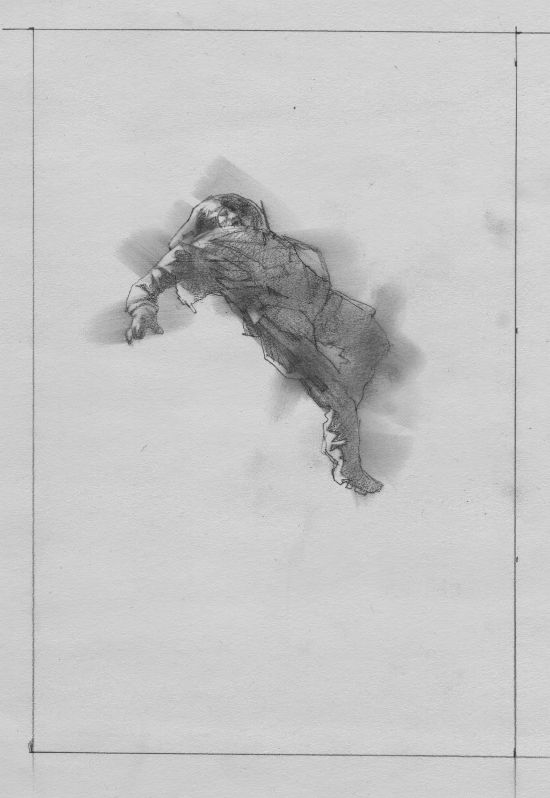
At the thumbnail stage, I realized that there are many ways to compose this. Move close in to the helmet visor, with a reflection of stars in the shield? Or back off and let the figure float helplessly in the middle? I drew several attitudes, and we agreed on this one.
The body of the astronaut could’ve been in any number of attitudes, but I wanted to see something of the face in the visor. This ruled out several angles. Upside down would’ve been an appealing approach, but I ruled that out as an awkward read for the potential buyer.
Expecting a reader to stare at the cover, going over details and pondering what’s in the picture, won’t happen. “Gee, isn’t that interesting, and gosh what’s that little thing the figure is wearing, and I wonder if that’s in the story, because….”
If that happens, I’ve lost the viewer. I want fast impact. Blam! “I want that.” If you’ve got them at the outset, they’ll take time to ponder it later. Piling detail upon detail, cluttered on a cover, will not get that response. That’s what other publishers do.
We had a number of discussions about this piece. I knew, and Irene was counting on, the idea that once it was composed, the rest was in the paint.
That’s when the black took over. The black became an emotional sweep of paint and not necessarily the black of space. I mixed several cool, intense colors into a base of black pigment, with a touch of transparent earth, and let the strokes move in and out of clarity. I wanted to see the rhythm of the black.
There are many fine conceptual illustrators in the field and as much as I’d love to work like that, and have on occasion, my concepts are subtle. I want the visceral staying power of simplicity.
Clever is not enough. Conceptual thinking is being creative with the commonplace, and staying away from the staid approach of always thinking realistically, even when, as a painter, capturing realism. This gives lasting impact.
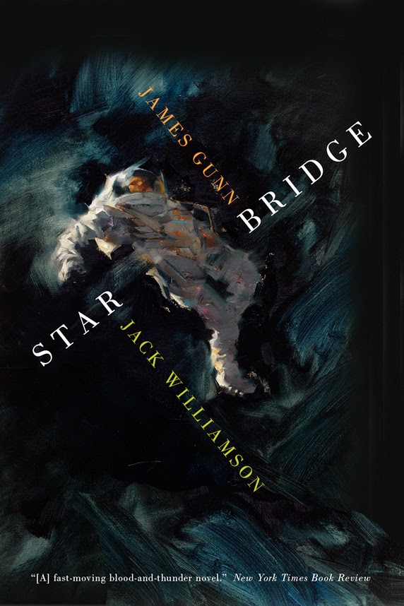
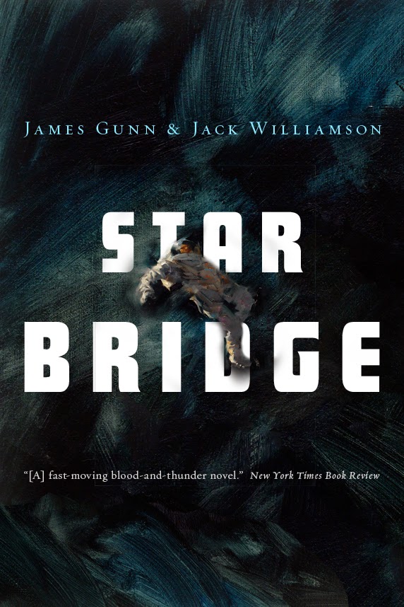
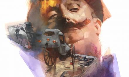
Included here are several iterations of the cover design. I love them all! We’ll see which one they use.




Amazing! Thank you so much for sharing this.
Well, it is always interesting to witness less becoming more. That is quite true in this instance.
That black really comes alive. Another home run Greg. Fantastic work!
Wow. This painting is why I'll NEVER be an astronaut. Thank you, Greg!
You really nailed this painting! powerful work!
Gorgeous work Greg! I love the lighting and gesture!
“Conceptual thinking is being creative with the commonplace, and staying away from the staid approach of always thinking realistically, even when, as a painter, capturing realism.”
Boy, did this resonate with me! I'm printing out this sentence and taping it to my studio wall. Thanks for the wisdom, Greg!
Beautiful painting, Greg. I can tell you really had a blast with this one.
BTW, the cover design with the type in the cross shape really accentuates the feeling of a body spinning in empty space. Fight for that one!
gorgeous!
I'm withJeff on this one too! The cross cutting typeface works beautifully with your cool astronaut!
Hi Greg,
The Painting is Great.
The challenge here seems to be the book cover design and not losing the emotion and isolation of the astronaut.
Have you been in situations were your painting reflects the story correctly but the book design has lost it? And then have you been able to convince them to change the cover so you get that connection back?
Thanks for sharing another of your covers, much enjoyed, much appreciated.
~ Mike Perusse
I love the energy you've achieved with the dark paint and the way the astronaut's suit seems to be fragmenting into space. Fabulous work!
This is my favorite painting of yours, hands down. Absolutely brilliant.
I don't care. I'm buying a book for the cover.
OPP GUM TAPE SUPPLIER IN BANGLADESH
OPP GUM TAPE SUPPLIER IN BANGLADESH
OPP GUM TAPE SUPPLIER IN BANGLADESH
OPP GUM TAPE SUPPLIER IN BANGLADESH
Can I buy a print pof this original painting? Dear lord it's incredible.
Thanks all!
Casey….email me about the print: manchess@mac.com
Mike+Stacey…love to hear that. I think the publisher would, too!
Mike…book design is completely up to the publisher. We're hired to paint what they ask for, so no, I haven't tried to convince a publisher to make the cover different. I stay very open to interpretation in that regard. It's really not about painting “as an artist” in these situations. It's about your service to the client….your client, which is the publisher. NOT the author, NOT the book.
Sounds odd, I know, as I usually talk about doing the book a service by painting good imagery for it, thinking about the author and the sales of the book. But that's all part of the process of getting to a good painting. Once you paint the image, it's back in the hands of the publisher and at that point, you're done. No matter what you may think.
Very nice post, impressive. its quite different from other posts. Thanks for sharing.
anti skid tapes supplier in india
Beautiful painting, Greg. I can tell you really had a blast with this one.
———-
خدمات تخزين العفش من الخدمات التى لابد ان تقم على افضل ما يرام فاذا كنت تعانى من اعمال التخزين التقلدية او تعانى من البحث الدائم عن افضل الشركات التى تساعد فى التخزين دون ان تجد افضل ما تتمناه فلا داعى للقلق من شان التخزين الان وعليم ان تتصل وتستعن بينا على الفور فى القيام بكل ما تتمناه فالشركة تعتمد على افضل الخدمات المميزه فى نقل العفش والحصول على افضل النتائج فنحن نعتمد على افضل الطرق المميزة من القيام بالبحث عن افضل المستودعات المؤمنة التى تساعد فى الوصول الى افضل النتائج فالمستودعات يتم اختيارها على حسب بعض الامكانيات التى تتوقف على حسب اختيار الخبراء وعلى حسب درجة تحمل المخازن الى الزجاج والمواد الرفيعه والاهتمام بدرجة حراره تحمل المخازن وغيرها فاذا اراد ان تقوم بكل ما تتمناه فاستعن بينا على الفور فى القيام باعمال التخزين للعفش والحصول على افضل النتائج المميزة من الحفاظ وحمايه العفش من التغيرات التى تحدث نتجة للتخزين الغير مالوف وجوده على الاطلاق .
شركة تخزين عفش بالرياض افضل شركة تخزين اثاث بالرياض فهى لا تعتمد فقط على القيام باعمال التخزين بل تسعى الى البحث دائما عن كل ما هو مميز من اجل ان يتم الحصول على افضل النتائج فى حمايه العفش ضد الكسر او التلفيات او التغيرات التى تحدث نتيجة لاعمال التخزين التقليدية فاذا اراد ان تشعر بالتميز وتحتفظ بالاعفش المكتبى او العفش المنزلى فعليك الاستعانه بشركة بسمة الرياض افضل شركة تخزين عفش .
Our expert designers are dedicated to producing layouts that ensure your design is distinctive to our clients’ liking as well as functional. We warmly invite you to browse our website or visit our freshly remodeled showroom to witness for yourself how Cabinet & Stone City can provide luxury without the cost!
Maintaining the safest driving records on the road, our drivers are the company’s most valuable assets and the reason for our growth and success.