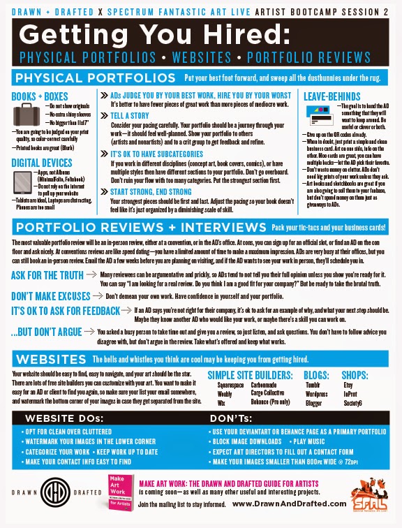
Since the Bootcamps were so popular at Spectrum that we ran out of prints, we promised to make pdfs of the one-sheets available after the con—now revised after a bunch of input from artists and art directors alike.
Now we’re releasing the one-sheet from the second Bootcamp: Getting You Hired: Physical Portfolios, Website Portfolios, & Portfolio Reviews. This is the topic we art directors probably get the most questions about, and we’re happy to share all the information with those of you who couldn’t be at the Bootcamp.
We’re still hard at work on the book, so definitely let us know in the comments below if there’s anything you want to make sure we cover on these topics (or any Art Biz topics) in the final guide.
These one sheets are both a microcosm and a starting point for related sections in the book, so we want to know if you’re left with deeper questions. Ask questions or make suggestions in the comments below, and we’ll make sure we’ve got all the bases covered. We want this book to be the most useful stack of paper on your bookshelf, and we know we can do it together. This is a group effort, and many art directors and artists and students and lawyers and accountants and assorted other experts are all contributing to make this book the one place you can find all the essential information about growing a solid career as an Illustrator or Designer.
You can download the one-sheet pdfs for Bootcamp 1 and 2 at the Drawn + Drafted website. And add yourself to the newsletter below to be notified when the third Bootcamp one-sheet is released, and to be informed when the Make Art Work book is ready to go live on Kickstarter:


I love concise and well designed information like this! It gathers all the different tips you might have already heard here and there – plus several new ones – on a single simple page for future reference! I'm also looking forward to the book very much.
One thing that surprised me though: on the website don'ts you say no pictures smaller than 800px wide. Is this irrespective of orientation? Do you mean at least 800 px on the shorter or longer side? This is something I need to address on my website – my pictures are all 700px on their longest sides. This means that (on my screen at least) they fit nicely on one screen inside the browser, no scrolling necessary. My thought was that clean presentation was more important than being able to see more detail, that wouldn't give me the job anyway if the big picture wasn't good. Could you elaborate a bit on picture size on the web, and how you like to view pictures online?
These parameters are just a base recommendation. I am sure 700px are fine. The theory behind that stat is that ADs and clients need to download your work, and either attach & email it to people, or print it out for meetings. You want to make sure your images are large enough that that can be done effectively – they don't have to be so hi-res that you're worried people are going to rip you off, just big enough that they're easy to see, and can print without looking TOO crappy to see.
Thanks! That makes sense.
These sheets are just perfect, Lauren! I wrote my thesis on e-marketing and evolving audiences and I can say with full confidence this is *exactly* the kind of info that is missing from so many art school curriculums.
For individual artists, this is such gold! I'm signed up for drawnanddrafted and am looking forward to the rest of your sheets! It's fascinating to get this insight from working AD's in the industry. Thanks to you and Mark for taking the time to do this!
Sharing this everywhere that I can!
Oh and another thought for you. This may be beyond you and Mark's expertise, but a section on the value of art agents and artist reps (how to find them, how to know if they are good, the pros and cons of using them) would be of interest to me as an illustrator. It may be knowledge you could employ other experts on if you're extending to book to this arena as well. Best of luck, either way!
awesome! glad to be of service.
oh absolutely, we'll be covering that. meanwhile, there's a previous MC post: http://muddycolors.blogspot.com/2013/10/agents-who-needs-em.html
Awesome stuff! If everybody does this, makes things easier for both directors and artists and less headaches. Are you going to be tackling things such as dodgy art tests/free work scenarios and other traps that people don't necessarily know about, and the importance of the contract?
All the best!
Please include info relating to the business. Copyright. Different types of employment (work at will, staff, contractor, freelance, commissions, etc.) The need and role of lawyers, agents, reps, etc. Contracts. Is fine art dead? Portraiture? How to start & set-up your business.
Why shouldn't images be less than 800 px wide? Just curious about this specific number.
THANK YOU FOR THIS!
(See above comment answered)
Thanks for the link, Lauren! I somehow missed that post. Will definitely check it out!
I started switching away from my wix account To my Behance account because my wix page does not allow for saving my images as you said ADs like to do. Could you possibly elaborate on what aspects make Behance accounts less desirable if they are used as specific portfolio sites and not just for art dumping? And Behance has a ProSite feature so would this be on the same level as a free Behance account?
So when did DeviantArt and Behance become unacceptable? And why? And why does a physical portfolio take precedence over virtual? Is it the fact that you have to spend money to keep a physical portfolio updated, especially when one is producing work constantly, that makes it acceptable? I honestly cannot keep a physical portfolio up to date without a financial burden, so choose to use (you guessed it) DeviantArt and Behance. Is it accessability that makes those sites “bad” for ADs? I would love to know, because if I am sending portfolio links that ADs ignore, then I need alternatives other than physical. Thank you.
Very nice article, I enjoyed reading your post, very nice share, I want to twit this to my followers. Thanks!.
Howtostartcleaningbusiness.net