A second set of paintings that changed my thinking, and influenced my approach to making pictures.
Influential Paintings 2
Wednesday, May 28th, 2014
Greg Manchess
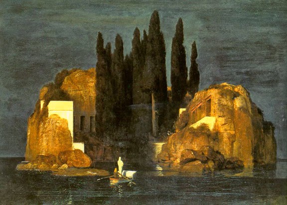
Arnold Bocklin…Isle of the Dead…shows me that creepy can be subtle, and make me curious…..
See if there isn’t something that speaks to you as well in these examples.
Also think about this: how looking at different mediums can confuse and influence at the same time. How studying one medium, watercolor for example, can influence the use of another medium, such as oil paint. Proficiency with different media comes from studying all media.
Picture suggestions welcome.
NC…patterns of light, shadow, and color establishes mood….as well as just the right moment….
George Lambert, Chesham Street, 1910…..shaping brush strokes to mimic form and dimension…
Sargent…simple is better….and fascinating….
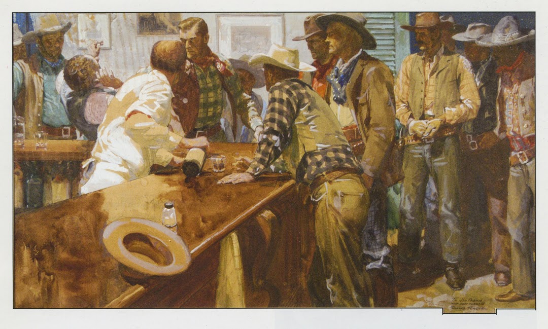
Donald Teague…composition within chaos directs the viewer…..
Roger Coleman’s book of beautiful watercolors, “Downland”…value is critical….
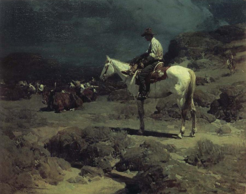
Frank Tenney Johnson…less is more, strokes define shape, and moonlight is amazing…
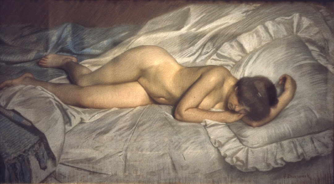
Frank Duveneck…one of the greatest nudes of all art history…and it’s pastel. A valuable lesson in using chalk…at the Cincinnati Art Museum…
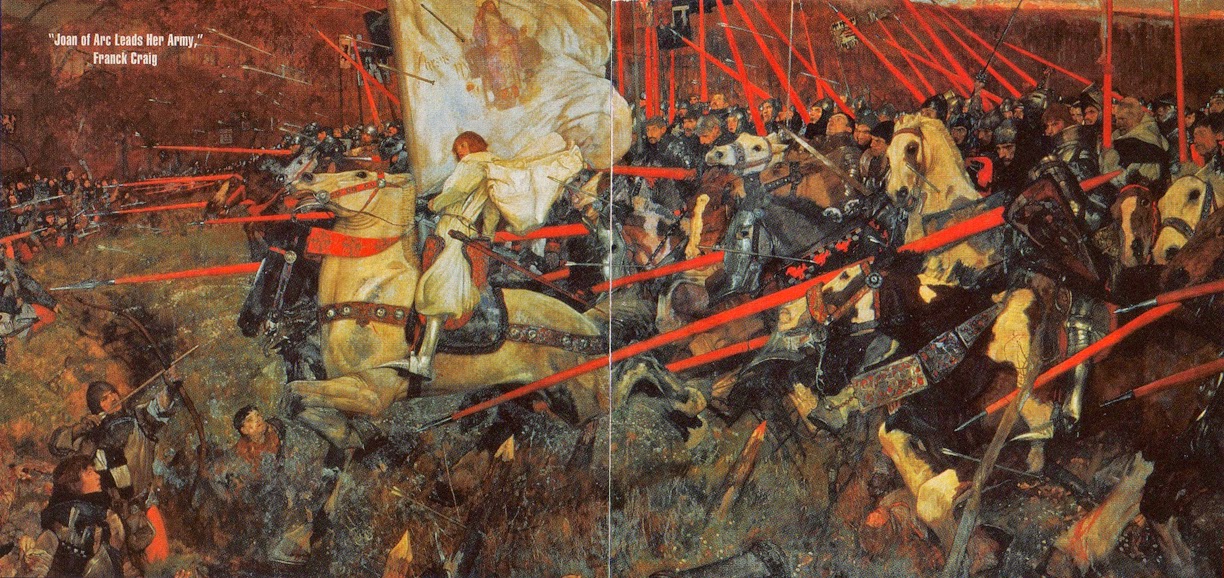
Franck Craig…just–wow. Again, battle paintings must be designed to work well….
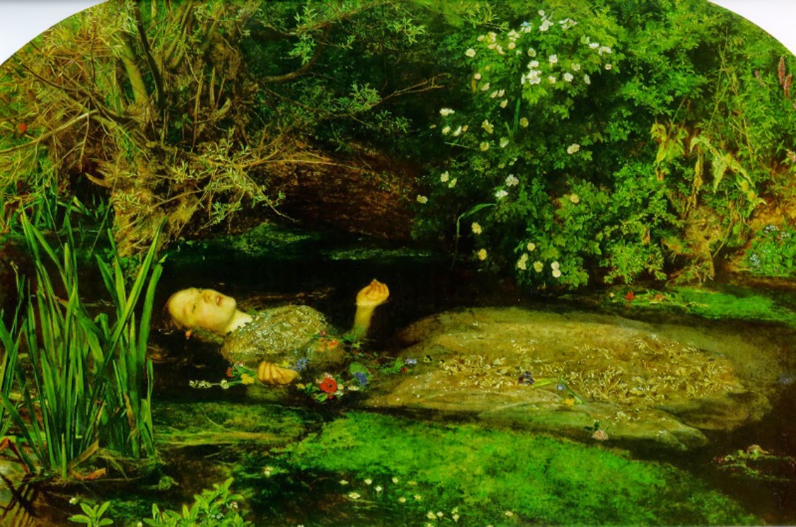
John Everett Millais, Ophelia…in one painting I learned that detail must have a purpose in a picture…here, it’s about weightlessness….
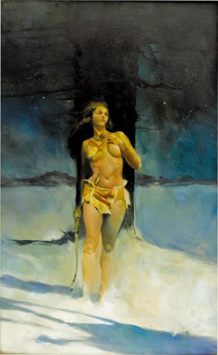
Jeff Jones’…so simple and bold…and it doesn’t need to make sense to knock me out…
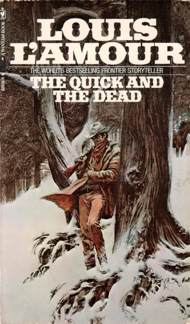
H. Tom Hall…makes acrylics look easy, even when painting snow….simple poses can create story and again, curiosity–very important on a book cover.
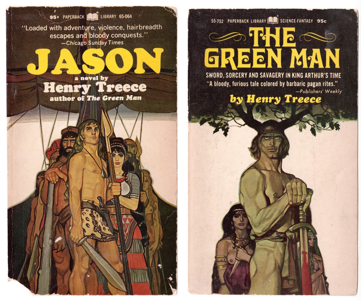
Graphic design and sculpture, coupled with unique shape drawing. (I’ve lost the name of this cover artist. If anyone knows, please let me know.)




Look up William Wray's urban landscapes. Seriously.
http://williamwray.com/urban.html
These are all great examples, but that one by Teague is just blowing me away…just awesome. Thanks Donato!
Er….you mean, Greg? : )
As always Greg, inspiring. That Craig war scene is amazing. That Red!!! and Colman's works is new to me. Will track that book down. And if you want another suggestion you know how I love to push 60's Bernie Fuchs. It is work I wish I saw a lot sooner, design, value, expressiveness etc there is a reason he was a giant! https://www.flickr.com/photos/mattdicke/5515134965/in/set-72157625369781729
Hi Greg,
the artist for the Treece books seems to be a Michael Leonard
Love FUCHS, Matt! Push away! Will have to do a post all about him sometime. David Apatoff has written about him quite a bit.
Hey, thanks, Mike!
Actually… I don't think I have ever seen you and Donato in the same room together (except at IMC, but I was pretty sleep deprived, so that probably shouldn't count). You are about the same height, similar build… I think the facts are pretty clear. Listen, no LISTEN! Donato and Greg are indeed the same person, probably named Grenato Mancola. Well played.
*Your post and this reply will look funny if Daniel deletes his post. 🙂
Another to add to your list Greg is Tom Browning ( http://tombrowning.com/GalleryMain.asp?GalleryID=45408&AKey=N7FHPS2F )
Well greg when you do want to do a post on Fuchs feel free to use some images: https://www.flickr.com/photos/mattdicke/sets/72157625369781729
I have heard there is a book in the works but no date yet when it might see print.
Steve Huston
A current artist, but one of my favorite painters of people in motion. Even his drawings and sketches of still figures look like they're moving .
http://1.bp.blogspot.com/_QlioU6TYhnQ/TUyLPOvCNGI/AAAAAAAACZ4/eqQL-3Rlp_8/s3200/Steve%2BHuston%2B%25285%2529.jpg
Yup