The phone rang.
It was Charles Ardai, art director and publisher of the Hard Case Crime novels. The conversation went something like this.
“I need a cover with a woman on a bed, nude, looking very sexy,” he tells me. “You can do whatever you want.”
I reply, “I like this job already.”
“But…she may be sleeping, or could be dead. We don’t know. Better that she’s alive though.”
“Uhh….that’s a little tricky.”
“Yeah, I know. That’s why I came to you.”
“What’s the title?”
“So Nude, So Dead.”
“Get out.”
So began one of my most challenging, yet fun, paintings.
I like working with Charles as we both visualize covers in very similar ways. We almost get the same images popping into mind, so it’s very easy to work with him. He’s already halfway there. He knows where I’m headed in the sketches, so exploration is fun.
Then there’s this one, with the word ‘dead’ already in the title, and it had to read just right. The hard part was, there are many ‘just right’ poses and angles to pull this off. And not say, ‘dead.’
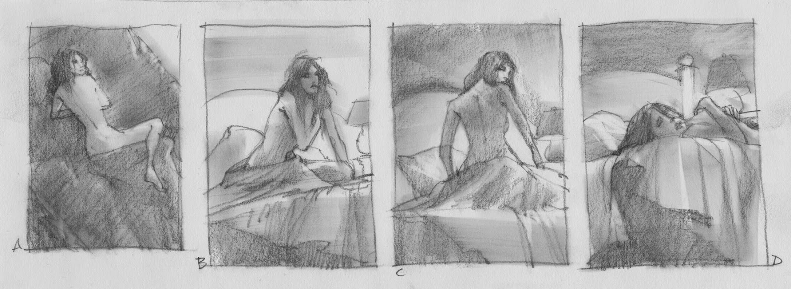
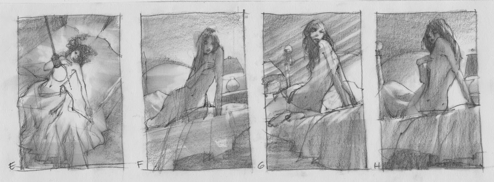
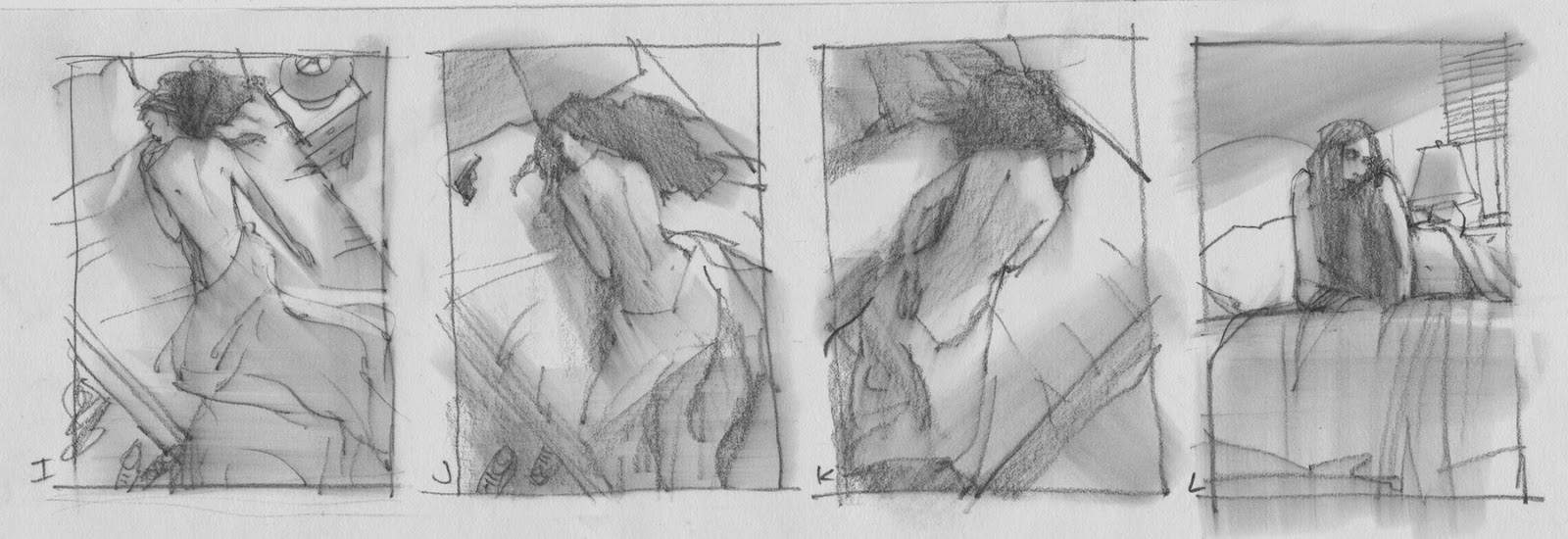
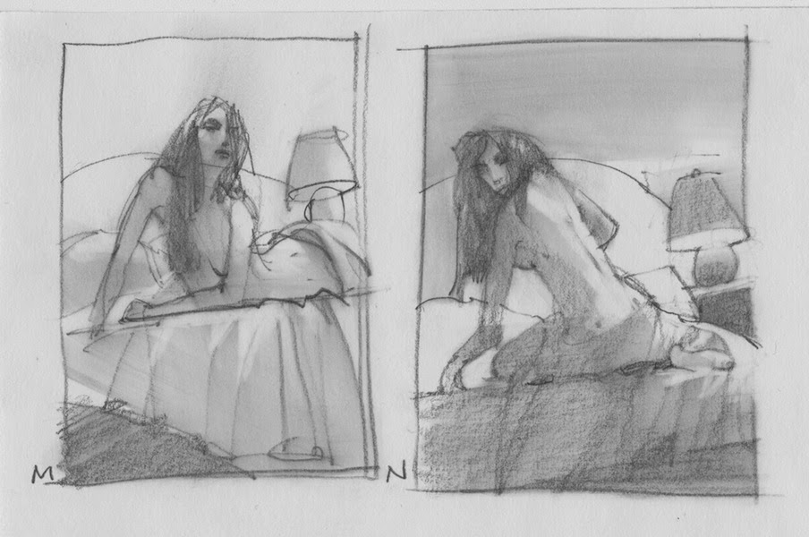
Thumbnails. I started with the idea that we spy the scene from just below the surface of the bed, allowing me to raise the figure up from the sheets, signaling the viewer that she has just awoken and is, in fact, alive. I wanted to telegraph ‘alive’ as much as I could.
Exploring for angles in my thumbnails, I moved around the bedroom in my head looking for alternate perspectives. When I found myself at the ceiling looking down at the scene, I thought it might be nice to see her stretched out. That’s when the light came on. Figuratively.
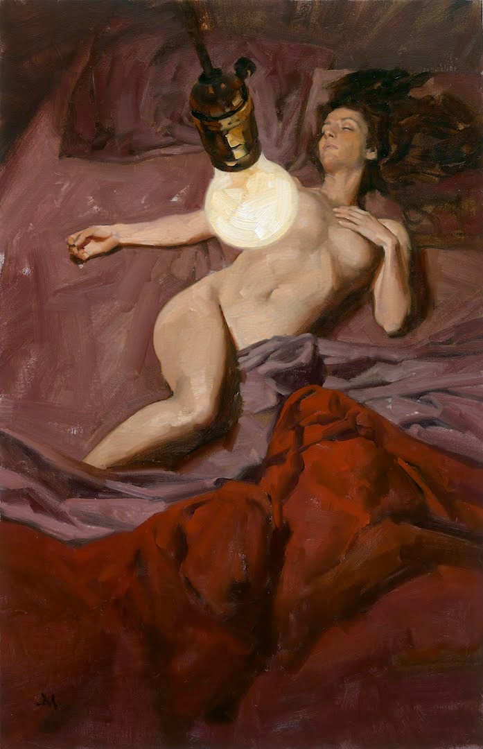
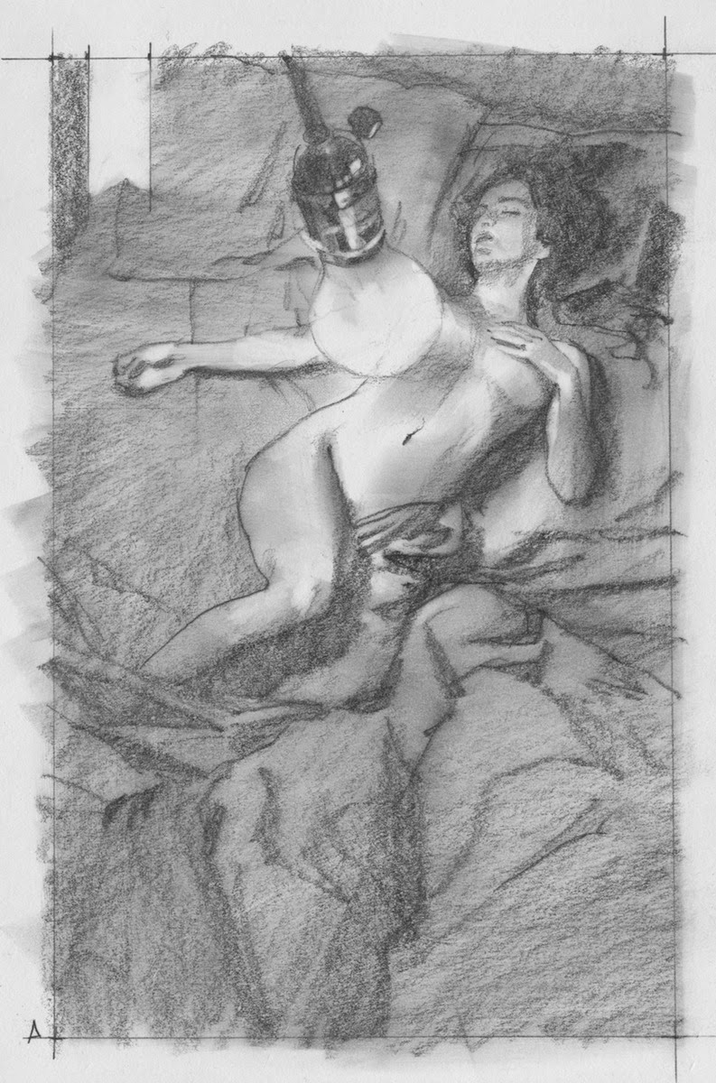
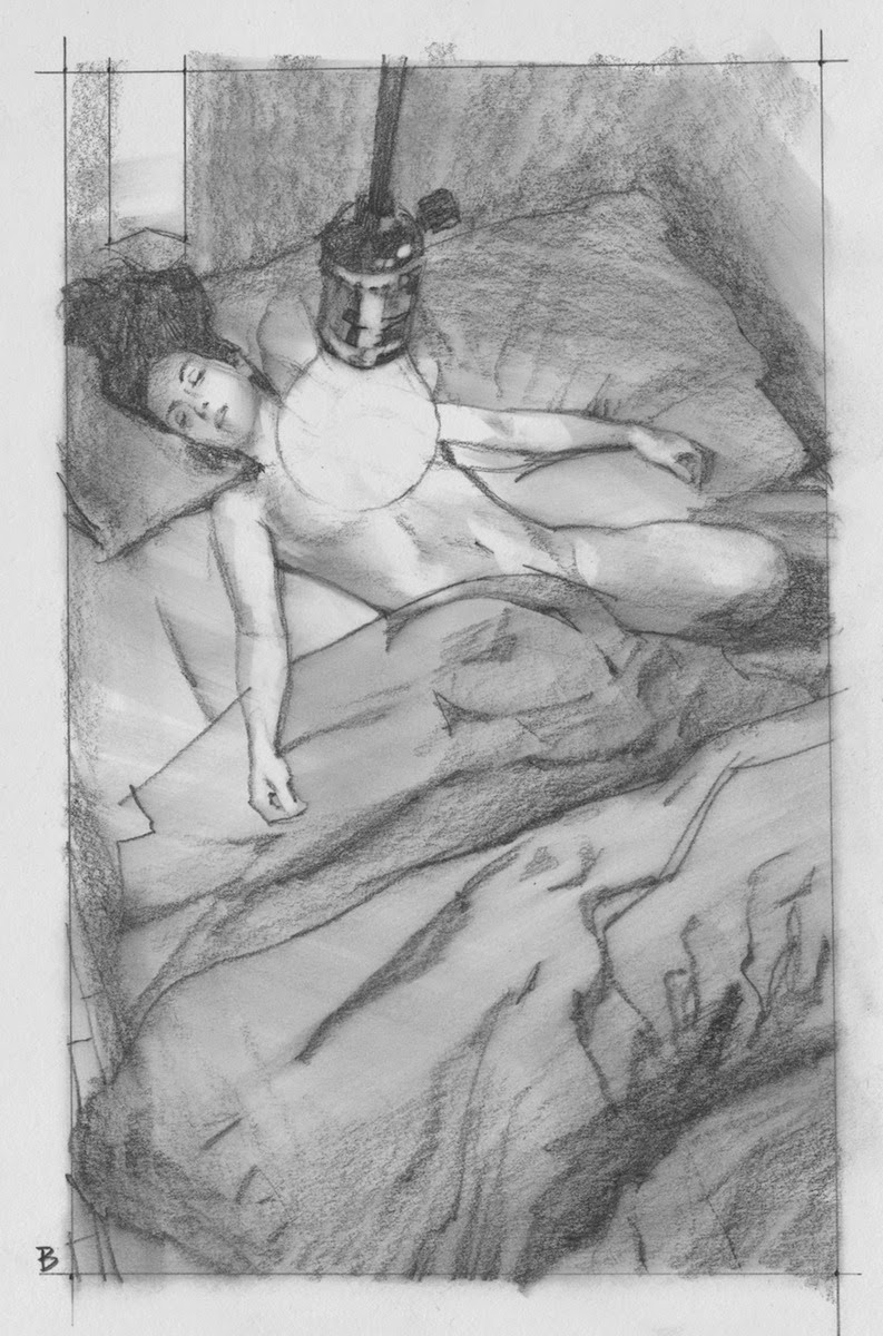
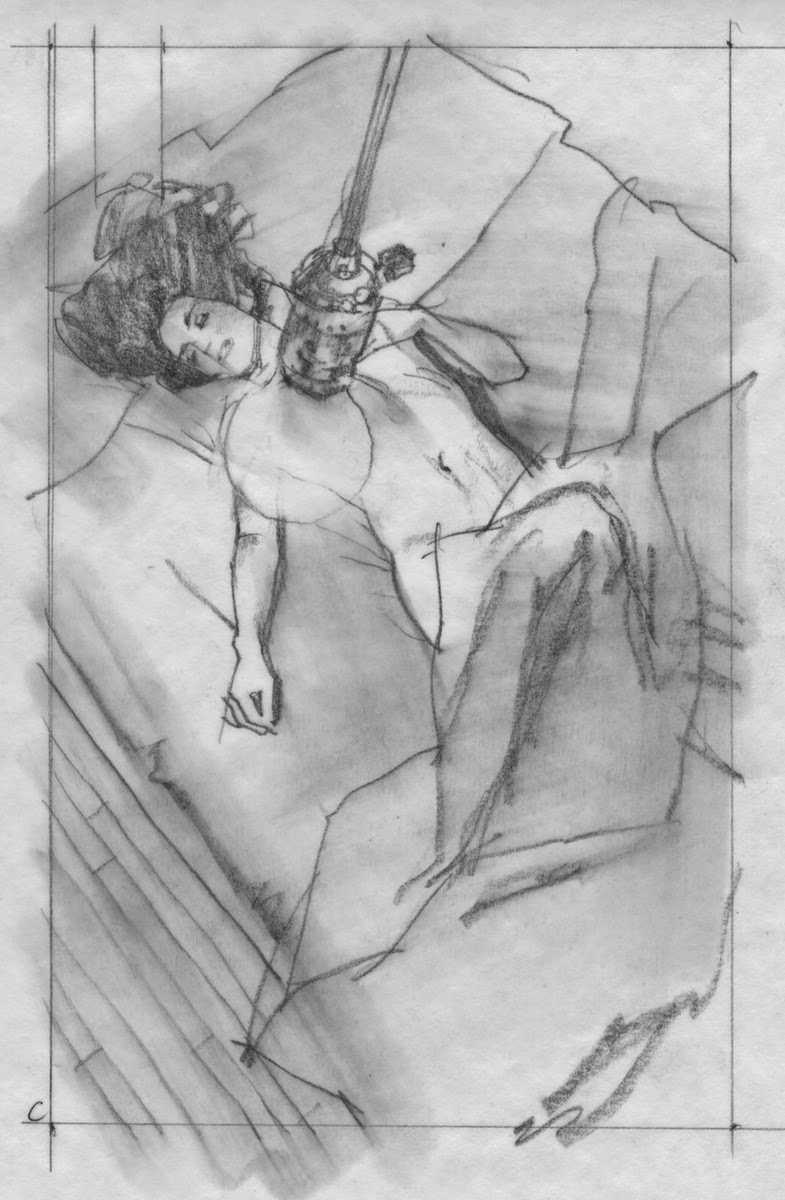
Maybe it’s a dingy hotel room, and there’s a bare lightbulb dangling overhead. I can use the bulb on a cord to cover her nakedness ever so slightly, and use the sheets to cover the rest of her. I tried a study and continued on with other ideas, thinking Charles would laugh about that one, but not be interested.
I met with Charles in NYC, and that was the idea he responded to the most. It read well, but he wondered if I could pull it off. I told him it would come down to how I posed the figure and the angle on the bulb.
I got in touch with a favorite model. (She thought I was kidding when I told her the title of the book.) With the thumbnail as a guide, I set up lights to mimic a bare lightbulb glow on her and shot from the top of a ladder while holding my finger in front of my eye to see how the bulb would block certain parts of her anatomy. (sorry…won’t be sharing those shots here.) She was perfect and we captured the essence of the image on the first shot. I took several dozen more, however, using the other sketches in case the publishing house, Titan Books, didn’t like this idea. (read: ‘too naked.’)
I bought a light fixture at a local hardware store, lit and shot it for reference, then combined them together into the finish pencils. I drew several so that Charles would have a choice, and he could help me make a decision about the right pose for the strongest cover.
There was type to consider, of course, and I decided to use darker bed sheets so her skin would contrast on the cover, as well as the reversed type. It had to read very fast.
I got the ‘go ahead’ with no changes. There were a few minor adjustments to the final piece, just a couple of tweaks, but ultimately, the cover allows the viewer to wonder: dead or alive?
Either way, she is definitely ‘so nude.’





So “funny”… You could show a child holding a gun in a book cover but OMG you can not show a woman's nipple…
I don't get it 😀
You definitely nailed this one Greg. Fantastic work!
So good Greg. For some reason this opened in the middle on my browser and I saw the sketches first. The lightbulb was just so good. Of course add a little color and voila. Or did you actually have to work for the finish? So good to see you at SFAL.
Download The Amazing Spider Man 2
Fantastic job
I think the composition you ultimately chose looks the most natural and least “posed” (in terms of lightbulb placement) out of the bunch. Fantastic job, and you managed to keep it classy too
The final composition also reminds me of people who recall near death experiences, they almost always say that they can see themselves while floating from above. Beautiful art Mr. Manchess. Love the thumbnails.
Amazing thumbnails!
True. They also mention the light. Now we know it's an exposed incandescent bulb.
I might have to buy the book just for the cover! Absolutely beautiful!
Brilliant.
Excellent post, great execution of a tricky brief and thanks for sharing your process
great piece greg! love to see all the thinking you do in thumbnail stage…
Thanks, you guys! I treat these covers more for their figurative, gallery painting potential than “just a cover.” I learned that from Gary Kelley years ago that there's much potential in every assignment to be a classic piece, or even a portfolio piece.
Good to see you, too, Bill (and Lauren 🙂 at SFAL! Another great year of great work. There's so much skill out there. Dang! Your pieces looked great, Bill, but I didn't get to study them. Thanks again for the sketchbook, tho….and lemme know when you'd like me to come out to Idaho and do some art blabbin'. Looking forward to it!
And Lauren….isn't it odd that most of the industry believes that when an artist 'thinks' that they must be thinking of something completely different, or abstract. Getting a concept to work takes as much thought when working with commonplace elements, too. Like a figure lying on a book cover.
I grow tired of the common sense thinking about thinking (!) in the market….
Ooo, I feel a '10 Things' coming on…..: )
Download X Men Days Of Future past