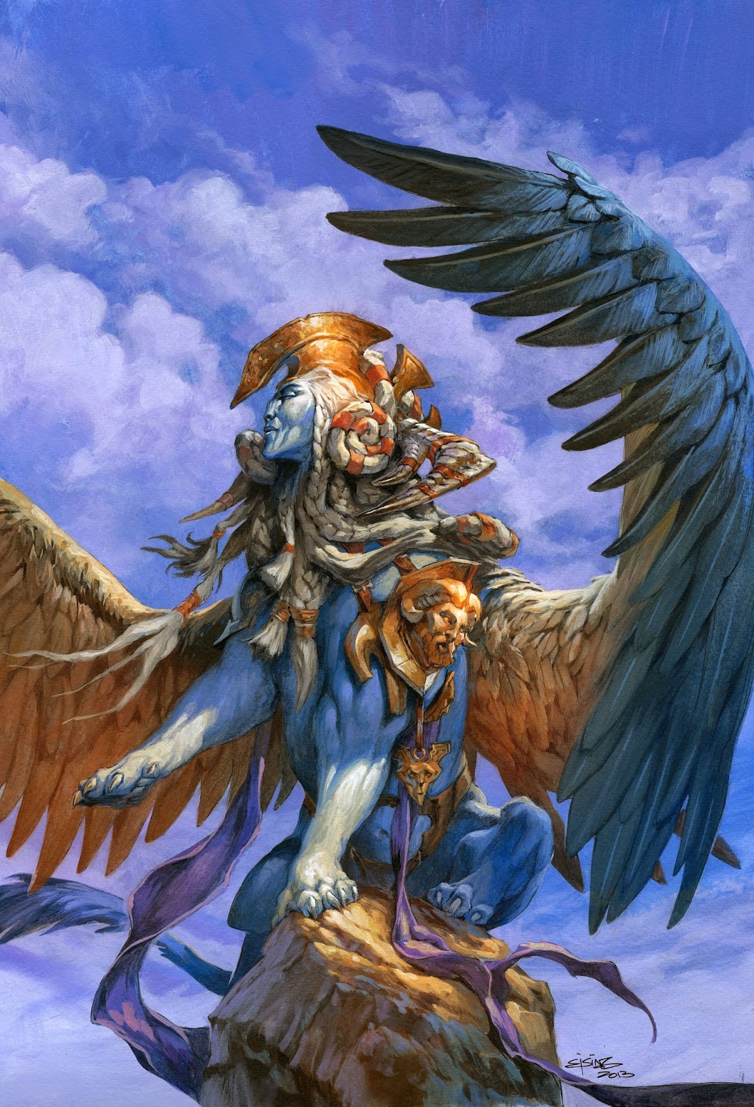
Today’s artwork is yet another painting I did for Magic the Gathering. It is for a Token card and therefore the format is tall instead of horizontal as usual. The assignment for tokens is always a portrait of that creature.
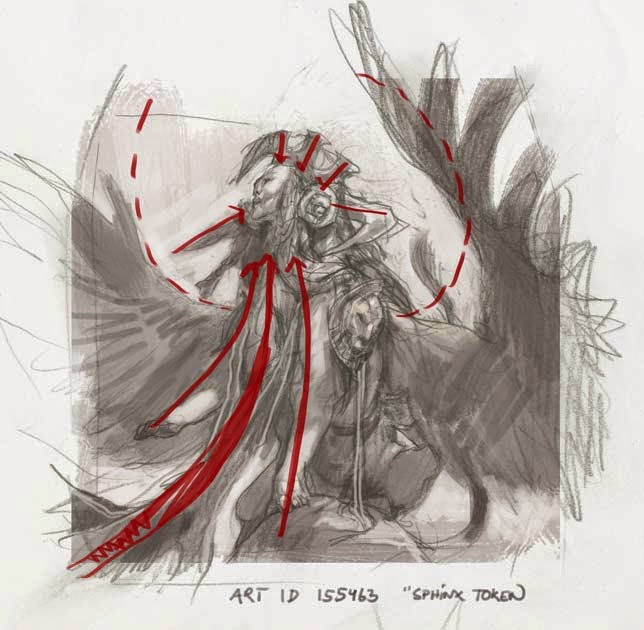
The style guide had a picture of an old male Sphinx, but since I was given the choice between either male or female. I went for the opposite than the style guide, so I could go my own way. My thoughts were centred around a somewhat static and royal pose. i thought that would suit a creature the size of an elephant – and with the craze of a female lion. So instead of trying an aggressive attack pose I placed her on a pedestal like rock. I just had a long period of refusing to draw beautiful Hollywood like people, especially elves. And I had just finished an elf painting with him looking very non-human and with alien features. I was happy with the way it turned out, so in sketching the sphinx face I was trying to make her look Nubian with a very flat forehead and overly large cheekbones. Like an Egyptian statue. Turning the face up and looking around as if everything is beneath her. I used the outstretched wings to frame the figure and also used the forced foreshortening in her left wing to draw the eye into the picture. You might notice how many of the lines in feet, cloth and crown piece is pointing into the focal point of the face.
I added all the equipment and decoration and went on to my favourite part: painting.
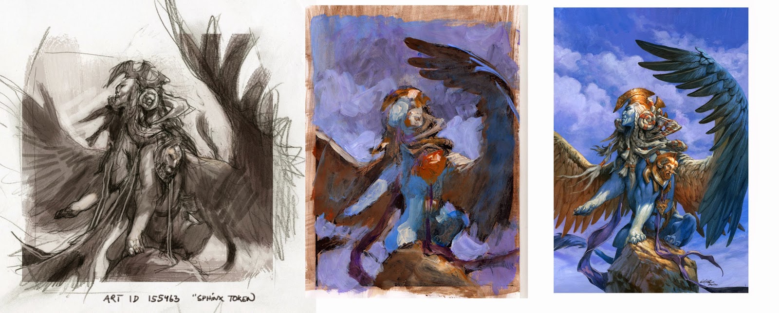
But before I started sloshing wet acrylic onto my carefully and precisely transferred sketch, I tried everything out on a print. This Magic set was themed around ancient Greece, so I new I had to make it a clear sunny day. I also had to make the Sphinx body blue. To be honest I chose the safe colour theme. And you can say it out loud, I am not being offended: “Somebody ought to take that purple away from Jesper” I cannot help it but like the way orange and purple blue play together. So I more or less build up all of the painting in Orange-brown and “Light blue Violet” I find it easing to the eye to use so simple a colour palette. What I really thinks works well with the colour rough was the blue area of her right leg standing out from the warm brown wing.
After seeing everything works in a rough I went straight to painting. I masked out the figure with frisket film and went to work on some nonrefined defuse clouds. Working with the figure masked out, makes me much more reckless and relaxed since I do not need to paint around anything. But after a while the figure area with the masking film, is completely covered in paint and I have no longer an idea of how this sky will work together with the figure. When I somehow thinks it is done and peel away the masking film it is an exiting moment since going back and remask is not possible without ruining the paper.
In the painting process I lost a lot of the alien looking features and she ended up looking more human than I had planed. I also chose to aboard the purple background and changed it into the Cyan blue of her body to simplify the palette even more. The size of the artwork when printed on a card is 6 x 4.5 cm so anything that will make the image simple and clear is helpful.
I really whish I had kept the ultimate foreshortening of her left wing. I cannot remember why I changed it, so it points to the left instead of out towards us. Maybe I will go back in and repaint the wing on the original.
The final painting is acrylic on paper, size 30cm x 25cm.



Gorgeous work Jesper…maybe you changed the wing because it looked too similar to the card it's from, Hour of Need? When are you putting that one up by the way? It's one of my top 5 favorites from the set and I can't wait to delve into the details 🙂
14 days. My next article will be for the card that makes the tokens.
Jesper’s Sphinx Token art is a striking blend of bold design and vibrant colors, with a unique Nubian twist that makes it stand out!