I’ve asked three brilliant sculptors to select one of their pieces and walk us through it, starting with the money-shot and then taking us on a tour of the hidden beauty and mysteries few, if any of us, will ever get to see. To read the previous posts in the series, click here: Part 1, and Part 2
I’ve been a fan of Forest Rogers’ work for some time. I had the great pleasure of getting to know her in preparation for SFAL 3 and while at the show. She is smart, funny, charming and gracious. You get a sense of the beauty and depth of her art from pictures. But only seeing her work in person do you feel the poignancy, delicacy and honesty that imbues each piece. The images of her work stay with you in your visual memory. The emotion lingers in your heart forever.
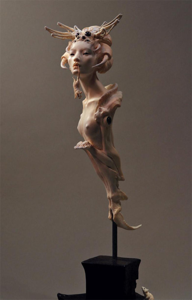 |
| “Goblin Spider” Kato Polyclay with garnets, approx. 15″ (w/ base) |
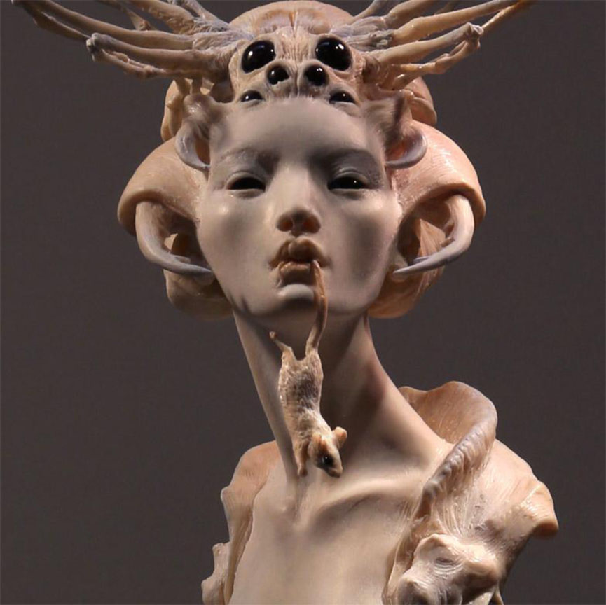
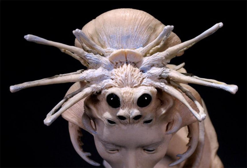
“Goblin Spider” was inspired by a folktale bearing that name, and by traditional Japanese ukiyo-e prints. Elaborate hairpins made me think “legs,” of course. I also noticed that many beauties were depicted holding a bit of folded fabric or tissue in their mouths. This was a come-hither symbol, sufficiently demure to get past court censors but widely understood as erotic (don’t attempt it with Bounty Duratowel — it loses in translation). Thus, mouse in mouth.
The full figure photo below was taken at a three-quarter angle in an effort to show as many elements of the piece as possible in one view: the human and arachnoid faces, the mouse in the mouth and the mouse below at the back of the mouse-chewed base.
The full figure photo below was taken at a three-quarter angle in an effort to show as many elements of the piece as possible in one view: the human and arachnoid faces, the mouse in the mouth and the mouse below at the back of the mouse-chewed base.
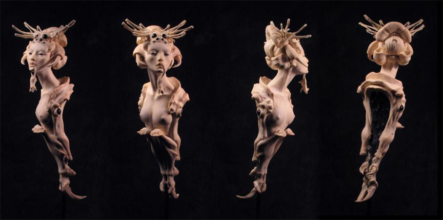
Since I find I rotate an object more or less constantly during its creation, striving for engagement and harmony from every angle, a single 2-D view of a 3-D critter does feel limiting. Perhaps this is particularly true when a sculpt is designed to present sharply differing compositions when viewed from different angles. A somewhat fragmented or abstracted piece, like this one, doesn’t benefit much from our general knowledge of the human figure — i.e., the nature of the back cannot be automatically inferred from the front. That’s one reason I put together the four-view rotation below — it better answers the question, “What the heck is that?”
One thought has stayed with me from a class in stage direction and actors’ blocking: there’s a theory that, at least in cultures where text is read from left to right, a figure that faces or moves in the opposite direction (from viewer’s right toward viewer’s left) expresses more dynamic tension and force than a figure that flows left to right. Having an affinity for stress, I find I often sketch and initially compose sculpts facing distinctly leftward. When a sculpted figure doesn’t favor one direction or the other in its innate composition, I wonder whether the choice of direction in a single 2-D photograph influences the kind of energy projected by the piece. Do we storm the Bastille leftward?
Then, there’s the full-frontal view, as below. A face to face shot can make a figure feel more confrontational or more intimate, or both. There’s no evasion; you meet the creature. If the sculpt has achieved life or a soul or whatever you want to call it, it’ll be looking back at you and thinking you know not what. That can be nicely unsettling.
In Goblin Spider’s case, it emphasizes symmetry.
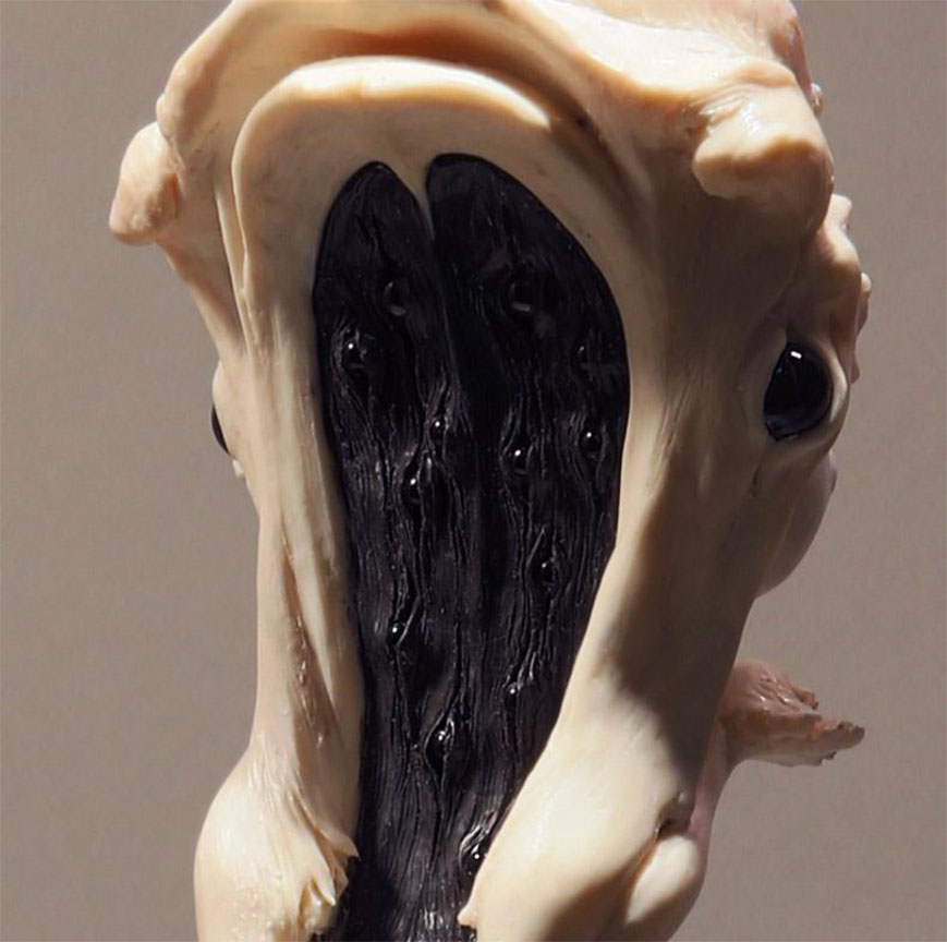
The backside of this piece puzzled me at first. I wanted some meaning, not just filler. I concluded such a being might watch you inescapably, and so implanted tiny eye-gems in the black hollow of her back. I was also thinking of medieval memento mori in wood or ivory, depicting a living person on one side, skeleton or worm-riddled cadaver on the other. I love the tight-rope between grace and horror, death and the maiden. Having 360 degrees to attempt it helps.
Then of course there’s the hair-do. If one spends this much time on one’s ‘do,’ of course one wants to show it off before it crawls away:
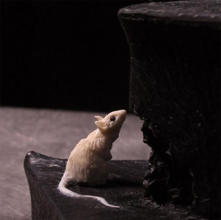
Last, the mouse at the back of the lower base. Mouse could actually curl up on a penny. She sits outside a mousehole, and presumably dwells in the cube of the base. I love the way some netsuke have a flip-side secret, and how some picture-books have one last vignette before the endpaper. A treat at the tail end.
All in all, I’d say a single two-dimensional image of a three-dimensional sculpt is a teaser for the full tale, like the frontispiece in a just-opened book.




The tight rope between grace and horror is perfectly balanced! I am so interested in the process. When something is well done, I just get the itch to know more about how it is done.
Jameson Gardner
I just love the grace and ornate sensibilities of your sculpts, they breath I swear it. I can smell the mystical forest berries on their breathes as they pass by.
I am brand new to sculpting, and I was wondering how exactly this stunning piece was created? What materials? was it hands-on modelling or some other way?