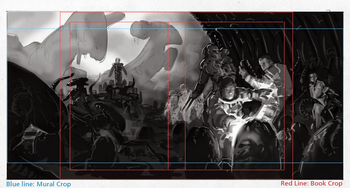
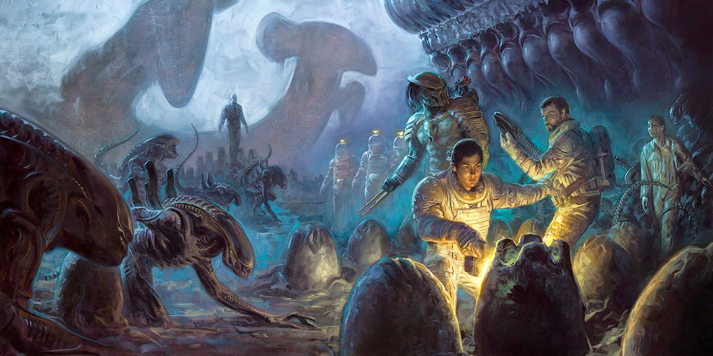
Late last year, I was very happy to be asked on as a cover artist to the Aliens and Prometheus comics coming this summer by Dark Horse. I’ve been a huge fan of the first two Alien films since about as long as I remember and the original remains one of my top three favorite visual movies, so of course I was 100% on board. As the covers progressed, another opportunity was presented to me to also create a piece of promotional artwork. This painting was to encompass the full spread of titles (Aliens, Prometheus, Predator, and AVP) and would ultimately be reproduced as an 8×20 foot mural for the 2014 Dark Horse convention booths. Though I don’t know what else might happen with the image, I was also asked to make the format flexible to be used as cover and/or wraparound images in case they might want to do something with that. I think it is fair to say this ended up one of the most complex design challenges which I’ve yet faced.
Essentially, I had a laundry list of key elements to include: Aliens, at least one Predator, Engineers, eggs, the Engineer ship, three specific characters, an Engineer-made weapon, black goo ampules, and some Gigeresque architecture. There was also request for the human spaceship though that was compositionally a bridge too far so it was dropped. Besides tying all of these pieces together into a coherent image, it had to be potentially convertible to fit multiple formats. And of course, it had to look good blown up to mural size. I had my work cut out for me.
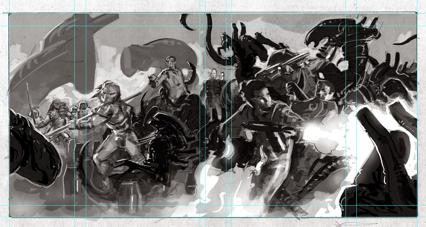
My initial plan was naturally for a battle scene. Besides being exciting, it is the most logical narrative to insert such a collection of characters into. I still think this would have made a badass painting, though ultimately it was decided to be too war-like and the target tone was a more atmospheric and horror vibe. But that’s ok, I like atmospheric horror more than battle scenes anyhow.
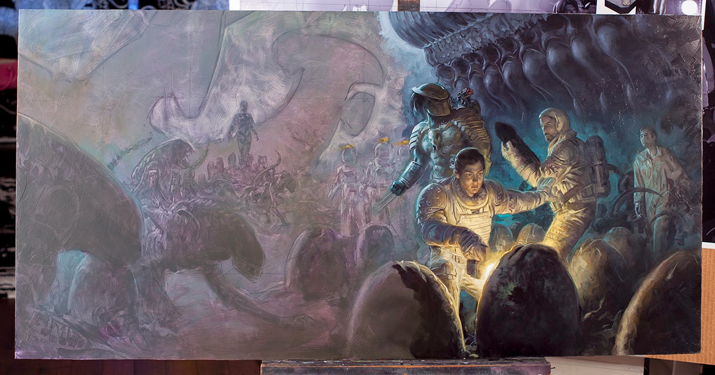
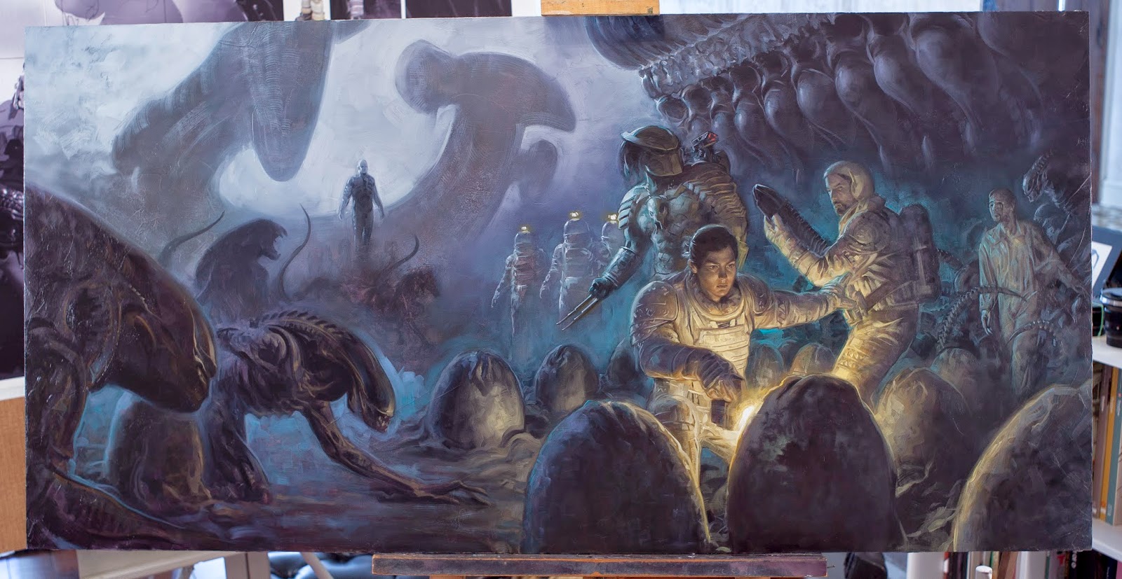
The new challenge that this created was tying these elements all together. In the end it seemed best to go with a more symbolic than literal composition, painting the texture of the story rather than a scene from it. Because of the possibility of a wraparound cover, I knew my central characters should clump together somewhere just right of center and I decided to have them gathered in a cluster of eggs. The lead is curious and her attitude calls back the scene from the original film of John Hurt about to make a huge mistake. Her companion looks a little less thrilled at the situation. A predator stands ready for action as well, presumably on the side of the humans. To the right we have another character looking in pretty rough shape and surrounded by shadowy forms of xenomorphs. The left side of the image is dominated by aliens and a familiar landscape. The aliens close in slowly while an Engineer stands atop a hill in the distance ringed with ampules. Also in the distance are some unfortunate anonymous redshirts in spacesuits. You know, for the bodycount.
As one narrative it may seem jumbled, but as a collection of vignettes it is much more in line with the requested tone and should read as such when either blown up huge or folded around a book jacket.
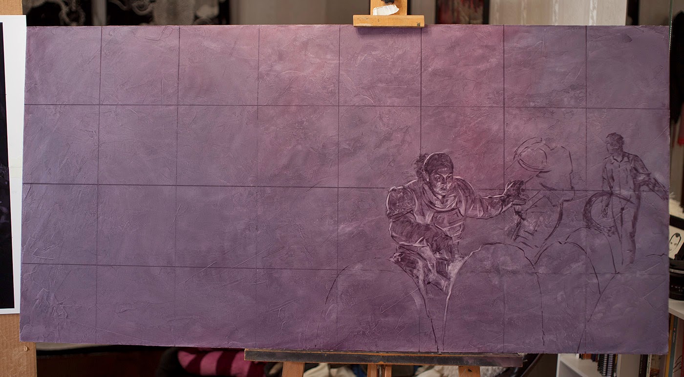
Once this new direction was approved, I did my normal prep of shooting and gathering reference material. For the surface, I used a 24″x48″ birch ply panel, sanded and gessoed. I always apply my gesso with a large palette knife in multiple coats to get organic textural effects. I then stained the entire surface in an Alizarin Crimson/Pthalo Green oil mixture to create a neutral midtone. To transfer my sketch, I laid out a grid of six inch squares to aid in measurement.
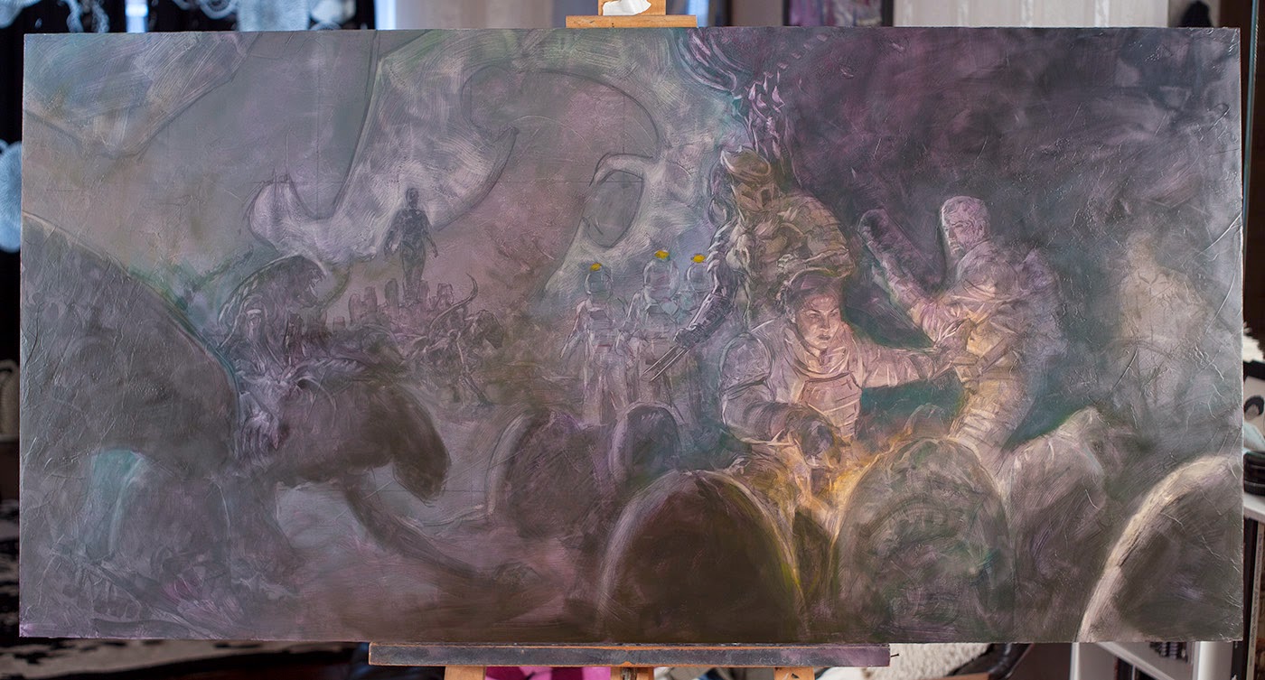
I often like to begin either with the biggest shapes or the key focal areas. In this case you can see I started with the crouching figure and worked my way outward. When laying in my underpainting, I continue with the same color mixed previously for the neutral tone and (very important) I NEVER add white or any other light pigments in to bring a value up. I might wipe out a bit as you can see here with the flashlight beam, but mostly I just add shadows. Lights can be built up later, for now I’m mostly laying in mids and darks.
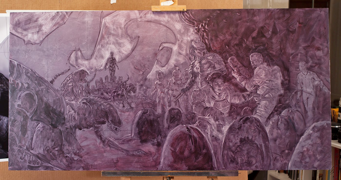
Here is the finished underpainting, which will then be allowed to dry before moving forward. Value relationships are suggested but I’m not too concerned about their accuracy for now. Structural foundation is the primary goal. In many ways, creating a painting is like watching a Polaroid photo develop and it began with the earliest thumbnails. Each step that follows is refining and adding definition, building on top of what you have already made, and using the solutions so far to aid in solving the new problems when they surface.
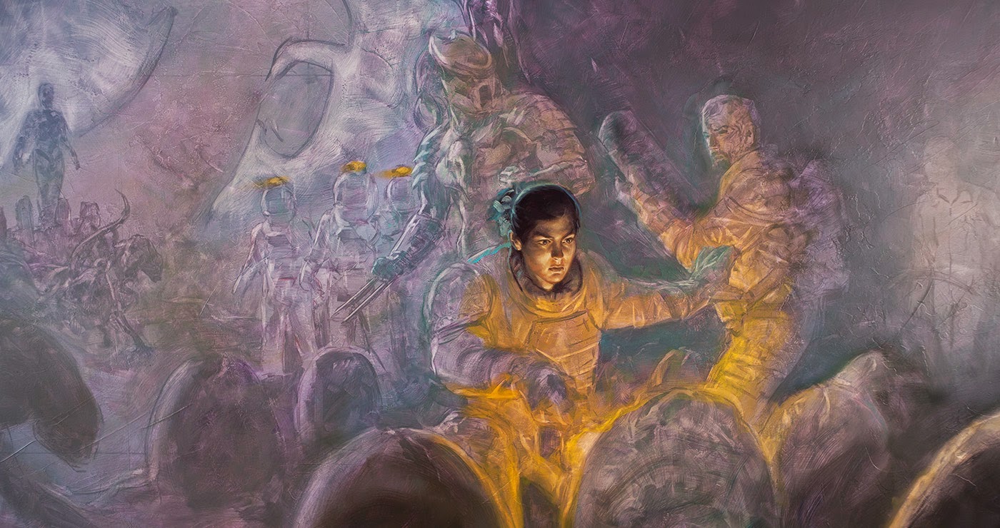
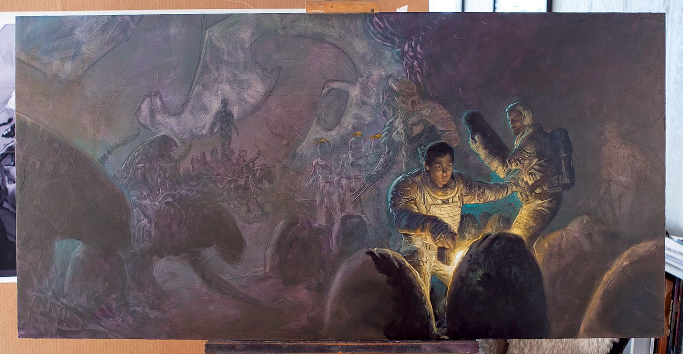
When my structural diagram (aka underpainting) is dry, I often jump into the finish with a quick color wash. I think the main benefit here is that it wets the surface, giving even the earliest strokes something to play against, and it also helps get my ass into the deep end of the pool if I am feeling hesitant about where to begin. After that, it becomes a simple matter of laying down the paint.
It might seem a big jump. “wait, how did that happen?” Really, it is just the same principle of the Polaroid photo: work the basics and gradually get more specific. I find it helpful to do this in layers of paint (wet on wet) which gradually get heavier in application. Putting down too much paint at the start can lead to a big mess, but carefully refining thinner layers and holding back the heavy stuff until you are confident of the placement, color, and value seems to work pretty well. To keep moving forward rather than waste time painting in a circle, I’m always asking myself “what is the next most important thing to resolve?” Additionally, I let the under-layer do much of my work and guide my hand.
Beyond that, I find it difficult to predict what is going to happen so I have to just be ready to react. As I see it, solid planning is crucial to a successful painting, but once the paint touches the surface it has shifted from a process of planning in to a process of reaction. You’ve studied the route, now you just have to navigate it and deal with obstacles as they arise.
The finished piece. There were a few notes from the publisher (open the egg, get rid of that dude’s bonnet, etc.) but mostly this was just finishing touches and color corrections. I’m looking forward to seeing the ultimate finished version larger than life at San Diego Comic Con in a couple of months.
Please feel free with comments and such. I have trouble articulating some parts of my process but can usually do a better job in response to direct questions so don’t be shy 🙂




Love it. Love the lighting and the way the eye moves. I like the fact that the aliens are there and can be seen but don't really draw the focus; kinda like in the first movie… You know they are there but the full alien is revealed slowly. Beautiful stuff.
Awesome painting! Thank you for showing the process. Are those initial rough sketches digital? Do you make color studies before diving into the final piece or do you just develop a color scheme as you go along?
What's your ideas on brushstrokes? Do you go more gestural on areas that are more important or less important? Do you go more gestural in the foreground or background? What about balance of smoother vs rougher brushstrokes?
What were the biggest challenges working with the aliens and predators? Could you have them in the studio at the same time, or did you have to schedule them separately to model for you? After your initial work on the energetic, battle-themed approach, how many of them were left alive to pose for the creeping dread approach? When you work with models like the aliens or predators, do they ever try to offer their input on how they are composed and portrayed?
Thanks all!
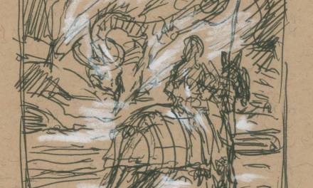
JT Parsons – They are digital, which is usually how I figure out a sketch, though they did start as pencil roughs that became covered in digital tone and placement adjustments. I don't do color comps. When I've tried in the past it just felt tedious and not all that helpful when it came to the larger piece anyhow. I generally have a basic color plan which I try to steer while also letting it take the shape that it wants to.
Jeffrey Nguyen – I aim for more polish in the focal areas and more abstraction in supporting/peripheral areas, though I want to maintain character in the strokes for either case. I really like the interplay between areas which are tighter and looser though. In some ways it feels like having selective focus on the important moments.
Thomas Diem – Great question. Normally I'd have shot them separately (both for scheduling reasons as well as the potential problems you mentioned) but I really lucked out on this one to find an Alien and a Predator that are very close friends and get along very well. I hadn't referenced the sketches so injuries from overly enthusiastic posing wasn't any concern. And I always welcome input from models, though these guys were pros and had no problem getting into the scene.
another question sent via email that I thought might be worth adding here:
“… I was wondering why you don't use white in the under painting and wipe away instead. Also, I've been looking at a lot of artist's process, particularly the colors they use in the under-painting. Is it just a personal preference? When you make a value darker in the under-painting stage, are you just applying thicker paint, instead of actually mixing colors?”
There are a few reasons that I don't add white in my underpainting and they are all, like anything else in painting, just personal preference. To put it simply, I just don't think that it looks as good. I like the texture, life, vibrancy, and speed that comes with a simple additive/washy approach and it helps ensure that my underpainting is in the midtone to dark range (even when wiped out, my surface still leaves a stain) which is helpful to me later in developing the piece to final. And yes, for me the darker values in the underpainting are just heavier application.
Color for the ground and underpainting can vary, but the more saturated the color the more difficult it might be to work on top of. I like something neutralish. Some artists will use an opposite temperature to their intended temperature for the painting (say a warm red brown for a cool blue image) to get vibration and depth to the final. Sometimes I might play with this but usually I stick to the neutrals.
A fantastic piece and a great article. Well done, Dave!
Nice Dave, Great to see your process! I am starting my last AVP cover tomorrow, and this has me excited to get to it.
Great post mate! Love the process!!!