In general I think it is bad to retread old ground. If I get lost when I am driving, I don’t turn around to retrace my steps. No, like a caveman I plow forward thinking, ‘this’ll probably lead to the right place… eventually,’ and I floor it. (The male brain can be a wonder to behold.)
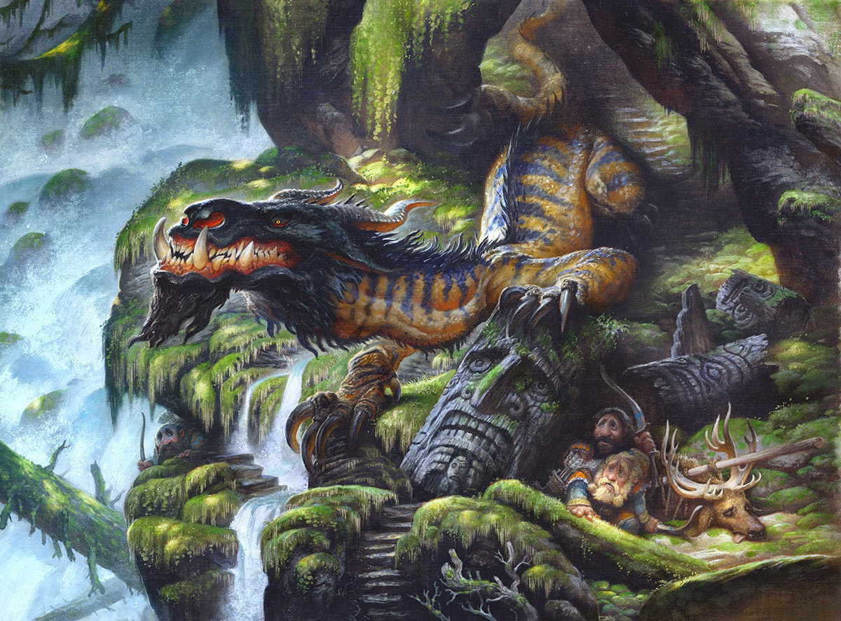
And sometimes it really is just better to plow forward and tackle new ideas and new stories, and not just retread old ground. But this is one of those times where if I didn’t go back and fix it, and give the painting the treatment it deserved, it would always haunt me.


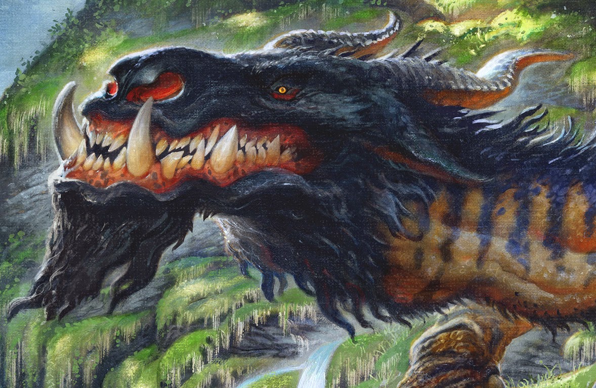

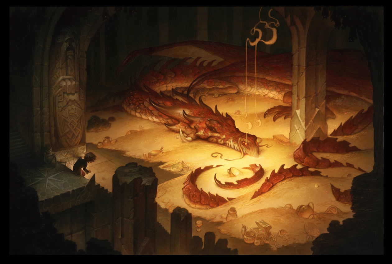
Well done Justin, I love the new one, especially the beast (his teeth and colors are great)!
As usual your drawing is really cool and full of life.
your colors are deeper and you have more subtle contrasts, that's a really nice uppgrade :).
The only minor thing that i find awkward is the silhouette of the rock behind the dragon's head, it follows his profile and i think it flatten your work a little bit.
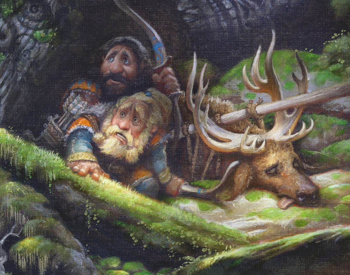
The rest is perfect, especially the two guys with the deer.
Regards.
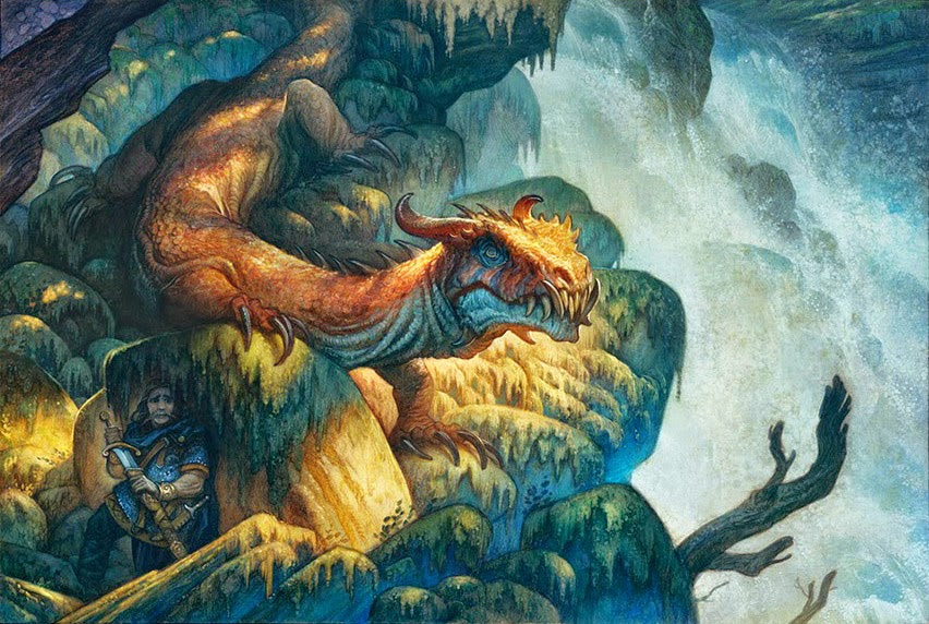
I honestly really like the old version. I love the colours, the warm light and the blue reflected light. I think the mood is just really beautiful in that piece.
I do also like the new version as well I think here is more storytelling going on in the new piec but I just really love the lighting in the earlier one. I will admit though I have a super weak spot for lighting
As someone who has seen the original, I can honestly say your computer screen does not do the new version justice. The colors are amazing. The thing I love most about this painting is the think application of paint. It has a very heavy yet playful feel.
So good Justin! Are you going to FantasyCon? I thought I saw your name on the site. If so, any chance you will bring this? I would love to see the original. I love it!
Beautiful work Justin!!
I like the hunters in the new version much more, but the dragon in the old version and the waterfall is beautiful.
First of all, both pieces are awesome.
Now, I prefer the spot lighting on the first one, it enhances the dragon and focuses the attention on the middle of the piece. Also the waterfall covers more space and has more depth to it. On the other hand the second piece features a more interesting dragon and better storytelling than the first one.
In the new version there is maybe not enough contrast between the dragon's head and the rock behind it. You added an edge light around his head but its not enough. I think probably a better solution could have been removing the rock altogether and letting the clear water behind the dragon silhouette the head or part of it? Just an idea. Great work anyways!
Hey Howard, I am planning on exhibiting at FantasyCon! And I will definitely have prints of this one, but I don't know if I am going to bring the framed original. I am just so nervous about flying with framed pieces!
Thanks for the feedback everyone! You guys are awesome!
Hey Antonio,
Actually your idea for removing the rock has come up a few times from other illustrator friends of mine who I showed the painting to. It's a good idea and one that had I to do it over again I would definitely try out. It would definitely flag the head more and make the shape pop out stronger.
Wonderful work, Justin!
Love the addition of the totem pole thingy and stairs, the guy hiding on the far left and all the characters (including dragon) seem better developed now. The tongue of the deer sticking out is pure win!
This second version also doesn't rely on lighting effects as heavily as the first one. It reads just as well, maybe even better, but does so with more natural contrast.
Simply great!
I like the hunters in the new version very much more, but the dragon in the oldest version and the waterfall is beautiful. Adoption & Guardianship