I teamed up again with art director Matthew Kalamidas for the third and final cover of the Vampire Earth series. And this time, we started early. But we didn’t get to talking it over until we had two weeks to final, once again. Must be something about this project.
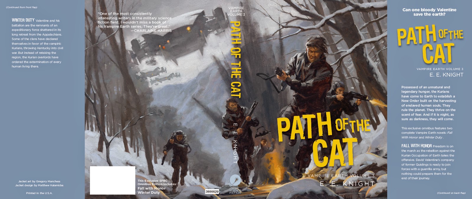
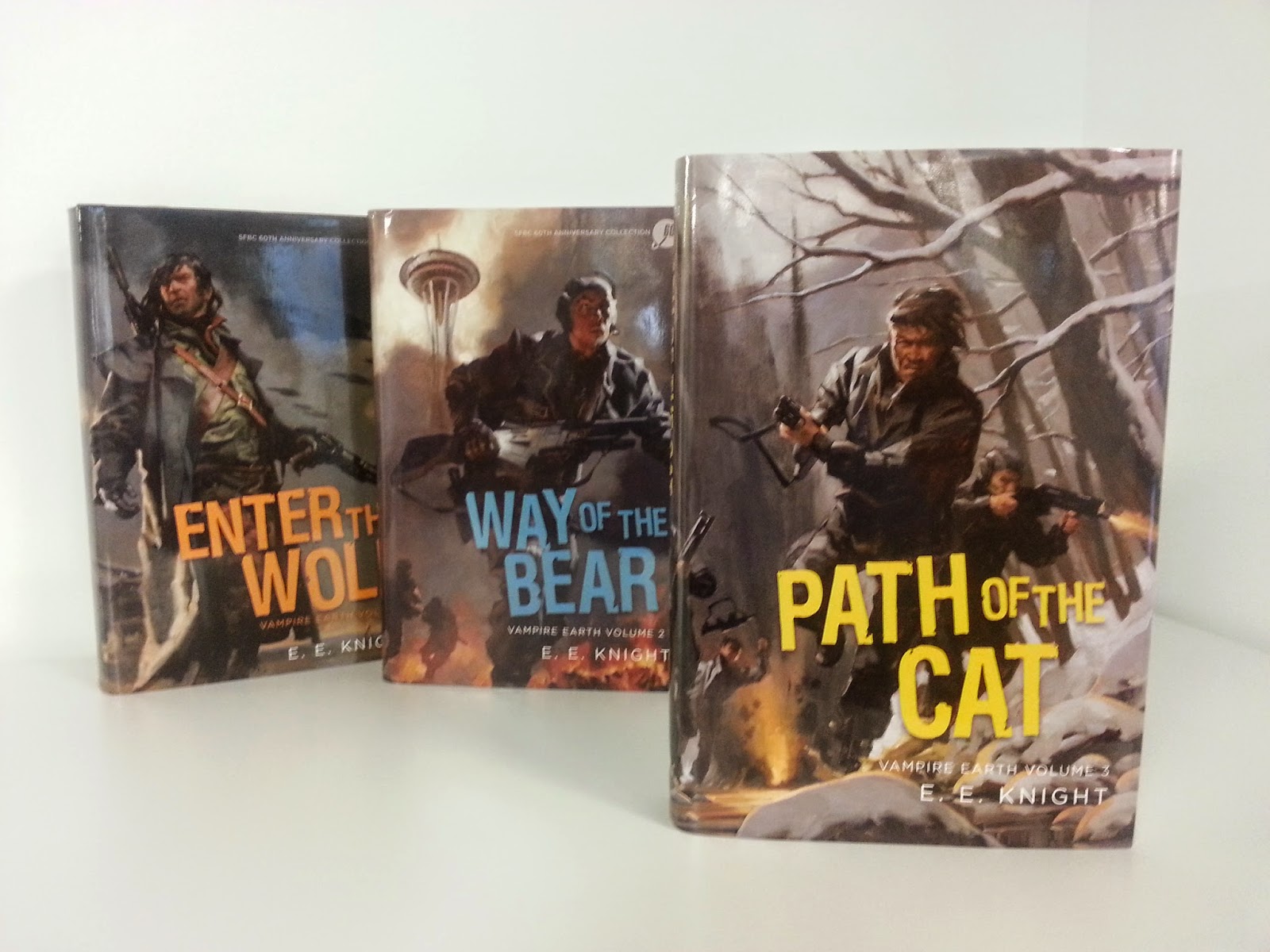
Each cover took on a sense of increasing movement in the series. I’ll admit that since this cover needed to have even more action than the last one, I needed to think about it a lot more. Obviously, running figures were necessary, and I’m rather particular about capturing the right run.
The first step was to read the synopsis of the books and get a feel for the setting. The books take place in the Appalachians and Matthew asked that I think about a scene in Kentucky as it was an important location in the stories.
I grew up in Kentucky, so being quite familiar with the landscape, the first thing that entered my mind was a desperate fight in a creek. Reflections, trees, rocks. Should be perfect. I checked with Matthew to see if it would be ok to start there and he agreed.
As before, the cover needed to capture a broad feeling of the final series. I wish more covers were designed this way. I’m certain art directors would be fine with it, but marketing departments want a scene from the book to please the readers. Unfortunately, editors tend not to pick a very visual scene to paint. An art director that understands the visual language can direct a cover to excite a potential reader, and also please marketing. Matthew understands.
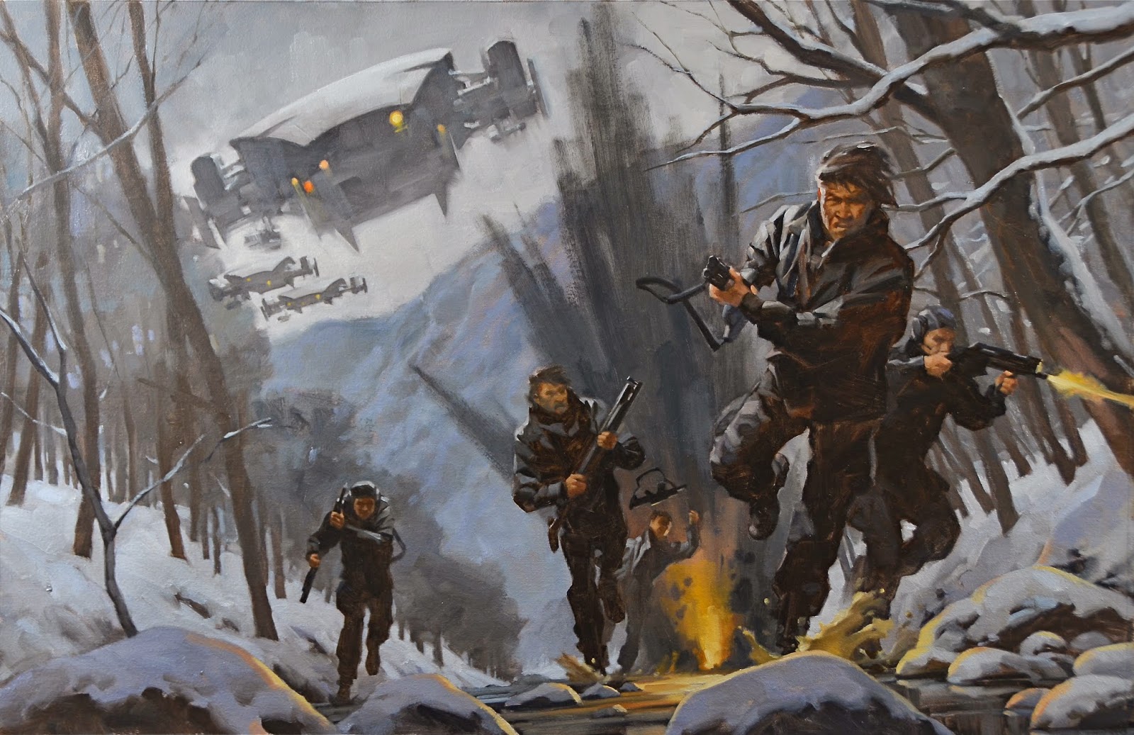
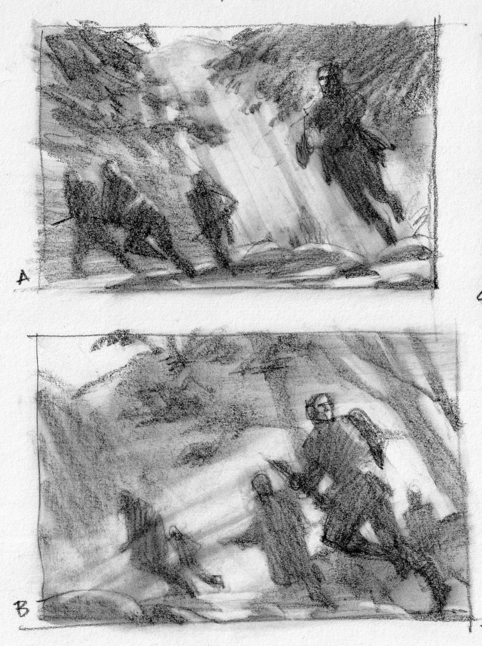
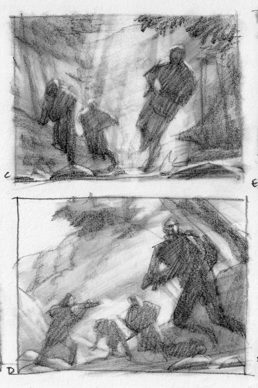
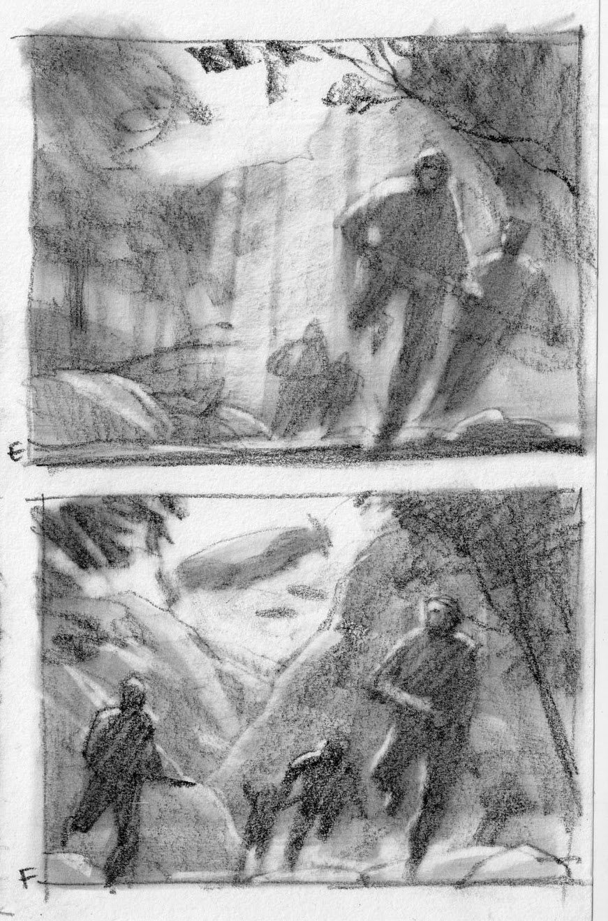
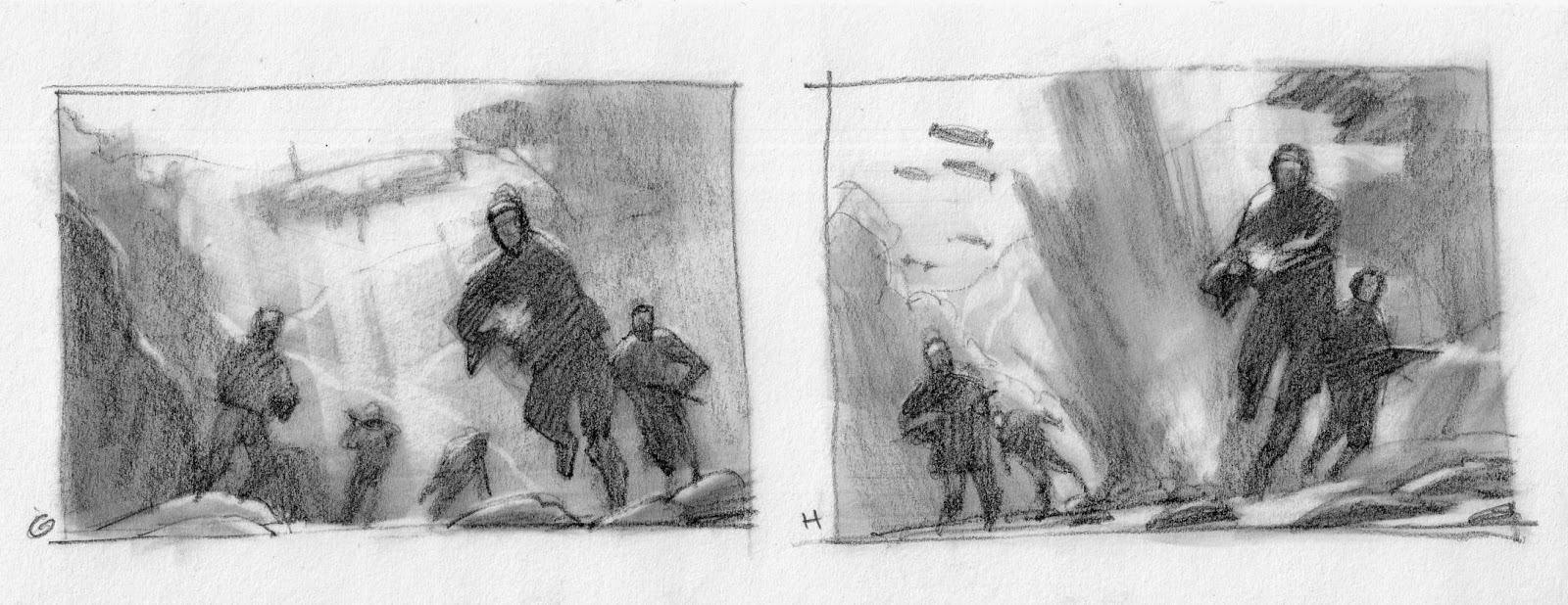
I researched Kentucky shots and as usual found nothing that fit the image in my head, so I decided to design my own creek bed and get the general feeling across in the thumbnails for a wraparound cover. A bright Summer evening, sun going down, lots of greens, browns, tans, and enough humidity to fade the background for atmosphere and depth. A team of rebels crossing a creek in a firefight racing for cover from pursuing aliens.
Matthew went right to H, and we discussed using different parts of the other thumbs to build the scene. I was surprised that he liked the alien ships I drew. I played with multiple flight vanes on the outside of the ship, looking for something sinister. But Matthew nailed it: fangs. Perfect for the series.
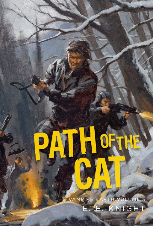
Then he reminded me that the scene should be winter. Gulp. There goes the color scheme I had in mind. Now it would be a cool scene overall, with snow blues and purples contrasting the bright explosion and mussel flash. What the heck, I’ve wanted to paint some winter trees for quite awhile, and this would give me the chance to work loose and capture the greys of multiple leafless branches, and work with snow shapes to define rocks and accent tree trunks.
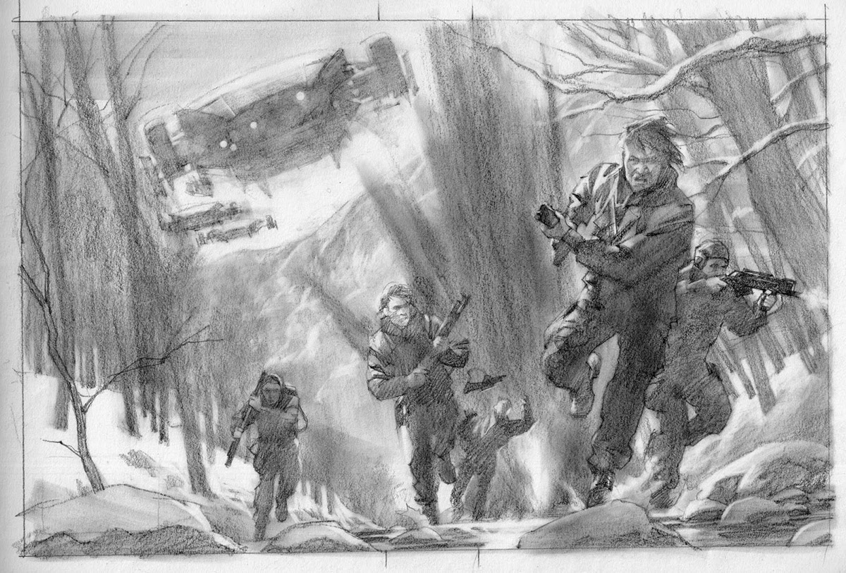
I dressed up in all the gear I own and took shots of myself running full-tilt through the studio. I was looking for the right leg movement. You can’t fake a hard run, and really shouldn’t fake any run. Most artists assume that the upper body swings the arms counter to the leg stretch. But they don’t. Study a figure running and you’ll find that the arms are already moving away from the outstretched leg as it’s planted, preparing to balance for the next leg plant. It’s not about the apex of the motion. It’s about the medium points between the extremes that portrays a natural run. Only sprinting uses the top of the arm motion, but the body stays straight, not twisted through the spine.
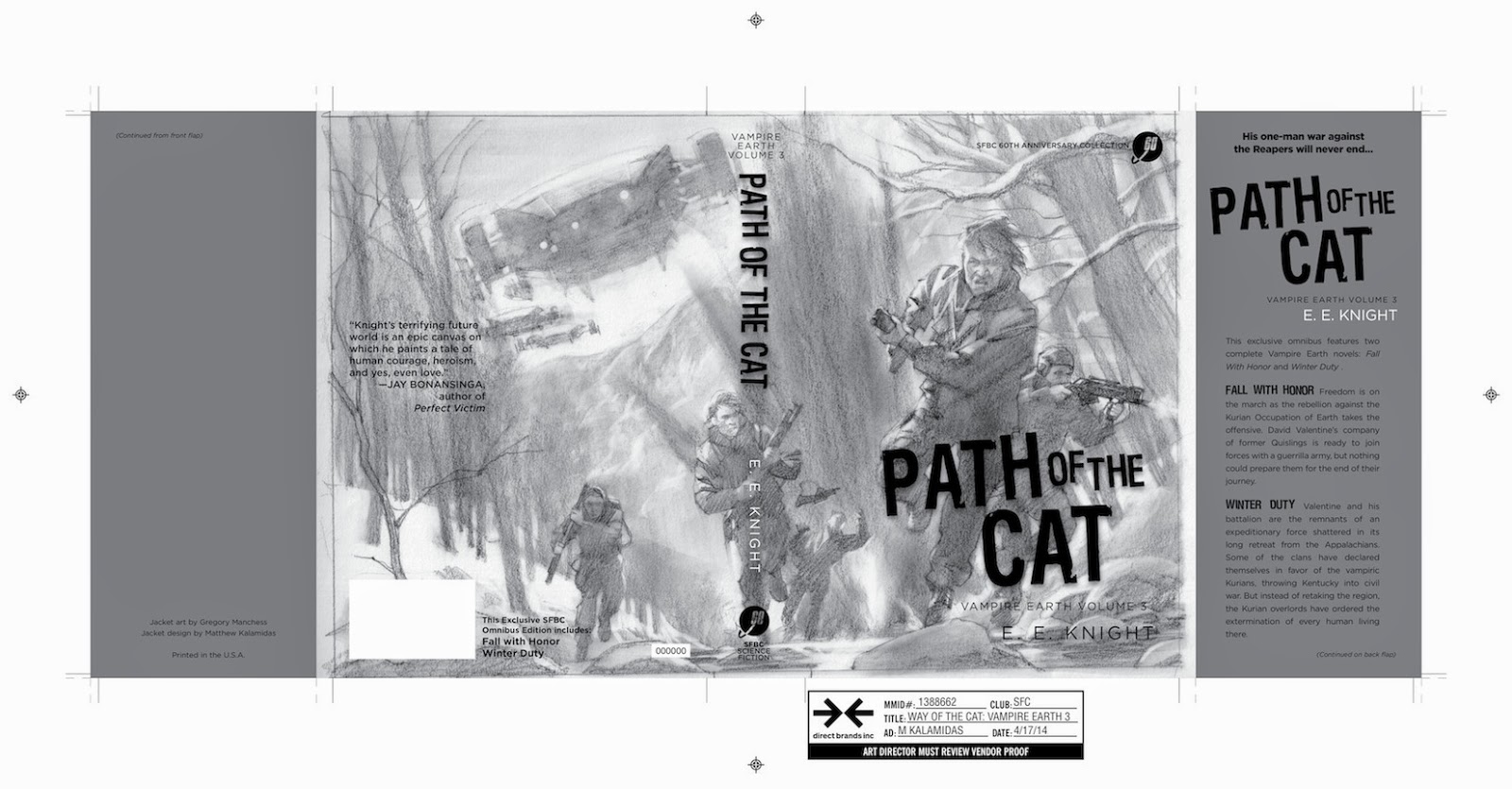
Estimating the title placement from Matthew’s comments about the thumbs, the final pencil happened to fit perfectly this time. Other than Matt thinking that the gun flying up looked like a piece of ladies’ apparel, just a small shift to one figure on the cover and an adjustment of another in the background to accommodate the spine thickness were the only changes. After a couple subtle changes of my own, like adding the rifle sling, we were ready for paint.
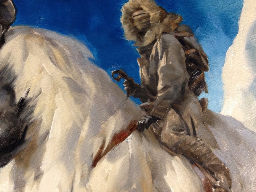
I projected the sketch to the canvas, and in about 12 hours, over a day and a half, I sent a quick shot of the finish to Matthew. Approved, with minor touches to values on the ship.
The end of a very fun series with him and SFBC. Thanks, Matt!
Here’s the full cover layout, and a shot of the three covers from the series.


Excellent painting, great post… keep 'em coming…
Great post and tid bit about running poses. Did they ask you not to sign it? I don't see the Manchess M!
Nice Greg!…..love that ship design.
Thanks, you guys…
I think I had it shot before I signed it, Matt. Gotta go check! : )
Damn! I just love how you build and design your comps/pictures. Great series, Greg.
You mention the layout/rough took 12 hours. How long did the whole project take? Also… what do you do when designing a book cover when you aren't given any dimensions for anything but the front cover? (Also… I am always completely blown away by your sketches and value studies. It's amazing how quickly you can create comps that are so clear and readable! Love your work! Do you plan on doing any more video demo projects like you did with “Above the Timberline”?)
As an aspiring writer, I would love for an artist to put thought into designing covers for my books as part of a series like you did. I love the increasing movement. Nice work.
Dear Mr. Manchess, here is a nice article written about you. I thought you'd like to know. http://illustrationart.blogspot.com/2014/07/greg-manchess.html