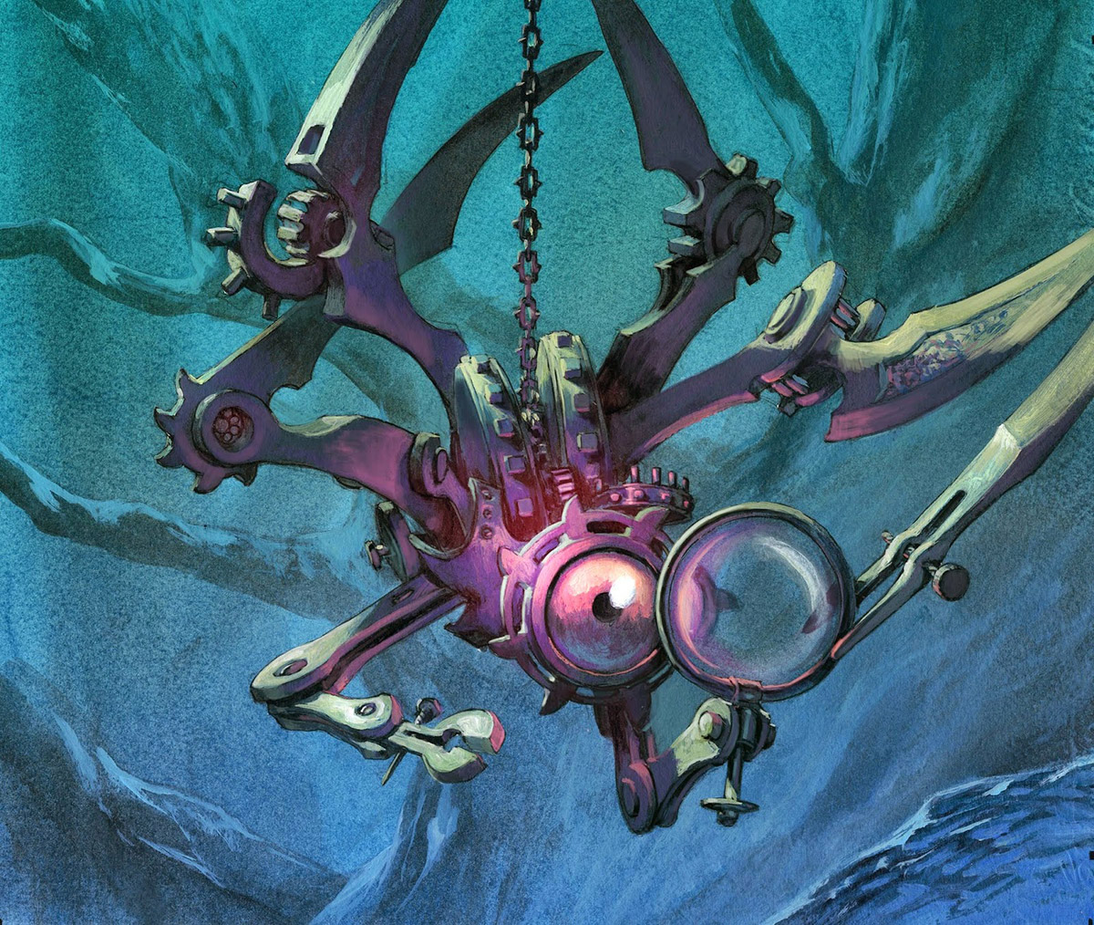
This little mechanical clock-work creature is an illustration for Magic the Gathering. The image shows a small artifact in the shape of a spider lowering itself down from the branches to get a better look. The original description said that I could perhaps make the heads of to noblemen that the creature was spying on. I tried only versions without the nobles, to keep the focus on the creature.
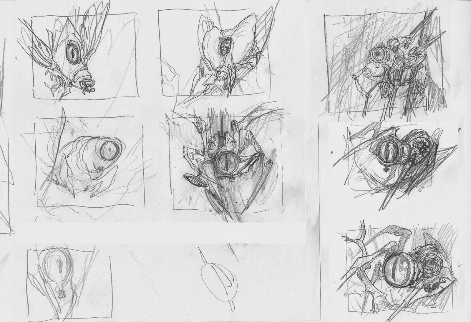
I sketched a whole bunch of thumbs. I went past shapes of caterpillars and moths and decided on the spider figures. The 3 to the right were all acceptable but I did not think they were creepy enough. I chose the middle one. The silhouette was loosely based on a photo of a real spider and the way it hangs in the middle of its web.
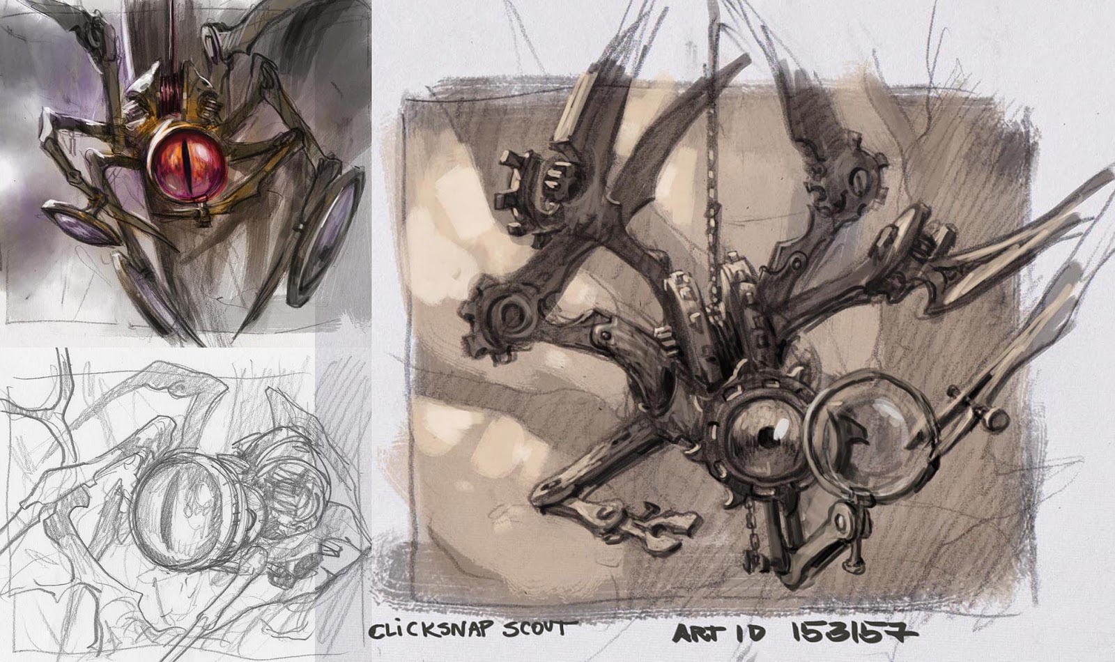
I sent it of to approval and was asked to change its eyes to be less snake-like and for the mechanic to be more wheels and clockwork.
So instead of tracing anything I placed the original sketch next to me and started on the same drawing again on a new piece of paper. Rather than tracing and correction, doing a whole new version makes it easier ( sometimes ) to enhance the drawing and add the new stuff. I often use this way if I am happy with where a drawing is going but something seems off. It is often better to start a new one.
The corrected sketch ended up being different in many ways. Most important was the magnifying glass. In the first sketch it was right in front of the eye making it look like an eye rather than a smaller one being magnified. The point got lost. So in the new one I pulled the glass out and made the eye smaller. I made the wheel components more chunky to make the creature seem smaller.
And then traced it and started painting.
To enhance the sneaky feeling I went with a night scene. The blues and purple are my all time favorite palette. The background is mostly a cyan blue wash over all of the image. I then gradually builded up the trunks and branches carefully trying to make the strokes soft and blurry to keep the focus on the figure. It was a way of achieving the camera lens effect that is soooo easy to do in photoshop but way more work in traditional. Anyway; since the background was mostly consisted out of washes and small highlights I did not mask out the figure as I use to do. After the background was done, and most of the figure drawing covered up my random strokes of paint, I based colored the spider in a paynes grey. If you look at the leg behind the chain you see an area left of the base figure wash. I love this way of painting where you use the tones of the initial grey tonal drawing with a wash on top for base, and then only adds color in the middle tones and highlight. If you look carefully, the only area that is actually thick paint, are the greenish white highlights and the purple/pink light. The pink I used as a projector for focal point. I tried sneaking in a lot of purple and pink light into shadow areas close to the eye of the creature. Adding color to the shadows are a great way to make the overall image seem lighter and like the environment is alive with light-sources. In the final version I boosted the pink light with a brush set to overlay in photoshop.





Recent Comments