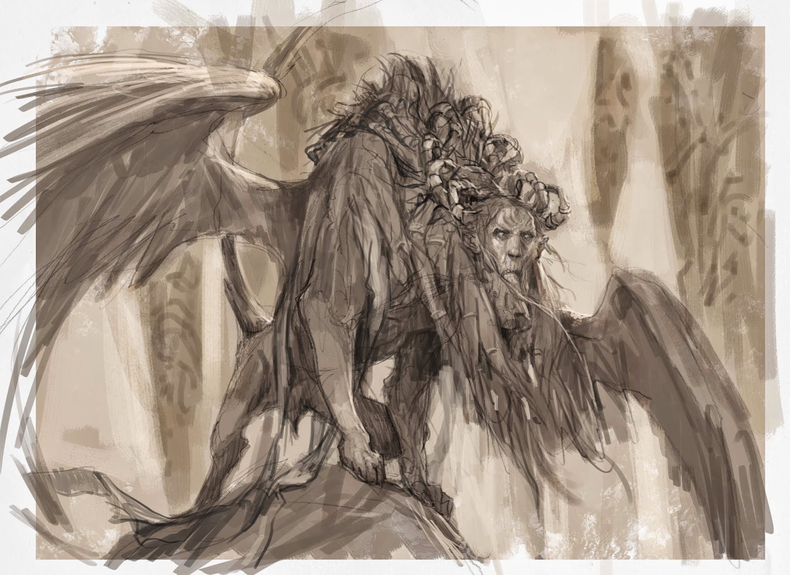
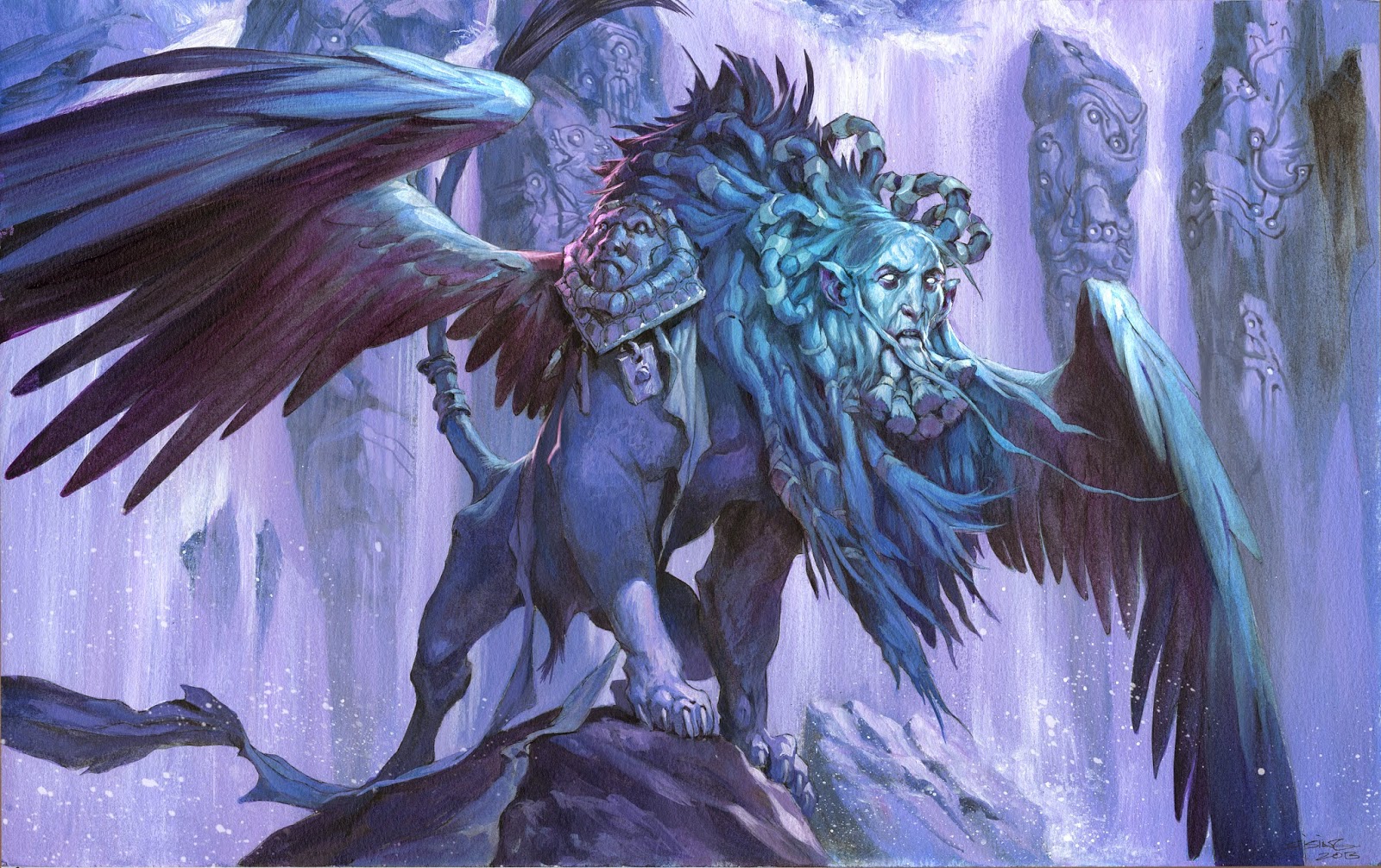
Here is a Magic card illustration of an ancient Sphinx.
The most terrifying thing about this assignment was that it was a alternative art version of a card that my friend Steve Prescott already did a fantastic job on. So in trying not to compete, and thus fail against his, I tried something different.
My sketch was a ragged old very scrawny creature. I placed him in front of a waterfall to make a clear readable silhouette. The palette is kept simple and is almost only consisting of purple, turquoise and Payne’s grey.
But the one thing I’d like to focus on is the simplicity.
I masked out the figure to be able to create the long straight strokes of the waterfall behind him. I tried not to keep any hard edges on the background and kept all the values down to make sure that the details of shapes would blend into the background. I was aware that the danger of a monochromatic painting is loosing depth, since I have no colour or temperature contrast to pull things apart with.
One more thing I was focusing on, was to keep the face interesting. By adding all the detail of the equipment and the strands of hair and beard being very detailed the eye is drawn to that area more than legs or body of the beast. It made me remember that when I started using acrylics, a friend of mine told me to use 4 different brushes. A broad fat one for large surfaces in the background, a flat medium and a flat round for almost all of the painting, and when I couldn´t go small enough with the medium size, I could use the small thin brush for details of faces and eyes and such.
I have kept that theory close, since I think it allows the painting to live in a better way, when areas of the image are rough and simple and the important areas are super sharp. Had everything been equally rendered with a size 2 brush, I am sure it would have seemed impossible to read clearly. More than ever I am aware of this issue, when painting on a cintiq and the zoom function lets you render every area out of context.
The four brush rule helps me remember what important in painting, helps me keep things interesting and alive, helps me maxing out my effects where they are needed and letting other areas rest.





A bang up job for just three colors, Kudos to you sir!
really nice work jesper, the focus on his face is really great (also the limited color palette has always been a win with you).
the old pieces of fabric and his rear leg are the secondary details i love the most: simple, extremely right even though it has low details.
I wonder what Paul Bonner think of your 4 brushes rule ^_^.
Amazing man! Always love your Sphinxes!
Blogs with racing you make your blog a candidate to win the promotional prizes. With the support of our sponsors from blogs are organizing events within the first round of our competition. Add your blog and get involved. You refer to your blog. You can find detail information on our website. Thank you for your interested-in.
Sincerely,
Web: http://www.bloggercontest.info
Mail: contact@bloggercontest.info
Cell: +441269200450
That's some solid advice, thank you for sharing- I'll be sure to remember when I delve back into acrylics! This piece came out wonderfully, very captivating work.