David Palumbo
I wanted to use this Saturday entry to point people towards some incredible compositional and design inspiration in two parts, but Greg totally snaked me yesterday on the B&W Raiders of the Lost Ark link! So far as that goes, all I can do is encourage those who still have not watched it to take two hours out of your day and soak it up. Raiders is one of my all time favorites and watching it like this blew me away. I felt like I’d never actually seen it before. Really amazing.
But never mind that, the main item I wanted to bring out is something which I’ve been sitting on since San Diego Comic Con. Robh Ruppel has a new book from Design Studio Press of his digital plein air paintings which I highly highly highly recommend. I was fortunate to get an early copy in July, but they didn’t go on sale officially until a week or so ago.
Keeping the composition and design inspiration train rolling, Robh has put together a fantastic collection of work which is almost entirely dedicated to those subjects (well, also value, shape, some other good stuff, it’s all pretty damn good). What really struck me was not just his exceptionally well executed landscapes, but the inclusion of process shots, thumbnails, and text to help follow the design thought process. This feels more like a process journal than artist monograph.
The text is the real icing on the cake. Every few pages there is a short blurb, almost like composition haikus, reinforcing in very direct language the basic principles of creating strong images and saying more with less. The whole book flows so easy despite being packed with valuable thoughts, suggestions, and reminders on what really makes an image work. Overall I felt it was surprisingly educational.
As a side note to the paintings themselves, I’m not a digital guy but I find it very refreshing when digital artists let their medium show with this much gusto. Richard Anderson is another who come to mind. I love seeing people embrace their tools like that and end up with such a powerful and personal result.
http://designstudiopress.com/product/graphic-la/


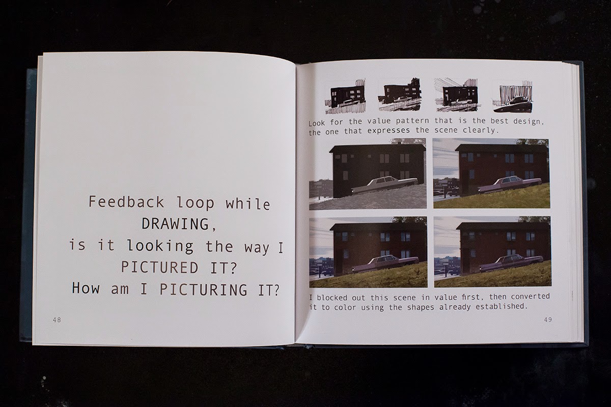


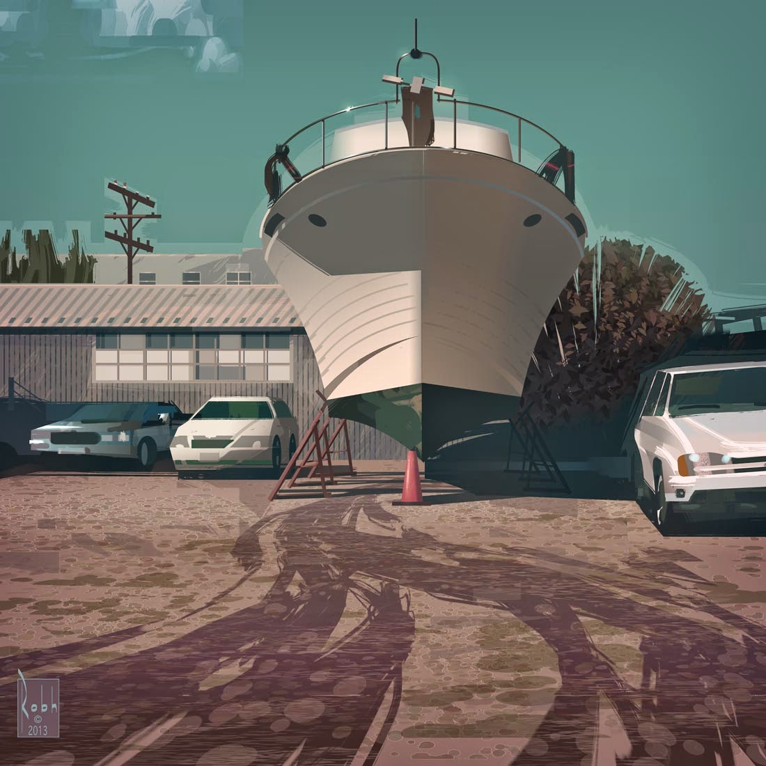


Robh Ruppel's work is great. He's got a lot more process shots like these one's up on his blog for anyone interested: http://broadviewgraphics.blogspot.com/
If you go back through some the posts there you can see the evolution of his plein air method. The earlier stuff is less graphic and kind of overworked, he's making the medium do things it doesn't want to. over time he gets to the point he's at now where he's emphasizing shape relations, breaking the image down into component pieces and slowly trimming and nudging them into place. Its really an ideal working method for digital painting, since there's a lot of cutting over forms and adjusting color independently from shape.
I'm so looking forward to this book! But unfortunately I have to wait till Christmas or some other holiday festival.. I really like the way he makes everything so graphic and captures the essence of the composition and mood.
I can't wait to get this! Ordered.
Breakfast & coffee delivery | bar in mission – cafetaboo Cafe Taboo Wide variety of foods that are a bit expensive, but definitely tasty. Breakfast bagels and croissants are a must before work at any of the surrounding buildings.
Health Tips | Crazy videos | Funny | Humour – Unshakld We are one dedicated to bring you the the best of what is on the internet by creating a platform for you to share whatever you feel is worth your time and also think others should see it.
Robh is just so damn good. I LOVE his work. Can't wait to see the book and own a copy. I've been impressed consistently over the years, and love the way he sees.
Way to go, Robh!!
G