 |
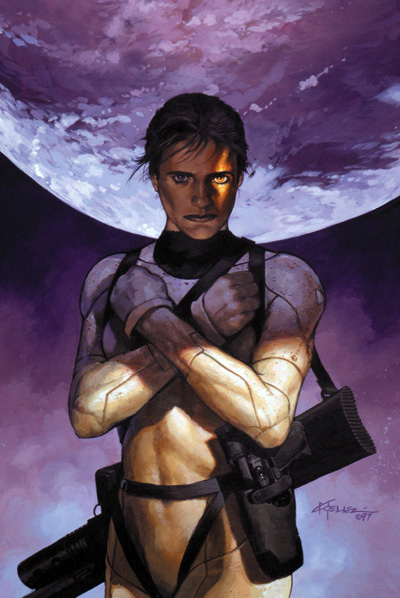
| Sheva’s War, by Chris Moeller |
I have always toyed with the idea of producing my own fully-painted comic, and perhaps one day I’ll finally make it happen. And although it’s one of those projects that always takes a back seat to other more pressing assignments, I have made enough head way with it to know just how daunting of a task it is, and just how much work producing one actually is…. It takes YEARS! Which is likely why you see so few of them.
My small foray into the subject matter has however given me a much greater appreciation for the artists that do manage to produce fully painted graphic novels. The painted comic work of Chris Moeller is a particular inspiration of mine.
You may know Chris’ work from some of his posts here on Muddy Colors, from his extensive work on ‘Magic: The Gathering’, or more likely from one of his many amazing and fully painted graphic novels for DC Comics.
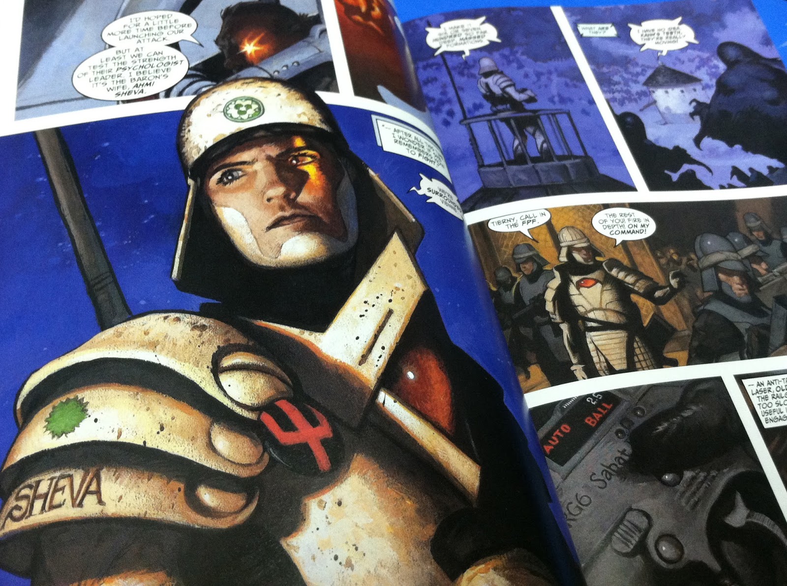 |
| A sample page from ‘Iron Empires: Sheva’s War’ |
The work that Chris has put into these books is nothing short of spectacular. There is no skimping here. The interior art is just as exquisite as the covers, and page after page is full of beautiful compositions that only get better as the series goes on.
These books, in my opinion, transcend ‘comics’ and reside on my shelves amongst the the other ‘art books’.
The amount of work that goes into books like this takes serious dedication, and a whole lot of passion. When asked about what helped fuel that passion, Chris had this really wonderful story to share:
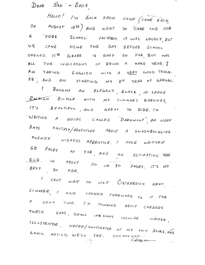
I recently found an old letter, written to my grandparents when I was 15 years old, in which I proudly set my goals as “writer/illustrator of my own books, and comic artist.” It reminded me of when I decided it was what I really wanted to do with my life. My parents (an engineer and teacher) clearly hoped that it was a childish fantasy that I would out-grow, but when it was clear I would not, they talked me into at least going to a “name” university so I would “have options” should I change my mind.
Chris’ letter to his Grandparents I was admitted to Cornell and Carnegie Mellon, but fell in love with the University of Michigan, mainly because of the shiny new light-filled building that housed the school of art. This was back in the early ’80’s. When I arrived I found the school full of eager, talented students and a faculty who, to a man (and one woman, if memory serves), were abstract expressionists. It took me a while to figure this out, and when I did, I had to look up what an abstract expressionist was: Willem de Kooning, Jackson Pollock, Mark Rothko, etc… It was clear I was not an abstract expressionist – not even close. I feared I was in the wrong school. But being an earnest young student, I went all in. I was determined to see what abstract expressionism had to offer me (a hell of a lot, it turned out). I spent my spare time drawing comic book art.
That’s the key to mastering anything, of course. If you wait for someone to lead you to the promised land, you’ll never get there. You have to be so driven, so passionate, that you don’t realize what you’re doing is work. I drew comics all the time. I wrote, inked and painted a full-color comic-book when I was at Michigan called “The Death-Mauser Saga” (don’t ask). Every week, I displayed a new page on the door of my dorm room.
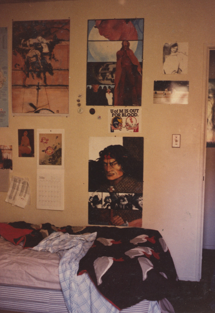
I kept my comic work separate from my class work, except for two occasions I can remember. The first came during my advanced painting class, in which we were encouraged to select our own subject matter. When I hung my painting of Conan the Barbarian on the wall at critique time, it became clear that our choice of subject matter hadn’t been intended to extend beyond abstract expressionism. My professor did his usual routine, moving down the wall of paintings, offering comments, soliciting input from the students. When he came to my brooding portrait of the famous barbarian he stopped, clearly at a loss. Turning to the class, he asked “do you think this is a suitable subject for a painting class?” At least one student who had imbibed deeply of the abstract expressionist Kool-Aid™ replied “No! It is not suitable!” I asked the professor if he could help me improve the painting. He chose to move on to the next piece.
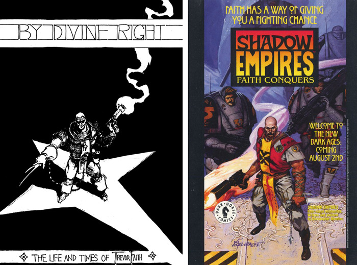
The Conan painting in question, hanging in Chris’ dormitory The only other time I “outed” myself as a comic book artist was for my senior project. My advisor, the great Al Hinton, raised one eyebrow but signed off on the idea. At the end of the year, when I submitted my finished 12-page story “By Divine Right” to him, he shook my hand and said “you know, it’s a shame we don’t have somebody here for students like you.” I agreed with him. It was late in the day, but I appreciated the sentiment.
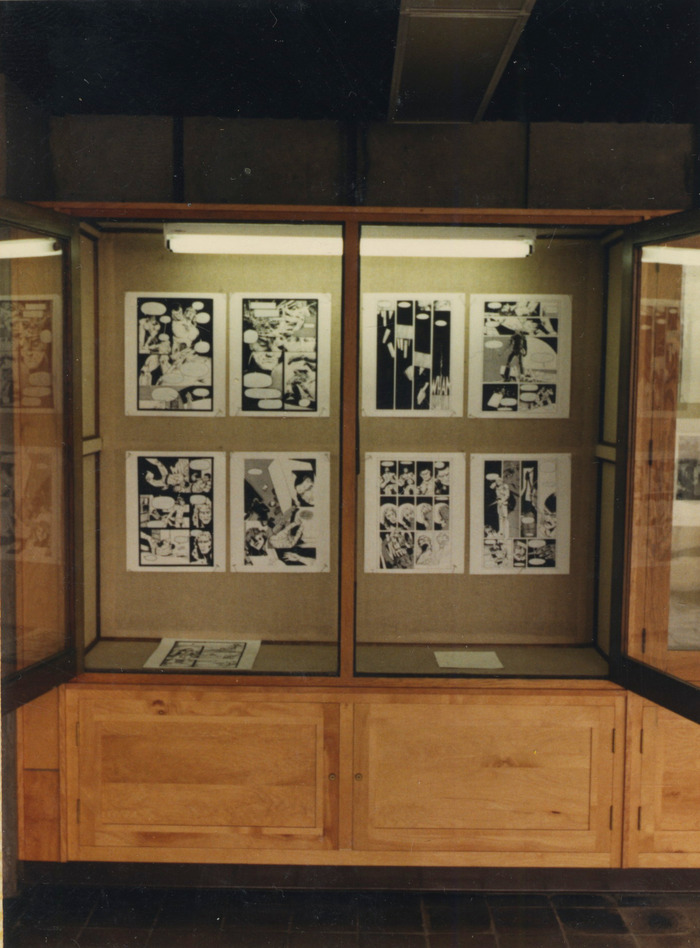
The last event before graduation was a Senior Exhibition in the Slusser Gallery, and I displayed that final project as the centerpiece of my work. My painting professor came up and gestured to my framed pages of art. I braced myself for another “is this appropriate” critique, but he said “I’ve spoken with the rest of the faculty, and we all agree you’re most likely to succeed.” I thanked him, and hoped he was right.
‘By Divine Right’ on display at the Slusser Gallery I worked like a dog and got some lucky breaks, and then 5 years after graduation (in 1990), I painted my first complete 128 page comic book, Rocketman. My career was launched. I felt I had died and gone to heaven, especially the first time I went to Comi-Con as an exhibitor. I loved writing and illustrating comic books for DC and Marvel comics. It was a thrill to paint Batman, Superman, Spiderman and all my other childhood heroes.
But I had a world that I had been creating since my days among the abstract expressionists at U of M. It was a world on the edge of extinction, where a group of galactic nations struggled against decline. Against this backdrop I would create the stories I loved, filled with excitement, danger, suspense, romance and heroism. Each story stood on it’s own, with its own characters and resolution. Iron Empires gave me a common framework I could keep going back to when I wanted to explore different themes and situations such as rebellion, humility, courage, finding meaning in life, and being true to yourself.
—Chris Moeller
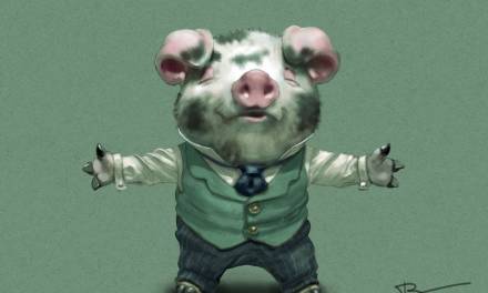
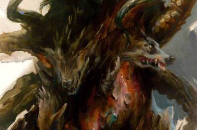
The original comic Chris produced in college, and what it eventually turned into.



Wow, great to get this insight into where Chris comes from. I have only read Sheva's War, but I can attest to the sheer beauty of the work, and a great story, also. I was lucky enough to find them in the back issues bin about years ago, before I knew you could look artists up on the internet to see what else they'd done. I would love to see hardbacks of that book and his other work in the universe. In addition to being beautiful, the storytelling is also great.
Thanks for the heads up, now off to Kickstarter.
Wow! This is exactly my goal at the moment. There are so few painted comics in the world and I'm glad to see that I'm not the only one still invested in making them! Thanks for the inspirational post. Now I'm off to drool at Chris Moeller's website.
oboy. Um, I think a reason you don't see many fully painted comics, besides the labor Dan mentions, is they plain don't work as comics. The primary purpose of comics is story-telling, which is to say one image leads to another, building to a cumulative experience by the time you close the book. Pausing to pore over this or that spectacularly fully rendered panel interrupts this flow. The essence of good comics has to be simplicity. Charles Clarence Beck, the first artist to draw Captain Marvel–Fawcett, not Marvel –was always dismissive of detailed, realistic drawing in comics, maintaining people just glance at the pictures and focus on the next word balloon. I concede this is an extreme position, especially as comics, at least, US-produced comics, have been art as opposed to story-driven for decades, but there is a kernel of truth to Beck's assertion as most people have to force themselves to overcome an urge to fly past wordless panels to get to the next word balloon, after absorbing a series of pages of words PLUS images. And speaking of word balloons, for all that there have been beautifully painted attempts at comics–I interpret them more to be heavily illustrated texts rather than actual comics–no painter–NO one–has ever successfully incorporated word balloons into fully rendered “realist” imagery, unless as a device of parody. Stark white bubbles full of black text floating above heavily detailed, realistically rendered heads is so jarring as to touch absurdity.
Incidentally, I got my BFA at Michigan after studying there 1981-88. Somewhere in there Al Hinton gave me a semester of “independent study” to do comics. But I was a drawing major, not a painting major, which in all honesty probably informs my conviction that good comics must be a function of drawing, not painting.
Still, I can't help feeling all you talented realist painters who aspire to sequential story-telling might just want to go “all the way” and consider film-making.
I'm going to disagree, Cory.
I think a good comic reads like a movie. A good comic, with beautiful paintings, can still read properly if done well. Simpler images just make it easier to achieve that flow, but in my opinion are the equivalent of a simple stage set you'd see in a play production (as opposed to a movie set).
Look at 'Akira'.
Those panels are INCREDIBLY detailed, and still remains one of the greatest comics ever written.
Often times, the details slows the flow of the reader intentionally. The point is to be conscience of it.
It's also worth mentioning 'Arkham Asylum' by Dave McKean.
That comic wouldn't be half of what it is without the paintings.
The cacophony of paint compliments the chaos of the characters.
I do understand your point though, and I agree… story telling is paramount.
The painted image should NEVER come at the sacrifice of the story.
But in deft hands, I feel painted images add to the story, and don't hinder the flow at all.
The artist just needs to know how to control it.
Geoff Darrow's 'Hard Boiled' is another great example.
Ultimately, I think Chris actually does it VERY well.
Big, complex panels are balanced by smaller, simpler ones. The details are used to hold the eye deliberately when needed, and simple panels move it along faster when desired.
Hey Cory,
Al Hinton is a treasure! I'm glad you got a chance to study under him. The points you bring up are excellent, and something that we “painters” of comics talk about all the time. There are two main issues that painted comics have to address if they’re going to work, and you hit them both: storytelling and dialogue. Let's look at them one at a time.
Storytelling: In comics this is obviously paramount, and when approaching a painted book, something one must be very deliberate about. When I was a young up-and-comer living in NYC in the '80's, I had the privilege of sharing a dinner with Kent Williams and looking at his original pages for Meltdown. One way he had of organizing a page was to focus on one panel… whatever the panel was that he felt was the most central “beat” of the scene. He brought that panel to a relatively high level of finish, and used it to hold the rest of the panels, which he rendered in an unbelievably loose and gestural way. I don't have the courage for that, though it's something I aspire to. I agree with you that there is NO greater killer of a painted comic than paint-every-panel-as-if-it-were-a-cover-painting. Alex Ross was successful at pulling that off, but roughly 100% of his imitators are not, and that's what everyone thinks of when they think of painted comics. It's a shame.
Dialogue: How do you get those stark graphic elements (sound effects, word balloons and captions), to live in the same space as the painted artwork? When you're looking at a drawing, your eye automatically switches how it sees. It says “this isn't real, it's a cypher of something real”, just like the text that lives alongside it. When you read a painted image (particularly one creating a convincing illusion of reality), your eye says “oh look, that's real”, and then “those words next to it are not real, they’re symbols”. That's the jarring note that you’ve correctly identified. Does that mean painting can't work with text? As a painter I obviously believe that it can, but it takes some consideration. Master comic-book painter Scott Hampton, who I've spent HOURS talking about this with, began introducing more and more line into his painted work in an effort to help his words and images play nicely together. He will often render large panels, where he wants the reader to slow down, in a lush painterly style, and then accelerate you out again by bringing in more line. It's a tremendously effective storytelling technique, and also lets the reader's eye understand that “you're not supposed to believe this is an illusion of reality.”
I approach the problem from a different direction. Although I use a fair amount of line in my painting, my main method for alerting the eye that what it’s seeing is a “cypher of reality” is to be very graphic with my shapes. When I want the viewer to slow down and drink a scene in, I become more realistic. When I want to move along at a faster clip, my shapes become very graphic. Additionally, I use a very rigid approach to panel boundaries… mechanically sharp white edges that always appear at a consistent width (inset panels are narrower, but also consistent). Even if there is no dialogue on the page, your eye is being reminded that this isn’t “real.”
These are issues I’m obviously quite passionate about, as maybe you can tell! I think there’s no dispute that words and drawings live together most naturally. They are speaking identical languages. The beauty of paintings and words (and also their great danger) is that they can speak with a whole spectrum of visual languages. To me, when it works, there’s nothing quite like it.
As a painter of comics I completely agree that you have to beware over-rendering and be very deliberate with the composition to get the eye moving. But as Dan pointed out, there are many ways to combat this problem! And if the story is good enough and the dialogue natural, the speech bubbles will disappear no matter how they're rendered (unless of course you're studying and dissecting the comic).
By the way, the term “painted comics” I feel has been stereotyped as these very realistic cover-like panels. Am I wrong? I personally work with watercolor, acryla gouache and ink with completely visible lines. But it's all done by hand. Maybe that's considered a hand colored comic?
Any thoughts?
wow, great, thoughtful replies. I love this blog. I'd like to address a few things for now.
Dan: LOL you nailed me with the reference to play productions. In my time at Michigan's art school I sort of unofficially double-majored in theater with a focus on staging Shakespeare. My own on-going graphic novel project is to adapt “Hamlet” and set it in Prohibition-era Chicago. But until you brought up plays it hadn't occurred to me that my love of theater would inform my “minimalist” tastes.
hm. Akira; see, while detailed, the thing is it's still line drawings with transparent effects like dot screens and the color process Marvel gave to the series while they had it under their Epic imprint. Similarly Darrow's work is all line with maybe flat, transparent color. I'm going with the distinction between drawing and painting being the difference between organizing your image in terms of line versus organizing your image in terms of shape. When I'm talking detail versus simplicity, I mean the detail of a full-process painting like one of your fantasy/horror book covers, which will always look more detailed, or maybe I mean more “real”, than the most detailed complex Darrow drawing, because line predominates by (my) definition, and that level of abstraction means his imagery will integrate better with the word-balloon convention central to comics than more fully and purely painted images would. But I take your point about Ottomo and Darrow both controlling the level of detail in their comics to make the reader slow down and absorb a highly detailed panel's contents or speed through a succession of more simple panels in accordance with their expressive intent. I think Akira is rather less successful for being designed to be read left to right, with the solution of printing the pages in reverse for Western readers being imperfect at best.
Chris and Abrian, if I understand your solutions correctly, and I may not, it's late and I've been thinking, hunting and pecking for a while–when I should be drawing tommy-guns and '30's era roadsters; but if I get you guys you're talking about solutions that move the work from pure painting to something like drawing, depending on how prominent line becomes in the work. But any allusion to line allows for greater success in integrating word balloons.
Abrian: yeah, when talking painted comics I personally mean full process painting where shapes and their edges define form. I would call your process drawings tinted with transparent washes/colors. My favorite kind of work for comics. and it actually describes almost all the work of one of my favorite fantasy artists, Charles Vess, in both his comic work and his “stand-alone” imagery.
Chris: Al Hinton is great. I studied under him for a couple of semesters of both drawing and life drawing, wherein I built up his trust in my commitment and discipline enough for him to let me draw a comic for a semester.
On the other hand there was the semester early in my career when I took BOTH color theory and intro to painting from Vincent Castagnacci…I still tremble when I pick up a brush…