A short and simple post today as I am working on a portrait and need to keep going while the surface is wet. These photos are fairly self explanatory, and I apologize for not that many color oil progress shots, but once I get working in the studio, I hate to stop!
 |
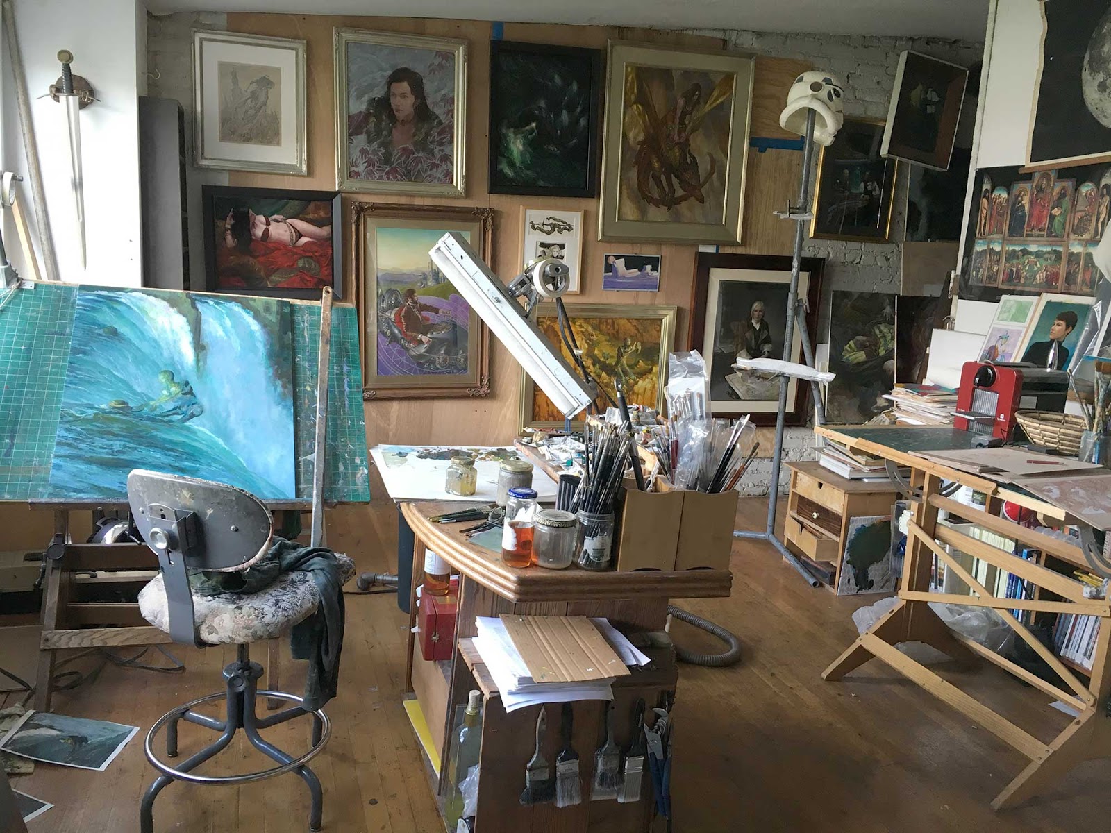
| Initial lay in of figures and composition in graphite. Note the reference for the previous painting of RiverRun still on my drafting table. |
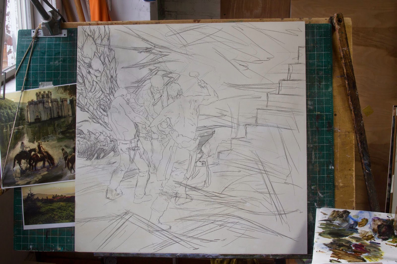 |
| Final drawing – very simple and rough due to the limited time constraints on this image. Less than two weeks remained to finish this image and color check the other paintings before the deadline. |
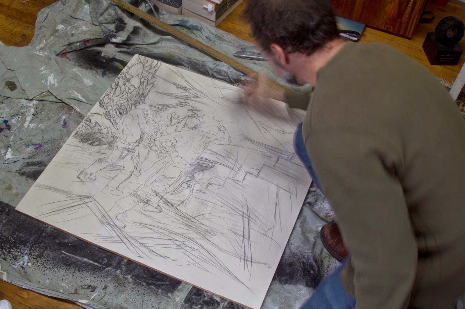 |
| Sealing the drawing with Acrylic Mat Medium. |
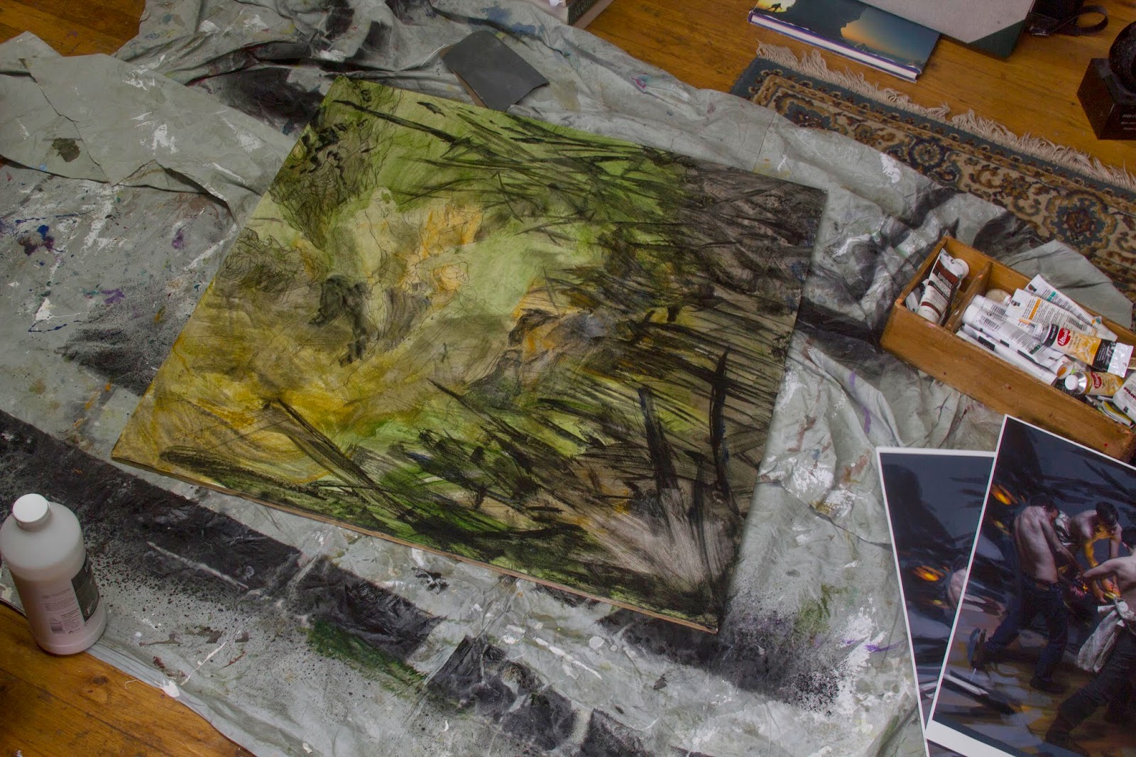 |
| Acrylic washes to establish tone and movement, as well as the patterns created from the twisting swords. |
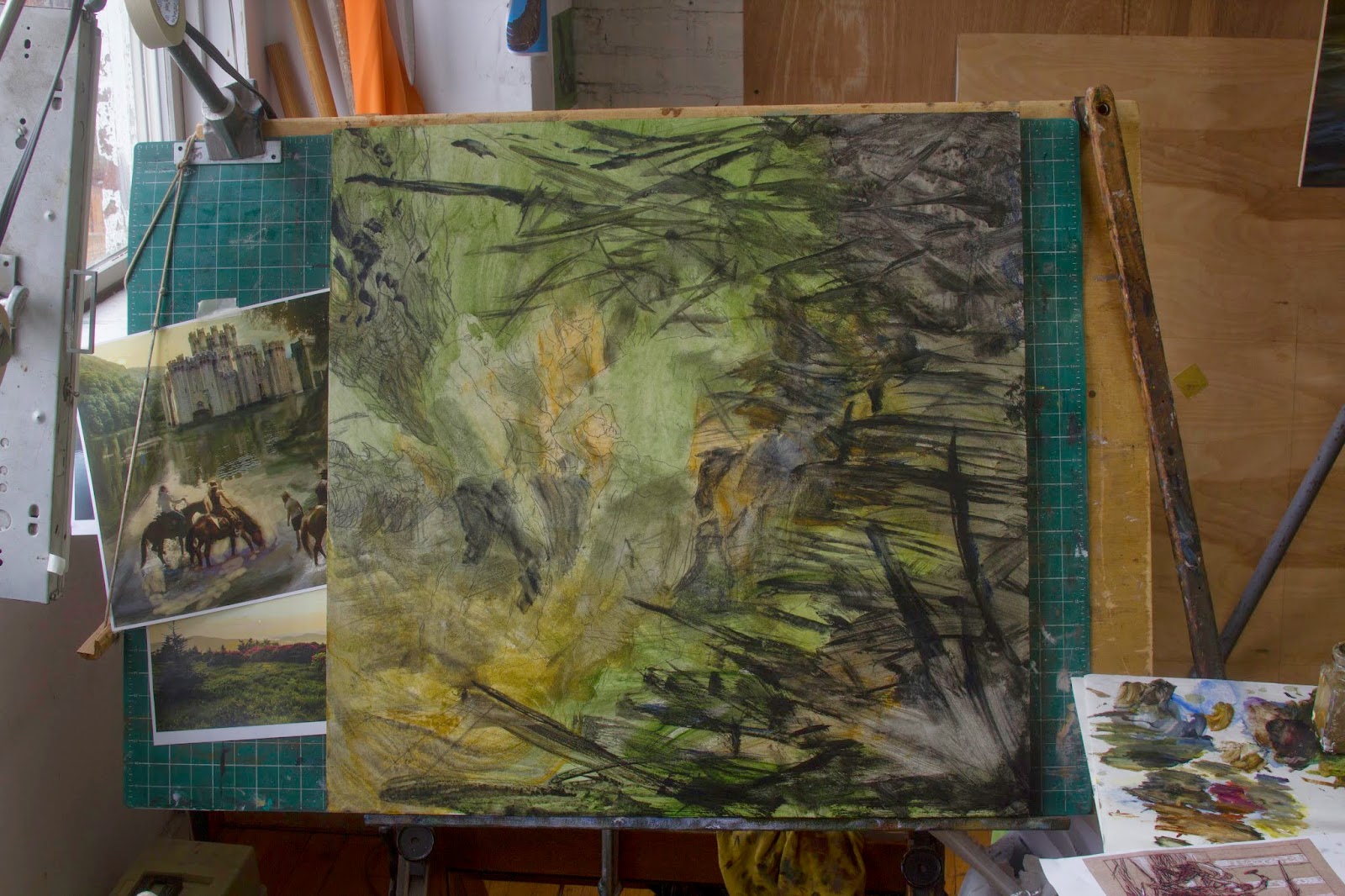 |
| Up on the drafting table, ready for oils. |
 |
| First pass on the background/swords in oils. Flying fast with the paint here! |
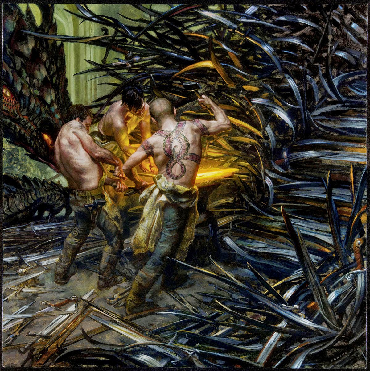 |
| Final Art: ‘Forging the Iron Throne’, 30″ x 30″, Oil and Oil Mediums on Panel, 2014 |


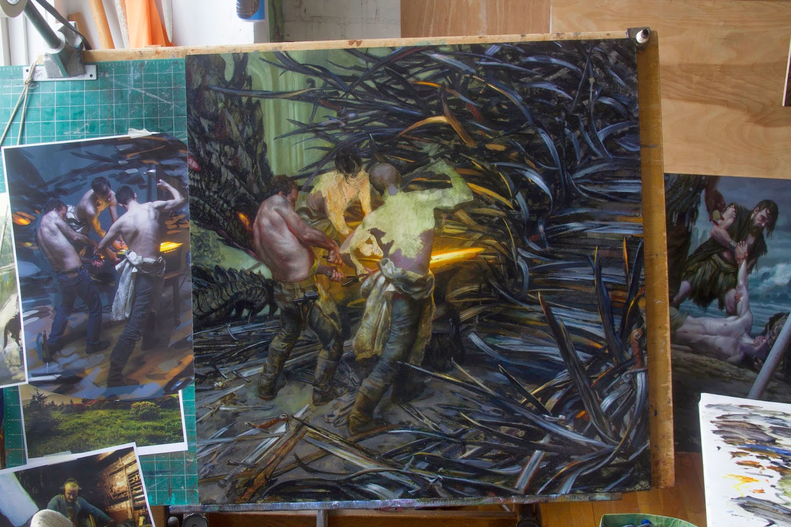

I think this was one of my favorite things at IlluXcon! Very cool to see the process! Out of curiosity, what were the stages before initial lay-in, if any? Was there a thumbnail/rough sketch stage? Also what is that ref on the left – is that some sort of digital color comp from the reference shots?
Reliably Incredible! Thanks so much for posting this process.
Hello Gwen, yes there were a few initial design/concept steps before the drawing stage you see here. I have an initial rough in another post:
http://muddycolors.blogspot.com/2014/09/forging-iron-throne.html
The reference image is indeed a rough digital composite of my models (myself and a friend Grant) as well highly crude value scumbling to block in shapes for the areas around the figures.
Hello Donato,
I know that often you transfer a very tight drawing to paint over – do you find working over a loose sketch freeing? Does it lead to more spontaneous decisions, or do you ever bog down over details that would have been worked out in the drawing?
Working over a loose sketch is always more freeing NJL! But you have to sacrifice specifics in the pursuit of gesture. Thus each image requires a change in plan pending the structure/design I am attempting to communicate. The randomness of the swords embedded in the throne lent itself to this play in paint, but the other image you see referenced in the photos above, that of the castle/landscape would have been seriously handicapped by such a loose approach. In the end my approach was different for each image, and thus it has always been for all of my paintings…
Thanks. I tend to fixate – got to remember to make the right decision for each scenario, and not just assume that every situation requires a hammer, just because that's the tool I'm holding.
Hi Donato, thank you for this post! I bought your calendar and although the reproductions dont do the originals justice it's a very nice calendar. Now I will have a new picture each month to inspire my art. I am also pleas to see the drawings inside on the separate section.
Hi John. Yes the drawings as the center spread was a wonderful treat! I thought they would just use them as spots, but David Stevenson, the Art Director, thought they would look great sampled for the center!