started out as an acrylic painting, but I messed it up so seriously that I had
to finish it digitally.
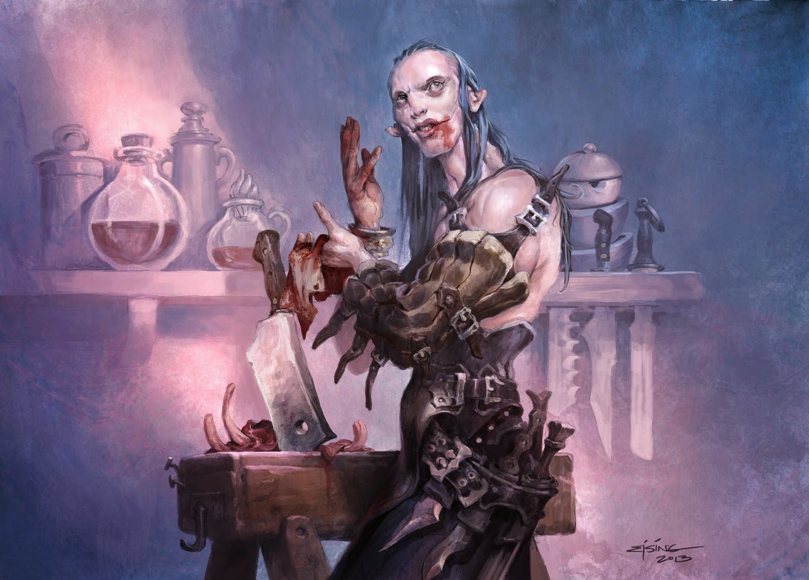
illustration is for a magic card. I was asked to do a wizard-like butcher
standing at the butchers block, carving up meat. We should be undefined if it
was human meat or something more ordinary.
I had all
kinds of visions all at once for this image. When I read the art description the
one thing I instantly knew was that I would picture him as looking up from the
work smiling invitingly looking kind of happy and inviting. It would be hard
contrast to the bloody scene of the rest of the image. And it should reveal him
as a crazy person.
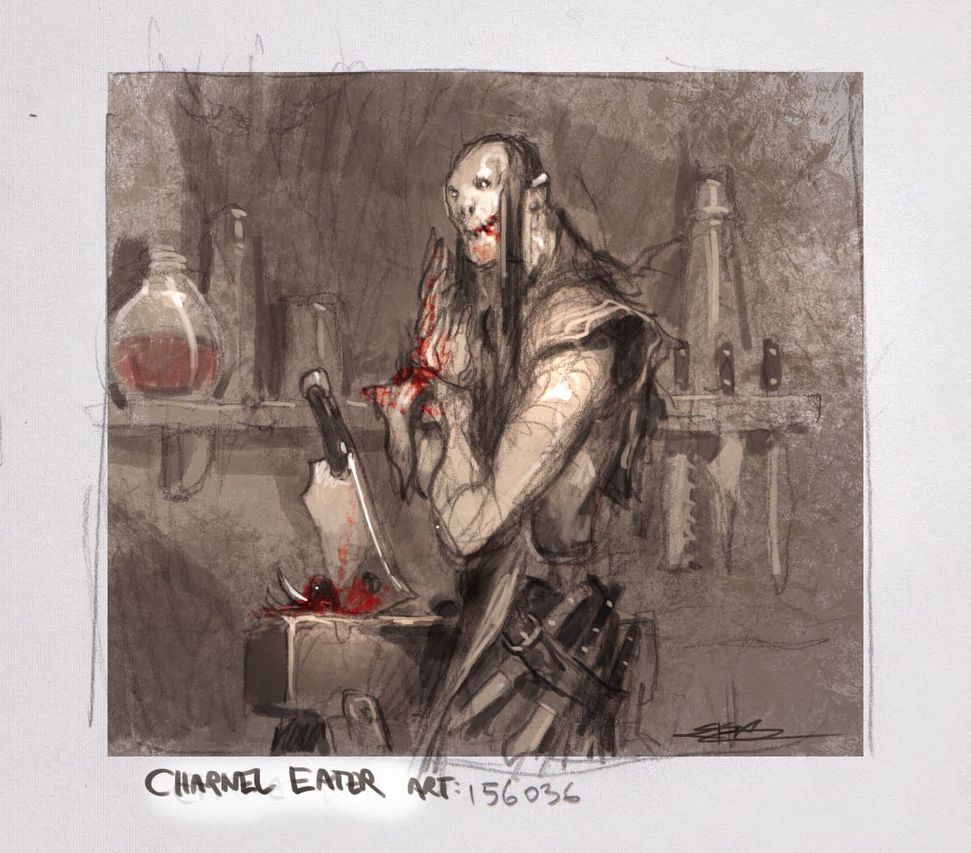
sketching process I changed him to wiping the blood from his hands. The gesture
shows that he is done with the grizzly part and is looking up ready to engage
with the spectator. I was going for the image of; “Ohh, there you are. Let
me get this of my hands and clean up before I give you a taste”. The thumb
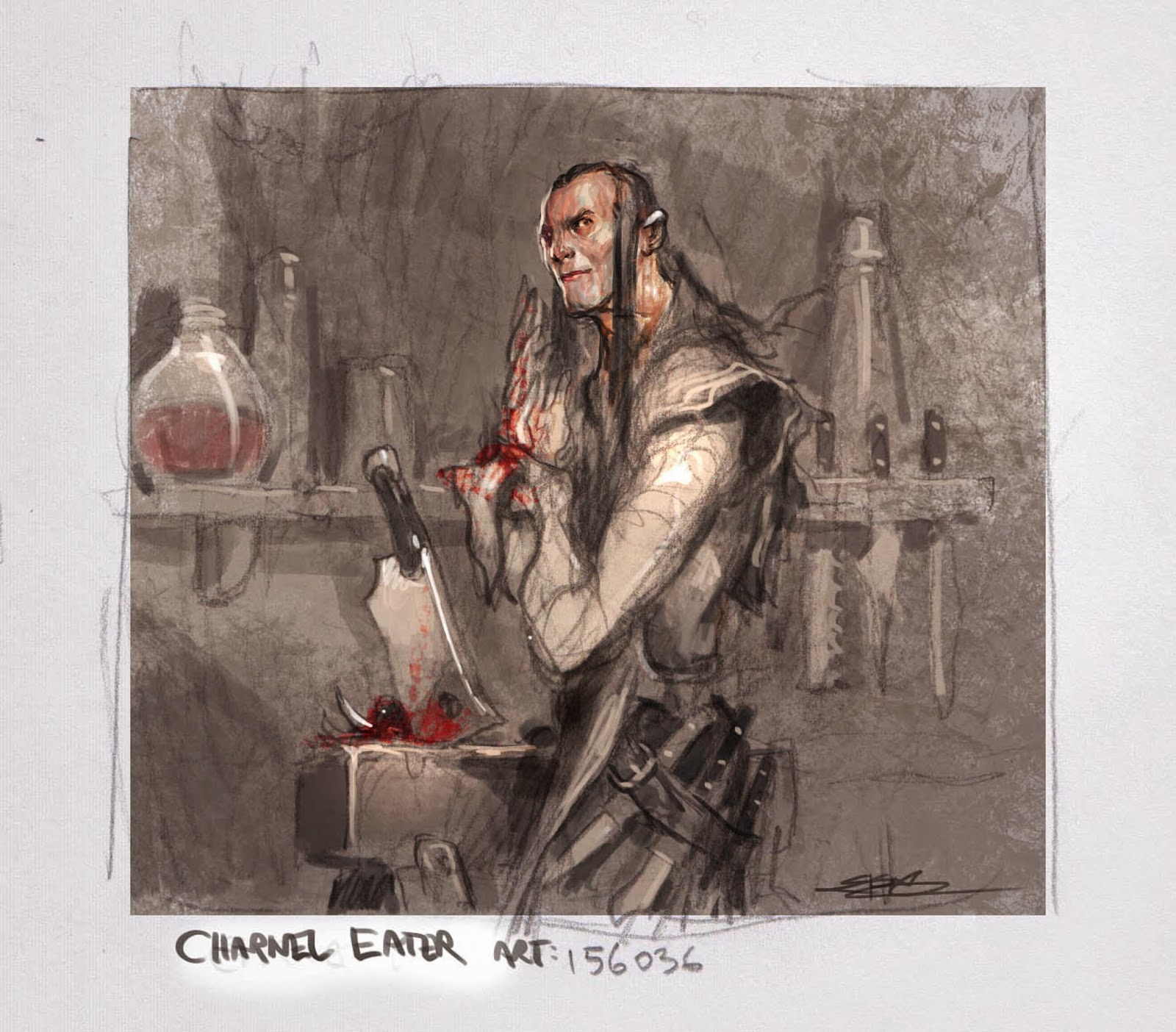
came back from Dawn Murrin, My art director at Wotc, with one really good
remark. He looked too undead. In my pursue of evil I had turned him into a
monster more than a person. In hindsight I am super glad to have been pointed
in a different direction. I realized how often I go with the stereotype of
evil, as if “Just Evil” is good enough.
I only
realized this when trying to change the
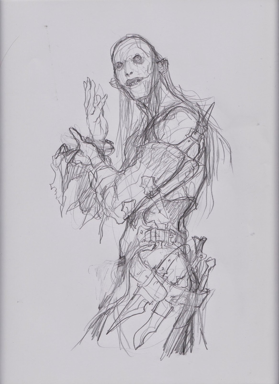
face of him to be more human. But I abandoned the sketch since he looked plain
and ordinary and not at all crazy like I had envisioned. So I did, what I usually
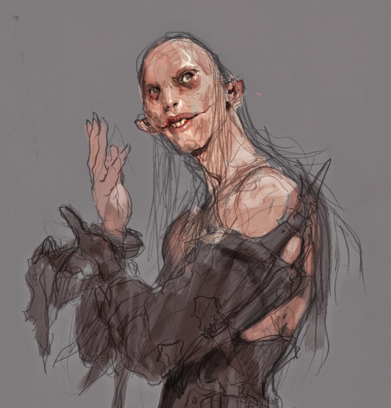
do, when things get difficult: start over. I printed out the thumb, placed it
next to me and started a new sketch of just the figure. When you start all over
you often get the best from the previous searching sketches but without the
limitation of the lines all ready there. So I do this to liberate my mind rather than confining it
by drawing on top of the old sketch.
case I thought of Marilyn Manson and the Joker when sketching. I gave him big
meaty lips with large teeth to enhance the cannibalistic theme. I also fitted
him with thin wispy hair giving the impression of an undernourished person, like
the sea traveller from old days that didn’t
get enough vitamins. I turned the angle of the head slightly to make him look
up more, and suddenly it struck me to slit his mouth. My idea was that if he
had slits that allowed him to part the lips wider, that would be nasty as hell.
I giggled at the pure joy of my own evil-ness, in utter rush of cruelness I also
had his ears top cut as a scarification. I outfitted him with a padded gloves
and arm protection so that his victims would not scratch him too much while he
cut them up, Women’s nails can be very pointy, you know.
perfectly aware that all of these thoughts are probably lost somewhere between
my mind and my drawing skills, not to mention, that you, as an audience might
not see anything but a dude and a cleaver. It really doesn’t matter. The point
is that for me it is important to think of all these details and reasons to be
able to invent interesting ideas. The more story I put into it, the easier
flows the fountains of ideas.
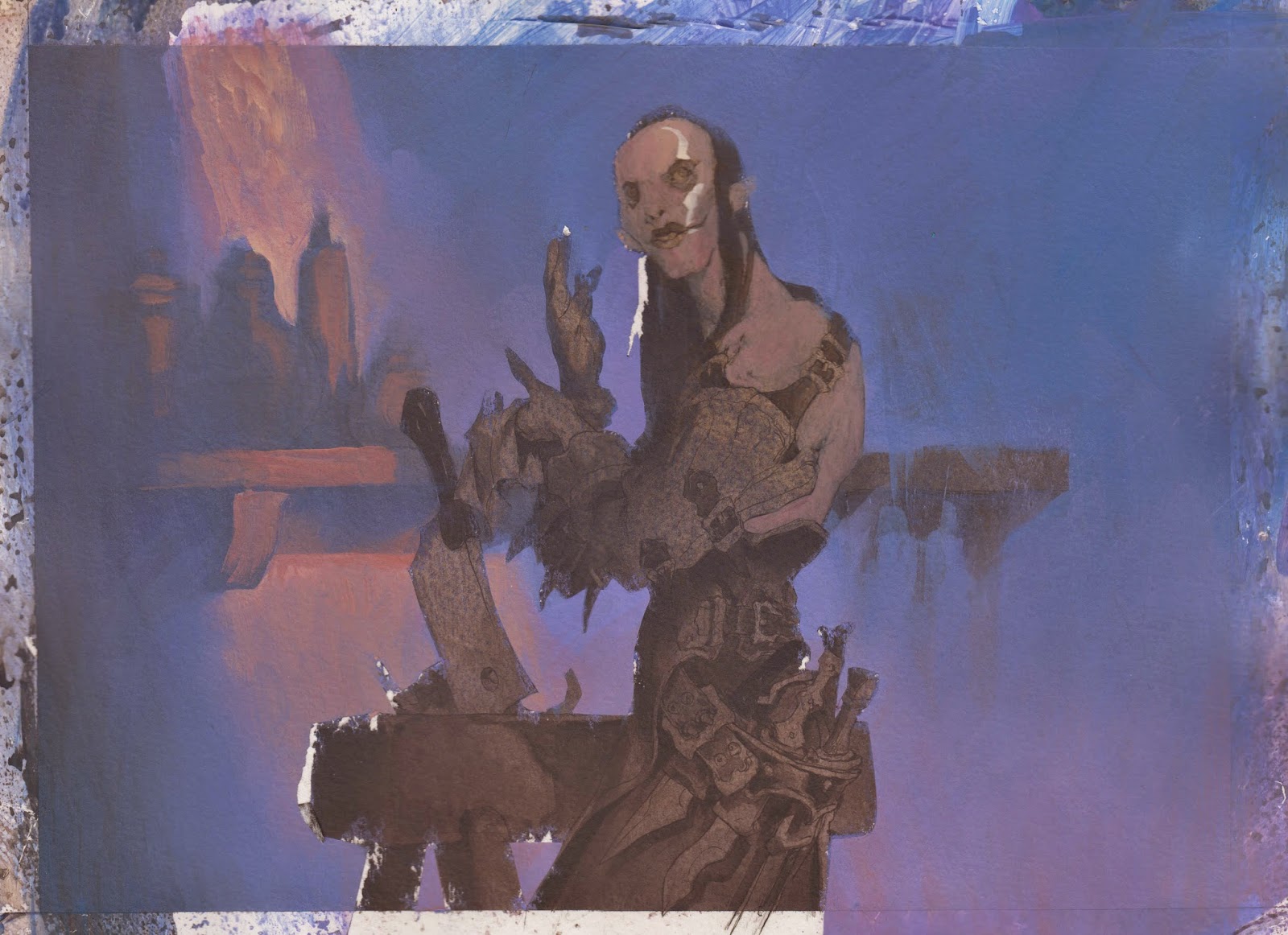
sketch approved I transferred it to paper, using a light box. I inked the whole
thing and added grey tone value in acrylics. This is a well known process to me
and something I do with every painting. I had a clear palette in my mind and
started on colours right away…
out way too dark. In order to save my mistake I tried lightening everything up
by adding thick opaque paint, thus covering the last visible lines of my under
painting, destroying the layer of values completely. It dawned on me that i
would never be able to use the areas of dark under paint and use my usually way
of washes to create interesting texture and still retain a drawing visible
underneath, visible as a tightness all over. If I was going to take this image
to final I would have to paint every single area lighter with opaque paint
trying to paint forth all the effects that I usually obtain effortlessly by
just following my work process. I felt awful. Mostly because I had worked
myself up with this drawing happy at how every stage up until now had turned
out, and in my minds eye the image was already final. Looking down at the
painting i saw no way I could fight my way to this perfect final image I had in
my head.
to start all over. this time with a clear and solid colour rough. I opened up
the file in Photoshop and started on a digital colour comp on top of my grey
value version. i always scan my preliminaries and this time it really came in
handy. I added colours for the rough by setting the brush to multiply and
started with a large texture brush. After 10 minutes I was done and thought;
“Why don’t I try to take it a bit further”? and after 10 more minutes
the background was almost done. “I could just finish this digitally”,
and so I did. Learning from my mistake in the acrylic version i brushed with
gentle easy strokes. I zoomed in on the face and used a Photo of Steve Bushemi
as ref for an ugly mouth ( sorry Steve ).
version looks very much like my acrylic paintings do. I never told anyone that
it was digital and no one ever raised the question. Well, it is half and half
anyway.
this image came out exactly as I had in mind. That is a really rare experience
for me.


.jpg)
Very awesome!
It's kind of liberating as a fledgling artist to see that pros, no matter how far along in their career, can still make mistakes. I understand that lots of people say this happens, and I think I remember reading somewhere that for every one good piece, there are like ten bad, but it's just good to see it in reality.
I kept flipping your ink wash final over to the colored final, and I think it's really cool to see them side-by-side. There wasn't much lost in translation so it just goes to show that even mistakes (the ones you made previously) really helped push your final into a great direction.
All this is to say, great work, and keep on learning! 🙂
I died a little inside when you messed up the first painting. Good to know you had a backup, I can't imagine how horrible loosing the only original would be like 🙂 I'm glad it's alright, it looks great!
Jesper, i've always enjoyed your art and even though it's half digital, it still looks like your traditional stuff. Awesome work!
Really nice work Jesper!
Love the way his right elbow is only hinted, to suit the balance of the pose.
Awesome!
Incredible work! BTW- your site link doesn't work on your Muddy Colors profile. It's been mislabeled as a .com, rather than .dk.