David Palumbo
I’m a big believer in the value of personal projects. Though not every experiment or personal series which I’ve explored has lead to a lightbulb moment, every lightbulb moment I’ve experienced owed a great debt to the time which I had invested in personal projects. I know for certain that I would not be the painter that I am without having set aside time for experimental work.
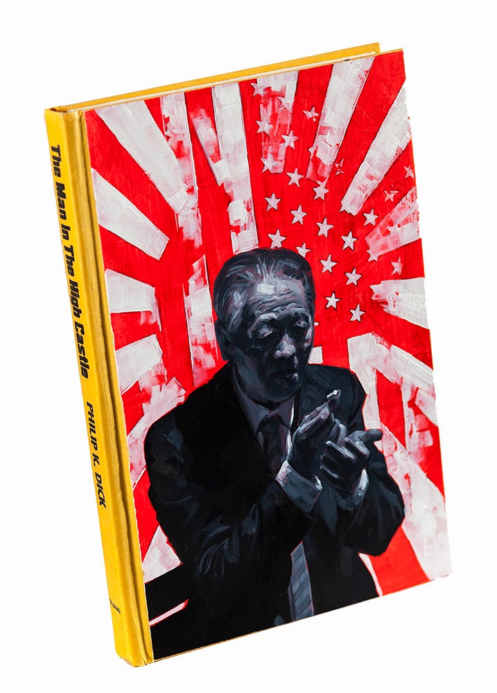
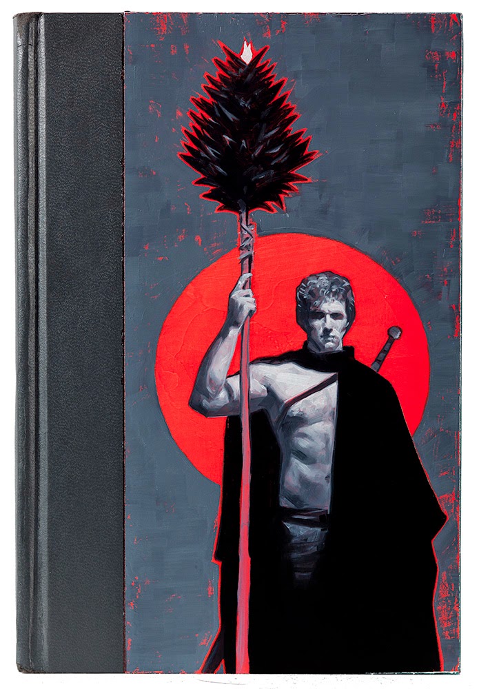
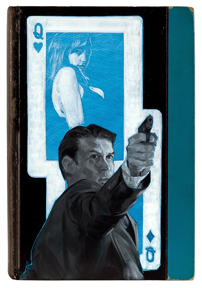
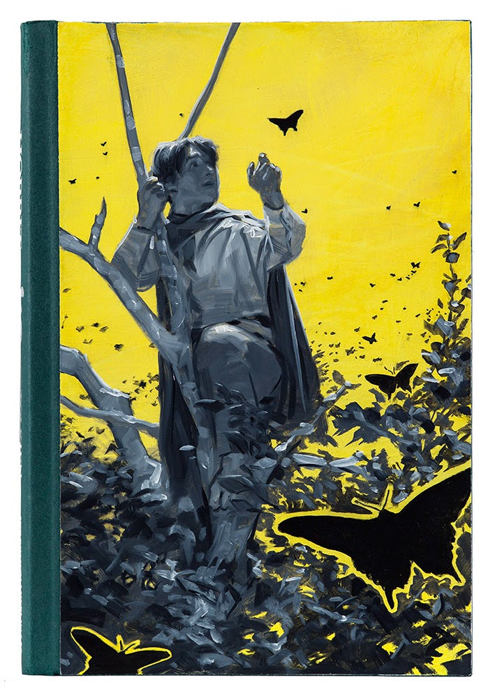
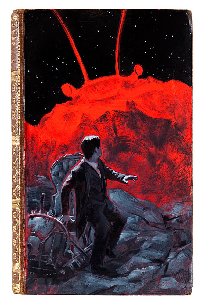
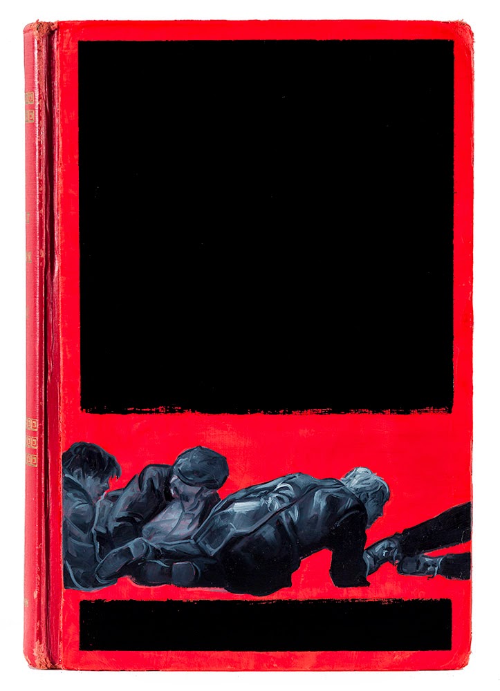
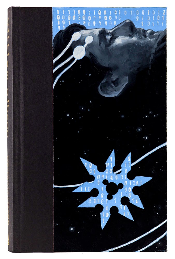
My most recent series that I’m particularly excited about is the Re-Cover Project. Basically, I have been finding old hardcover copies of some of my favorite books and creating new cover images for them directly on the book itself.
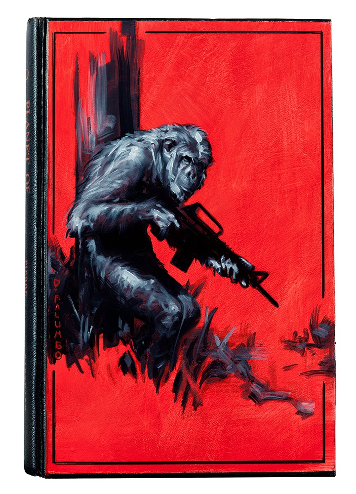
The series started in an almost accidental way. Some years back, a fellow artist (hey Bill!) was generous enough to send me a couple drawings of apes which I really liked but he refused to take any payment for them. The best I could get in the way of reciprocating was he said, if I really felt like sending him something in return, I could send some books to read. For the next two or three years I tried my best to collect a good group of books but really didn’t know what he had already read or what his taste might be, so the books went unsent. Finally, earlier this year, I knew we’d be seeing each other at SFAL and wanted to finally bring something after all of this time. Looking back through the box, one of the books I’d set aside was a 1963 first American edition of Planet of the Apes. Tying this to the ape drawings I’d been given, I thought it might be fun to paint an ape onto the book as a new cover.
It was one of those moments where I wasn’t sure if this idea was good or terrible, but figured it might be a fun experiment so I ditched the dust jacket, gessoed up the front board, and jumped right in.
Like any experiment which turns itself into a series, I really enjoyed myself on that first one. I had the end papers of N.C. Wyeth’s treasure island in my mind as I worked and so ended up limiting myself to a similar palette of black and white with one “spot color”. The thing that I really enjoy about this limitation is how much it focuses my attention on design.
I began thinking up other books which might be fun to re-imagine. I started reading books I’d always meant to read but had never found the time for, which meant I started making more time to read in general.
One of the wonderful things in a personal series is exploring processes or visual solutions which you would not turn to on a job. It seems that is the sacrifice needed when appeasing the angry volcano gods called deadlines and client expectations. Without those pressures, however, I’ve had fun pushing graphic ideas into places I normally might shy from. It’s too early to tell how this might filter in to my illustration work, but I’m certain that it is already having some effect.
Another thing about this series which has been really enjoyable for me is the conversations which it sparks with people when they see them. People who know the stories will talk about the choice of cover image while people unfamiliar with the stories might be interested to finally pick it up. Of course, that is besides the number of recommendations which I’ve been given for books I’ve yet to read (and so they are added to the ever growing list…)
The books are all vintage copies when I can manage it. Some have been too rare for me to be able to use an actual first edition, but finding re-printings and book club editions from decades ago are just as good to me.
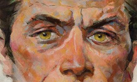
I think of each cover as a puzzle in a way, which is why these are shown mostly head on and without titles. If you are curious to know what each book is, I’m listing the spoiler sheet at the end 😉
Books shown, from the top:
The Man in the High Castle by Philip K Dick (1962 book club edition)
Planet of the Apes by Pierre Boulle (1963 1st American edition)
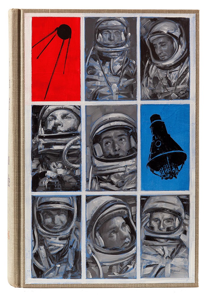
The Right Stuff by Tom Wolfe (1979 1st edition, 2nd printing)
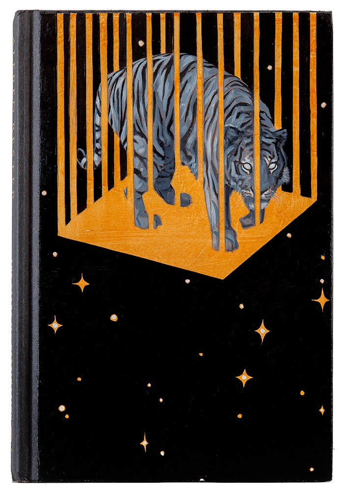
The Stars My Destination by Alfred Bester (2003, SFBC 50th Anniversary edition)
The Shadow of the Torturer by Gene Wolfe (1980 book club edition)
The Call of the Wild by Jack London (1931 reprint)
Casino Royale by Ian Flemming (1953 1st [?] edition)
The Hobbit by J.R.R. Tolkein (recent printing)
The Time Machine by H.G. Wells (1927 reprint)
The Great Escape by Paul Brickhill (1950 1st [?] edition)
The Shining by Stephen King (1977 1st edition)
Neuromancer by William Gibson (2004, 20th anniversary edition)





Wow, these are incredible Dave. They remind me a bit of the duotone painting Harold Von Schmidt and Mort Kunstler used to do. I've been thinking recently of mixing a graphical approach with a painterly style, and now seeing your work is making me incredibly jealous. Great work!
Hi Dave-
are you using oils, and do you prep the covers with gesso? nice work- David
Experiments make the world go 'round, at least our world. Working on something with its own history brings a certain responsibility but also allows for great dialogue. Great stuff. This was a great surprise and maintains a treasured spot in my studio Dave.
This has got to be one of the coolest ideas ever.
It makes me want to follow suit IMMEDIATELY!
OH man.
Are you considering selling any of these? Or are they just for fun?
Adding this to my list of “Dang it I wish I had thought of that” ideas. Really wonderful Dave! I like them all, but “The Right Stuff” is most excellent.
Dave can I steal this idea? It would make a wicked nice xmas present for a friend of mine
This is one of my favorite MC posts of all time just because I love the images!
Great on all fronts–great 2-tone approach, great solutions, great blog entry and great books–I've read most of them. High Castle and Destination are great solutions especially for me. Now you can use these to get book cover gigs I hope.
hello your art work's very awesome 🙂
and i want tell you something
the first artwork's background image is= Asian nazi flag
The 'Asian Nazi' flag was a naval ensign of the Japen's navy back on the world war 2 and we can easily assume that the 'Asian Nazi flag' is an symbol of Japen's imperialism and militarism
Did you know these facts?
or maybe this artwork is Satire!!
that is right~
then it so awesome work 🙂
thank you 🙂
That is an amazing idea! I think a lot of people will be “borrowing” it.
Great job.
Yes, the story was an alternate history in which the Axis powers were the winners of WW2 and most of the book takes place in the Japanese occupied post-war California.
thank you for Reply~
Holy heck! I remember hearing about these a short while back and thought it sounded cool…These are Freaking AWESOME!!! I kinda want to try this now…
These are so incredibly gorgeous and bold. I love them.
I too had a similar idea. A couple months ago I finished a Stephen King book that inspired me to re illustrate the cover for the book. In addition to the re-cover, I was also going to do the design and maybe the type as well, to create a mock book cover so to speak. Your post has inspired me to continue with that idea.
You kill two birds with one stone: a. you expand your portfolio and b. you motivate yourself to read, which is a great thing.
Fantastic post.
This is a really great idea!
But what makes this such a suburb cover is you've captured the still small moment of humanity at the heart of the book when Mr. Tagomi meditates on a small piece of art and perceives an alternate world-perhaps ours.
cool website