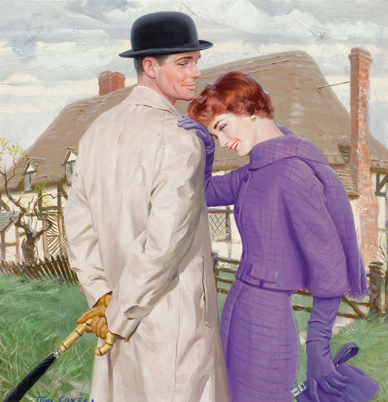
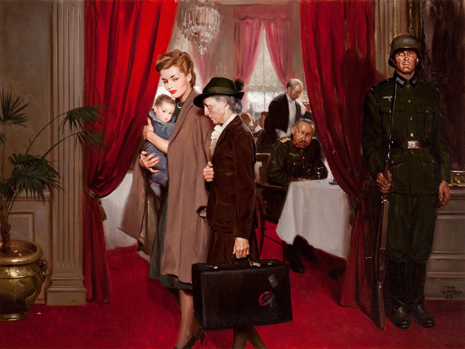
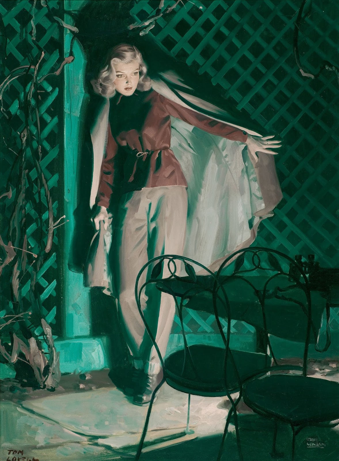
I am huge fan of Tom Lovell’s illustrations. Lovell was highly skilled as a draftsman, efficient with the brush, and could really paint a great figure, male and female. Lovell entered the illustration field just after the Golden Age of illustration, sharing a studio with Harry Anderson for a short time. I think is shows in both of their work. If they weren’t influential on each other they were certainly like minded.
 |
| Great composition. Love the big strong shapes and simple colors. I also love the shadow on the wall and the quick confident brushwork. |
Lovell then moved to New Rochelle, which had become a real gathering place for illustrators. Who wouldn’t want to be neighbors with Norman Rockwell, Meade Schaeffer, Dean Cornwell, the Leyendeckers, Al Parker, C. Coles Phillips, Frederic Remington and many more. I can’t imagine, it must have been a wonderful place to work and create.
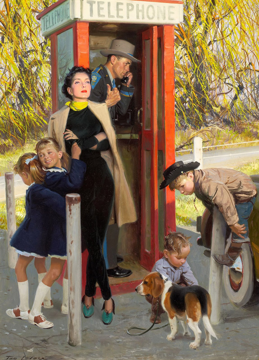 |
| When you are dressed this fashionably, you get other people to use the phone booth for you. “I think I can see Macy’s from here. Yes, they are having a sale on scarves…” |
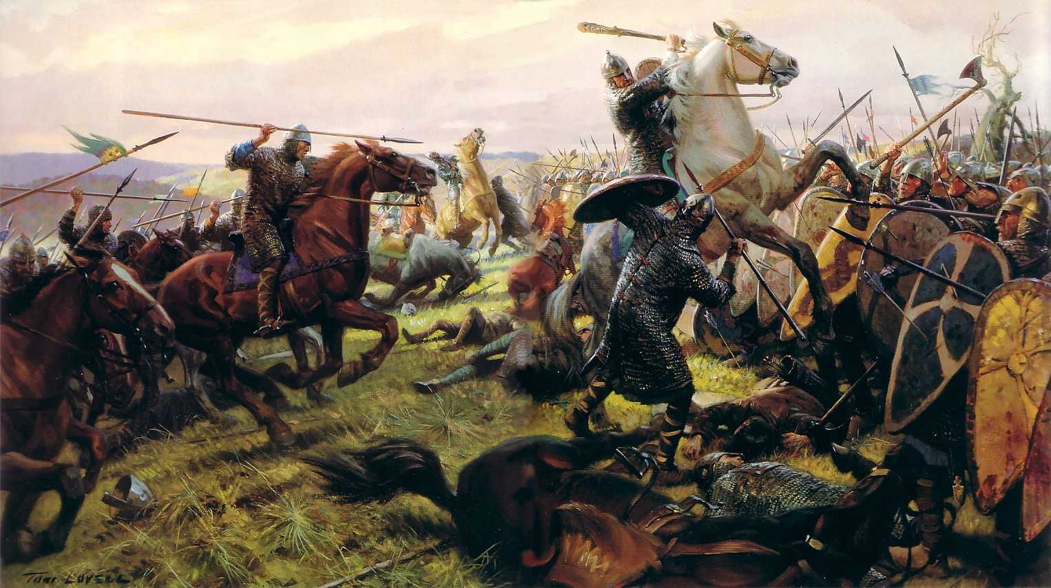
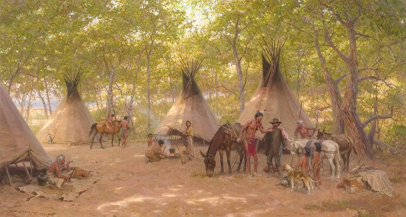
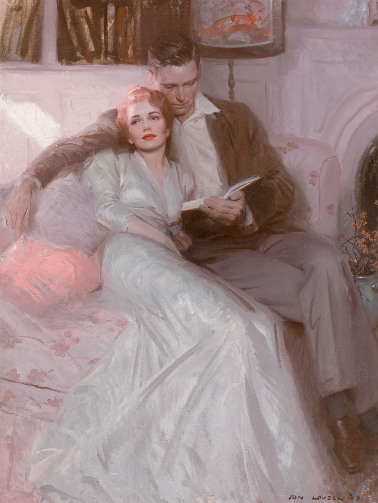
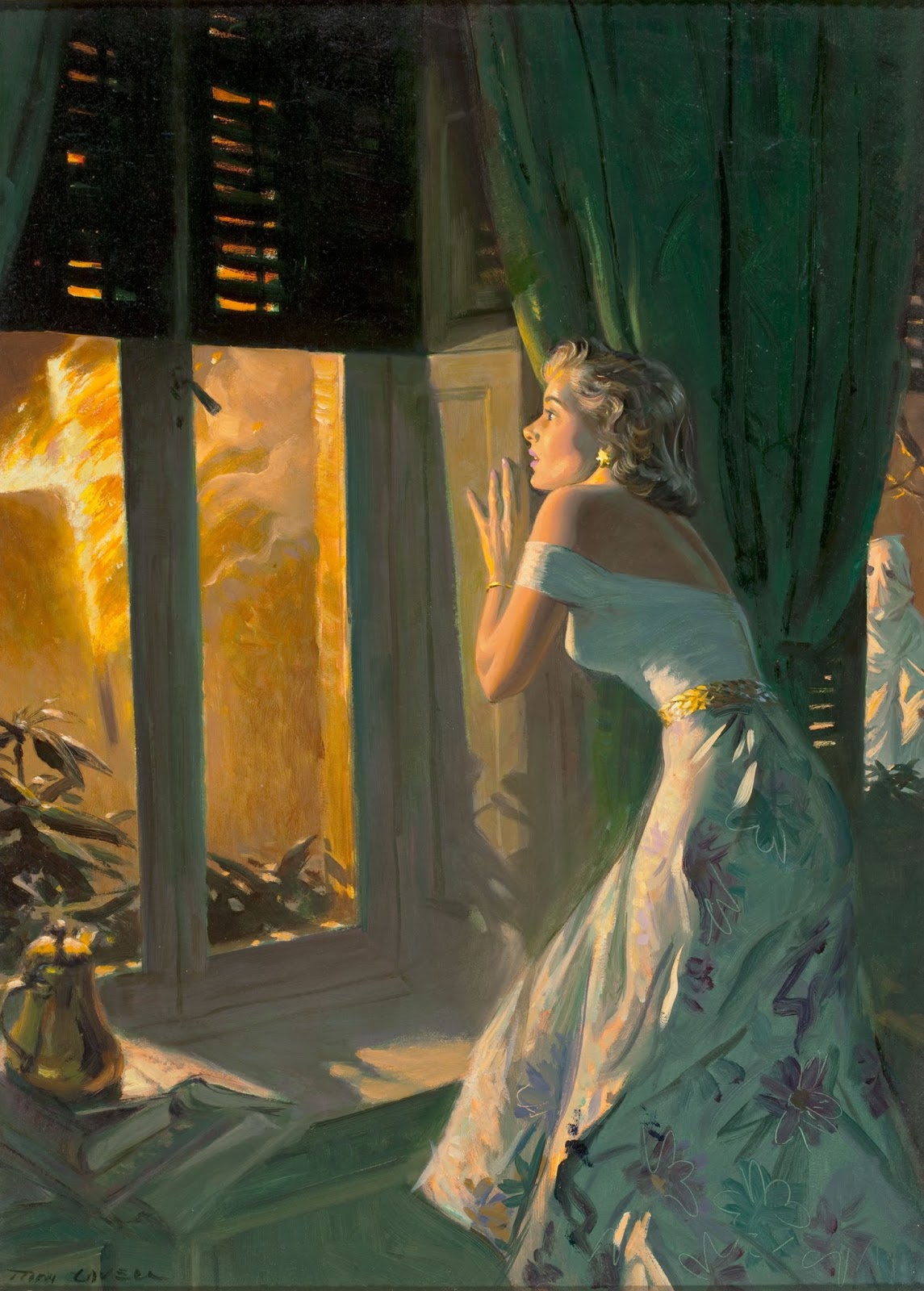
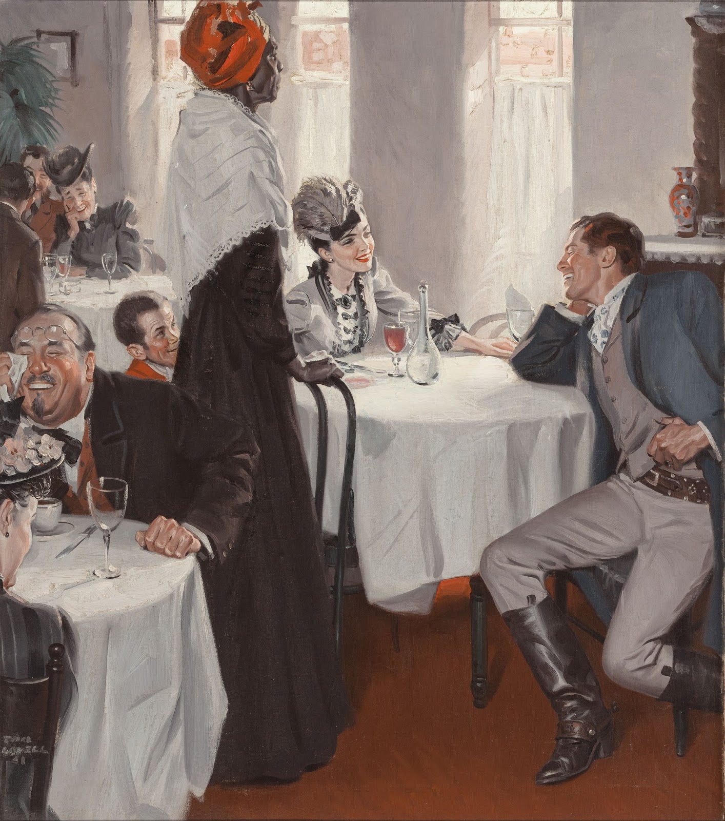
Lovell did a lot of men’s adventure and pulp illustration early in his career painting some real classic leading men and women archetypes for the era. I enjoy this kind of work, but isn’t my favorite within his body of work. What I really enjoy are his historical pieces that he did for National Geographic. Work ranging from Viking settlements and Alexander the Great to the Revolutionary and Civil Wars.
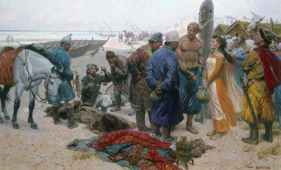 |
| I love all the characters in this painting, from the rough slave traders to the tall bare chested viking and the poor beautiful slave being sold. Lots of great details. |
His career is adorned with many awards and distinctions. He is the only artist to have won the National Academy of Western Artists Prix de West award twice and was elected to the Society of Illustrators’ Hall of Fame in 1974.
Some quotes from his Wikipedia page:
He said: “I consider myself a storyteller with a brush. I try to place myself back in imagined situations that would make interesting and appealing pictures. I am intent on producing paintings that relate to the human experience.”
On illustrating for pulp magazines in the 1930s / 1940’s: “Painting for the pulps was great training. You learned to tell a story in close compass. You couldn’t spread out over two pages, and you couldn’t take three months to research it. You had to get the job out in ten days. This took discipline.”
On historical research methods: “When you’re painting history, it always comes down to fundamentals. Reading is a help. But writers don’t need the depth of information that a painter does. With a few well chosen words, a writer can set the scene, whereas an artist must know the costumes, the weapons, what the interiors looked like, the horse tack – all the thousand things to make it come alive. I wasn’t there when Alexander marched across India. But I was able to do a painting of what Alexander did by working like hell at it.”
Most of the images I am including here are very hi-res. Worth downloading if you like Lovell.
There is a great art book on Lovell and incredibly, it is just under $4. Seriously, Merry Christmas to anyone who doesn’t have it!
The Art of Tom Lovell: An Invitation to History
Enjoy the images… and pardon some of the captions, it has been a long week.
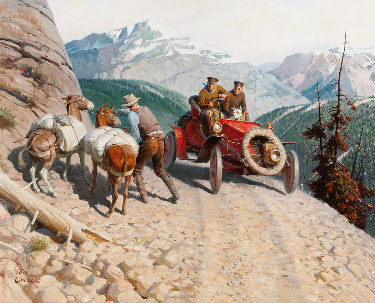 |
| The dog has goggles! That dog is the coolest. |
 |
| I am not sure what stories some of these pieces were painted for and it is hard not to make up your own stories. I think this is about a woman who was forced to live in an apartment with a bunch of men who wouldn’t stop talking and it gave her a headache so bad that a police officer and his wife had to come rescue her… |
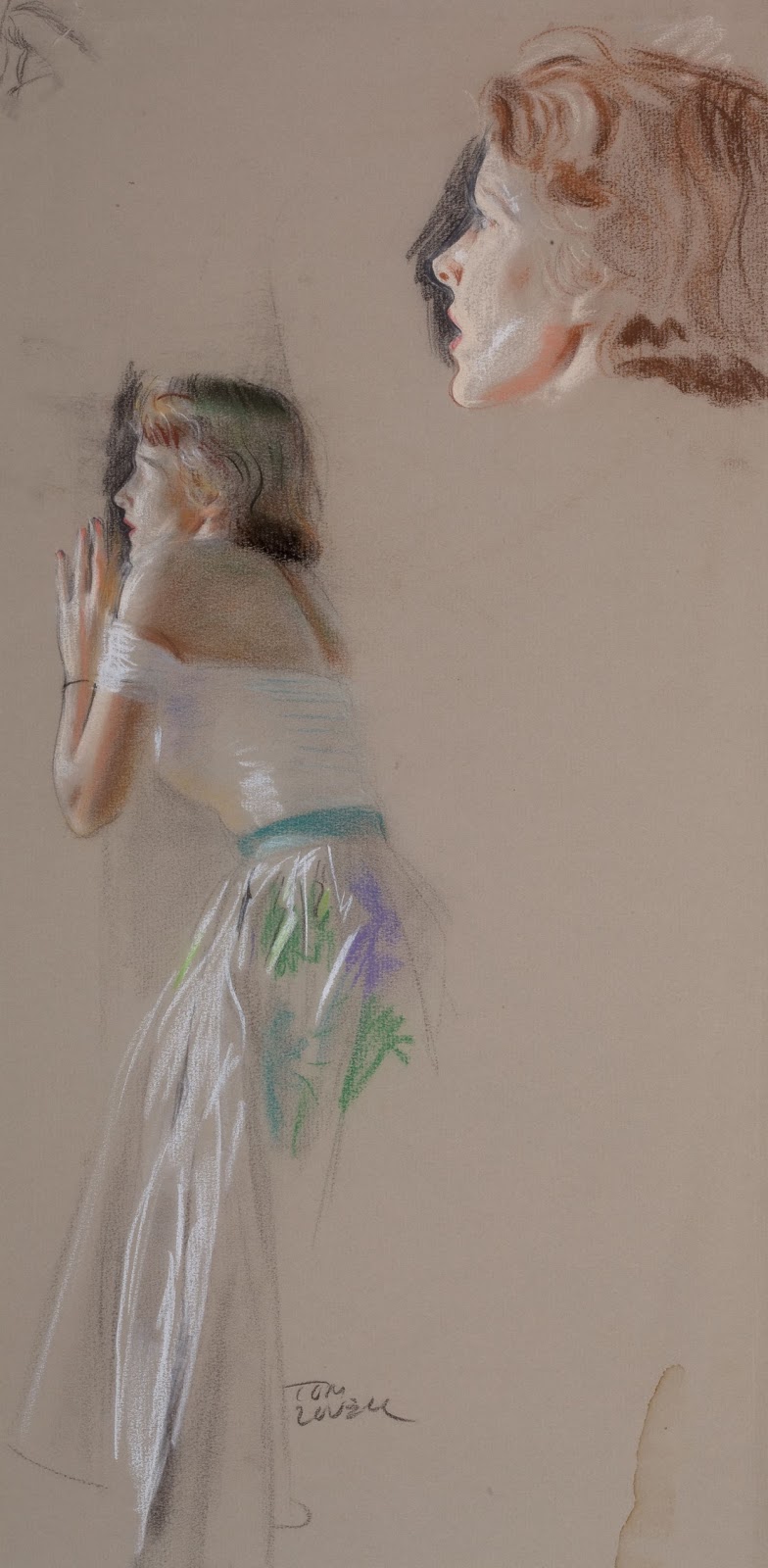 |
| Chalk study for the painting below |
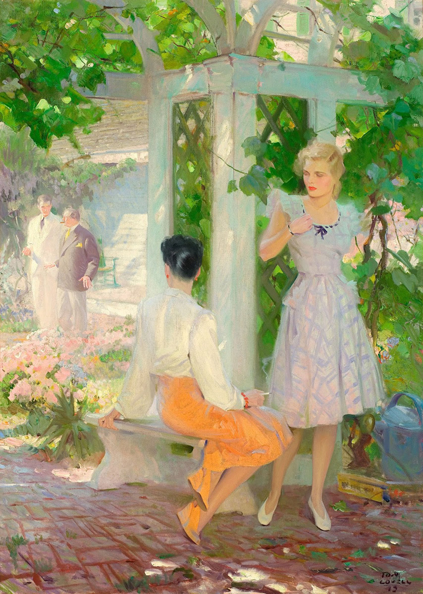 |
| I admire how light and airy this piece feels. The two foreground figures are excellent. Overall, they aren’t much lighter in value than the background scene, but the piece still manages great depth. Look at the little spot of dark leaves just to the left of the right-most woman’s face to heighten contrast as well as her red lips. The black hair of the woman in the middle is like an anchor that everything else hangs on. Great use of value and saturation to create depth. |
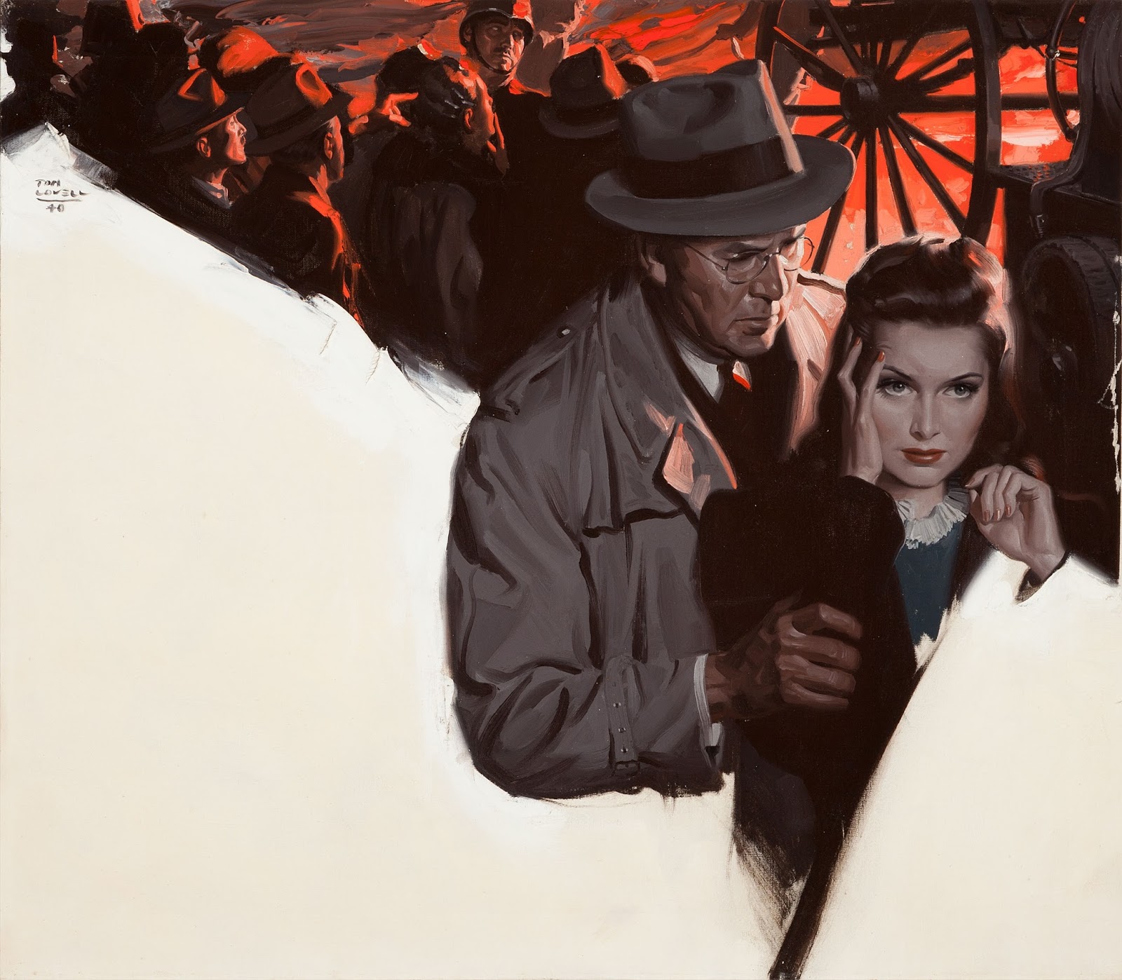 |
| Another painting that makes me want to come up with my own story. I this one is also about a woman with a headache and the man is trying to get rid of it by squeezing her forearm. It isn’t working. |
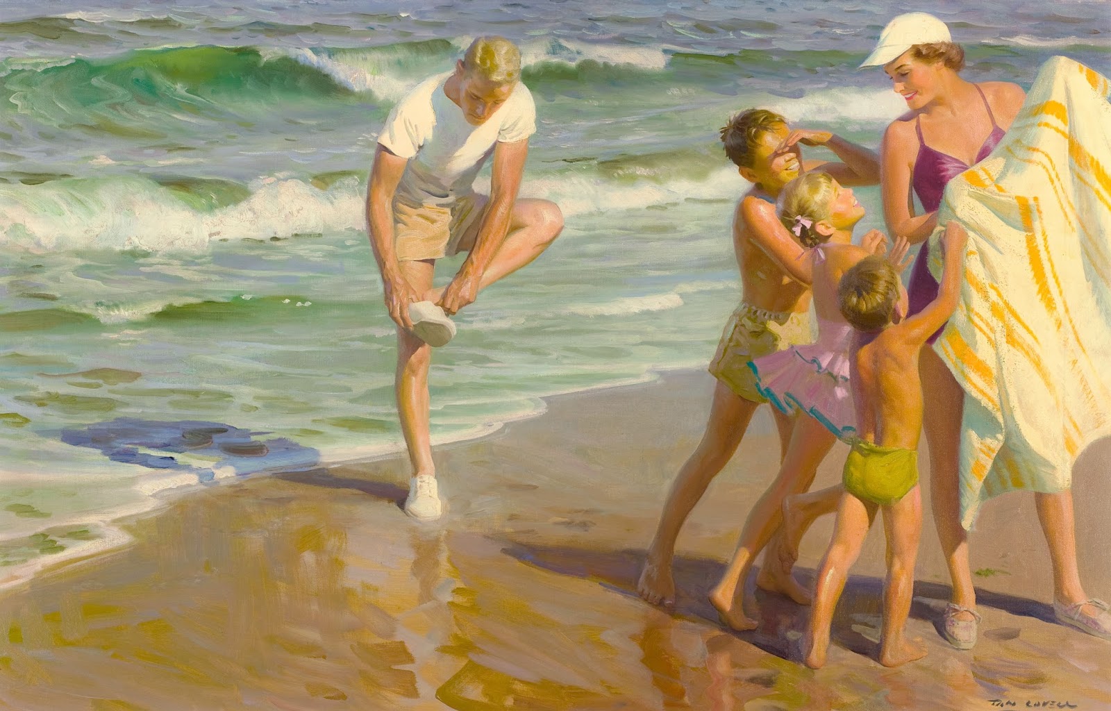 |
| Almost feels like a Sorolla with the concise brushwork and colors. |
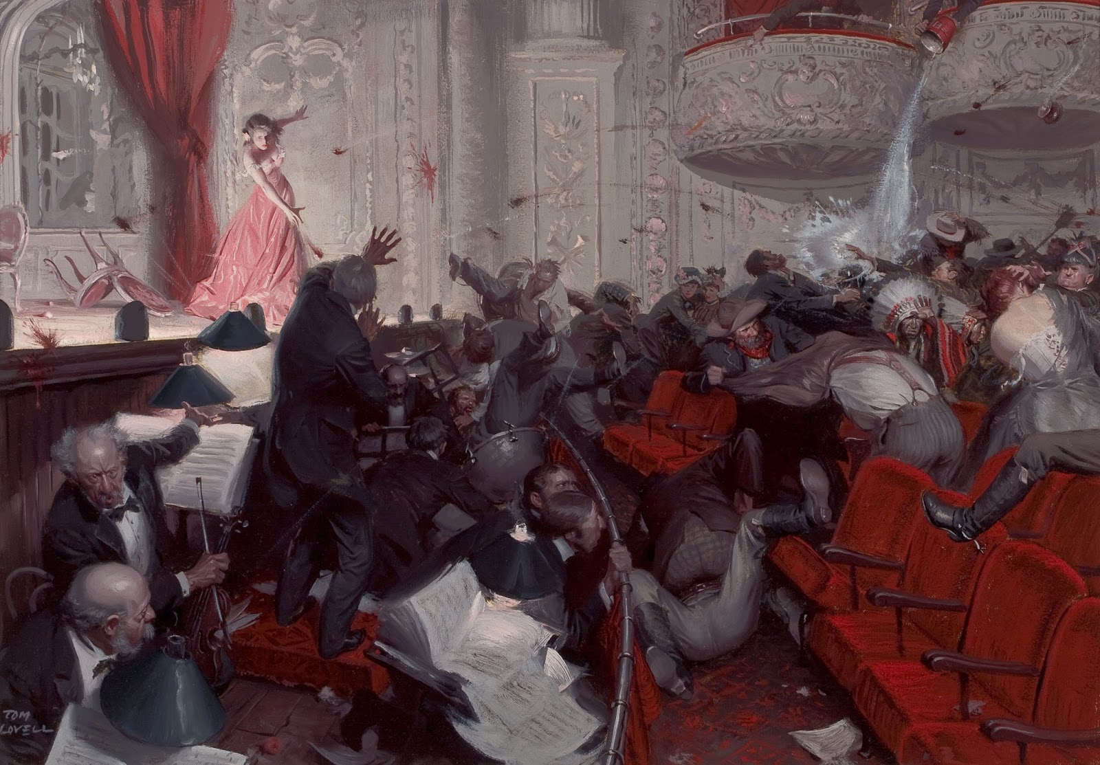 |
| I could be remembering this incorrectly, but I am pretty sure I read that this piece was done with little or no reference. Great fun either way. |
Thanks for giving this post a read. I hope you took some time to really browse the images. Lots of treasure in here. There is a great blend of detail and spontaneity backed up with some really great drawing.


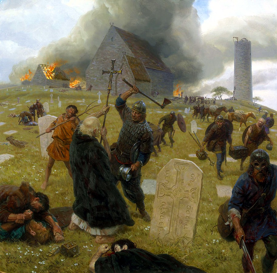

I discovered Tom Lovell in a National Geographic book about Greece and Rome when I was a kid—his paintings of Alexander the Great and his campaigns are still favorites—and loved him ever since. Great post, Howard!
Fantastic post! So… the question of the day is; where can we see these (or even just one) in person? Does anyone out there know? In my neck of the woods, the two museums that would have these are the Brandywine and the Delaware Museum of Art. I worked at the Brandywine and can say that during my time there I had never seen a Lovell and I don't think the Delaware has a Lovell in their collection either. Sadly if they did, it may no be gone. SO! Any suggestions?
Edit; Sadly if they did, it may now be gone. SO! Any suggestions?
Two of my very favorites of his are at the B. Grandin Printing Office in Palmyra, New York. He painted them for the 1964 Worlds Fair exhibit for the LDS Church. I stop and drool over his brushwork and colors each time. I think the staff don't realize what they have on display. Suprisingly small, too. “Moroni Burying the Plates”: https://www.lds.org/bc/content/shared/content/images/gospel-library/manual/06048/06048_all_001_86-MoroniBuryingPlates.pdf; and “Moroni Appears to Joseph Smith”: https://www.lds.org/bc/content/shared/content/images/gospel-library/manual/06048/06048_all_001_91-MoroniAppears.pdf
Well, so much for workable links.
Thanks a lot for this article! I knew the viking slave picture (i found it on an italian magazine time ago) and i've always wondered who was that stunning artist! 🙂 i feel happy now! 😀
An amazing artist. These grand old illustrators are my favorites. So much more skillful and talented than the Modern Artists the 20th century is know for. A Lovell or a Duchamp? Lovell, please!
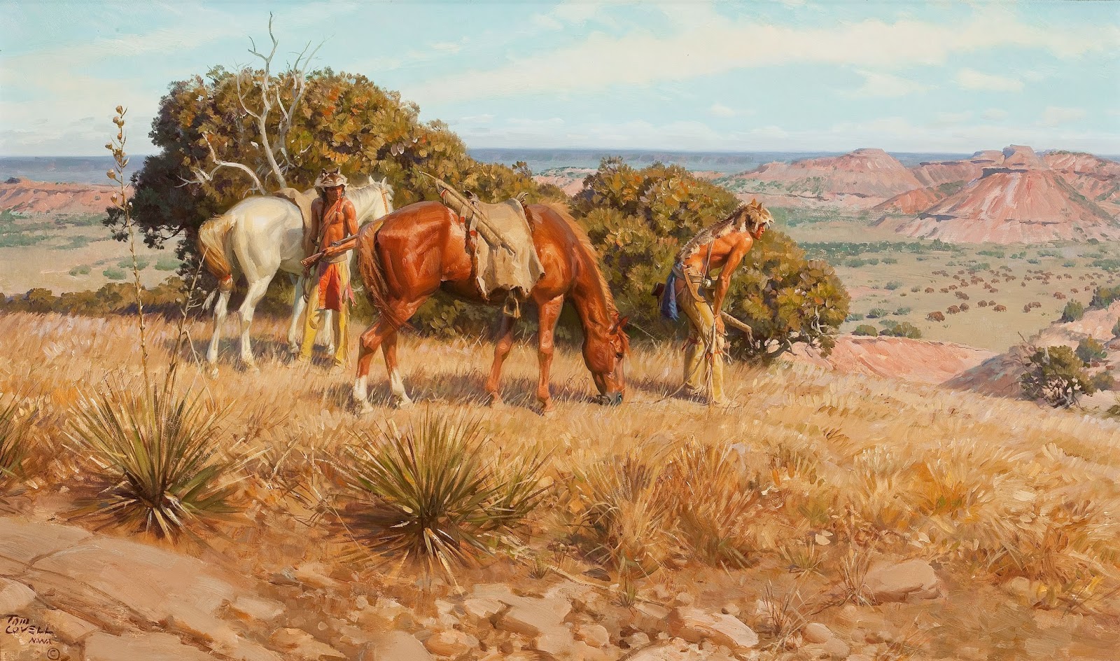
I have this book you mention Howard – it's excellent – but actually doesn't even have the paintings you're showing here.. it has many of his paintings of Native Americans and the west, and some of the other historical paintings. He was absolutely amazing. And what I found astonishing – he didn't start doing art until he discovered he had some talent in college. He just happened to take an art class and it changed his whole future.
Thanks Arnie. He is so dang good. I need to see more works in person. The Legacy Gallery in Scottsdale had a couple last year. So much great control and skill. More please. 🙂
That is a great question! Dan said that there are some at the Society of Illustrators, but other than that, I have only seen a couple in person at an auction in Scottsdale. They are as good as you would imagine!
Great paintings! I love that Lovell did those, they have always been favorites!
Yeah, that image is awesome. His paintings of Alexander the Great are incredible too. Google those if you haven't seen them.
I am with you, Lovell all the way!
That's right, the book has a ton of images and very few of those above are in the book. The book has some great writing too. Thanks Tom.
What a Master!
I remember cutting the Battle of Hastings painting out of the National Geographic and hanging on my wall as a kid. A real inspiration.
I remember cutting the Battle of Hastings painting out of the National Geographic and hanging on my wall as a kid. A real inspiration.
Tom's work truly is incredible! I think he's one of the best ever with composition.
Lovell didn't start until he was in college? I started when I was five but he makes me look stupid. lol
I adore Tom Lovell and just bought the book you recommended. Thanks for the post.
There are some Lovell paintings in the Marine Corps Museum, outside Quantico.
In the piece with the two women standing in the foreground under a canopy, I believe the foreground is DARKER in value than the background.
He meant the foreground FIGURES were not so different in value from the background. And actually, the girl on the left of the painting is the exact same value as the background. Cheers!
Very interesting to notice, and this is something not too many people has, is that in the piece of the two foreground girls with the two guys on the background, the standing girl doesn't actually have a left arm. Tom here actually managed to do this and still make us think it's there! Maybe because the values are perfectly arranged and a little because the color of the background through the leeves is very similar to the skin tone (my theory anyway) Impressive.
Very nice post. I just stumbled upon your blog and wanted to say that I’ve really enjoyed browsing your blog posts. In any case I’ll be subscribing to your feed and I hope you write again soon.