On my way up the food chain of professional painting, I encountered what seemed a compliment about my thumbnail ideas for paintings, but it quickly became a shocking rejection to me.
“Greg’s trying too hard, he’s thinking too much.”
This was the first time I realized that conceptualizing images to tell stories or to describe moments, or to visualize unique concepts, meant that I had to work through an image to allow the viewer, any viewer, to experience the piece on their own terms and not bang them over the head with an idea.
Irene Gallo, art director of Tor Books and Tor.com, describes a principle she encountered in art school from a photography teacher. He would ask the students to explain their photos. When the student digressed into describing feelings or high concepts they thought the picture was about, he would stop them and ask, “What’s in the picture?” He would repeat this question until the student described exactly what existed in the photo they took.
Simply put, what’s in the picture is exactly that: what is actually in the dang thing. And what’s in the picture reveals exactly what the artist is thinking. Not what the viewer will think about it.
You have mere seconds to hold a viewer’s attention. How you do this must be simplified. Even complex, multi-figured concepts like battle scenes or a crowded subway delight the eye when it can flow through the painting. The brain wants to return to that experience again because it gets a payoff from it. A tiny hit of dopamine. Moments of time, composed well, draw the mind back again and again.
Don’t let any of this make you afraid to compose pictures, or tell visual stories, or take risks with your concepts. Think of it as a problem to be solved for maximum affect. It is The Problem everyone encounters, sooner or later.
Below are points to consider while you’re drawing thumbnail concepts to build a new picture. Do not assume that what’s in the picture reveals anything more than just what’s there.
Telling too much or too little.
You’re tempted to explain everything to get your idea across, so you pack the picture with needless elements. Or, you remove most of the elements and simplify it to a facial close-up. (Not that a simple face can’t be compelling, but many artists default quickly to this solution.) While powerful, it lacks the drive to reveal a complex idea. Simply too little information. What’s in the picture is a face, with an expression. Nothing more.
Everything in the picture is a decision. It is a compilation of elements. You must isolate the most important elements and use them to guide the viewer.
Every space is important.
Every space. What’s in it, how it’s lit, how it’s composed, all have an affect on the viewer. Not only what elements are in the picture, but how they’re arranged in the picture is esential to your concept.
For example, the point of view in a picture is critical. Starting with the horizon line, if it’s far up toward the top of the picture plane, it means we are looking down on the subject. If the line is low, we are usually looking up at the subject. Sounds simple, but how many times do you consider it? Both are powerful, but elements should be in sync with the position of the horizon.
In simpler terms, use a range of perspectives, lighting conditions, and compositions. All give specific feelings to the audience and you can use this to guide them to an understanding of your concept.
Time travel.
Certain aspects of life and story such as sound, temperature, time, thoughts, or intentions, cannot be easily translated into 2 dimensions. For example, an intention like, “She resisted the urge to tell him” cannot be portrayed. The idea of implication or hesitation can only be suggested or implied, but not described finitely.
People respond to what’s in the picture now, not in the future.
Overstatement.
Pushing the idea too hard reflects that an artist thinks the viewer has no experiences of their own, or hasn’t encountered anything remotely similar to their gloriously unique idea. You must assume the viewer is intelligent enough to want to go where you are taking them, and assume they are like you and have similar thoughts and desires as you. This is how one finds an audience for the work, and not the audience on a grand scale either. The piece must speak to one person at a time.
Instead of trying to win the hearts and minds of everyone, try going for the viewer that would respond to the piece you have in mind. There will be other audiences for other ideas.
Body language.
A pose can be pushed too far. Overwrought expressions of emotion lack subtle understanding by the artist. Especially when using obvious physical contortions to express emotion, like a circus performer or a mime. They have their place, and it’s not on the canvas. Emotions can be powerfully rendered in a picture, but when they touch on theatrics, they become cliche and melodramatic. Avoid this approach by asking again, what’s in the picture. Figures too emotional? Tone it down, push it back a little.
The audience is eager to participate. Let them.
Become the audience.
What is obvious to you is not necessarily obvious to the viewer. You’ve spent much more time working on the concept than the viewer, so naturally you understand more than the viewer at one glance. You’ve trained your eye to look for the parts which tell the story.
One of the hardest things a visual story-teller must do is step back and become the audience, to see the work with a fresh eye. This takes actually removing yourself from the studio, taking a break, walking away. What’s in the picture will reveal itself to you upon return.
Forget what you know. You must renew your ‘fresh eye’ over and over and over again throughout the process.
Forced detail.
Because a painting looks like a photo does not give it gravitas. A painting is a painting, and not a poor excuse for a lack of photography. Painting like a photograph is copying a copy of time.
Is this advocating only painting from reality? 100% no. Photos help capture things that we later use to make paintings, sometimes of reality, sometimes of dreams, sometimes of other ideas. It doesn’t make reality look any more real because it resembles a photo. Allow your paintings to feel like paintings. Have a voice and a vision.
Trust the audience.
What you intend the subject of the painting to do, or about to do, or even if what you, as artist, intend as the reaction to the painting, doesn’t matter. The audience will respond to only what is in the picture. They will not read your mind. They will not know for certain.
“The first sin is to confuse the audience.”–Stephen Sondheim. However, if your grand plan is to be enigmatic, then the idea is to specifically allow the viewer to come to their own conclusions. This is not a guessing game to find the hidden joke. You have no say in their experience. No matter how much you write about it or preach about it, you cannot control their reactions to any high degree.
Trust your audience. Put paintings into the world and let them go.




Wonderful as usual, and very good advices.
Good article, Greg. Funny that you mention “Thinking too much”. That was one of the first things that you said to me at IMC… “Dougie… You think too much”. I'm finally starting to understand what you were talking about… only took me 3 years. 😉
I'm trying now to get that fine balance of “enough detail but not too much. Let the viewer figure out the story”.
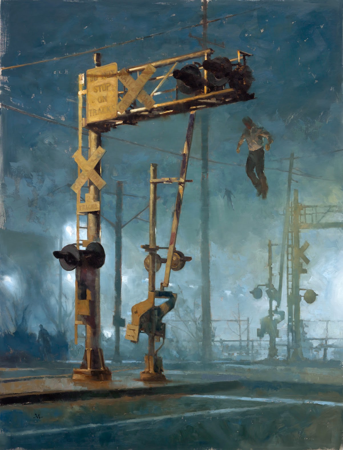
Great read Greg. I am always humbled when someone interprets what I have painted as something completely to what I intended – it's great to have an affect on many different levels. For this same reason I find it awkward to describe what I am currently painting as I don't want to cloud their own ideas and experience – they might be better than my own! BTW I love what you have done with the light in 'Nightwave' above. Very moody and mysterious. Would love to have been able to see it in the flesh.
Thanks Alex and Tim!