It is always tough to follow Lauren on Muddy Colors, but her post yesterday was especially killer. It was the 7 course feast, today is the light dessert, but hopefully it will be tasty.
I am in the process of moving into a new home and have the chance to design out a new studio space. I have been researching art studios to see if there are ideas or elements that I haven’t had in the past.
I have worked out of my kitchen, living room, bedroom, as well as dedicated studio space and right now I am in an unheated (this Arizona native still finds the blessedly mild Utah winter cold!) add-on in a rental home while I get ready to move next week into the home I just purchased.
*** I am asking for participation here ***. Share and image of your studio and tell me why you like about it and what you might change or wish you could do. Send your images and an information you would like included to:
Updates are starting to come in. Adding them to the end of the post.
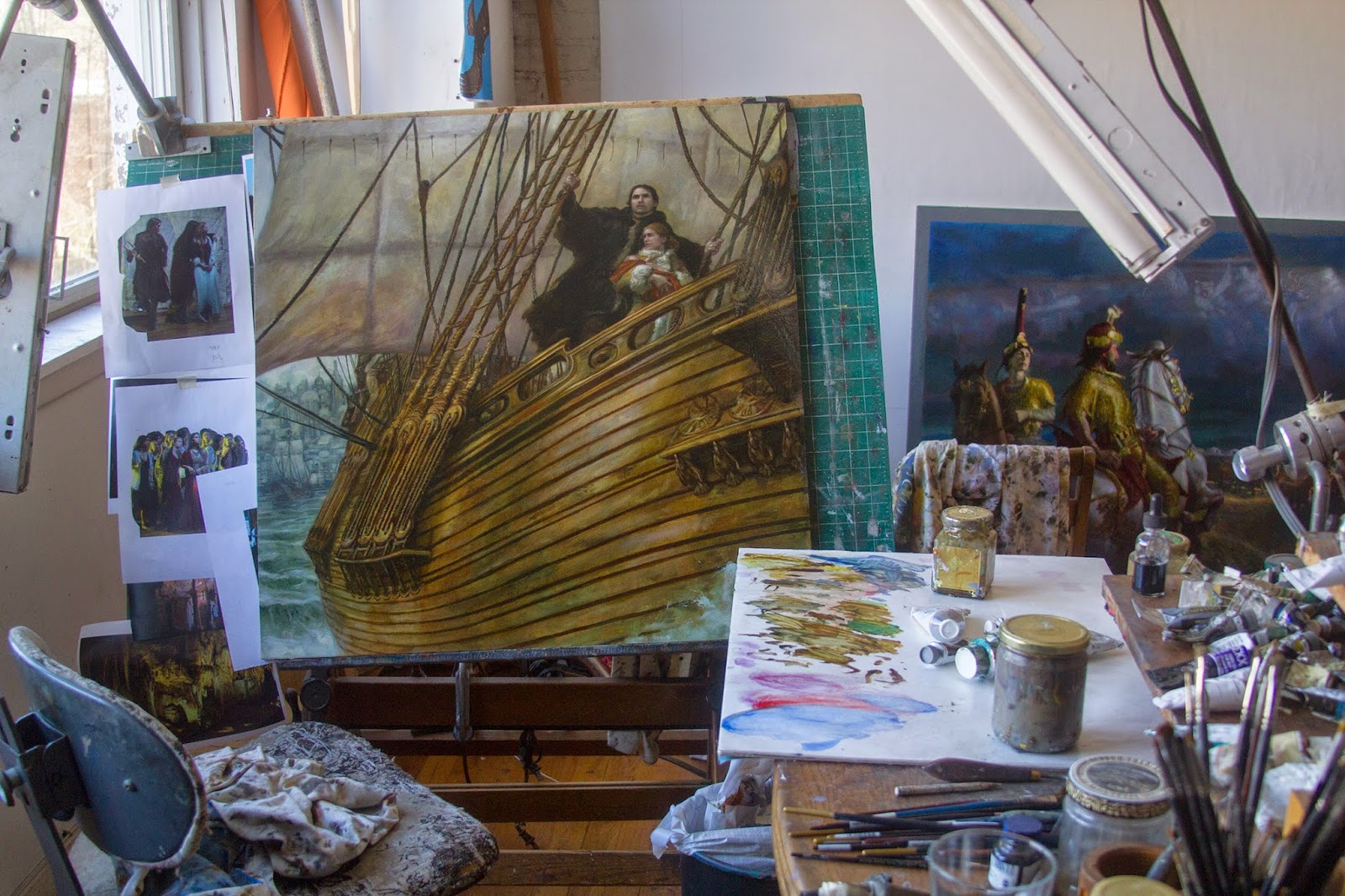
To get things started, I am including some past artists spaces as well as some current.
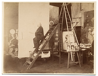
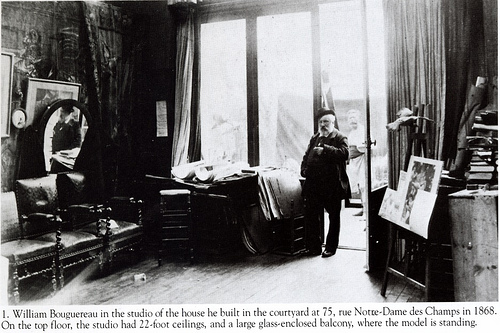
Bouguereau – Cool ladder scaffold for larger paintings.
A shot of Casey’s taboret. Impressive.
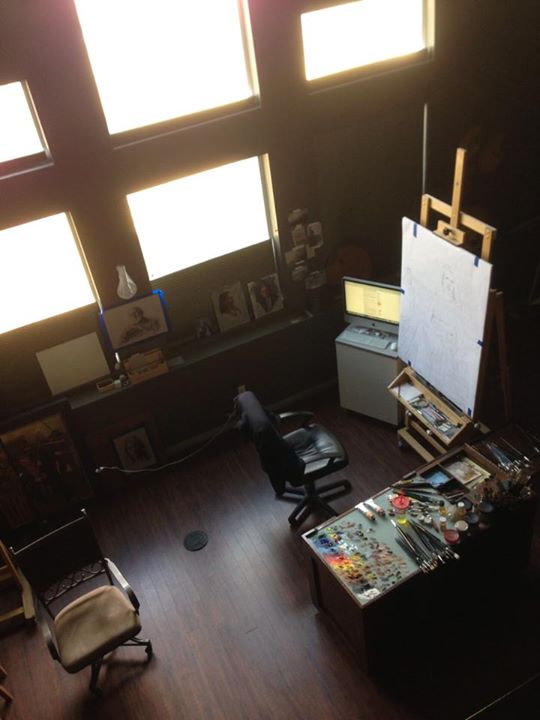
David LaRocca posted some nice images of his space just today. David has a great space divided into traditional and digital. I can’t help but notice it appears to be the light and dark sides of the force studio.
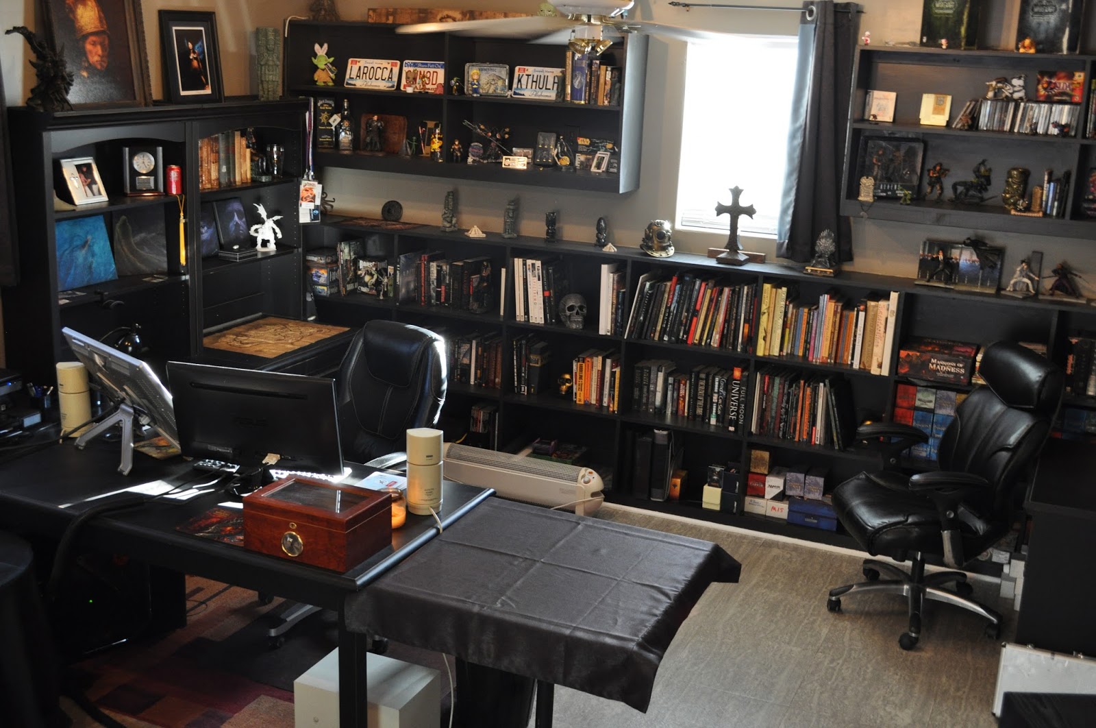 |
| The Digital Side |
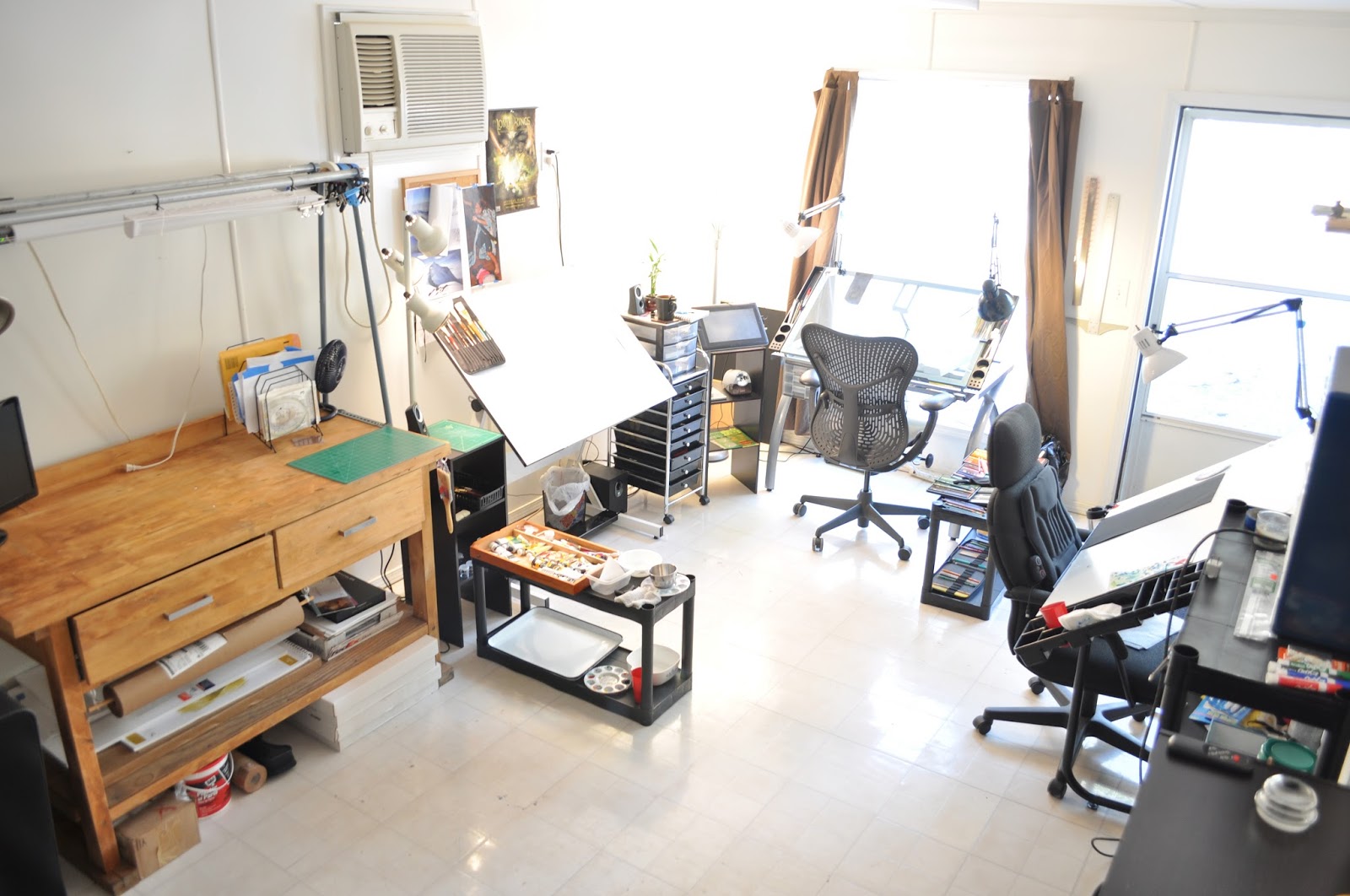 |
| The Traditional Side |
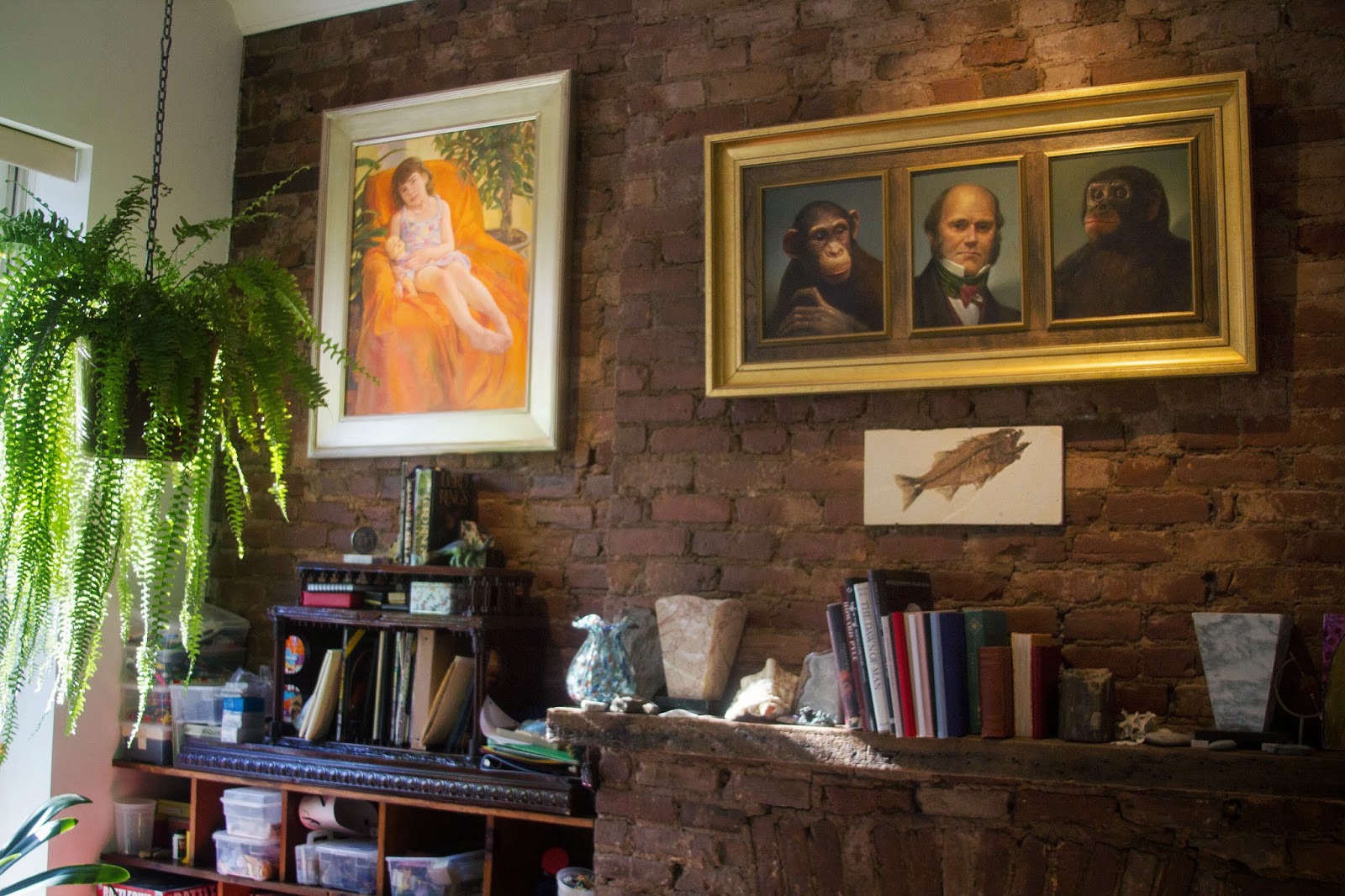
Love the old brick wall.
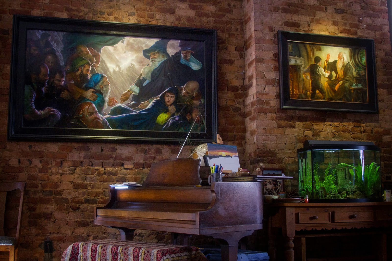
More brick, and a piano that wood elves come to play while Donato paints LoTR scenes.
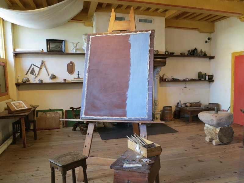
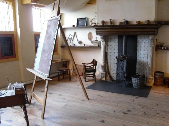
Rembrandt
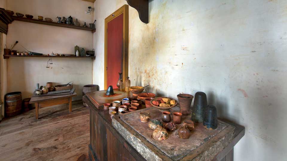
Neat shot of the mixing table with chunks of pigment in the bowl and mortar and pestle for grinding and what looks like a dark stone for mulling on the far end of the table.
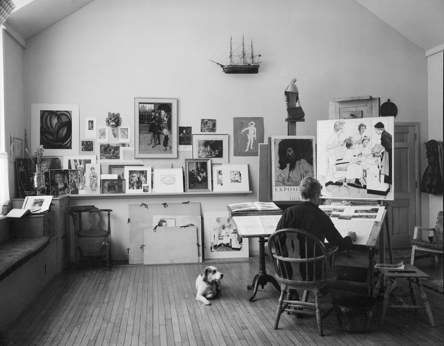
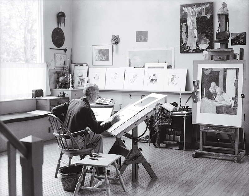
Norman Rockwell’s airy space. He was proud of the stand to his left. It was cast iron and he had it his whole life.
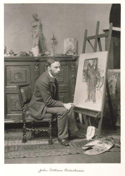
John William Waterhouse, one of my favorite artists and a fairly modest space from what I could find. “The canvas is a little to the left John, you aren’t painting on anything, just turn a little.”
William Merritt Chase – the opulence of the some of the 19th century studios was pretty amazing… but wait for it, it gets even better!
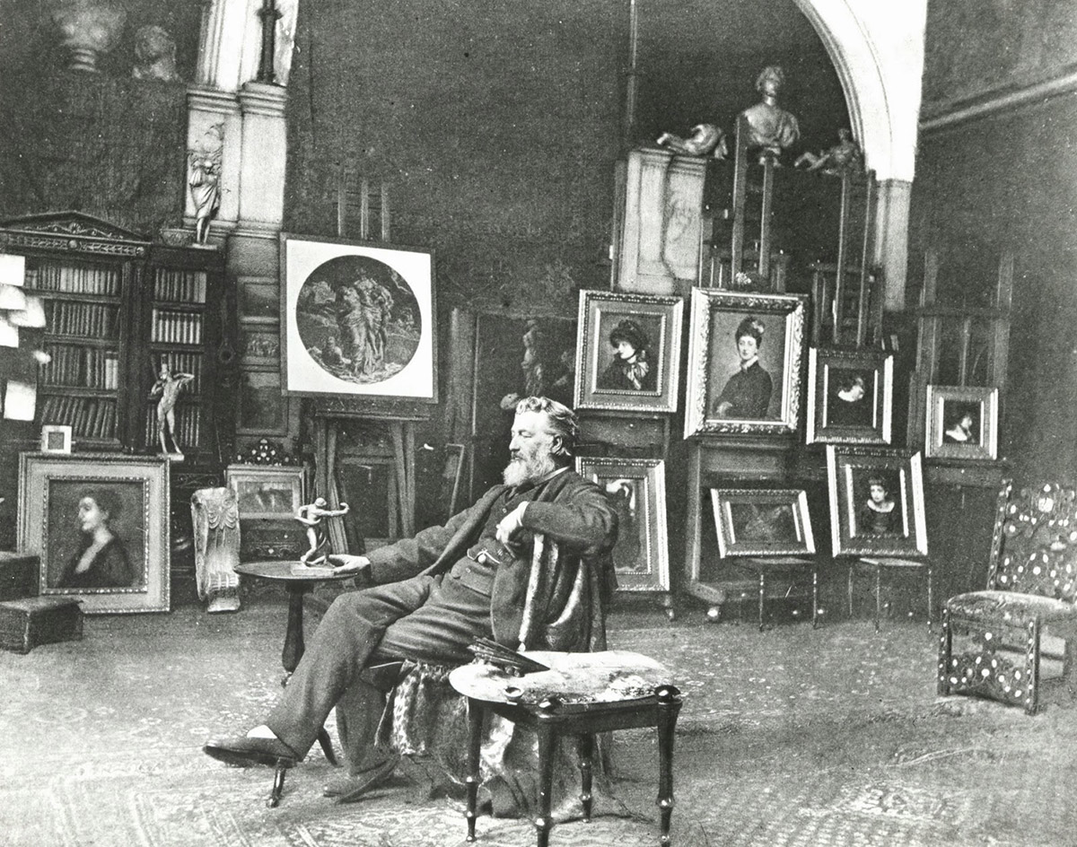
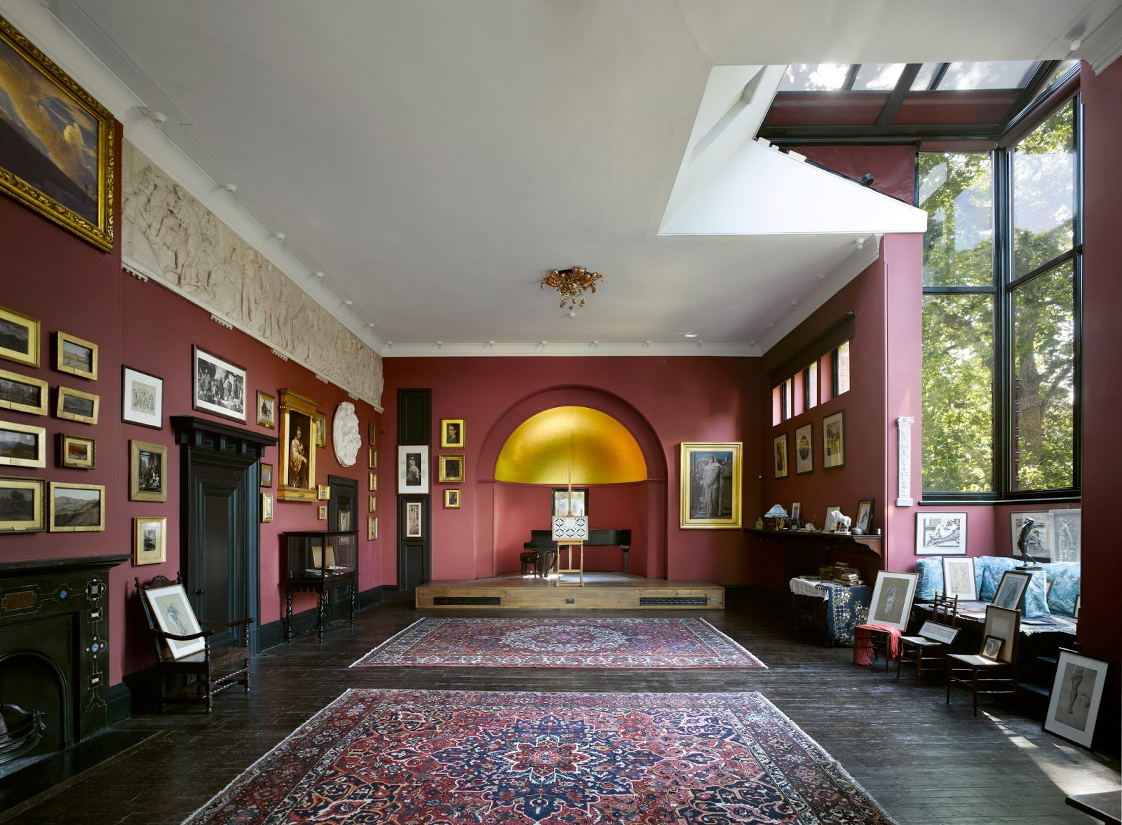
Last but not least, Fredrick Leighton’s studio. This is how one paints in style. Victorian opulence at it’s best.
The studio is now the Leighton House Museum.
Man, I love this space. What a great studio though it is hard to imagine the success and resources available to the premier artists of this time to be able to commission a space like this.
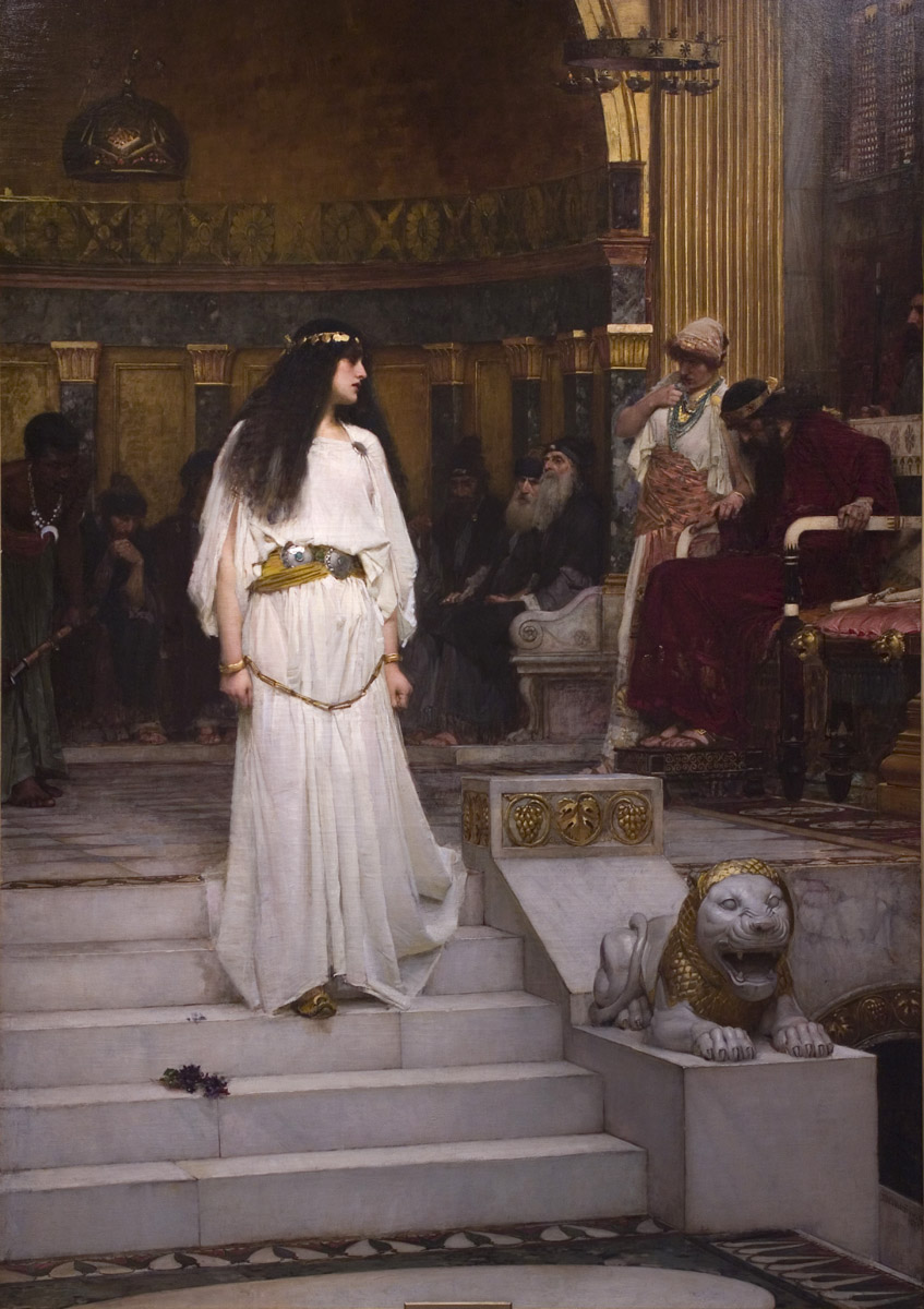
If that gold half-dome looks familiar, you have seen it before. It inspired the background in this Waterhouse painting:
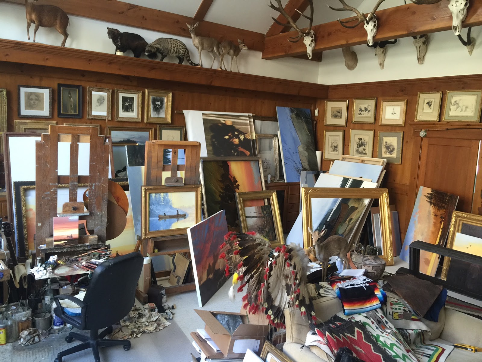
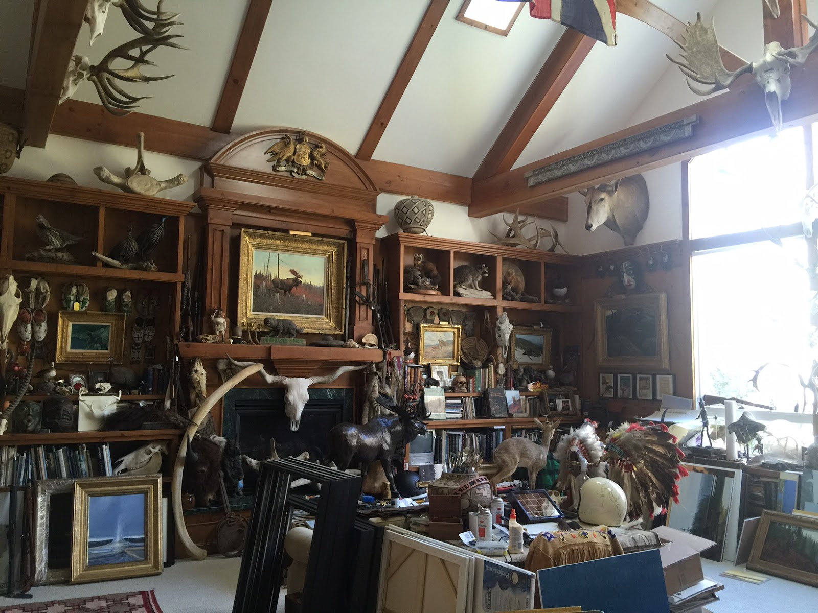
Howard Lyon
*** Adding in those who have emailed me pictures of their workspaces ***
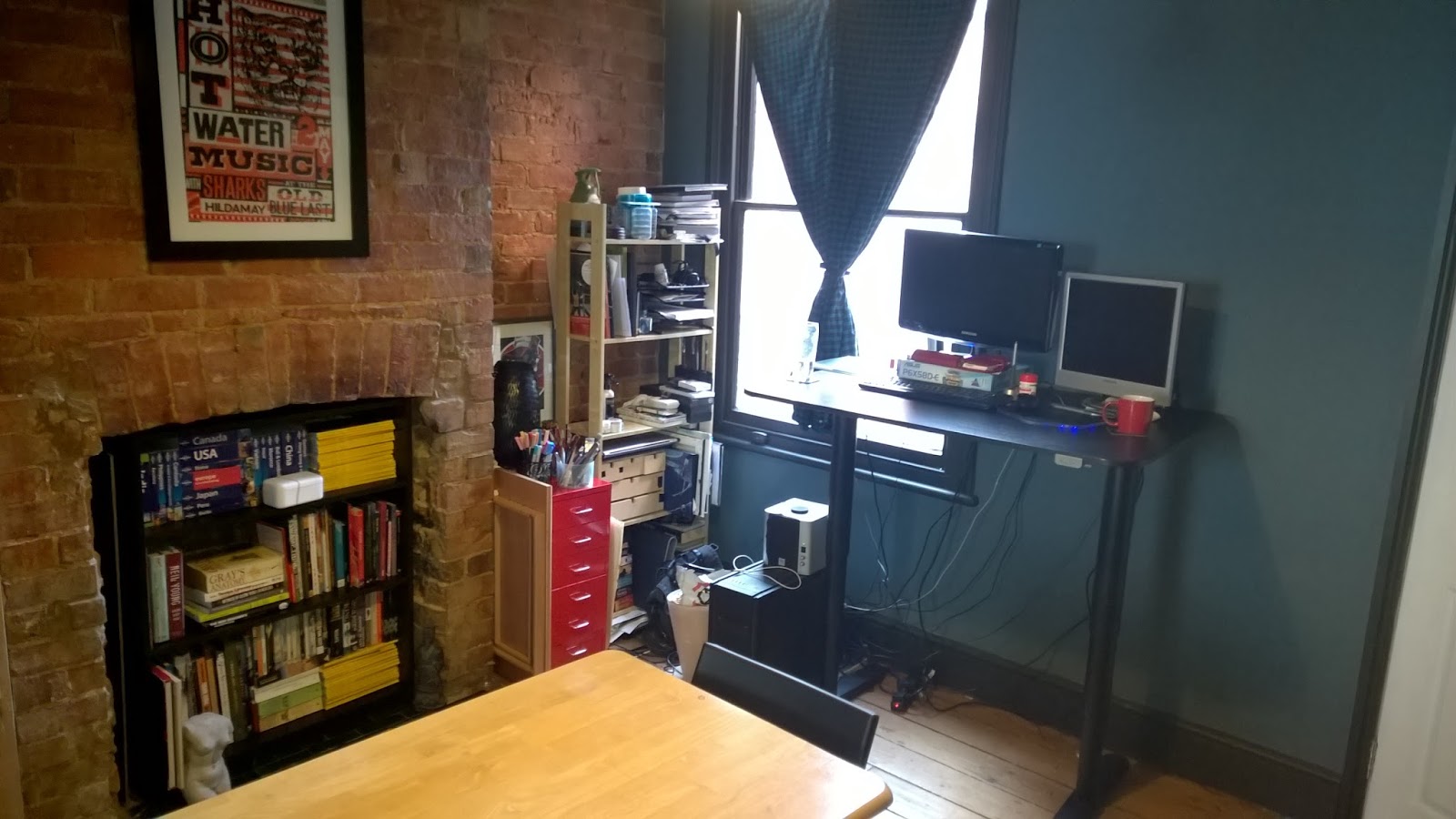
Nicole Alman – website
“This is my space, very lucky to have a housemate who’s let me take over the dining area! We’ve just installed the bookshelves in the fireplace so all our art and travel books finally have somewhere to live. I must say, having a standing desk has made a huge difference to my day to day life – not only are my back and hips in better shape but drawing on the wacom standing up gives you great freedom of movement. It can get a bit bright in the afternoon, but otherwise, this is the best space I’ve had yet.”
Marvin Silva – website
“Here is what I have in my apartment. My fiancé was understanding enough to let me use one whole room as a studio. I love being in it either drawing or painting. I do wish it had a little bit more space. Just a little bit more 🙂 other than that I love it.”
Jason Cheeseman-Meyer – website
“What I like about my studio:
I’ve got a digital workstation, two easels for painting, and an opulently sized drafting table. I can quickly change from working in one setup to another.
What I wish my studio had:
A little more space. Especially storage space. If I’ve got wet paintings hanging around, or many framed paintings and shipping boxes, it quickly eats into my working square footage.
Pie-in-the-sky? I’d LOVE to have a nice high ceiling.”
Nicholas Coleman – website (this is a great studio space!)
“25×25 with 30 foot vaulted ceilings- North facing windows for steady lighting”
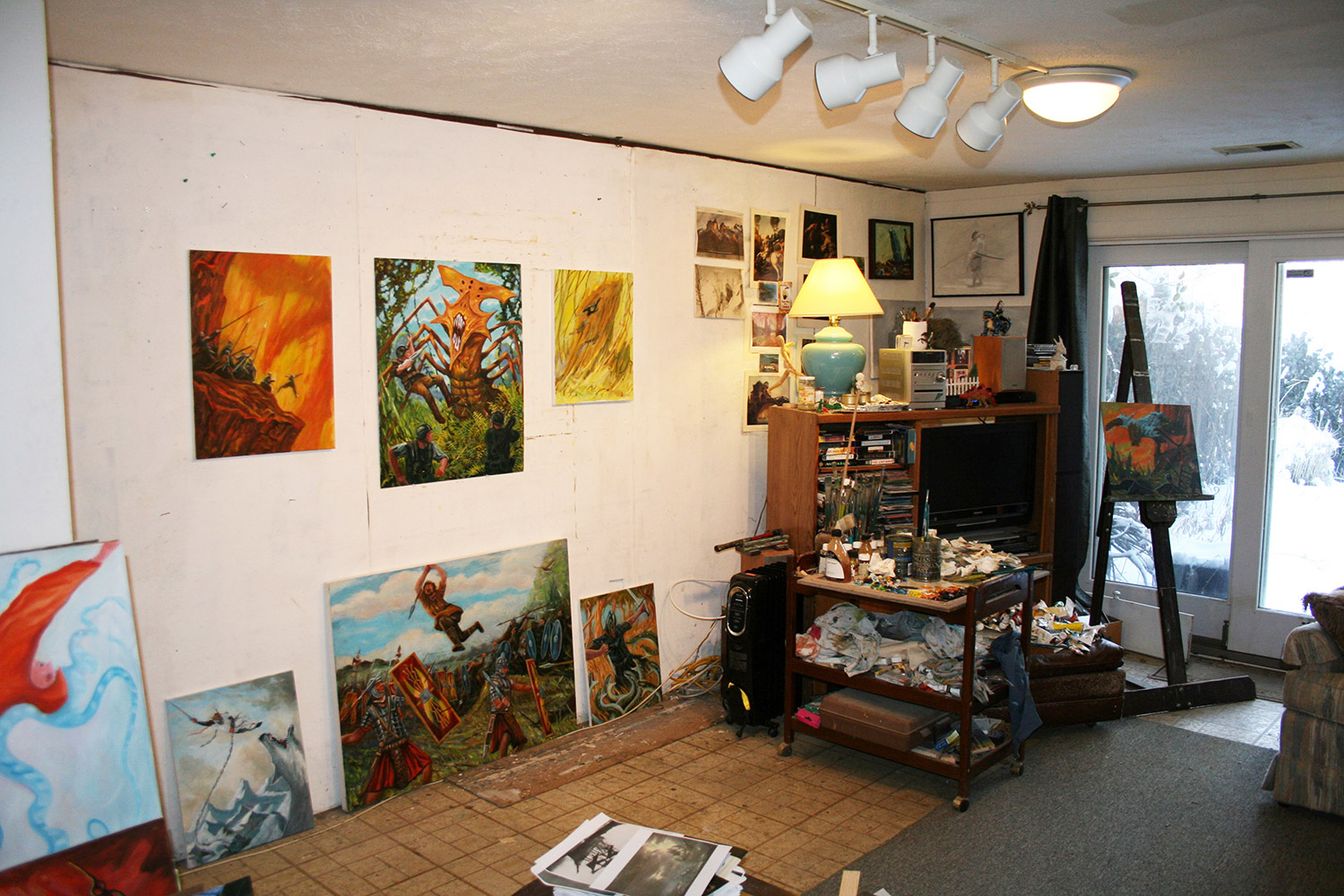
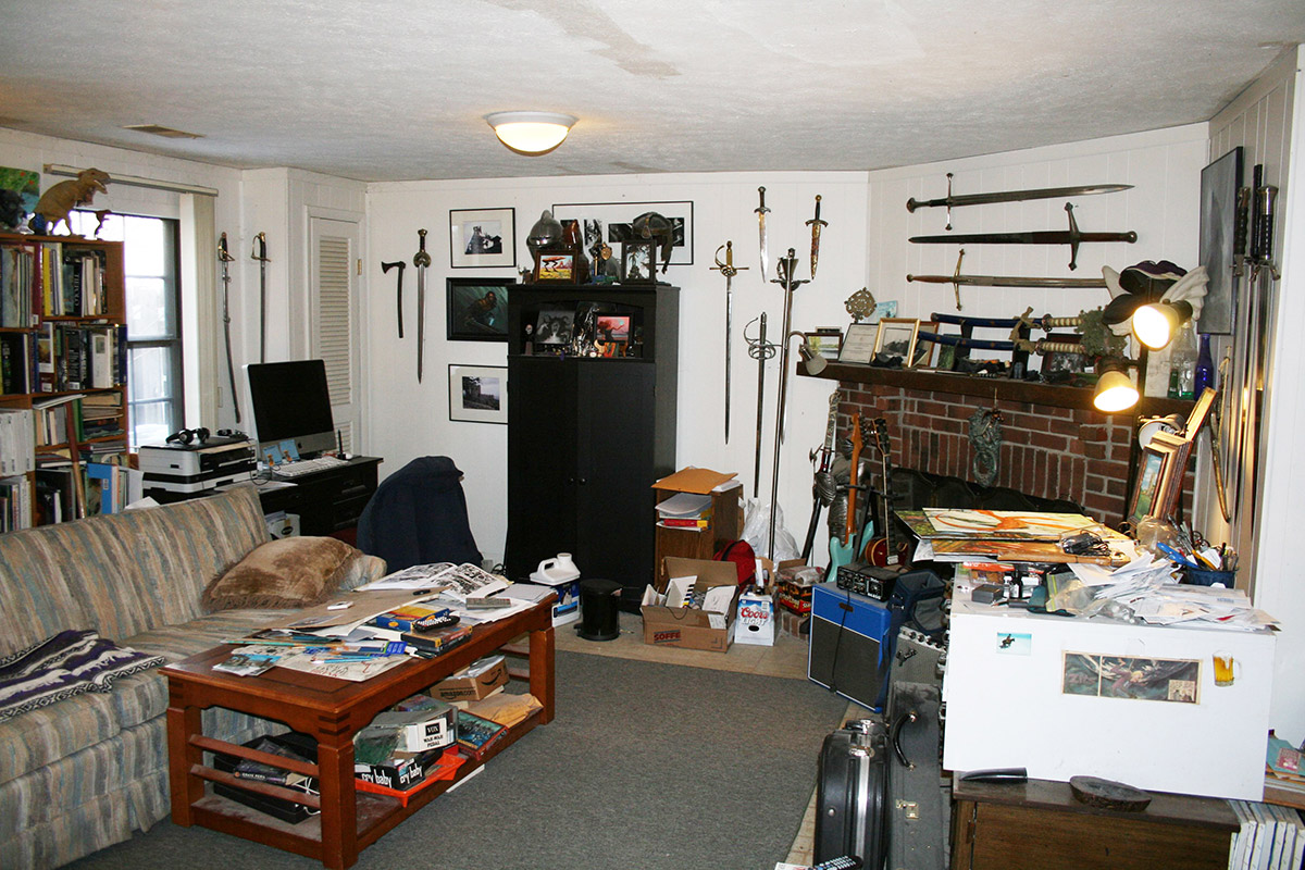
Brian McElligott – website
It is the bottom floor of our townhouse in virginia. The room was covered in that great 1970’2 dark wood panel stuff when we bought it. I covered the longest wall in a layer of treated plywood and then the somewhat spongy white board.
total space around 8′ x 30′. I like this because I can view and sometimes work on more than 1 piece at a time. I can also bang in nails for larger pieces and pushpins for smaller. The room is big enough that I can really step back and see what I have been doing. It also allows me to work either sitting ( with easels) or standing. My day job has me sitting at a computer most of the day so I NEED to stand up to paint sometimes.
I have my computer workstation in the other half of the room along with some of my favorite toys, sword collection and a few little works by other artists I admire, Thank you illuxcon! The main drawback is a slight lack of natural light on the painting wall but I overcome it with track lighting and assorted lamps I have a nice glass door to the back yard but it’s facing the wrong direction. And of course you need a couch for whatever cats or dogs decide it’s really there space..
Bill Wilson – website
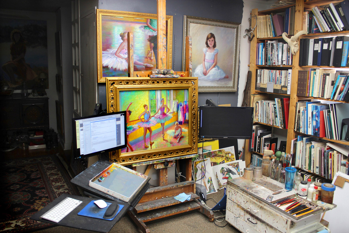
If anyone can show that a studio doesn’t need to be large or impressive to be functional, mine is the poster child. It’s just a small ten by ten foot room in my home. I’ve been a full time artist for over 25 years. During that time I have been, and still am: a portrait painter, illustrator, children’s book author and illustrator, court room sketch artist, political cartoonist, storyboard artist, and concept designer. I have four websites to accommodate everything I do. It’s not an ideal studio; I’d love several dedicated stations for each medium I work in, but I’ve learned to make it work. The trick is to be organized and have everything in the right place and ready at hand. The studio has always been in my home and many paintings have been done with a baby in one arm and a paint brush in the other.
My most valuable tool is my aging Mac tower behind my easel. Connected to the easel are two monitors on articulated arms. This I could not live without. All my reference material, the internet, music, Netflix, etc., etc., all on two monitors. Amazing. When I paint with oils or pastels I just slide up to the easel and start painting. If I’m doing watercolor, casein, or acrylics, I drag my table in front of it.
This book has been shared with me from a few people! Patrick Ollila sent me the link in an email, including it here:
Inside The Art Studio: A Guided Tour of 37 Artists’ Creative Spaces
Wi Waffles – website
My studio is all about doing the most with a very small space: I’m in an apartment and my studio space is also the dining room. The panoramic photo was taken from the angle of someone sitting at the dining table. The half that is darker in the image is the sculpture and craft side, and the larger part is for painting. My favorite part is the pegboard stand, highlighted in the second image. It’s like a vertical rolling taboret of sorts, with all my most used tools and paints on it (there’s stuff on the back as well), which was a custom build.
 |
| Very creative storage addition to free up room in a small space. It looks like store display, I think I would feel like I was shoplifting each time I took something off the cart. 😉 |




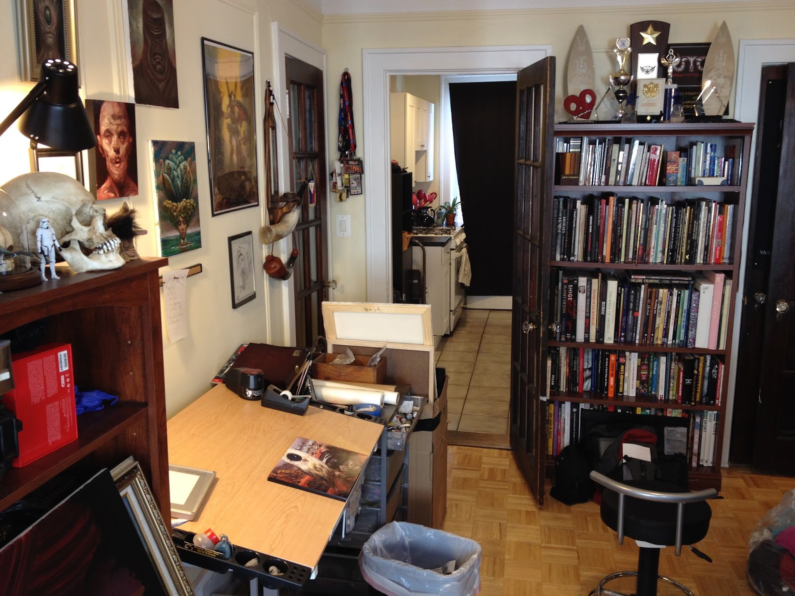
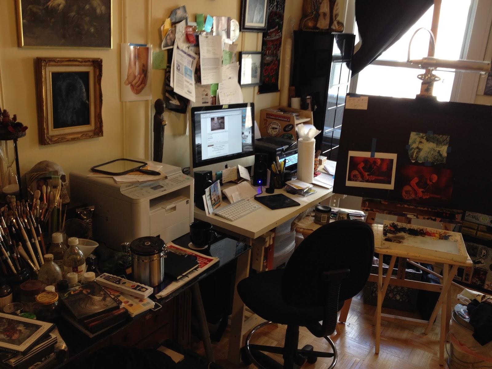
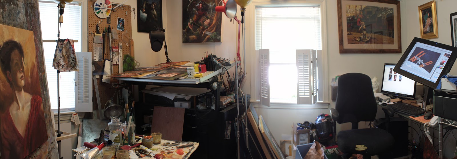
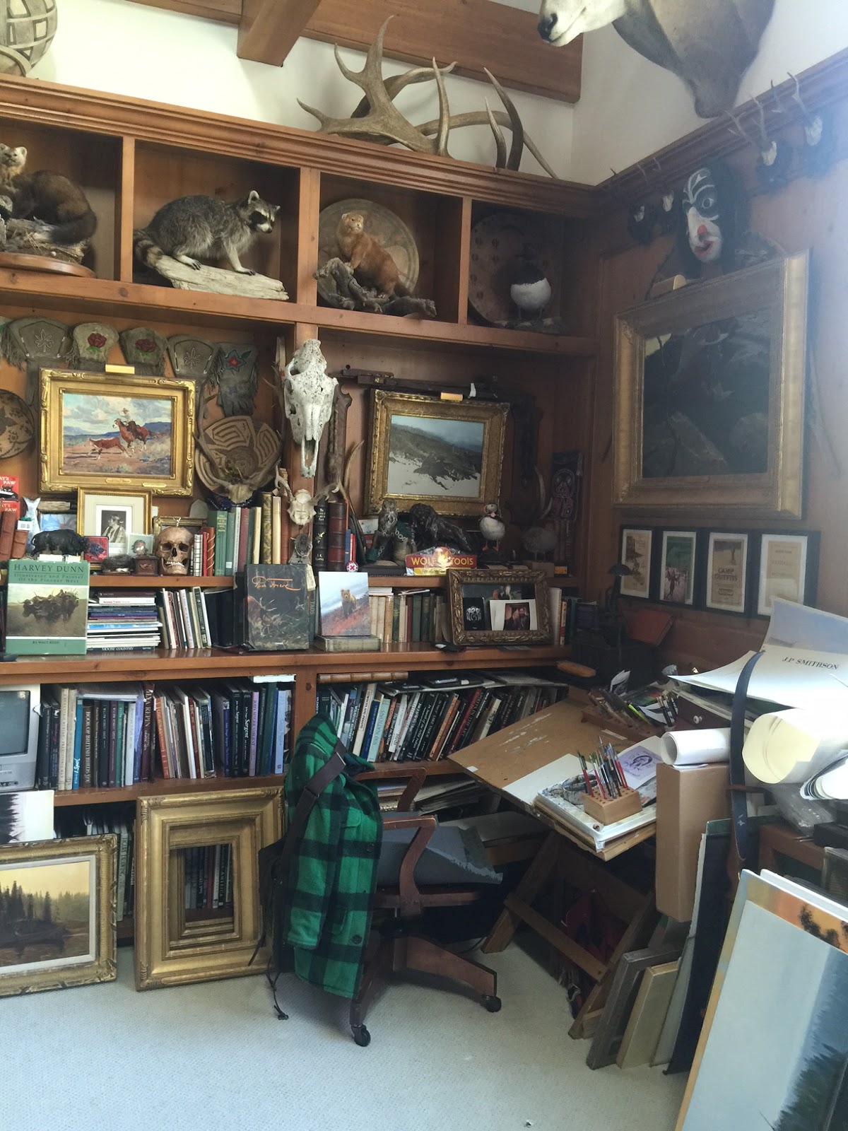




Depending on how much natural light you have coming into your studio, you should consider painting the walls a bright, not overly saturated color. I love dark walls, went ahead and painted them a dark textured orange/brown in my studio. Now there is hardly any ambient/bounce light, and the little there is … has a warm tint to it. Regretfully.
I've just moved into my first studio so I'm very grateful to see this post! I have the basics but it feels like it needs to just organically grow / fill up with things over time. There is a nice book out there called 'Inside the Painter's Studio' by Joe Fig. It was helpful to flip through and see what others have done. Mostly I gathered that there is a broad spectrum of what people layout based on their needs and desires. It's very thrilling to be able to shape a space anyway you want!
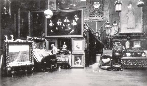
Check out the studio of Hans Makart! 🙂
I came from california before moving here to utah. I left a studio behind and currently work out of a bedroom and have had to store the oils and work primarily in digital. I miss the space. I hear winter is supposed to get colder in the next few months. Also nice to know there is another figure session opportunity near me. Something i didnt have in my area in california. Thanks for that Howard
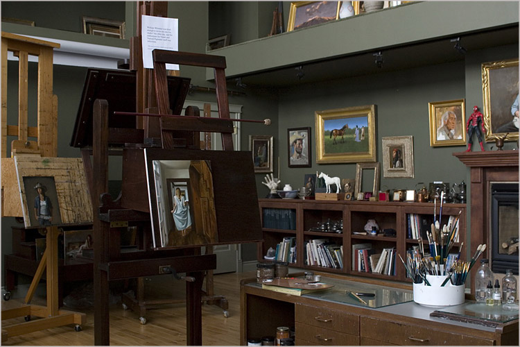
Thanks for the input! I had that in one of the spaces I worked in. A wall was yellow and any photography in that room had a huge warm reflected light. I learned that lesson. 🙂 My new space will have 2 6' windows that face north plus 4 skylights so I think I will go with the dark grey green walls like in Whitaker and Childs' studios.
Agreed, it is exciting to plan out! I will check out the Fig book. Thanks for the tip!
Oh wow! It looks like the Baroque era stashed all the extra fancy stuff in his studio. 🙂
Where in Utah are you? I will be in American Fork and plan to have some figure drawing sessions as well once my studio is finished. There are so many artists that live here. Crazy.
Draw Mix Paint.
how to set up an artists' studio
https://www.youtube.com/watch?v=KMOSvmdFKY4&wide
I dream of a studio like that… Mine is a 10'x12' guest bedroom crammed with my art studio, storage and stuff the wife wouldn't let me keep anywhere else. As a result I've had to get really creative moving around and storing things.
So for people with small studios, I'd offer the following as some great compact solutions:
Hospital bed tray, telescoping:
http://tinyurl.com/mpo9lkt
Easy to move around, holds a surprising amount of weight, and I can adjust to sit/stand at my drafting table rather than stooping to get tools.
Also a great thing to have is an old card catalog:
http://p6cdn4static.sharpschool.com/UserFiles/Servers/Server_154108/Image/Library%20Card%20Catalog.jpg
I was lucky enough to snag one from a library I worked at years ago. Been schlepping it around ever since! They are incredible. Remove the rods used to hold the cards and cover the slot in the bottom. Tons of storage for small items, pencils, paints, etc.!
Unfortunately the “decorator” community has caught on to these so they're getting more expensive, even on Craigslist. Hint: check your local library/college like a hawk and ask when they're getting rid of theirs! They often surplus the cabinets for a pittance…
I'm moving state and upsizing to a house in a couple months, and will have a proper space to build a studio for the first time, so this a really great post I'll want to bookmark for inspiration when the time comes. Thank you for sharing these!
Ugh… seeing even the artists of today's studios makes me cringe. I have a nice table in the corner of my living room and… my lap.
World's largest shopping site list for buy online everyone category products on lowest price. We are making this webpage for purchase best products in each category only on from Best Shopping Sites List.
congratulations Howard!
Bookshelves and storage space- 2x's more than you think you need;)
Sherrie McGraw has a great paint formula for neutral green walls:
http://sherriemcgraw.com/instruction/materials
And then there is the fairytale: http://www.bing.com/images/search?q=gottfried+helnwein+studio&qpvt=gottfried+helnwein+studio&qpvt=gottfried+helnwein+studio&FORM=IGRE&id=161D6EB639F71EF891F79EDBDBEE7F0C70963ABA&selectedIndex=0#a
Un. Real. “Hey, that castle looks like a cozy place to paint, but not all the time, I want multiple castles as studios.” It seems that that one of the keys to a good studio then is to dress and look like you used to be in an 80's hair band and paint with sunglasses on. Incredible photorealism. Hard to tell the difference between his photography and painting.
Looked this up, kind of interesting: https://www.youtube.com/watch?v=L78edjQc0NQ
Thanks Sal! That is a struggle, you can never have enough storage, right!? Hard to sacrifice floor space to storage, but then you end up with stuff laying around.
Thanks for sharing the McGraw link, exactly what I was looking for!
Scott, I know what you mean. I once had my studio set up in the kitchen. For a long time, the smell of damar and linseed made me hungry, not kidding!
Max, great share and cool ideas. The Hospital tray and card catalog cabinets would be incredible handy. I am going to keep my eyes peeled for them both now!
Thanks Vik!
Good luck with the move, I think we are getting some great input from this post. I know that I have. Be sure to share shots of your studio once you have it finished.
I wish I could have the big glory studio, one big room with all the bells and whistles, but I do prefer the home studio (rather than rent one at a different location) due to my work habits so I make due. 2 small adjoining bedrooms, 1 for painting, 1 for storage.
With a little creativity it can be made to work. I turned my dining room into the gallery section for my gallery work. Clients/collectors can visit and see paintings on display but the room still functions as a dining room since the table is there.
Incidentally having it this way makes for great conversation even when entertaining for 'non-art' entertaining so the room serves a dual purpose.
My dining room has become the room everybody naturally gravitates to.
http://davidteterart.blogspot.com/2011/05/studio-pics-gallery.html
Second hand furniture repurposed for my painting studio has been ideal including 2 huge flat files I bought from a fire department for about $125. They were their plan files and fire departments have gone to digital files for their storage. Retail they would have been around $1000.00 each for the size.
http://davidteterart.blogspot.com/2012/05/studio-pics-2-built-like-bridge.html
Im about 15 or so minutes away in Eagle Mountain. Ive gone out that way before for some figure sessions at CAS in provo. Bit of a drive for me so somewhere closer would be perfect.
Haha, stop, it's not a competition! and this is such a drool-worthy post! Inspired me to start a new pinterest board just for artists studios! <3
I made two real choices when creating my studio. One was the massive amount of storage, flat files and cabinet space. The other is the the most work space possible given the studio size. I purchased a 4×8 foot army issue surplus drafting table, two drawing tables, a butcher block work space, counter space over the top of the cabinets, as well as building in a drawing table over the flat files in the closet space. With all the strange client requests and job parameters I've used all of the work space.
lighting is always a requirement, I have two large picture windows on either side, skylights and lots of cotroled artificial light. It sounds like you have your lighting well in hand.
But, you will never have enough work space or storage. An interesting post, Thank You and Good Luck!
as well as building in a drawing table over the flat files in the closet space. With all the strange client requests and job parameters I've used all of the work space. your input here
Nice stuff dear Radiador honda & Venta de Radiador
This is a best option for buy car radiators.
Radiador honda & Venta de Radiador
A Closer Look At Gold & Silver IRA