One of the most difficult concepts to grasp about painting is the use of edges. Students often go immobile when I mention that they should vary their edges in a painting. It shuts them down. Most have no real idea of what I mean or even where to start.
It’s not surprising. Controlling edges is an advanced stage of painting that alludes most everyone, until it’s pointed out to them. I had trouble with edges coming up through my skill challenges, too, but as I never had a teacher pointing these things out I had to learn the hard way. From critique, and sometimes, ridicule.
That meant I was learning on the fly, listening to what other artists and critics said about my work that complimented or tormented my efforts to communicate to a viewer; how I guided the viewer’s eye through a piece. I paid extreme attention to what was said about certain passages, certain spaces in my painting, no matter how small or seemingly insignificant. It hurt, but I learned.
I’m about to cut years of struggle off your painting skills. The items below will shake your understanding and increase your ability to lay down interesting paint by concentrating on edges and not only give your work beauty, but give you a new awareness of control.
1. Contrast edges.
Edge control is built generally from pushing and pulling the eye through a painting. Pushing it back or pulling it forward. It is the contrast between edges that allows you to make shapes important or subtle.

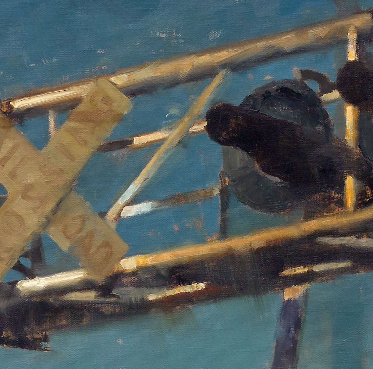
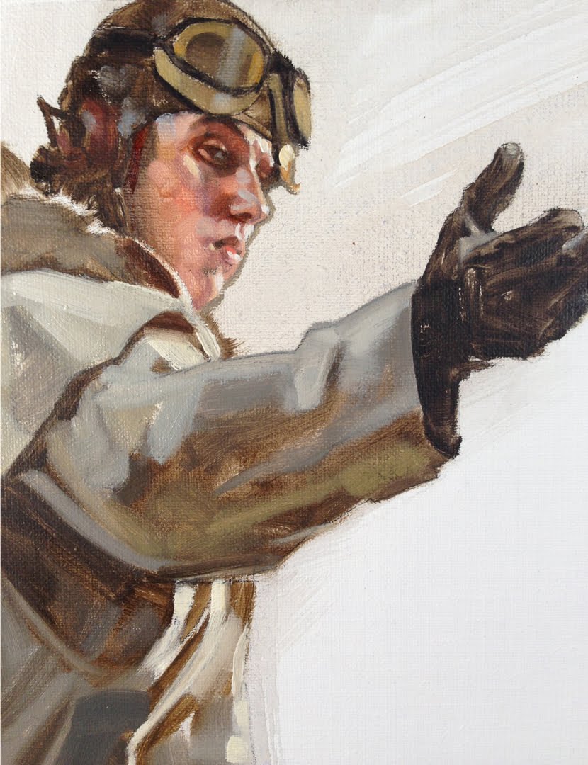
2. Sharp edges.
The easiest to identify. That’s why they pop forward. The brain zeroes in on these edges immediately, so use them to drive the eye to the elements in the painting that have them. The contrast is high with these edges. Set them against soft edges and the sharp ones dominate.
3. Soft edges.
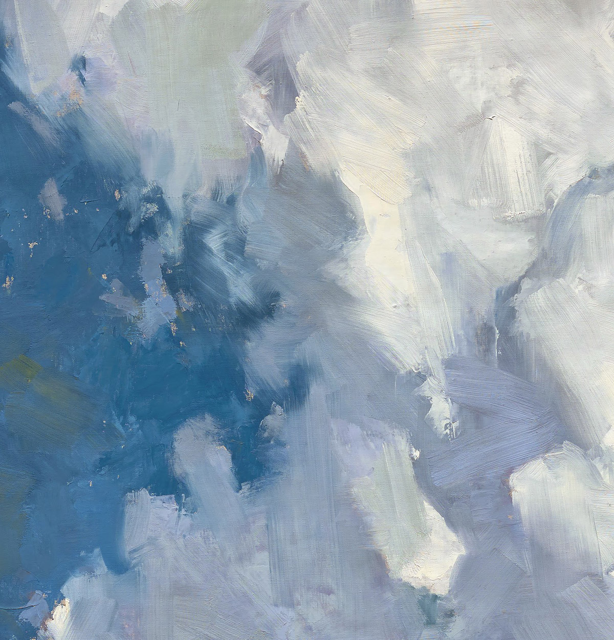
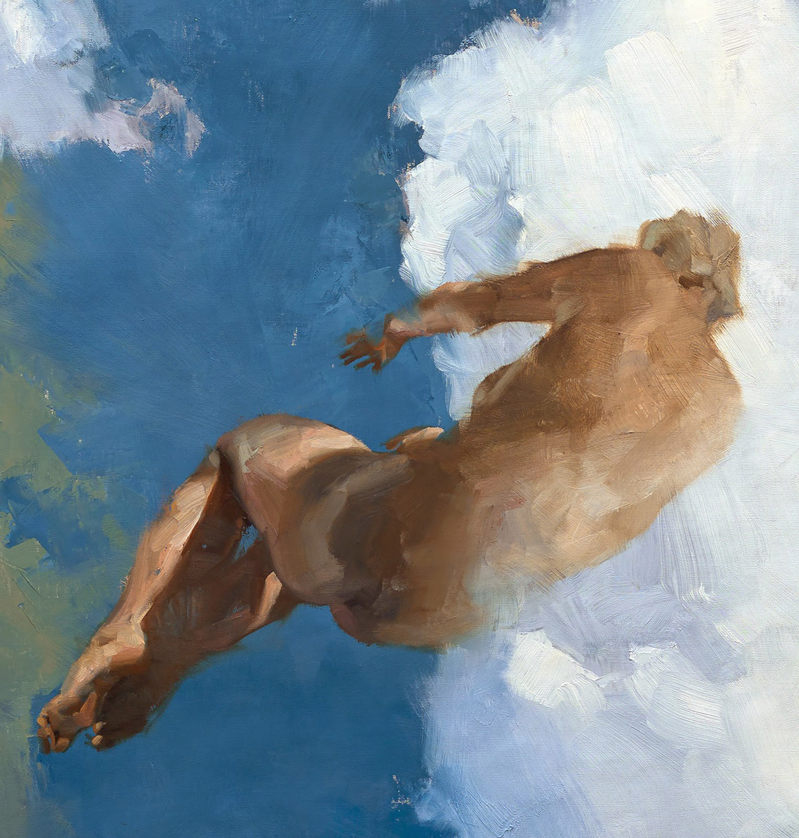
Use these edges to bolster the focus of the painting by pulling the eye away from anything with soft-focus elements. Soft edges lay as a background for sharp edges to sit on top of. Yes, on top of. Background edges that are sharp tend to jump forward. Again, the eye whips past everything soft to focus on the sharp contrast edge.
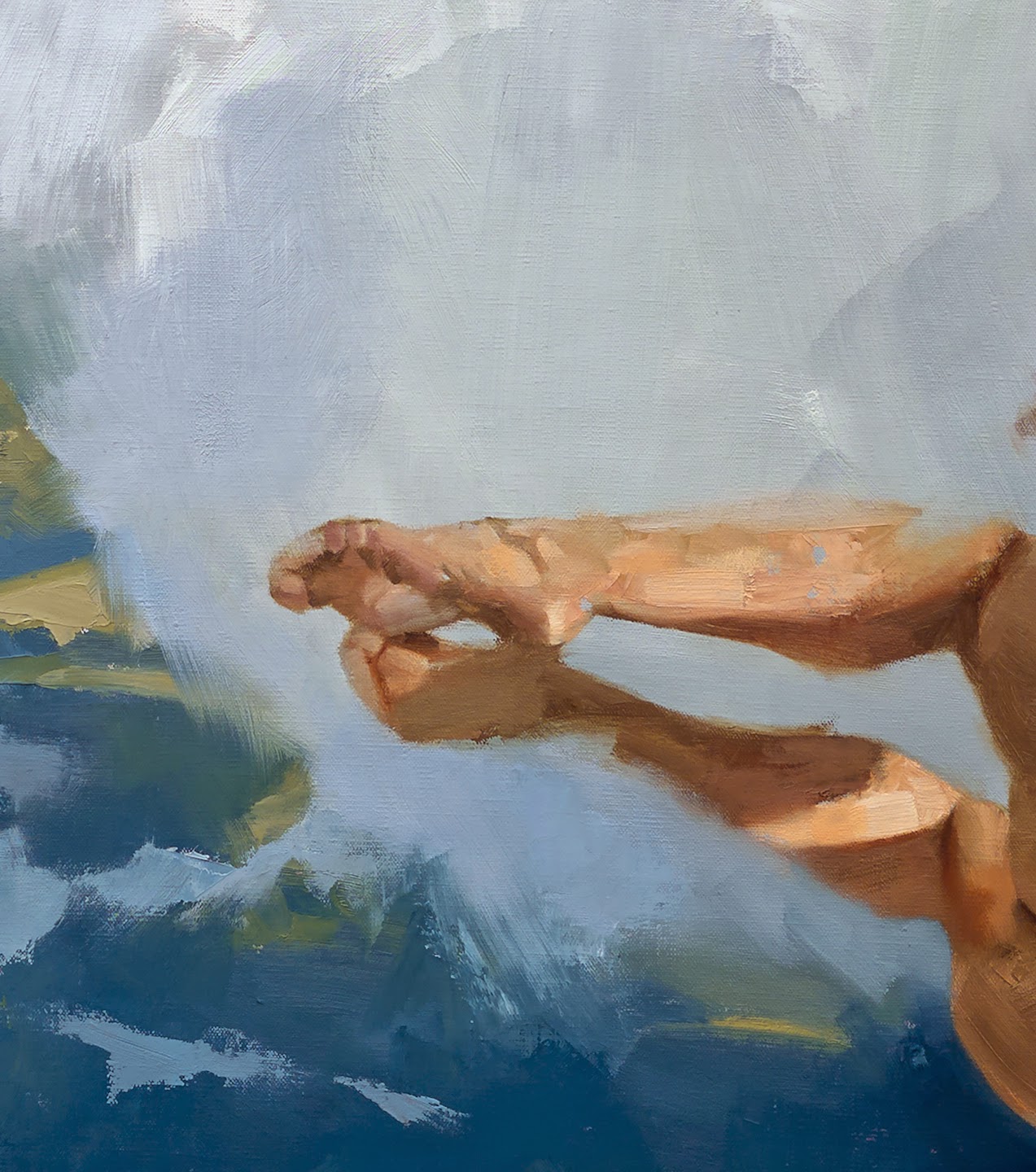
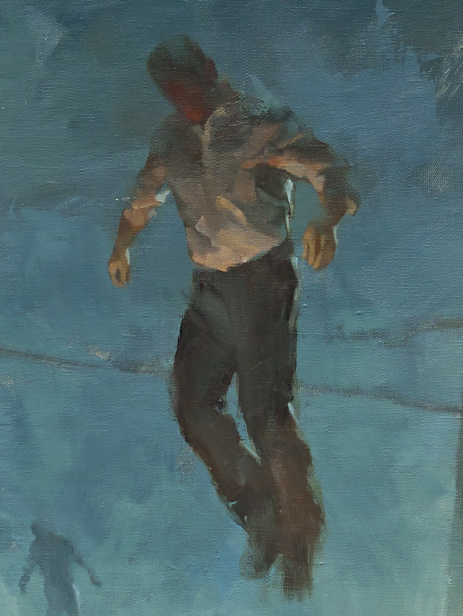
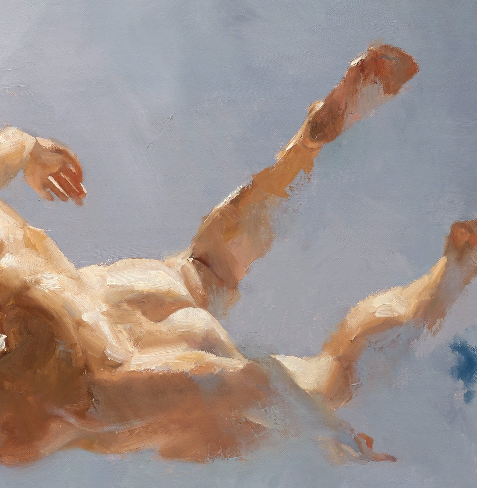
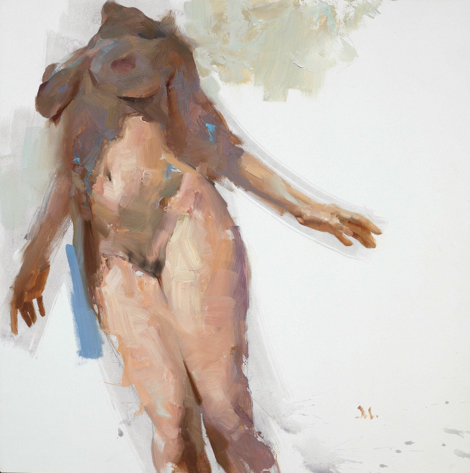
4. Lost edges.
Some of the most beautiful areas of a painting are where the eye expects to see an edge, yet it’s not there. Arms that bleed into the background, a cheek that disappears, edges of hair that are lost. It stimulates interest. This takes lots of risk to learn where and when to use them to full advantage. The risk is ambiguity. The payoff is curiosity and engagement.
The brain wants to complete the edge but must become involved with the piece to accomplish that. This is how a painting lingers in a person’s mind. There’s just enough information to stay focused, but isn’t overwhelming to the eye.
5. Sustained edges.
These are edges that work between edge extremes. Neither too sharp nor too blurred, but with just enough roundness to not carry too much focus in the work. Edges of figures, sleeves, folds, trees, mountains, architecture, etc.
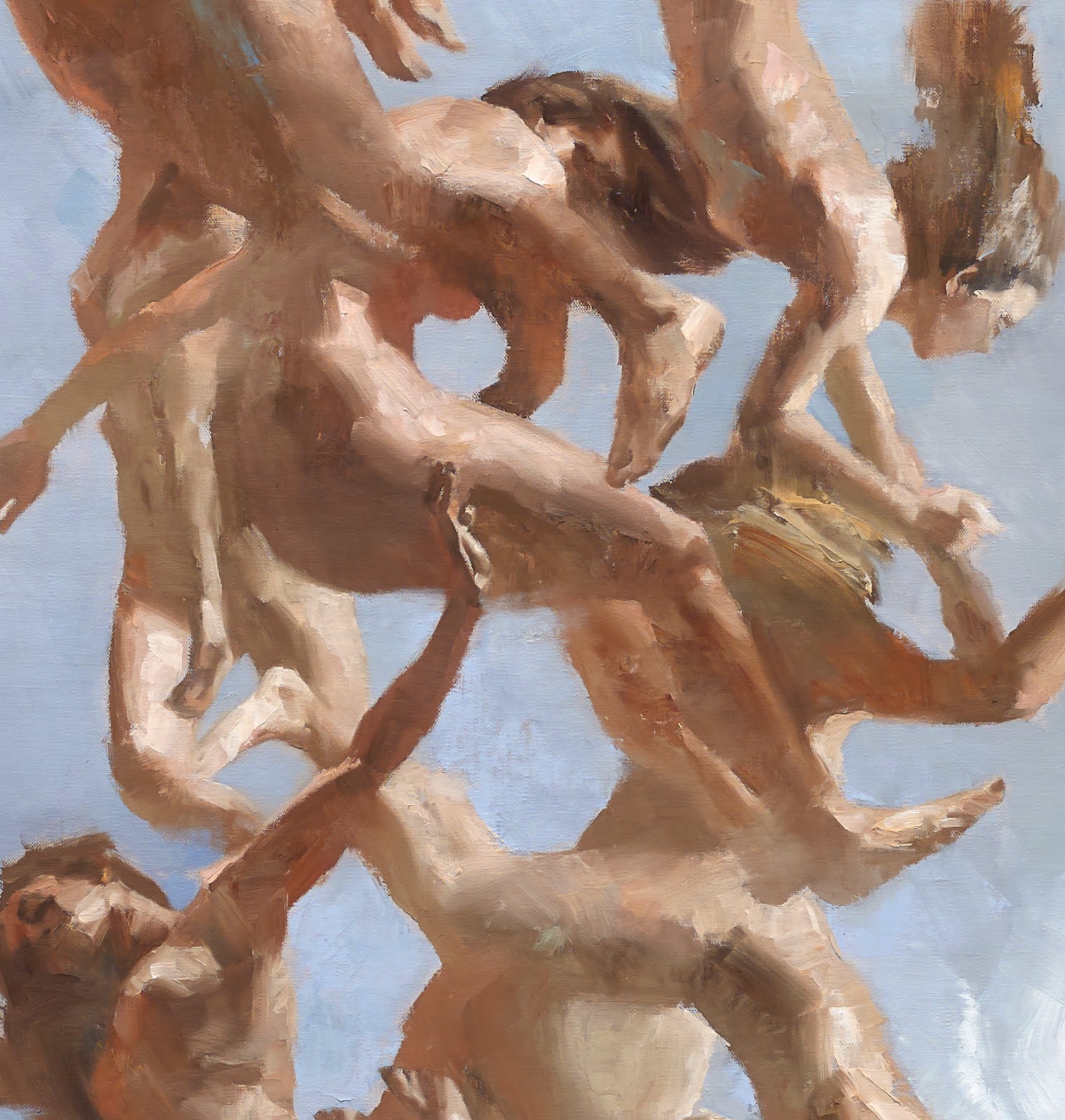
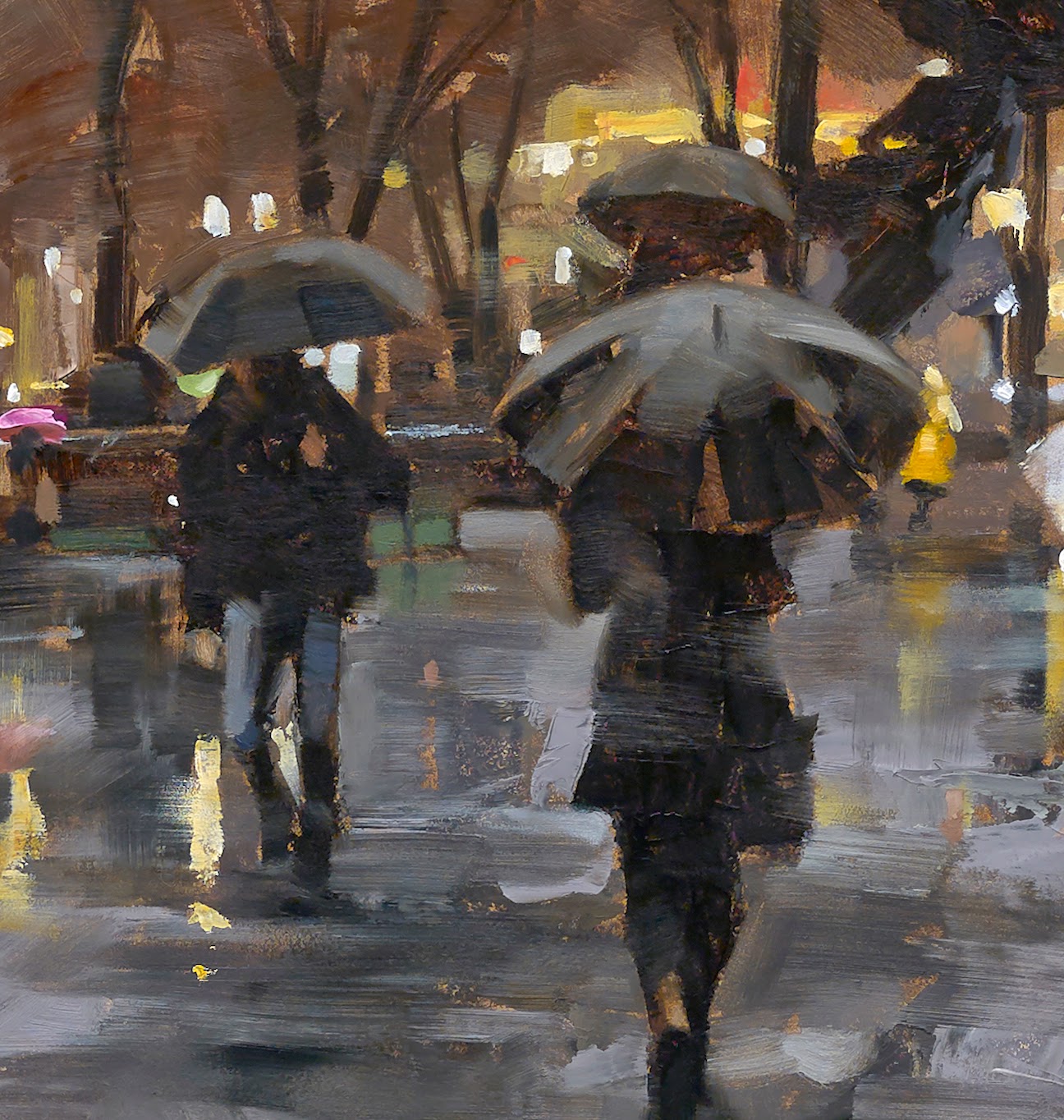
6. Repeating edges.
These are difficult edges to control because they draw attention to that repetition, and if they are integral to an element, such as leaves, or folds on a sleeve, they can overwhelm the eye. The first thing the viewer needs to do is rest. In other words, look away. This is not what you want from a viewer, just in case you hadn’t figured that out already.
You must find a way to vary these edges to take their power to confuse away. You do this by using sharp and soft and blurred edges. Not matter what your reference tells you is ‘right.’
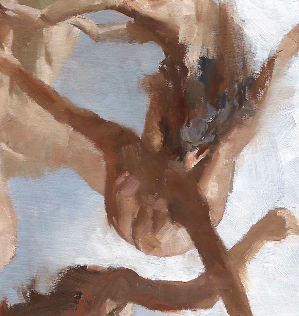
7. Shadow.
Shadow control is critical to a successful painting. And they are the greatest teachers for understanding depth, value control, and…oh yeah, edges. Now you get what I mean by soft and sharp edges, yes? What observer hasn’t noticed how shadows vary in such a short range of vision? Look at tree limb shadows on the ground and the information slaps you upside the head. The limbs closest to the ground are sharpest, while the limbs up high cast very light, soft shadows. It’s their edges that communicate this the most.
How a shadow rolls over a surface is determined by several factors. The texture of the element, the shape of the element, the angle of the element. Study a car in different lighting conditions and you’ll find an amazing array of hard and soft edges, all based on how the shapes cast shadows. Control those edges and you’ll have a shiny car or a dull car.
Shadows determine depth in a painting, and that’s portrayed by how you control the shadow edges.

8. Color.
You can control focus in a painting by using color. The edge between contrasting color can demand attention or allow one color to dominate another. The way those colors bleed into or over each other will draw attention, either away from or toward a subject.
9. Ragged edges.
If all of the edges of paint application are the same, it communicates pattern. And this leads to a flat graphic quality. There is no edge control other than to make it all the same. This is completely fine if that’s what you need in a piece. Making all the edges the same everywhere you look will demand that you control focus in another means, say through color or value.
Varying the edges between pattern and rendering can add much interest. It’s the contrast between the two that does it.
10. Light edges.
Try painting dappled sunlight without controlling edges. But through careful study of how light streams through leaves and strikes an object will reveal how edges vary between sharp, soft, blurry, lost, and blended. Light tends to flare through a short range of saturated color just on the edge between shadows and lit areas. Notice how the edge can lend interest and depth if captured in a painting. Flare the light with rich color invading the shadow and you gain depth.
11. Blending strokes.
Brush stroke edges can vary within the stroke itself. The front edge of a stroke can be sharp while the back slips into blurred nothing. Strokes can be short and sharp, or they can be fuzzy like an airbrush. A stroke can go down sharp and be blurred later with a different brush. The difference between a palette knife edge and a brushed edge is evident here.

12. Texture.
Blending between colors or values gives you a smooth affect. Simple. But you do this at the risk of losing texture and interest if done too evenly. Certainly there are many great paintings that are slick smooth, blended to perfection to give the idea of crisp, clean beauty. But using that same blend on leather, or fabric, or a wall can destroy the effect. The surface texture of an object reflects what the surface is made of. Yes, there are illusions to be aware of, i.e., that plastic resembles glass, etc.
The way the paint is applied makes a huge difference in what’s projected to the viewer. Ever wonder how those artists of the 19th century got those velvet dress effects? Study the evidence in front of you: value and edge control.
Your eye discerns this all day long, judging edges, surfaces, values, contrasts. The working brain takes about 30% of our energy each day, and most of that is dedicated to visual deciphering.


FANTASTIC post. Thank you.
Your timing is dead on- I so needed this post. (w/ beautiful visuals) Thanks Greg!
Very informative post! Thank you for sharing this information.
A concise and clear review of edges, and I discovered a few things about edges I didn't know before…thank you for sharing your experience and wisdom, Greg. (Also–12 tips in a “10 things” post…something special for April 1st? Not that I'm complaining, mind you!)
Excellent post, thank you so much Greg! I definitely needed this.
What sal said – absolutely spot on with timing
thank you thank you thank you <3
As much as I'd love to take credit for my 'timing' as it were, in reality, you guys were ready to hear it. You needed it because you were prepared to hear it. 'When the student is ready'….and all that. : )
Seriously though…give this all a try. You'll discover a part of yourself and your training that you hadn't known before.
Carry on!
just what I needed today before starting work thanks very helpful
I love your work, Gregory. It moves.
I am blown away by this post- useful, beautiful, inspiring. Thanksyou.
Gregory, nice post. Great info for all. Best wishes always.
Your art is stunning and your teaching priceless, but what i really find amazing is to see how humble you always are. In a word of wannabes and posers, it's important to remember that great artists (and great people in general) are always humble, i think. 🙂
Elude or allude?
Thank you! This is probably the best article I've seen on the subject in a long time. Looks like you've been working on articulating this for some time, as it isn't an easy subject to wrap your head around and then figure out what you're doing. Thanks again!
Yep, you caught it, Owen….I meant eludes…..escapes, evades. Thanks for the catch!
Thanks, Luca. It's perhaps more authentic than humble. I like to demystify the process of painting. It isn't paranormal, or mystical…..it is made magical by means of long-suffering training. And when we share these aspects with each other as artists trying to learn to express our best and most intriguing thoughts, everyone is lifted. That's when it becomes extraordinary.
Great post…hardly ever mentioned…and articulated so well! thanks!
Excellent article. You went beyond the hard, soft, jagged that I usually work on. And, I liked your descriptions.
So much great information here. I needed this post as I'm concepting and illustrating a giant walking vine elemental and will be able to utilize lost and repeated edges rather than painting every single individual vine. Thanks!
-Tawny from tawnyfritzart.wordpress.com
Well said Gregory, lovely article, full of rich offerings well received on my part!!
Great article! I would love to see the paintings that all the details illustrating the post are from!
Really enjoyed the clarity and simplicity of your data. Wonderful stuff. Is there a home-study book or course, too?
Amazing post Greg! Thanks for explaining this so well. Your paintings are such great clear illustrations of how to use edges effectively.
What a posting, … !
I have come to believe that edge quality reveals more about an artist than almost any other aspect of painting. Thank you, Greg, for this primer on the facets of edges!
Great information–wish I knew how to make the edges look the way I want them to–how to move brush, what to paint first, how to blend reliably– trial and error? or can it be taught?
You covered it all, and documented so well! Thank you.
5 years ago a respected artist said 'consider your edges' about a painting in progress. This post is a reminder of all the things I try to think about, every painting.
Fascinating, with terrific examples; well-stated, concise. Thank you.
Great article. I will have to re-read this again with a couple of my own paintings in front of me. Thanks.
You are the epitomy of the master and the teacher. Respect.
This 10 things series… you should make a book out of it. Always clear, clean and illuminating posts, you can get a lot from one read and then come back a thousand times while painting and studying and still understand something more by browsing the same 10 points.. I actually have some of them hanged on my studio wall so that I can refer back to them.. the “evaluate your painting” post being front row
Absolutely helpful and wonderfully generous advice; as usual.
I've always found the work of Walter Tandy Murch* to be rather absorbing when it comes to witnessing the range potential of edges. The way he approached certain subjects made even the most mundane objects become realms of industrial poetic fantasy. He shows that even gears, bolts, wires, and everyday detritus can be objects of tremendous romantic power with the right kind of edge.
http://en.wikipedia.org/wiki/Walter_Tandy_Murch
*Totally unrelated but interesting fact: His son is the famous film editor Walter Murch (Apocalypse Now, English Patient, Brad Bird's Tomorrowland)
LOVE Walter Murch's work! I learned so much about edges by studying his pieces. Hard to find though. Wish I could see the originals, or a color book about him…
That's great about his son, Tobias….thanks for that!
And yes, Maancheno No….have been talking with a publisher about it…..will let you know!
Thank you…that was wonderful to read. Now to practice…
Thank you putting this all together. I've been observing/ examining edges for years, but more in nature, and less so in paint. This combines both, but talks more about the end result. Full of insight and practical use.
Top notch! Amazing writing, paintings, and generosity. You counter all the pettiness in the world! Thank you.
Love this information…it's priceless….
Thanks for taking so much time to put this tutorial together. Great info.
Thank you for your post. Just wanted ti know if you could insert the pict. Of brushes..I am French, and it is not easy to understand which brush is which. And also, on what software ? Are the same brushes with Photoshop and sketchbook ? Thank you for your answer
Edges of figures, sleeves, folds, trees, mountains, architecture, etc.
Thank you for your post. Just wanted ti know if you could insert the pict. Of brushes..I am French, and it is not easy to understand which brush is which. And also, on what software ? Are the same brushes with Photoshop and sketchbook ? Thank you for your answer