One of the responsibilities of my current job is to identify and suggest a certain number of properties for consideration as calendars. The ideas get pitched to a committee of editors and sales reps: sometimes I get a hit, most times I strike out. The reasoning behind a rejection can be clear-cut (“Already being done by a competitor”), financial (“They want too much money”), a matter of function (“Doesn’t lend itself to the format”), market awareness (“I don’t get it: why would someone buy this and how do we reach them?”), or differences in taste (“Sloths creep me out”). I’ve heard all manner of justifications to say “no” through the years, but there’s one that always sticks in my craw…
“It’s too old fashioned.”
I’m often suggesting art-focused calendars (duh) and, though I won’t mention them, you’d be flabbergasted if I told you the names of some of those so blithely rejected by the committee.
When I hear the “too old fashioned” comment (and I’ve heard it numerous times from different people of all ages during my tenure as an art director) the thought balloon over my head is always the same. Those of you that have read my past MC posts know what my favorite word is, so you can fill in the blank. (I know Lauren already has because I learned it from her…no, I kid. Not really. My favorite word predates our friendship. F##kwad is actually the word Lauren taught me.)
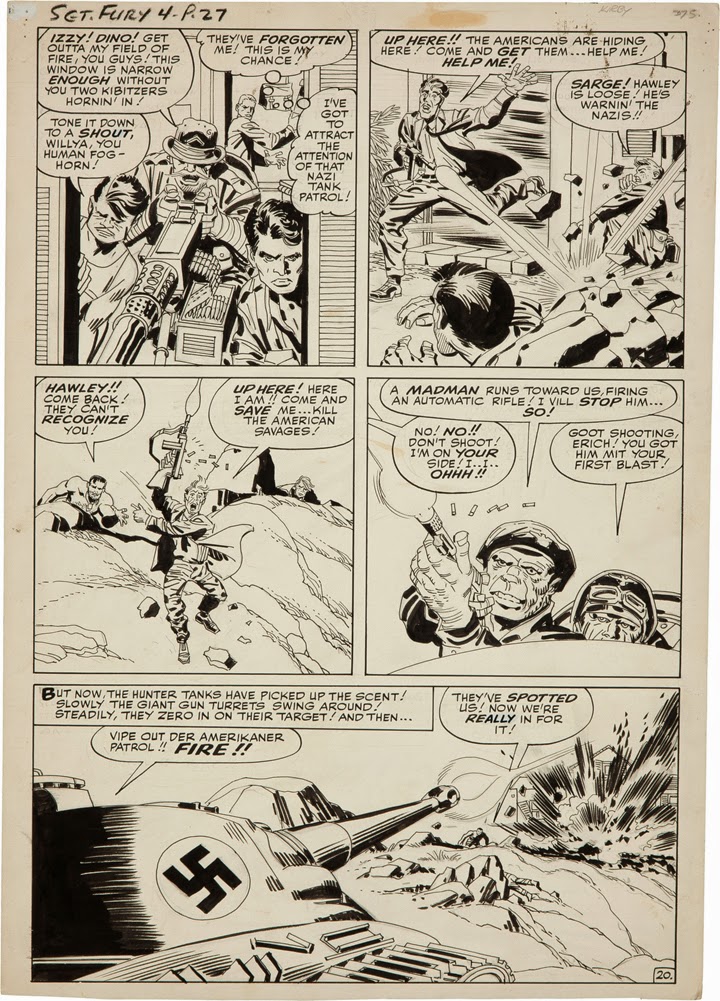
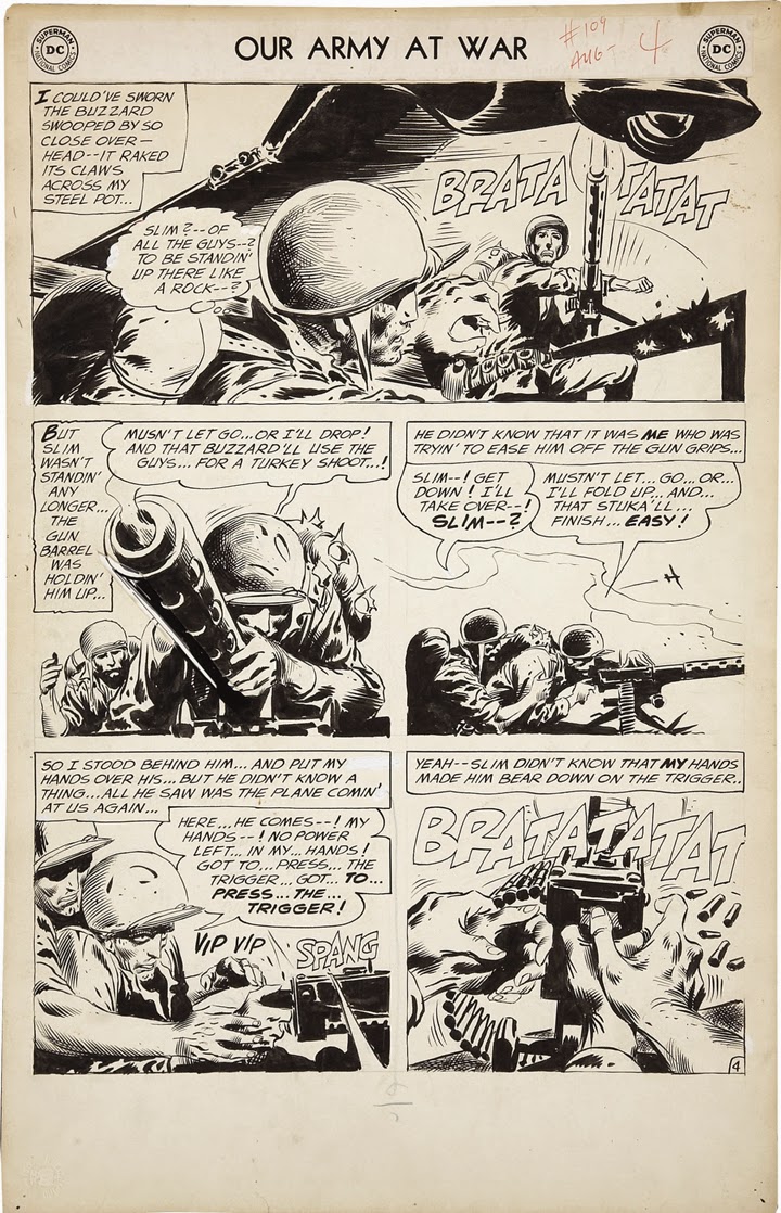
Above: Okay: Jack Kirby, Joe Kubert, and Frank Frazetta. Two were working nonstop in comics during the early 1960s, one was not. By the standards of 1961, which of the above artists was considered “too old fashioned” and couldn’t get hired? If you guessed Frazetta, ding ding ding, you’re right. “I couldn’t get work anywhere!” Frank said. “I could’ve done anything they asked, but they told me I was too old fashioned and wouldn’t give me a chance.” Frazetta, of course, eventually had the last laugh.
Why is it that when these…oh, nincompoops, ding-dongs, boobs, philistines…trot out that casual dismissal do I get my shorts in a bunch? Simple.
It’s because they’re wrong.
Well…at least in my opinion. My view is that art is never “old fashioned.” Not the technique, not the colors, not the style, not the subject. Art is art and there is always an appropriate use, an exciting application (speaking commercially) that can make any art fit with the times; sometimes it just takes a little thought and a little imagination to make it work.
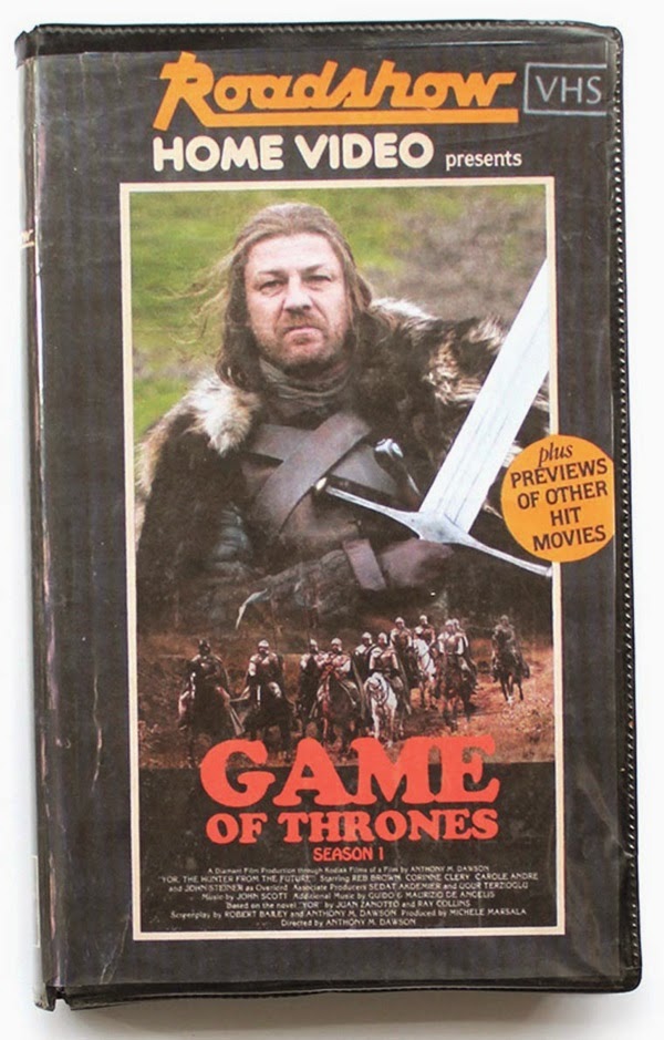
Above: An artist named “Stan” created these fake vintage VHS boxes for contemporary TV shows. Hold on, let me sit down; I’m having flashbacks.
It’s design (which includes layout, typography, and, yes, art direction) that sets a tone and can cause works to either feel “new” or make art seem out-of-date and dusty. Design by it’s nature is purposely of it’s time; fresh, “hip,” cool, or “swaggalicious,” reflecting current tastes and trends. And naturally, tastes and trends go out of—and sometimes right back into—fashion PDQ. “Retro chic” is a term batted around these days for art that was once deemed “old” or quaint but is now embraced as cutting edge (think Charley Harper). Typography, too, also tends to date quickly, but in the right hands it can be turned on its head and take on an entirely different look, feel, and personality.
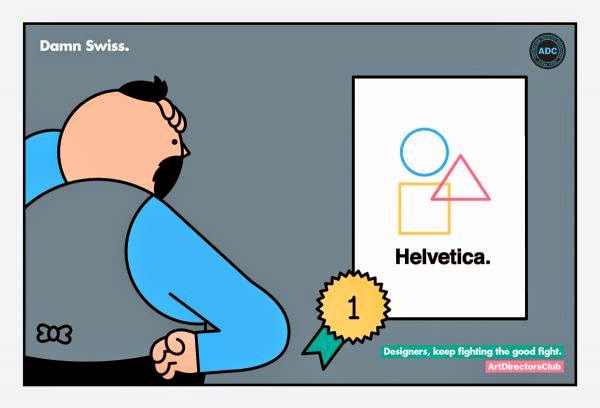
Above: Ah, Helvetica. So classic (i.e. old) and yet so goddamn fresh when used right. No matter what anyone says, no matter how much it might be derided, no one can deny that it simply works for an infinite number of uses—and has for nearly 50 years. This funny piece by Rami Niemi was created for the Art Directors Club.
But art? Good art? I think it’s timeless—and, again speaking from a commercial art perspective—can always be current and fresh when in the hands of a skilled designer and art director.
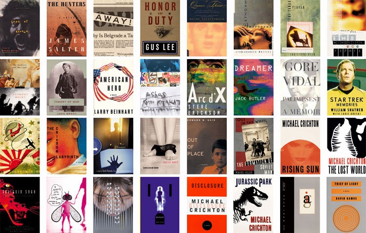
Above: Chip Kidd is a master of using “vintage” images to create contemporary and incredibly vibrant book covers. And he makes it look so easy, too, dammit. There oughta be a law.
Am I all wet thinking that way? Oh, I’m sure there are those who think so. My job as an artist, designer, and art director is to create (or direct the creation of) work that is plugged into the sensibilities of a contemporary audience. But “new” is merely a matter of interpretation—and everything is new, everything has its place, if you view it with a new perspective, if you provide a new context, understanding, or appreciation. To me, nothing is “old fashioned” when looked at from a different angle with a fresh set of eyes.
Old fashioned attitudes? Well, those are something else entirely.




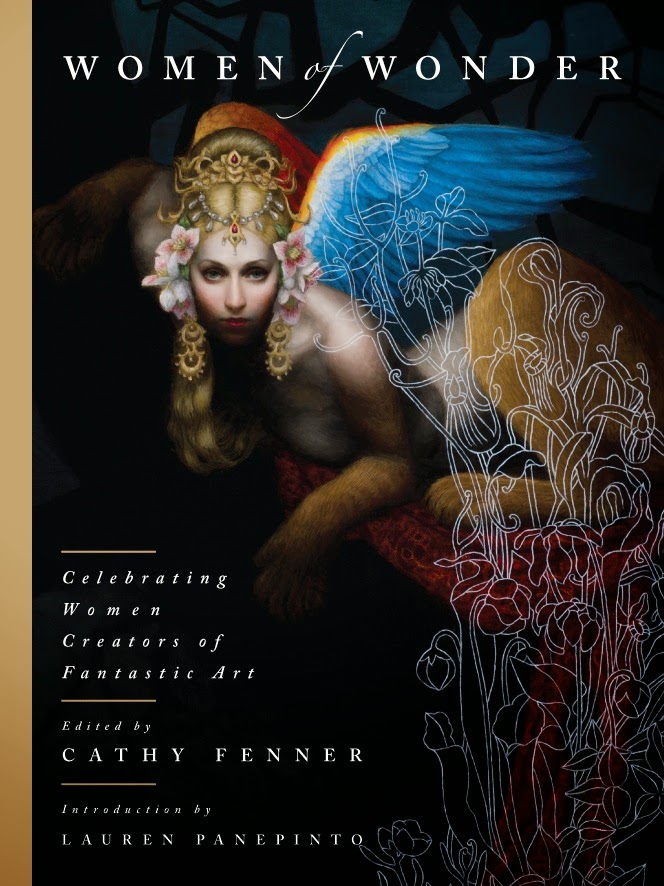
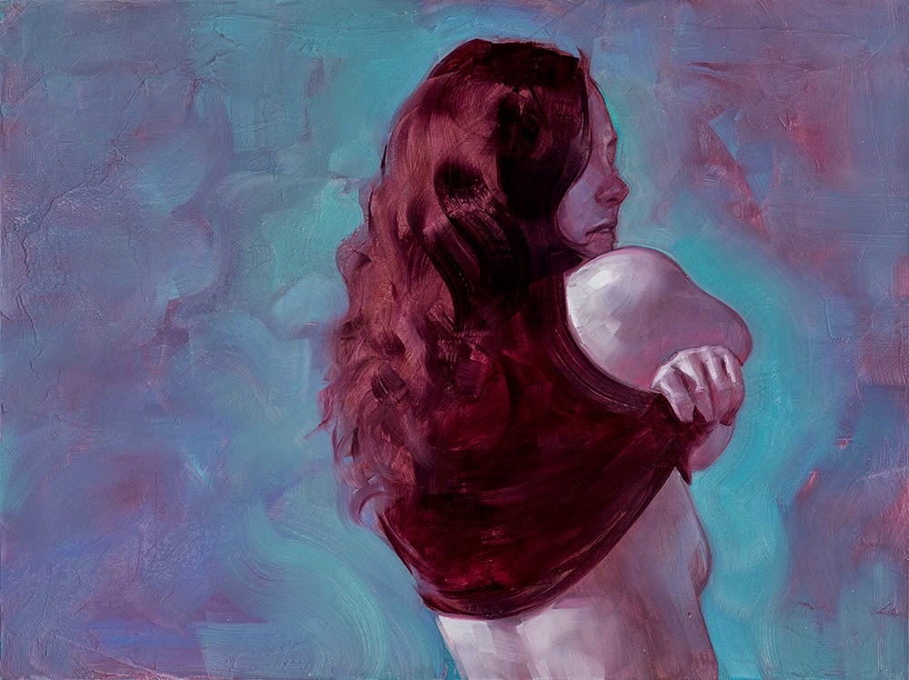
I never really understood the whole “old fashioned” thing in art -at least good art- as well as the associated products. years ago, when I first learned that Frank Frazetta had a rough time getting work for a while (and producing that awesome self portrait reflecting his dark days), I was flabbergasted. If it were up to me dudes like Jack Kirby would have been out of a job (no disrespect here but honestly much of the man's stuff is just way too boring and badly drawn I think).
I feel this has affected the way the genres of sci-fi, fantasy and horror art seem to have been evolving the past 15-20 years, their look, visual library and design sense narrowed down to a limited scope. Every sci-fi piece is a Blade Runner or Star Wars infested, monochromatic, abstract, digital speed paint. Fantasy may as well now be split into Lord of the Rings type or World of Warcraft type art. As for horror, well it's just a mess.
Sure I'm generalizing much here but still, one has to wonder why and how this “old fashioned” viewpoint is persistent and how it's narrowed a field of art that was so broad a few decades ago. It's weird that when I talk to people about setting a role playing game in a fantasy/sci-fi tech mix people are amazed before I have a chance to say 'like Eterina from He-man'.
All of the hippest new comic artists are directly emulating classic artists like McGinnis and Fuchs. It's always a bit aggravating to imagine that they are receiving all this acclaim from an audience that has no idea where the “style” actually came from, but I guess it doesn't really matter who invented it. I'm sure those classic guys borrowed their fair bit of style too. Perhaps having a style be rekindled is its own reward, like a Phoenix rising from the ashes.
I really enjoyed reading this. That's the great thing, though. Good art will last because of its inherent qualities even if some committee dismisses it as too old-fashioned. (I'll bet that doesn't make it less frustrating)
Jameson Gardner
Did you type that Phoenix sentence before or after you post above Dan?
Thanks Arnie. So much could be written about this. Is the chase better; the jumping on the stylistic bandwagon because it sells, or is there really artistic integrity; being the one the chasers chase? Marketing people usually know very little about being the “one” and a lot about what is selling at the moment. Hard to blame someone for wanting to keep their job. But it's no less frustrating for those who want to promote something beautiful.
What's up with the glass of iced tea?
Not tea. It's a whiskey drink known as an Old Fashioned.
http://en.wikipedia.org/wiki/Old_Fashioned
HONORED to have expanded your vocabulary!