(Since it’s a bit hard to judge these things while you’re also participating, I’d love to hear from anyone who attended Spectrum about what you thought of all the Art Director things—the meet & greet at the Opening Party, the Panels, the Bootcamps, and the Official Reviews. Let me know what you thought in the comments!)
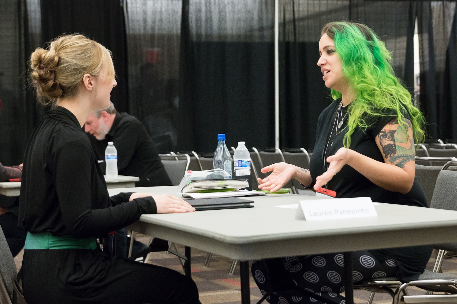 |
| This is my portfolio review face. Photo by Jerry Trapp. |
I experimented with the official portfolio reviews a bit this year. Instead of relying on the fastest mouse-clickers to fill up spots, we took more of a survey and I tried to match the reviewer’s intent and skill with the needs of the Art Directors who were reviewing. From what I can tell from casual reports back, I think most people were pleased. Many of the ADs said they noticed a big jump in the quality of the portfolios over previous years and other cons. While I can’t take credit for that—and I do believe the base skill level is absolutely rising due to things like SmArt School and Drawn + Drafted and everyone sharing good info — I do also think everyone was better matched Artist to AD this year.
Since I’m still trying to make up for lost sleep and con exhaustion, I thought a great post would be to highlight some of the new faces (and familiar faces with new work) that I saw this weekend. This is just a handful of the great reviewees I had, and whether your work is here or not, remember to follow up over the next few weeks so I’m reminded of your work and can bookmark it in my files.
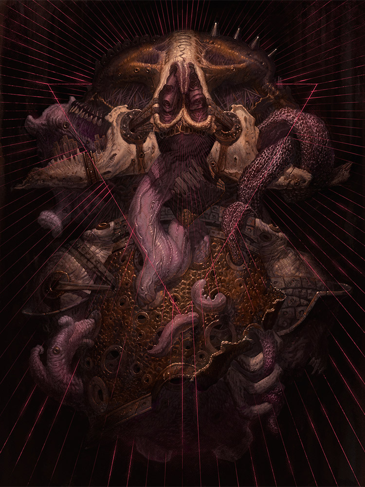
Matthew G. Lewis http://www.lostkeep.com/
Kind of creepy and disturbing, but also abstract enough to imply horror without grossing viewers out, I can definitely see this kind of style making a cool abstract book cover.
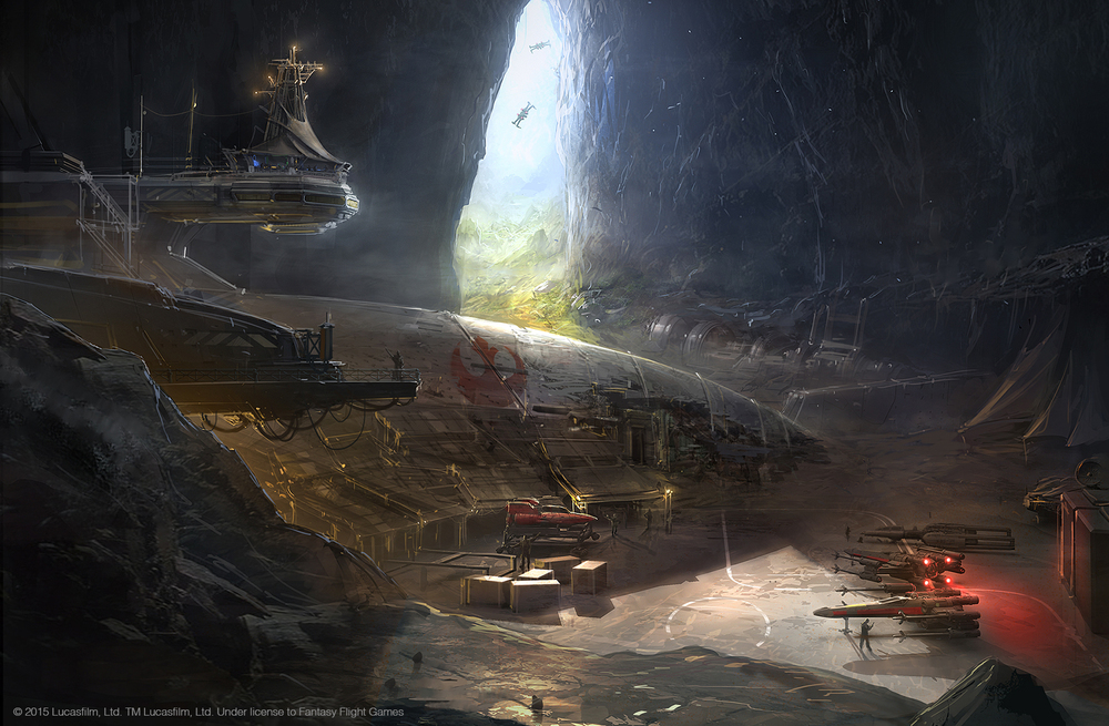
Ben Zweifel http://benzweifel.com
How did I not know Ben’s work before now? I was recently in desperate need of some environment & ship guys…there’s never enough.
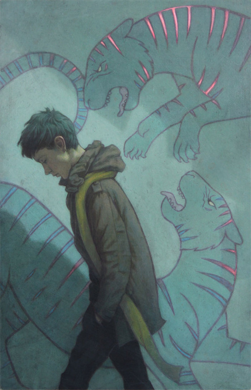
Jessica Shirley http://www.jessicashirleyart.com
Love the way she incorporates strong graphic elements (like these tigers) into more painterly work. Definitely can see her doing kids book covers as well.
Zach Nienhuser http://zachnien.com
Definitely more on the hip side of SFF art, I love the pops of color in the work…and the mild creepiness in all of his paintings.
Maggie Ivy http://maggieivy.com
Love the strong graphic shape of this one, dying to work some type design in and make a piece like this a book cover.
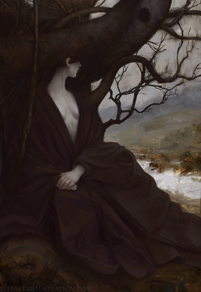
Lee Parks http://www.leeparksillustration.com
Really great mix of rendering and rough texture in the best of his works. The eye is really drawn to the contrast immediately.
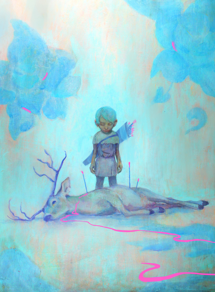
Cassie Allen http://www.cassieallen.com
This piece is so disturbing but cute at the same time, I love it. She’ll definitely will find work in editorial more easily, but could be great on the right book cover.
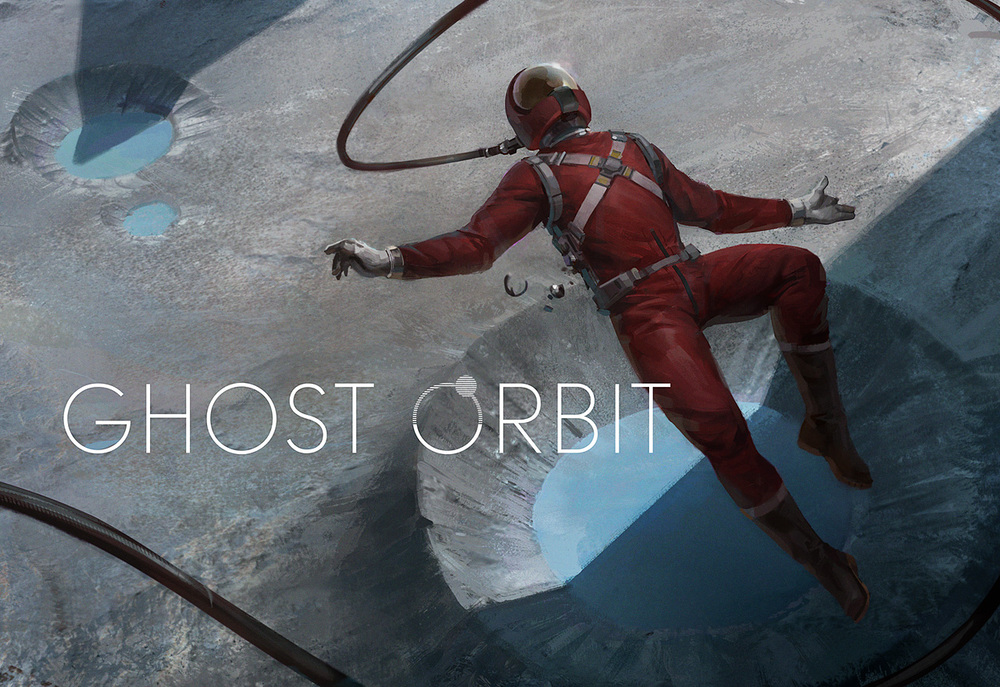
Adrian Majkrzak http://www.ghostorbit.com
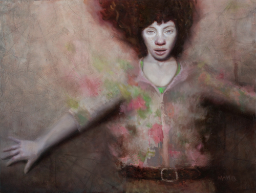
Mary Ancilla Martinez http://www.maryancilla.com
Gorgeous expressive work, definitely feels more like gallery right now, but will be perfect for book covers once a bit more narrative is brought in.
Chris Peuler http://www.chrispeuler.com
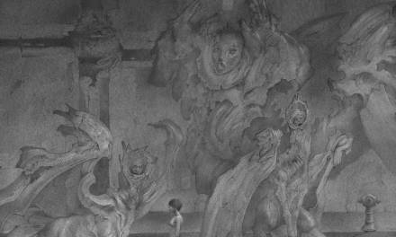
Good compositions, a little busy but tell a lot of story. He really loves the special effect lighting here and it works for his piece.
Kelsey Borch http://www.kelseyborch.com
Samuel Araya http://www.samarayaart.com
I love Sam’s work – definitely perfect the next time a good creepy but literary manuscript comes along.
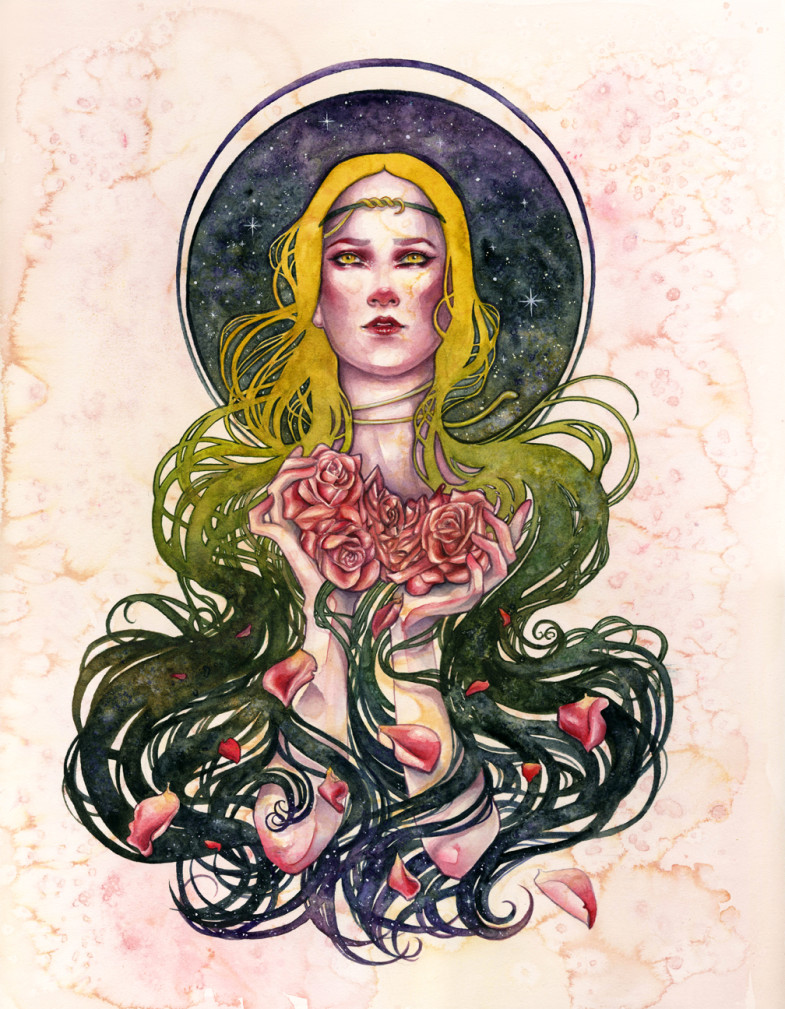
Kelly McKernan http://www.kellymckernan.com
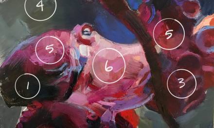
Kelly is definitely a case of someone whose work I know very well (I used this piece as a hair color reference with my stylist) but had never had the pleasure of meeting. So glad she got to come out to Spectrum. I’m not sure what book her art nouveau watercolor style will be right for, but when it comes along, I’ll know it.
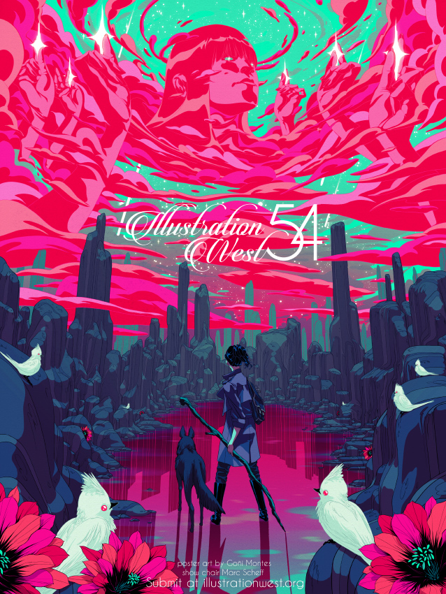
Goñi Montes http://www.goniart.com
I’ve been a big fan of Goñi’s work with other Ads for a while (Irene Gallo’s tor.com covers and this poster for this year’s Society West show art directed by Marc Scheff) but I had never had the chance to talk with him. Definitely looking forward to working with him in the future. I love the way he makes these really complicated compositions very visually legible.
So that’s a completely non-comprehensive sample of work I looked at this weekend at Spectrum. Thanks to all the artists brave enough to ask for reviews — you can tell all the others that we really DON’T bite.




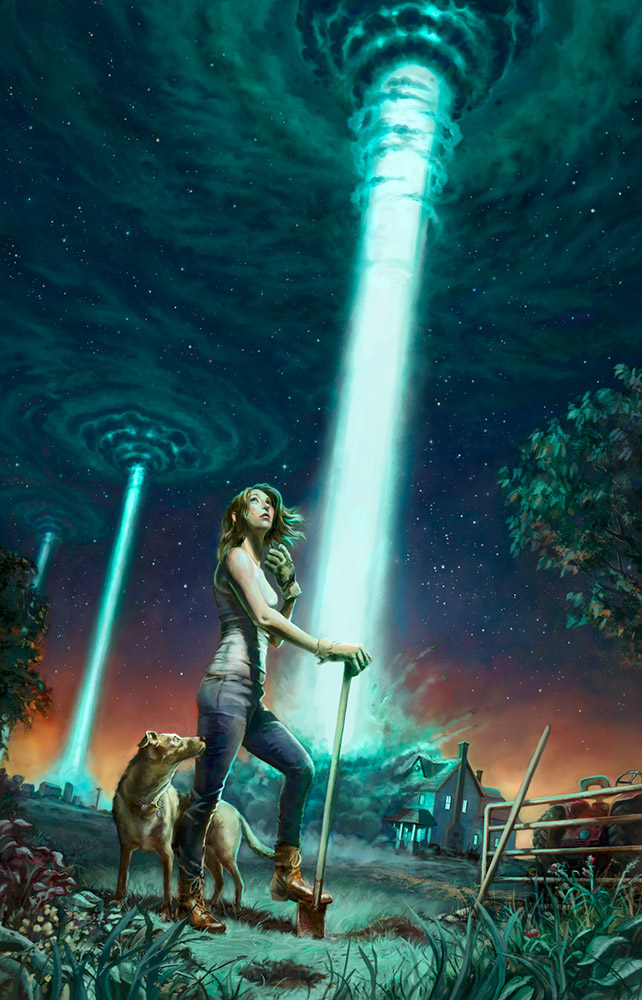
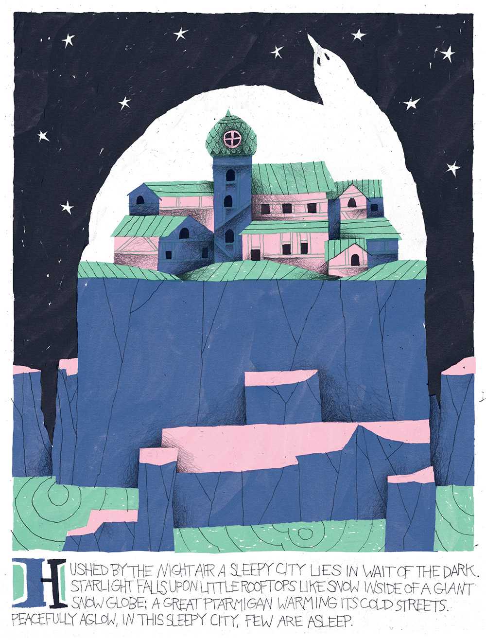


!!!!!!!! Oh, and: !
B-I-G thanks to Lauren and an exceptional group of ADs for making Spectrum Fantastic Live 4 memorable for so many!!
You guys are definitely heros. Wish I still had that energy. I add my big thanks. So many young artists were giddy to get real feedback and insight.
Yeah, the AD setup was great this year! I wasn't involved in the official reviews in 2014, but I can say that I personally loved the way you matched artists to art directors this year. The meet-and-greet was a fantastic way to speak with the ADs in a much more laid-back setting. I had a good time speaking with Taylor Ingvarsson especially.
Best Spectrum Live ever! Is it me, or have emerging artists collectively leveled up recently? So many awesome portfolios! Thanks for all your work, Lady <3 http://24.media.tumblr.com/14054db8bb8bd4b17f66b4e80ec1610d/tumblr_miai9yqzaQ1rjao5bo4_500.gif
<3
Awesome! Good to hear!
I couldn't make it to the AD meet&greet but I sat in on all the panels and bootcamps. They all were both entertaining and very informative. Totally wish all this info was consolidated and handed out like this a few years ago. Although I didn't make the official sign-ups Lauren let me fill in a couple no show slots and matched me up perfectly with the work I was looking for. Appreciate all the work she did this year it was pretty damn amazing from an attendee perspective.
<3x10