 |
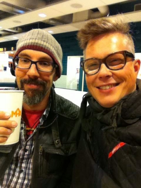
| Steve and I in Stockholm |
I have been a fan and friend of Prescott for many years. We have always shared artwork and asked for advice about works in progress or tried to see if a different set of eyes could push the image further on its way to awesome. When Steve first showed me his sketches for this cardgame it was clear that it was a golden egg. The images oozed Steve Prescott and made me smile, seeing him in every character. I took it upon myself to round up a gang of people who could help Steve expanding the univers. That included my gaming buddies Uffe Gorm and Morten Greve and my very old friend Peter Villumsen at Copenhagen Creators.
Well, today the egg is hatching. The game is launching worldwide, as I am writing this, so I asked Steve – the Layer of Eggs to tell us about his journey in search of the Soulspark.
-JE
Steve:
“Like many illustrators, I’ve had personal projects bouncing around in my head for years. They tend to flutter in and out of focus but I rarely made the time to pick one and take it somewhere.
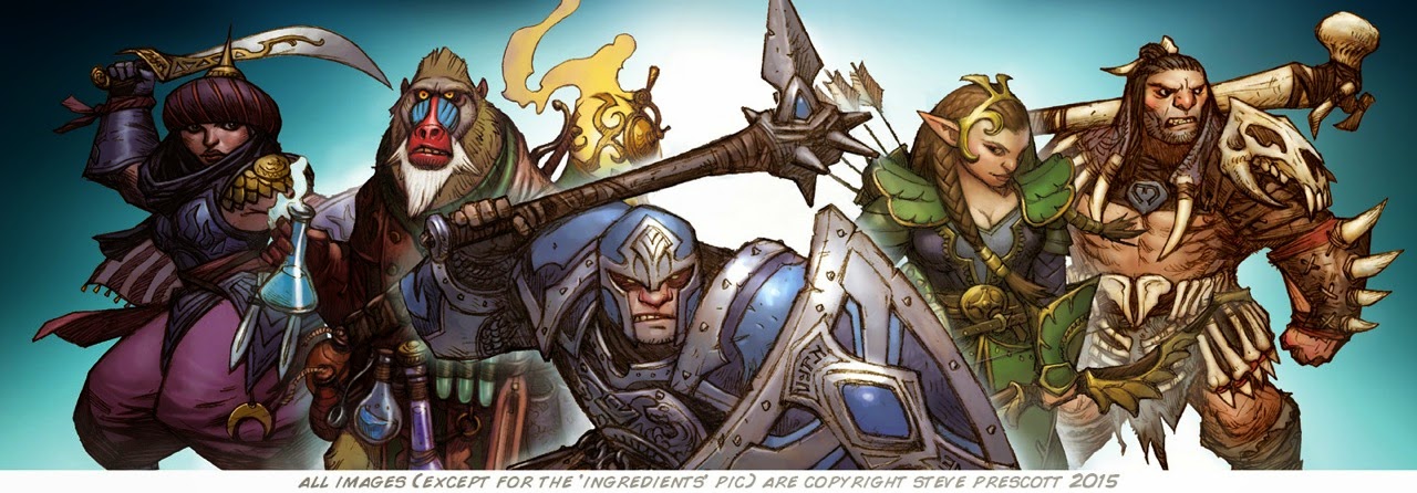
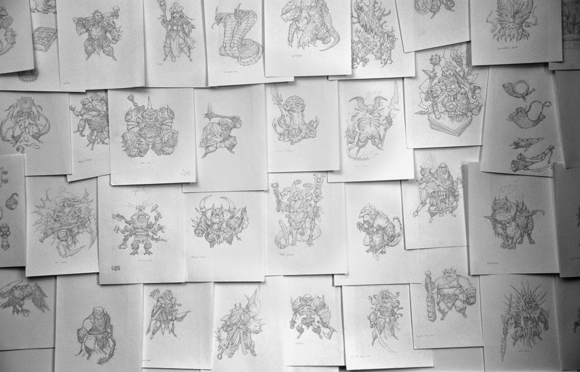
Finally, sometime around December of 2013 I decided I had to act on one of these ideas before I boiled over so I set out to make a self-contained card game featuring a bunch of fun illustrations of some sort. I didn’t really have the game ironed out and designed, just a vague sense of the kind of simple and easy card game I wanted it to be. I knew I wouldn’t be able to fully create a game all on my own (much playtesting is involved) but what I did have control over was the art so I figured I’d just start drawing fun little fantasy warriors and go from there.
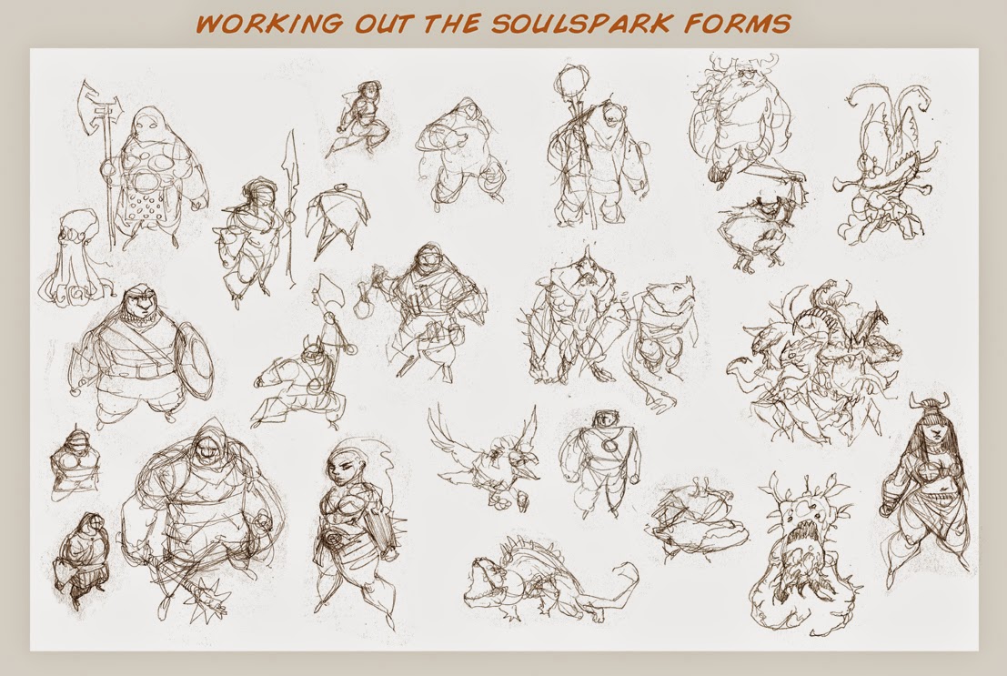
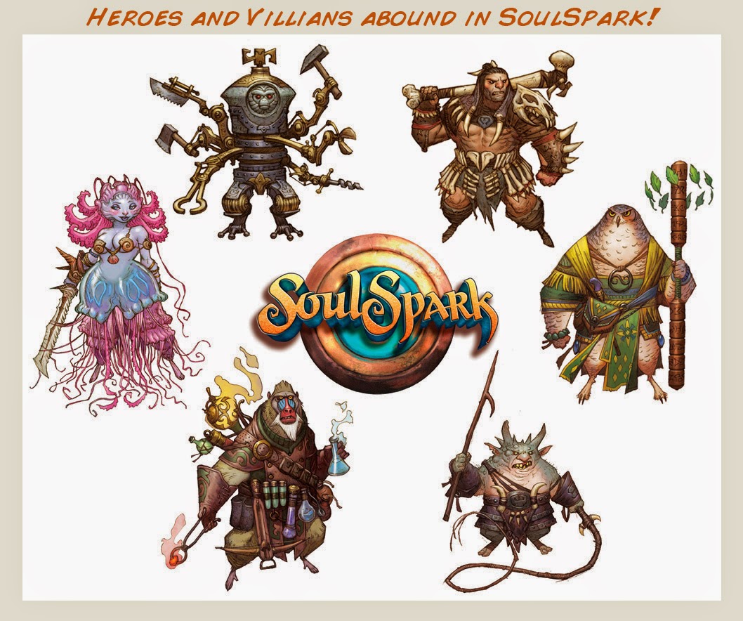
From the start, I knew I didn’t want to use my usual illustration style and technique so I first had to find the style I did want. To fit the shape of a basic playing card nicely, I wanted to establish a charmingly stocky-n-blocky body type for the characters. My everyday drawing style came about naturally through hundreds of avenues of inspiration and evolution. This however would require me to consciously go and develop the style I wanted – something I had never really done before. At least not on a large scale.
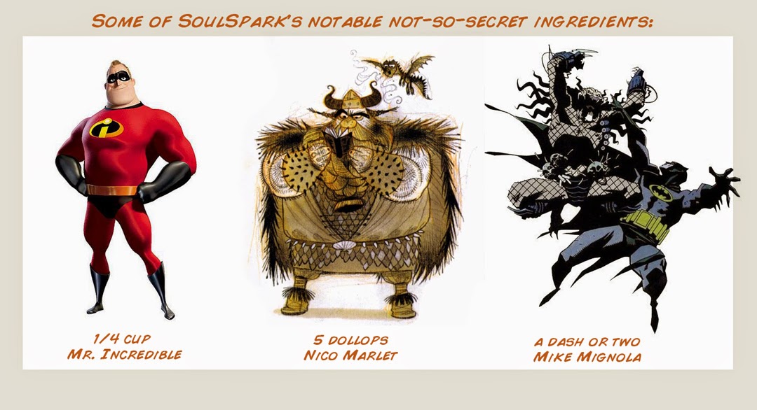
I wanted to push the stocky shape into almost a square but it was important the characters didn’t look like atypical fantasy dwarves since I wanted a diversity of races – just all of the same style. So I took inspiration from the hyper-stylized “hero” builds from characters such as in The Incredibles, Nico Marlet‘s character designs for How to Train Your Dragon, and a bit of Mike Mignola’s work where the (male) characters have immense shoulders, arms, and torsos, but the legs tapered down to dainty little superhero feet. This eliminated that “dwarf” feel nicely.
But it wasn’t all that easy. I had to work out the kinks quite a bit to get the shapes I wanted to use and reuse to keep everything consistent. Not only that, but the stylization had to be applied to non-humanoid creatures like snakes and dogs as well as to humanoid females – which was trickier than you might think.
I found the full boxy look just didn’t fit perfectly on the female form but if I simply gave them smaller torsos and thinner arms, it did the trick. To fill out the exaggerated “square” form, I could play up the costuming in strategic areas like the forearms and shoulders.
After drawing up 7 or 8 characters, I decided to share the early results with a few of my fantasy art pals to see what they thought. One of those pals was Jesper Ejsing, a chap I met years ago through mutual love of each others’ work on Magic: The Gathering and, because he lives on the other side of the Atlantic, the world-connecting sorcery of the internet. We met up with each other in person a couple times since then in various corners of the world but we maintain our friendship with plenty of facebook snarking and occasional skype sessions. Little did I know how much that serendipitous connection would change the path of where my blocky little characters were heading.
At the time, Jesper was working as an in-house concept artist for Copenhagen Creators in Denmark. He wound up showing my drawings to some of his coworker friends there at CC and apparently the timing could not have been more perfect. It just so happens they had recently started exploring the idea of producing their own app game when they saw my drawings and liked what they saw. It wasn’t long before Jesper and company came calling to see if an alliance could be formed.
My first reaction to Copenhagen Creator’s interest was immediately defensive. As an artist, you are sensitive and tuned in to rumblings about copyrights and companies taking advantage of the poor art schmo. You hear stories about intellectual property getting swiped away leaving the originator a penniless hobo living in a moldering refrigerator box with his pet shoe. Being fairly naïve about game invention type rights, I only had those sensationalized tales to call on.
Their idea was to make a real-time card game of head-to-head battles and have me illustrate the whole thing with this stocky, blocky character style. It sounded fantastic to me and I was galvanized by the possibilities. After some discussion and a skype meeting, I decided that playing completely safe wasn’t going to get anything done here. Plus, who doesn’t want exclusive artwork credit on a large, potentially popular project? So we worked out a deal that would require a crap load of work from me with all of my pay coming on the back end as a cut of the pie, so-to-speak. Sounds pretty risky and potentially disastrous, yes – but the key part of the deal is that I would retain rights to all my artwork which reduced my risk from crazy-high to almost nothing, really. I was wanting to make this artwork anyway so if something ever happened and the game never came out, I would still have all my little illustrations to do with as I please.
While those early talks were happening, I was busy trying to find a finishing technique for the artwork. Though I paint traditionally in acrylics for most all of my gaming artwork, that wasn’t the look I had envisioned for this. I wanted linework to be a part of it and pictured a pen-n-ink style enhanced with bold colors so I worked up one of my drawings thusly. I even dropped in some color to see what a final would look like.
The inked drawings seemed to lose something from pencil to inks – a feeling confirmed by Jesper’s opinion as well. Something about the sharp inked linework took away the soft sophistication and liveliness and replaced it with something just a bit too flat. It didn’t look bad but the tone just didn’t feel right. Jesper recommended that since the drawings were so detailed and tight anyway, why not just color the pencil drawings?
I took one of the pencil drawings, cleaned it up, darkened the linework, then toned the darkened pencils a deep earth tone just to give it a little general color. The detail and look I wanted remained intact nicely so, using my extremely rudimentary knowledge of painting digitally in photoshop, I made another layer and just started dropping in colors. The results were spot on to what we thought the look and feel of the game needed. Not only that, using the tight pencil drawings instead of having to methodically ink each piece would save me countless hours of work. It was a win-win!
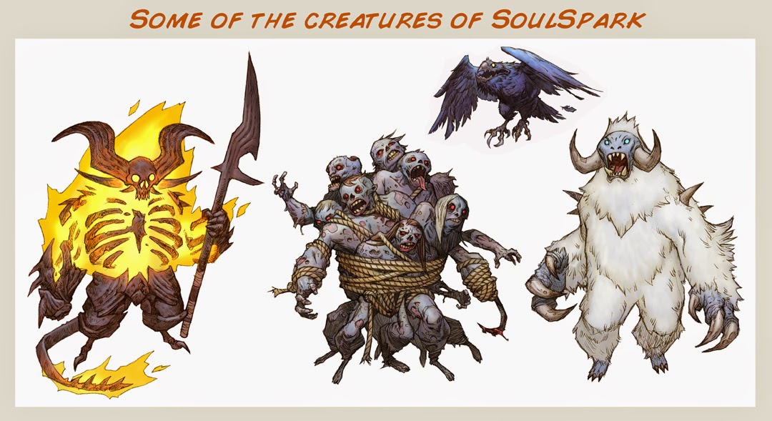
When the original idea for SoulSpark had been hashed out into a linear adventure storyline of head-to-head battles, Jesper and the Copenhagen Creators gave me a list of about 60 characters that would be needed. What I had already drawn up made up very little of this list so there was a damn lot of work to do.
So as Copenhagen Creators toiled away on game design and mechanics on one side of the Atlantic, I toiled away with pencil, scanner, and photoshop on the other. I became my own most brutal art director (most artists are, I assume) – nitpicking every shape and little detail – even going back to retrofit some of my earliest characters because I felt their style wasn’t quite as refined as the latest stuff. Every character had to be just right and hit the perfect tone. As I drew each one, I thought of them as collectables – each one unique but equally desirable (just for different reasons) and each with a completely recognizable silhouette.
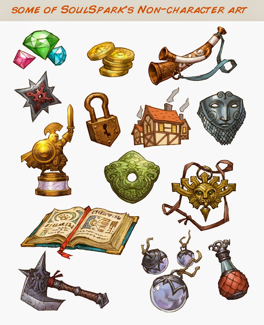
The whole project was an organic learning process for both sides. Components and aspects for the game were realized and created during production so my involvement, as I would find out, never had an actual ‘end’. There was no set number of pieces of artwork that would be needed because the game evolved as we went along. My job description was not “X number of illustrations” it was just “artist” – the ONLY artist! Though Copenhagen Creators’ Game Director did do some work on a handful of visuals within the game, it was otherwise up to me to apply the visual style to everything that came up as needed: another adversary, special equipment, icons, buttons, map elements, and so on.
This sounds like a nightmare – the worst kind of project you want to find yourself stuck with as a freelance illustrator, right? I mean, a project that doesn’t seem to have a definitive end, that is constantly requiring more work just when you think your work is about done, and is eating into the tight schedules of all the other jobs you’re juggling – oh, and has no promise of pay? Yeesh! However, there was just something there that kept us all engaged. The enthusiasm of the Danes working on the game and slowly realizing how cool the game was becoming before their eyes rubbed off on me as much as my enthusiastic drawings were energizing them. We all began to realize that SoulSpark was worth the extra effort, worth taking a gamble on, worth gumming up the rest of our schedules for.
After three projected “wraps” on production came and went throughout the Summer and Fall of 2014, we did finally close in on the end of production in December. By the end of 2014, I had illustrated 71 unique creatures and characters and 78 additional elements like weapons, equipment, and icons. That’s in addition to probably 20 other fully drawn characters that didn’t make it into the game. Oh and a couple pieces done specifically for the SoulSpark website.
After chief production ended, my involvement then switched to promotional mode as the people at CC continued to wrap up the programming and iron out the kinks. You might ask why I would continue working since the ‘art’ part was essentially over but, for the first time on any professional job, I had a big stake in the game I was making artwork for. And not only that but SoulSpark was all our little labor of love and we all wanted it to be the best it could be. So I made and handed out promotional stickers at events, posted artwork on the ol’ internet, helped proof read in-game dialogue text, made some graphics for the website, and even helped design a SoulSpark costume for a cosplayer model to don at promo events in Europe!
As I tried to organize my thoughts and production methods into something cohesive and interesting for this article, I realized the story of my involvement in the creation of SoulSpark is more about an illustration job that is absolutely like no other. One that often defies the common sense survival skills of freelancing professionally while reinforcing the value of networking, calculated risk-taking, putting time into your own projects and being fueled by something you believe in.
In a lot of ways, Copenhagen Creators and I were the perfect match that came together at the perfect time. I’m not sure this could have ever gotten done at another point in my career previous to now. Besides the years of accruing technical skill leading up to this, I also needed to be financially and professionally secure enough to be able to take a risk on such an energy and time consuming project that wasn’t going to pay me anything for a long time (if ever!). I also needed to be the perfect level of caution-to-the-wind fool to say “yes” to such a large-scoped project with a small company I had never worked with before nor even heard of!
Conversely, Copenhagen Creators had to trust that I could and would follow through with making all this artwork by myself without them having ever worked with ME. If they were a bigger company, maybe they would have gone with getting multiple artists to contribute illustrations – and the contract offer of royalties and image copyrights might not have been an option. If they had played it safer, maybe they would have went with multiple artists if only to cover their butts should one of the artists not come through. How many companies are going to gamble on the value and uniqueness of having one artist’s vision and style be the face of such a large project? I’m guessing not many – and I’m extremely grateful for having been given that chance.
So here we finally are. Our delightful little app game SoulSpark, through unconventional avenues of connection and production, through a whole heap of hard work by all parties, is now out there and ready to be enjoyed by the world. I’m hoping that with a little artist’s perspective insight into how something like this comes about, you will be compelled to not only check out SoulSpark for yourselves (free to download in the app store!), but also to take the time to direct some energy into your own personal work (because you never know where it might lead you) and to not be afraid to take risks when something interesting (crazy?) presents itself.
Steve Prescott
May 2015




Really cool character designs. An chance you might put some of those drawings up for sale?
Or put them in a book? Lovely stuff.
oi; it is comming Paul
https://www.facebook.com/photo.php?fbid=10153403853964560&set=a.10152422112689560.1073741826.673214559&type=1&theater
I love the character designs, they show the love and dedication put into them, seriously kudos to everyone who put SoulSpark together.
Fun game…awesome artwork! Your hard work and dedication has paid off! Congrats!
Amazing work as per usual Steve! I know you listed your influences but most of all I see your humor, personality, and design sense as the main influence on the style. The game looks really nice and polished too!
Just Brilliant you two !!! Screenplay.. then Film.. =)
How about a “The art of Soulspark” book???
I really enjoy your artwork, Steve!
Working on it, Lars! It's tight and I have all sorts of busy distractions in the way but I'm hoping to have it done by the end of July.
“Wow, this project sounds amazing! I always love seeing creative worlds and unique gameplay concepts come to life. The passion behind the art, characters, and storytelling really shows. It actually reminds me of the fast-paced energy and competitive fun I get from playing Spike Volley — a game that also focuses on skill, timing, and that addictive ‘just one more match’ feeling. If anyone here enjoys dynamic, skill-based games, definitely check out Spike Volley as well. It’s been a great addition to my gaming routine!”