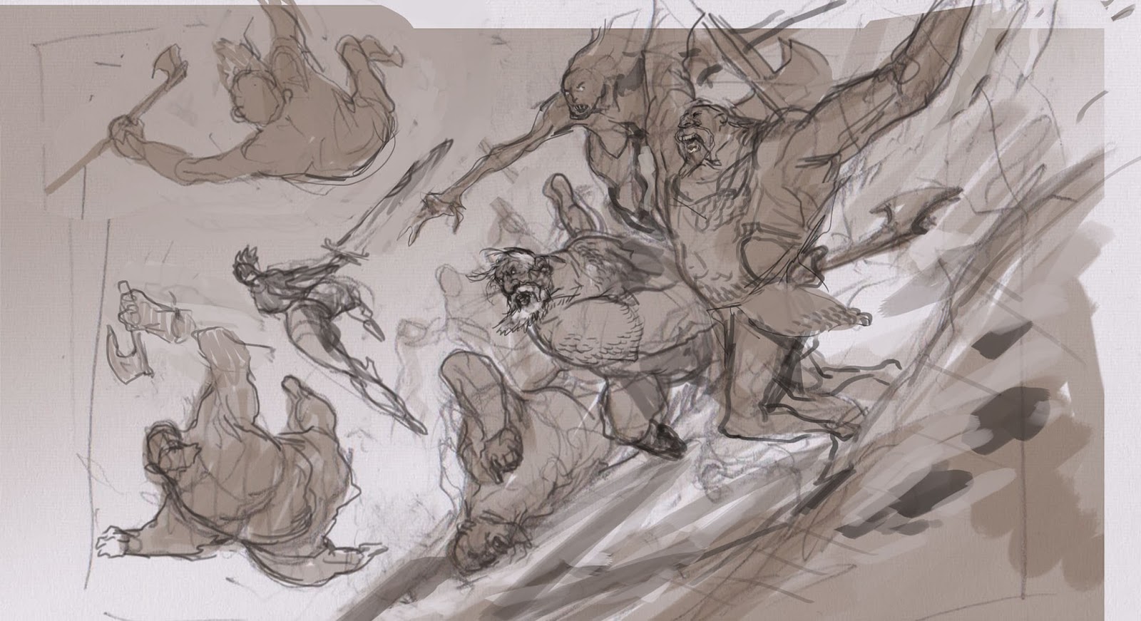
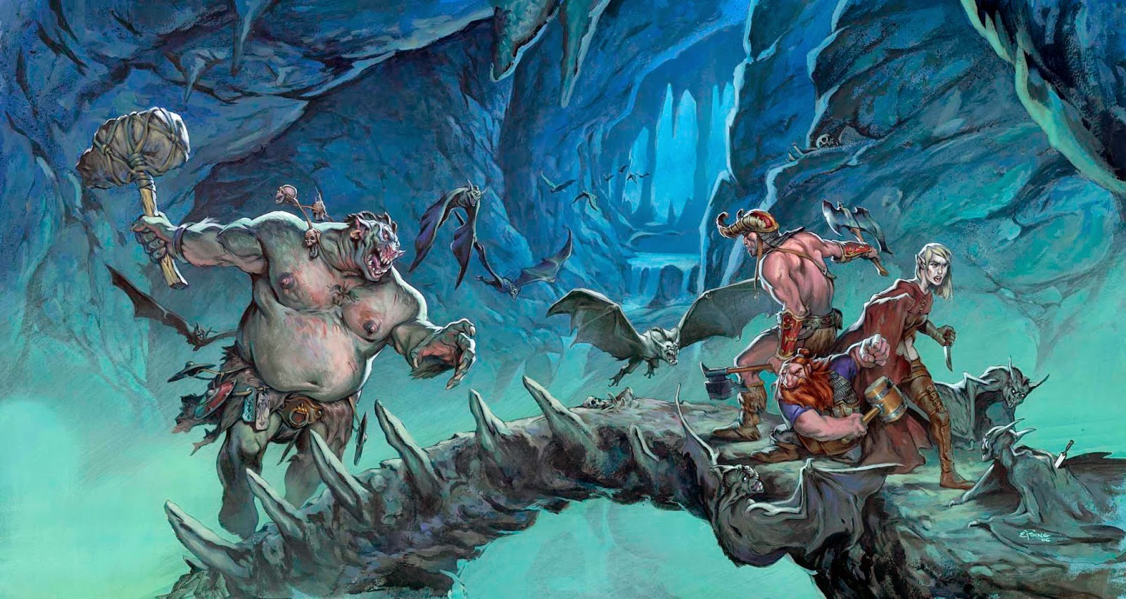
sketching this cover for Paizo´s Pathfinder series I got the urge to do a
multiple figure fight scene. Not a very easy thing to pull of. i knew it would take a lot of planning and composition so to make
everything easier I tilted the horizon line. I helps distort everything so that
no one notice perspective mistakes or nothing and it adds drama and action; win
win if you ask me.
previous sketch of the female barbarian that i had to abandon on an earlier cover,
but i knew I was going to use it now, so I kind of build everything around that
ass…I mean pose.
 To be honest
I think explaining composition is very hard. I know there is a thing called the
Golden section and there is all kinds of rules as to where to place things of
interest. I never learned any of that but you kind of know them anyway, from
being human and having looked at a lot
of images. So I go about this feeding on gut feeling. What this feeling is
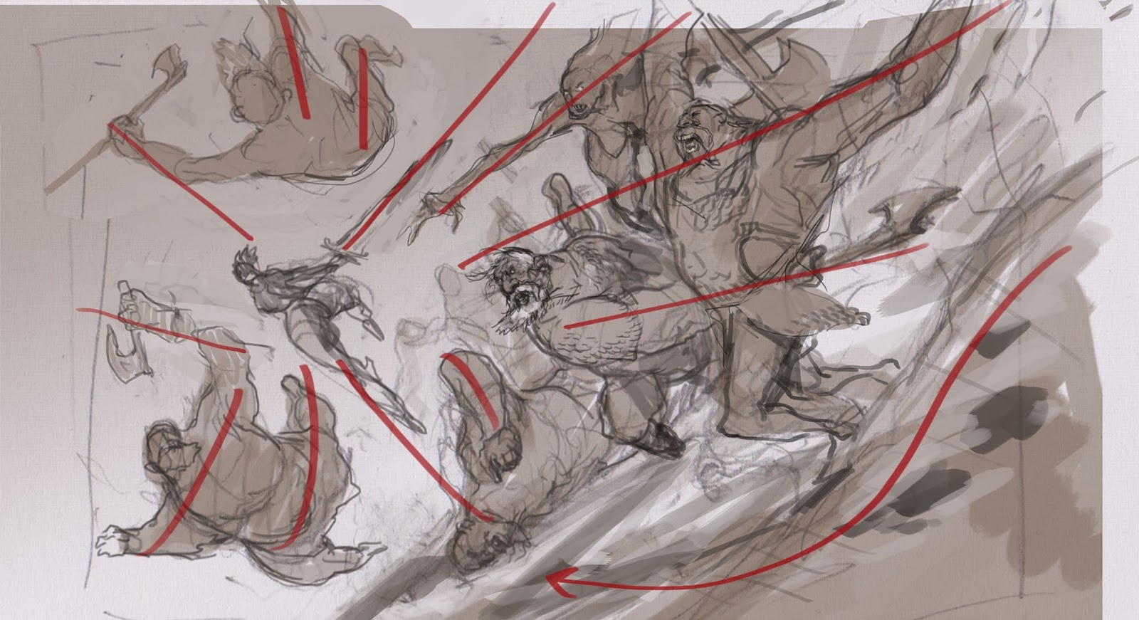
telling me is that there must be unified lines. Or framing. Notice in the
sketch that I actually have a whole figure reaching ( pointing ) towards the centre
of interest. And the figures around her nicely circles her in acting as a
framing for the main figure. When sketching these many figures I do not decide
that I want to follow these line from the beginning. they are not pre-described
in my head, but I take really good care of using them when they surface. It is
more about recognizing the right flow/direction or rhythm to the lines when the
haphazardly emerge, than actually doing it textbook like. almost as finding shapes
and figures in a cloud.
tried to see what could be eliminated to make the image seem more clearly
readable. I decided to remove the charging front giant to make room for the
second archer and also to clear some room for the Axe Swinger. When I sketched the
giant having his hand cut off I couldn´t get it right. he seemed like he was falling
in the wrong direction. He faced out of the composition and continues a moving
downwards and out of the picture. it felt wrong, so I changed his pose to be
more of a cup shape framing the barbarian from the bottom and up circling her
in.
these steps was created with pencils on paper. but as soon as I had all the
figures sketched i layered them together in Photoshop and stared shuffling them
around to avoid tangents and unclear cropping. In the old days this stage was
done from multiple photocopies placed as a jigsaw puzzle on top of a background
pushing and pulling around zooming the figures in and out printing them out a
lot of times before the placement was right. Doing it digitally is a lot
easier. And since I already had all the sketches placed together I might as
well color them right away.
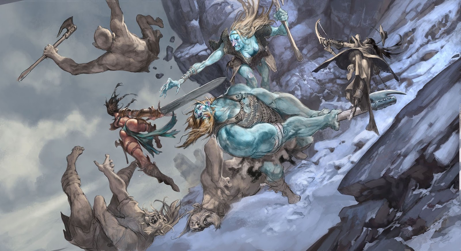 |
| half way image with greytones showing |
everything like I am used to do in acrylic and started painting on top of the
grey tone with overlay layers and colorize. then I just paint into everything
until it is done.
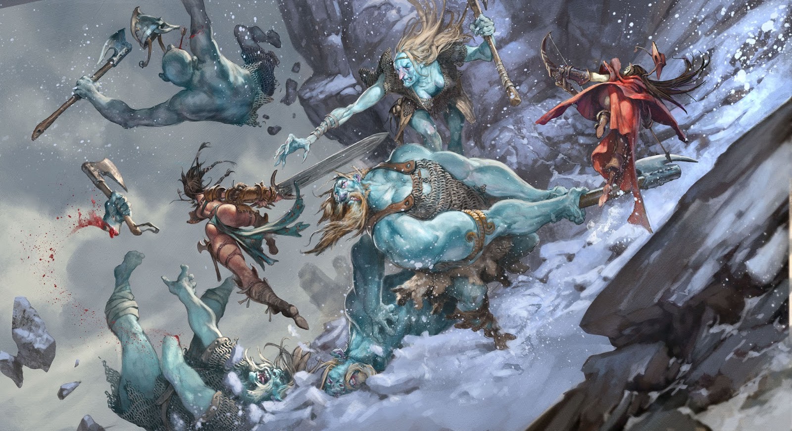
very simple and limited palette to not take away the focus from the figures and
the readabilities.
really like in this picture is that there is so much going on, small actions
within the big scene.



Don't let Ms. Panepinto see sentence 4…
As far as I remember, she was never opposed to a bit of fun.
Great work on this, J Ejsing! Its incredibly easy to read, good focus for an image that has a lot of dynamic things going on.
I like this. There's lots going on, yet it doesn't look busy. The falling snow makes the art for me! And the barbarian's butt is there, but isn't there, so that should keep Ms. Panepinto happy.
Great work! Looks really creative. Hope to see more of these!
http://www.itsallaboutthesearchbar.com/