David Palumbo
The sketch is arguably the most critical stage of an illustration. Conjuring thumbnails, narrowing the concept, clarifying the message, all of it boils down to the sketch: the blueprint for what will eventually be the final piece. For me, lazy sketching tends to result in client misunderstandings, technical frustrations, slower execution, and (worst of all) lukewarm finals. I respect the sketch phase. Up until a year ago, it was also the one step I absolutely dreaded.
Before last fall, I did all of my sketching in Photoshop. Thumbnails were pencil and paper and sometimes those would be scanned in as the base layer, but the real work was all digital. Composing demands a flexible mind. As pixels, shapes can be dragged, resized, and shaded fast and easy. The ability to react, and often react again to what that reaction resulted in, with an ease and flow is extremely useful. My problem is that I just don’t really enjoy working digitally. Something about it has never felt very satisfying to me. Combining that with the very abstract thinking that sketching requires and the pressure of, as I’ve already said, a strong sketch being absolutely critical to a strong painting, it’s no wonder I would procrastinate sketch days as much as I possibly could.
“Maybe I should work on that job that isn’t due for a few weeks yet. Maybe I should catch up on emails. Maybe I should watch some movies and go get lunch and look at Facebook…” Eventually, of course, I would sit down and do my sketches, but I found that I really had to draaag myself through them. Even
when I was excited about the project, I still avoided and procrastinated
sketching. I was resigned to the process which had been serving me
well (enough) for so many years. Working out preliminaries in physical
paint often seemed like a fun idea, but also seemed terribly
impractical.
 |
| my most recent digital sketches with the traditional final, from last August |
I can’t say for sure where the interest in sketching in paint started, but I believe the thing that finally tipped me to try it out was a box of preliminaries by Robert Maguire that were being sold for obscenely low prices at San Diego Comic Con. I have always loved seeing these sorts of miniature illustrations whenever I come across them and, for whatever reason, these in particular inspired me. It occurred to me that sketching might be more fun if I could do it this way. At this point I’ve done hundreds of 5×7 inch figure studies so I knew that I was comfortable at that scale. I decided to try doing something similar on the next job where I’d have some creative flexibility and a comfortable deadline.
Early Concerns
I decided my surface should be the same as my typical go-to (Masonite primed rough with acylic gesso). I wanted to work monochrome, but decided a colored ground would help give the pieces a bit more tonal variety and allow me a “spot color” if I needed it, so I coated each panel with cadmium red acrylic. This method was something I was already testing on my “re-cover” series and the success of those encouraged me. The tricky part was altering my workflow.
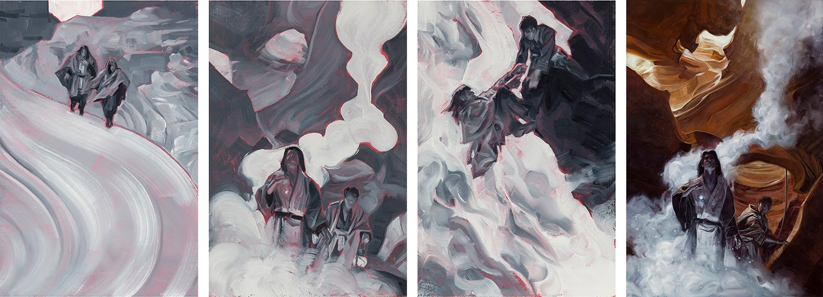 |
| my first oil sketches with final, from last August |
For years, my process had been: thumbnails, sketches, client notes, reference, move to final. I could still work that way, but jumping into sketches without reference felt too chaotic. Additionally, I wanted to maintain the early stage flexibility that I found so usefully with digital tools and that could get pretty messy in oils. In the end, I decided on a strategy which I worried might be counterproductive or inefficient. I felt it was worthwhile to test though. The new workflow would be: thumbnails, reference, digital composite (what some call frankensteining), oil sketch, client notes, move to final. The pushing and pulling would be handled in the reference composite and then it would all get tied together into something presentable (and representative) in the oil sketch.
There were a few obvious drawbacks here. The first and most obvious was I would have to shoot way more reference than before. Instead of shooting for the chosen idea, I was working up multiple ideas. This also ran the risk (which has bit me a few times so far) of having the client want completely new sketches in a new direction which meant bringing the model back in for a second shoot (and paying for that second shoot). There was also a slight concern about letting the reference drive the sketch as oppose to the other way around.
The upshot of all this was that once I had approval, I could dive straight into the painting with no delay and it would be as close as possible to the approved sketch because my reference was already assembled. It felt like a fair exchange, all things considered.
I’m happy to say that first set worked out. It worked out so well that I haven’t done a single digital sketch in the ten months since. As it turned out, the new workflow didn’t really slow me down but did have some surprising benefits.
Why I Love It
One of the obvious perks to this whole thing is having little originals instead of digital throwaway roughs which nobody besides the client would ever see. I knew that would be the case and it was a big selling point for me. I hadn’t quite thought through what it meant though. My general policy on sketches is not to submit anything that I wouldn’t be excited to paint. I want to love every idea because one of them is going to get picked and I don’t know which. But that also means that, on average, two others don’t get picked. Usually that means they fade away as if they’d never existed. On extremely rare occasions I might pursue one anyhow just out of love, but mostly they’re absolutely forgotten a month later. When each one is an actual little painting, they all get to live. Maybe not large and in full color, but they all end up getting painted and, as a result, still feel as though they‘d been “realized“ in a satisfying way.
That leads into the second surprise: When you are painting every sketch, you weed out the mediocre ones much sooner. The result here is stronger sketches to select from and, in the end, stronger finished paintings. There are several times where I’ve painted up a sketch which seemed perfectly sound as a thumbnail, reasonably interesting as a photo comp, but just didn’t have it as a painting. In some cases I could see what was missing and take a second swing, in other cases I could leave it be and try another direction. In the end though, none of them went out for an approval. If I’d been doing them digitally, I’m 100% certain that I would have sent those ideas out because they seemed pretty good at first. They seemed pretty good because the little things I wasn’t sure of fell in the “eh, I’ll figure that out with reference” or “it’ll make sense in paint” categories. But now I can see where that is the case and where it definitely isn’t.
On the subjects of figuring it out with reference, it turns out that’s a pretty good thing to do early. Now, I’m aware that we all have different tastes, habits, strengths, and weaknesses. Some people don’t want to reference early because it stiffens them up. So fine, I say know yourself and act accordingly. For me, I find the opposite is the case. It doesn’t hurt that I am recently fascinated with photography and enjoy learning and practicing as much as I can to improve that skill. Whatever the case, I’ve found that bringing in models with a set of mostly-there ideas, but none of which I’m actually bound to yet, gives me room to explore, improvise, tweak, and experiment. It also seems possible to me that sometimes a sketch which might not have seemed the leading concept as a thumbnail suddenly takes on new strength when you put some lights on a model. One of my favorite recent pieces was almost a throwaway thumbnail. It had potential, but it veered off course from the client’s brief. I shot it anyway just because I thought it might be worthwhile and BAM, I knew it was the winner the second I saw the results.
One last little perk, and it may be anecdotal (like any of this isn’t), but I feel like clients are more prepared for painterly finals if they review painterly sketches. Since I started sending oil sketches, I can’t remember any clients asking me to arbitrarily tighten up brush strokes, smooth the render, or any similar requests which normally make me a bit bonkers. I put thought into my brushwork and want for that work to show in the final. I aim to have a painterly quality. My digital sketches had rough strokes too, but it was more sloppiness than grace. The implication being “this will be cleaned up for the finish” and everyone is left to their own interpretation of what that will look like. The oil sketches, on the other hand, really mimic the feel and quality that I’m ultimately going for in a way that just makes sense. In general, these seem to be far fewer third act surprises and the clients seem to appreciate that almost as much as I do.
And the final surprise is that none of this seems to take any more time than my old process. I have a few theories why, but the one that makes the most sense is that I actually sit down and enjoy my sketches now instead of wasting hours (days?) avoiding them. Who knew allowing yourself to have fun when you work could actually give better results?


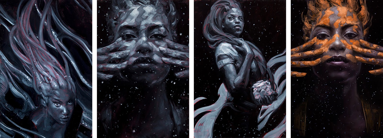
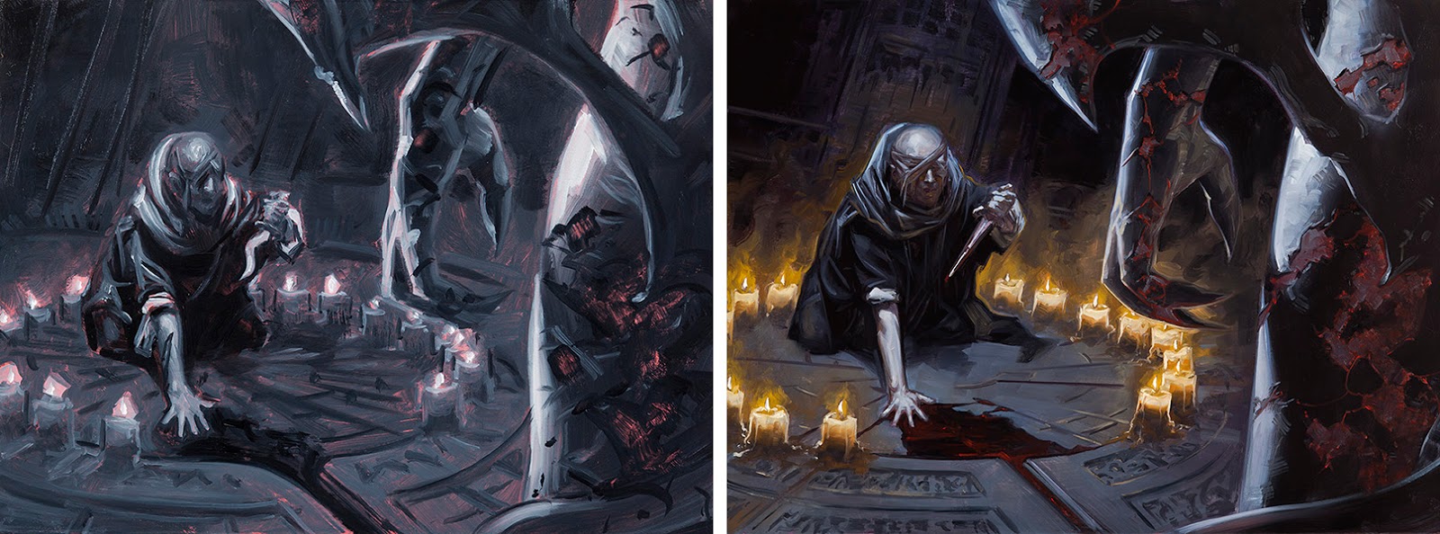

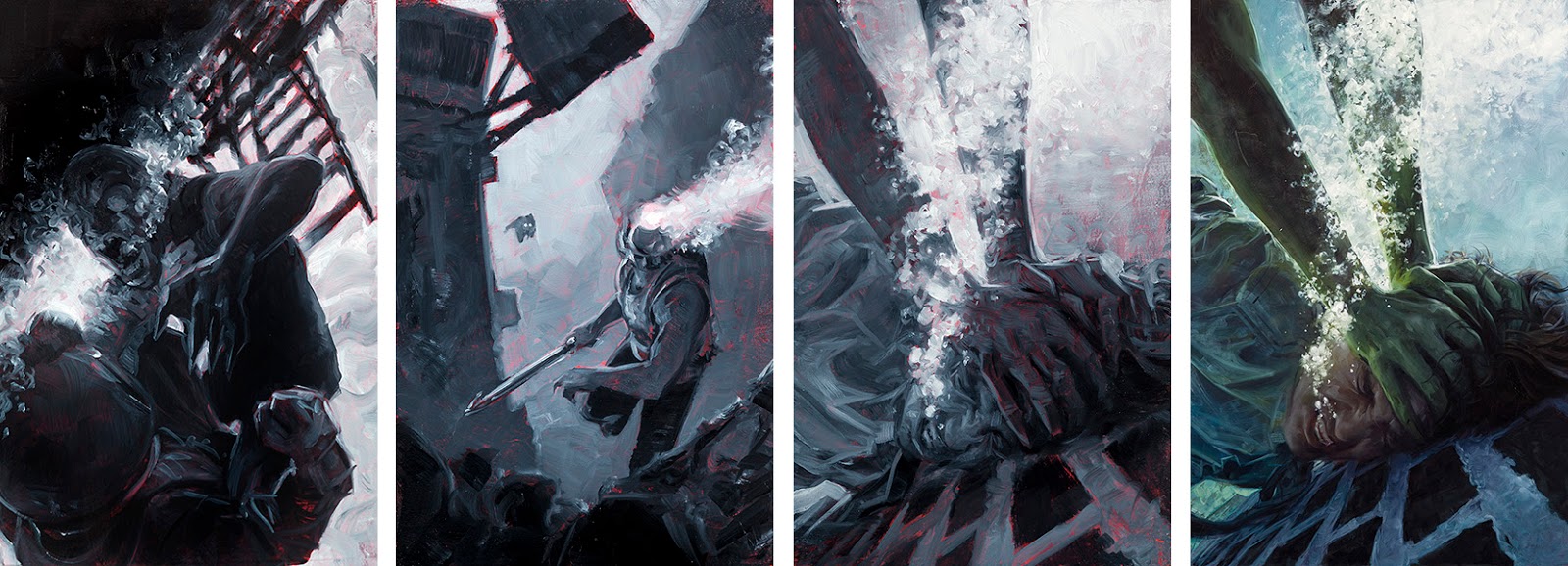
You know you're going to get the inevitable, “I like the sketches better than the finish” comments? Really beautiful stuff Dave. Great post.
Dave-
Great post and very honest in it's approach. I agree completely with what you have written. Having that tactile relationship with your work is important in my opinion, so enjoy your new found pleasure! Really like and enjoy seeing your work, by the way.
You have convinced me! I decided last week that I wasn't going to work digitally anymore on my finals… I will see if I can follow through on it now. 🙂 This post helps a lot. Thanks Dave!
I have been avoiding digital sketches as well, and figured that the lack of traditional experimentation could be what was making my processes duller… Now after reading this I'm pretty sure that implementing more traditional steps in my routine is exactly what I need ahaha.
I have been avoiding digital sketches as well, and figured that the lack of traditional experimentation could be what was making my processes duller… Now after reading this I'm pretty sure that implementing more traditional steps in my routine is exactly what I need ahaha.
Tried you method this morning and was really happy w/ how lively and fun the sketch was- Thanks Dave! It was very helpful for nailing values too (argghhhh)-awesome!
🙂 I don't know if I'll say I like them better exactly, but I tend to find myself more attached to them
Great write up and nice to know that ADs respect the painterly quality of the final more after seeing painted sketches.
i love the idea of keeping the mini sketch paintings. thanks for this one, I'll try it out.
that's still very much just a theory, but it makes sense to me
Great post! I want to try this even if I find it terrifying! Beautiful work from start to finish as usual!
thanks for the post. i feel the same way about sketching digitally. im definitely going to try this for my next painting. are all your oil sketches 5×7?
the long end is usually six inches, so book covers are 4×6, magic cards are 4.5×6, etc.