Another fine short story by Michael Swanwick in his series of
The Mongolian Wizard for Tor.
When the series started, there were so many great visuals for the lead story that I drew scenes built of moments. When I stepped back to see what I was trying, I realized I was creating classic montages. An approach quite out-of-style in the illustration field for a very long time.
But I love reading and working on these visuals for art director, Irene Gallo. In discussions with her we realized that while different for the times, montage was the right format to allow the flexibility needed to move in sync with the ideas by Michael. When working with themes like gryphons, gargoyles, and a Werewolf Corps, one needs to be able to play with all of it. There are just so many great elements!
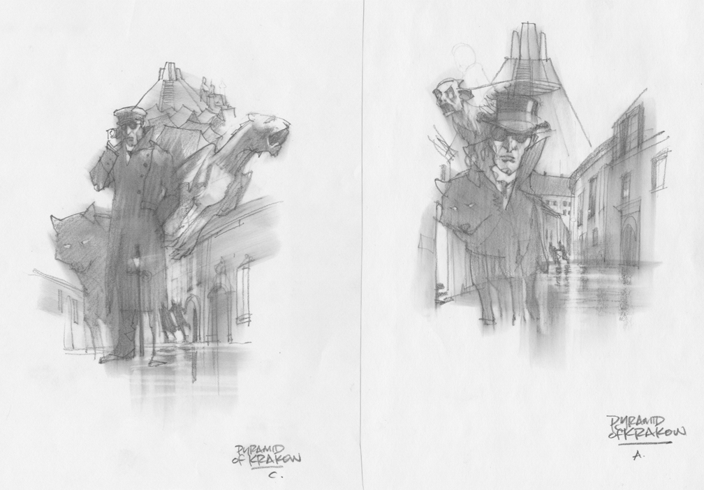
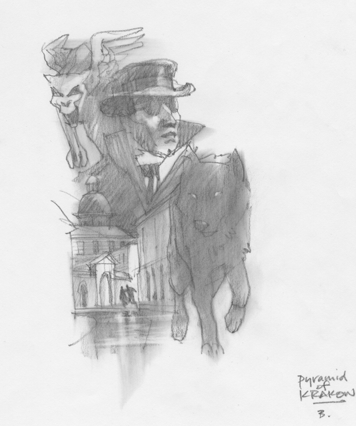
I read the story several times and chose images that I thought would be intriguing. I compiled a list and then started my thumbnails, adding elements from the list, and adjusting size relationships.
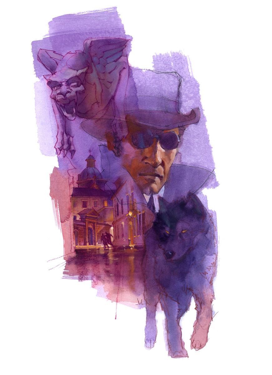
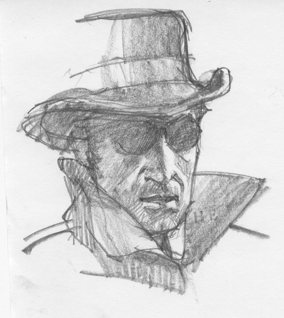
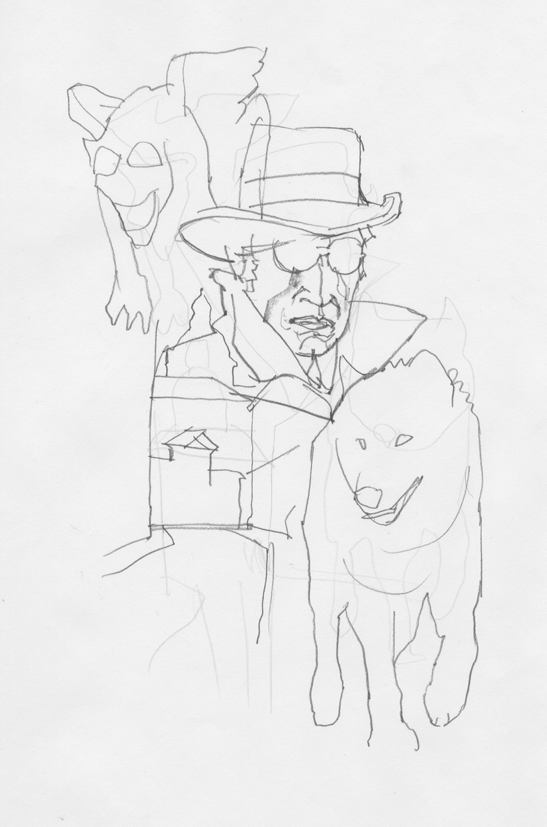
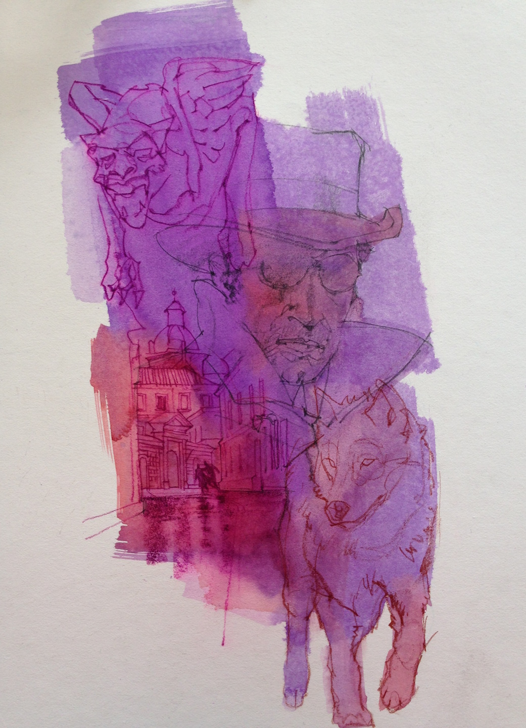
The general approach to montage is to provide contrast in scale, color, and composition. Here I drew different sized pieces that related to the importance of the overall story. Obviously, the main character takes center-stage. He wears dark glasses in the story, disguised as a blind man.
I added wolf and gargoyle images, all played against a tiny night scene in Krakow. The key thing about montages is pulling things together tighter than you think. Elements that bleed in and out of one another add not only interest, but a pathway through the moments depicted. In other words, I
crumped the pieces together.
The thumb I chose needed a few adjustments. I’m constantly refining the overall shape and the way the piece lays on the page. On a separate sheet I quickly re-sketched the elements, projecting the thumb so I could move them around until they fit the way I wanted them. Once I liked it, I scanned and projected that sketch to my prepared board and lightly drew the outlines in blue pencil. This was my skeleton sketch; my guide.
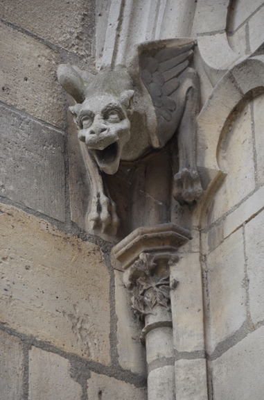
From there I projected my drawings of a couple elements, plus a shot I took of a gargoyle (from Notre Dame while traveling in Paris), and a daylight shot of Krakow which I changed to night. I freely drew under the projector to get the energy from the thumbs back into the final drawing, still making subtle adjustments as I went.
To seal the drawing to prevent my oil paint from cutting through the graphite and colored pencil, I mixed copious amounts of three to four colors of acrylics. This stage is always a little scary as it is very direct and tenuous. The paint must go down quickly, but heavy enough to cover. For a while, the drawing disappears.
The pigment must also move around and blend before it dries. Sometimes this is nearly impossible, as the thinner layers set up fast, and also because I’m freaking impatient. But if I stay frosty, I can manhandle the way it flows by tilting the board, and by quickly blending colors in and out with several charged brushes. I have to work in a hurry.
It’s a nightmare, and then it lives. Or rather…I live with it. I must allow the pigment to do what it wants while I guide it and simultaneously accept what it gives me. Some passages don’t occur the way I see them in my head, but then other things happen that are revelatory. Such is the process.
Once this layer dries, I dive back in with thin oil washes, wait for them to set up, and then lay in the opaque strokes. At this stage, I can blend and stroke, bleed things into other elements and pop other places for contrast. For example, the wet street versus the lights in the small city scene.
I love montage. I don’t care whether it’s out of style or not. It’s excellent for capturing a multi-layered story. I’m looking forward to working on the next one coming up soon. In the meantime, I’ll be writing a post about another in the series that was recently posted on the Tor site.
I can’t recommend this world of Michael’s enough.




Hardly out-of-style! I love the retro vibe I get from this one. Thanks for sharing your process!
Even though I'm supposed to be a mature adult… I still like splash page from comics, book covers, pulp fiction filled with montage… keep 'em coming… again, thanks for production details!
Aw, you guys….that's the best. Thanks! Nice to know that artists younger than me can still appreciate the beauty…
I love this! The way the colours blend in the city area are fantastically beautiful! Congrats!
That kind of montage on a book would always grab my attention when I was a kid. It still does. Out of style? In that case, so am I. And I'm fine with that …
“And always, he fought the temptation to choose a clear, safe course, warning 'That path leads ever down into stagnation.' “
– Frank Herbert, Dune
Beautiful work, Greg! If grooving on montage is wrong, I don't wanna be right.
Simply bad ass, Greg. Reminds me a bit of Bob Peak. Thank for sharing your process!
“If grooving on montage is wrong, I don't wanna be right.”
LOL!