Not many artists think that mere overlapping elements in a painting can make a marked difference in the strength of a concept, but my own paintings became much stronger once I understood how important it is to a composition. I’d understood it for years and wasn’t really willing to try it. After all, if it’s that simple, how could it add to what I already had?
So I learned the hard way: by making the same mistakes over and over again until I noticed that most of the artists I admired used some form of it. The sooner you utilize this principle, the sooner your work will grow in interest, too.
Or you can keep putting everything all bright and shiny dead-center in your composition and lull your viewers to sleep.
Interesting paintings are not so much about presenting the subject, as they are about revealing it.
1. Push and pull.
It’s that easy. Pull elements of a composition together more than you are comfortable with. Overlap elements you are afraid may lose their detail, their shape or form. Watch when your brain resists taking that risk and make yourself do it. You will see composition potentials you hadn’t thought of.
Train yourself to do it and you will learn it…naturally.
2. Foreground.
In general, the best kept secrets are right in front of you. Just because something is in the foreground doesn’t mean it’s the most important thing or the subject to look at. Sometimes we look past what’s unimportant to get to the subject. Light can draw us in, or value, or shape.
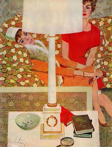
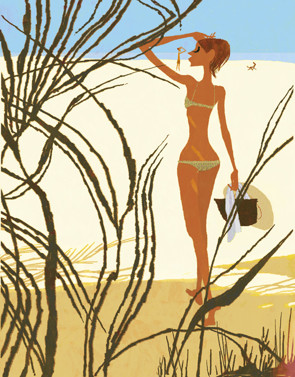
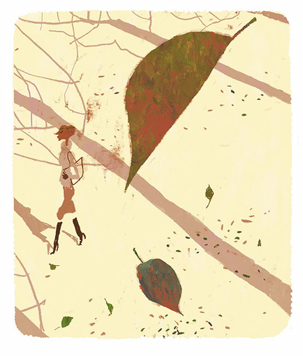
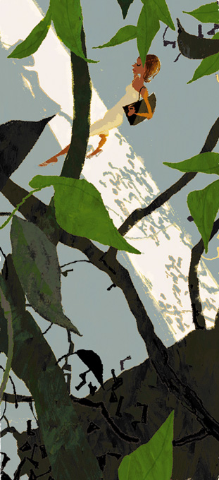
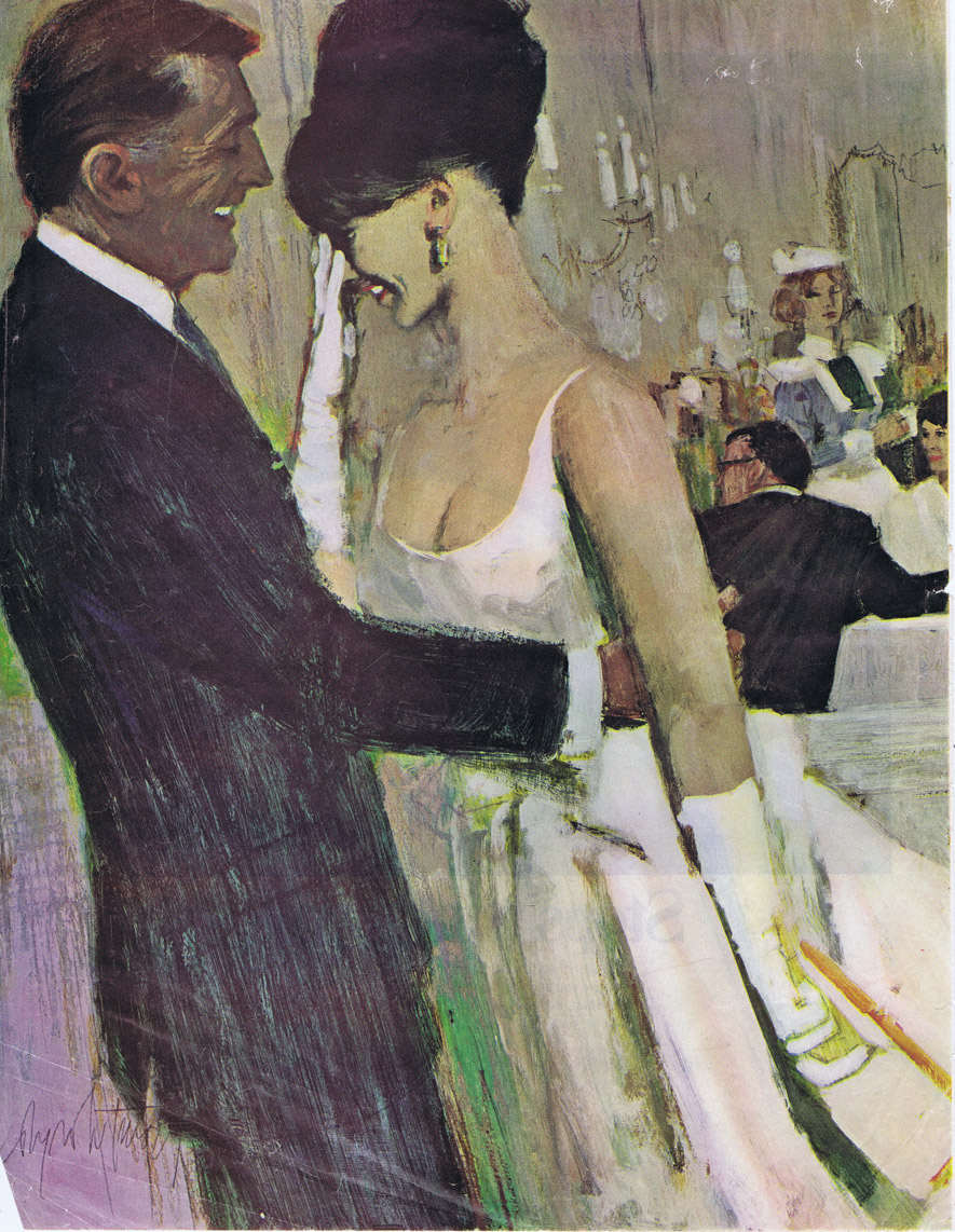
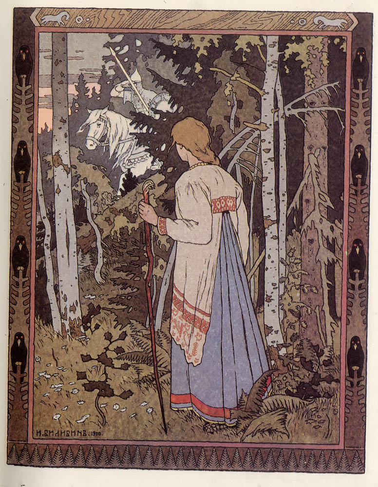
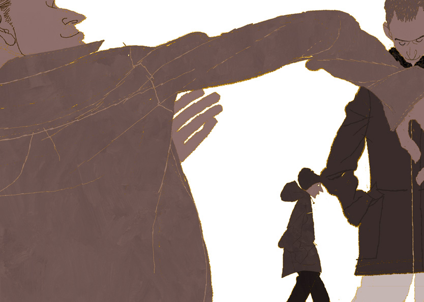
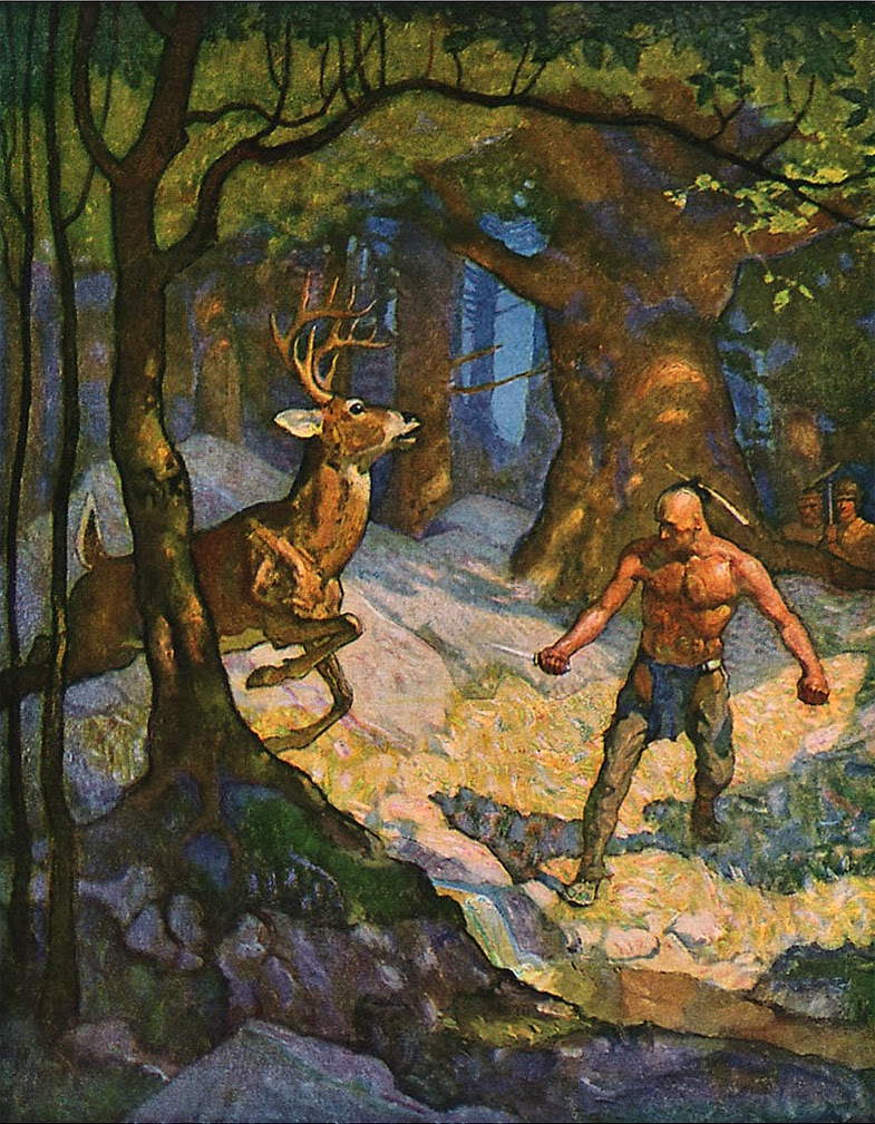
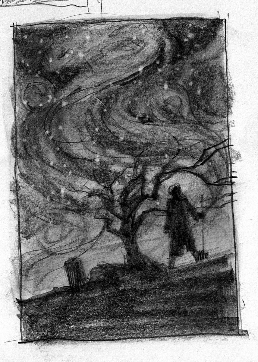
Think of the shapes that can drive the eye. You use it all the time when you put flowers or long grasses or branches along the sides of a piece and expect people to look past it. Foreground figures can guide the viewer past them and allow the focus to fall on the subject. They can frame the subject within the frame.
3. Middle ground.
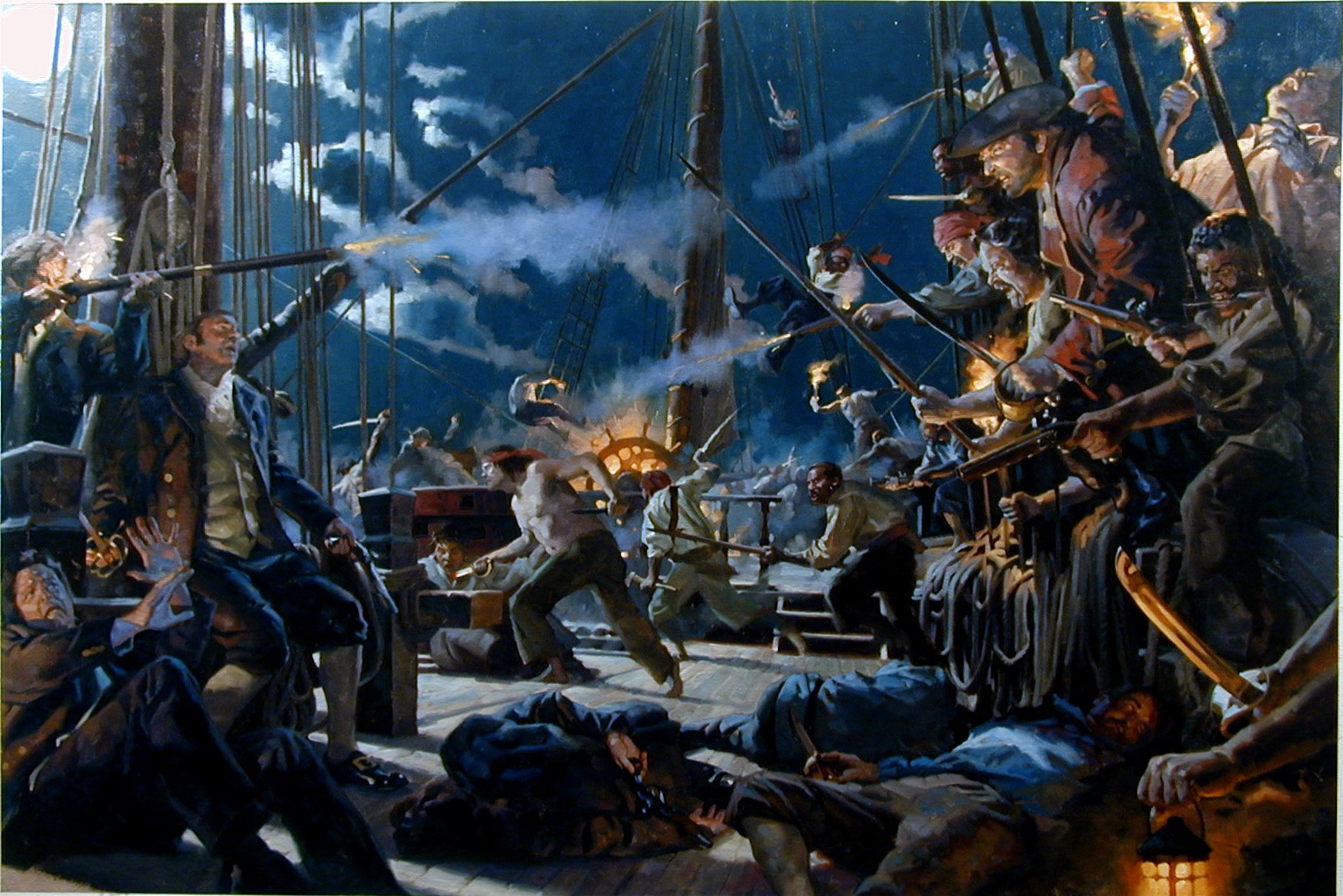
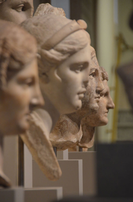
Most artists place the subject in the center, in the middle ground. (This has worked fine, by the way, for centuries.) But the middle ground can have quite a large range to deal with and the point of the picture can get lost. That range can be covered quickly by the way foreground objects overlap the main subject, as above.
Don’t allow the middle ground to become sacrosanct. Get off the average six foot height perspective and move your p.o.v around to imbue this area with interest. Overlapping subjects will enhance the interest in even an average painting.
4. Background.
It’s odd how the background, which seems limitless, has the least amount of area in most pieces. It doesn’t need much to give the feeling of space. Landscapes recede into the background, and as they do, elements like rocks, trees, mountains, and clouds compress into a smaller area. Let them overlap, and study the combined shapes they make; atmospheric perspective is built from overlapping layers, layer upon layer.
5. Maintain the subject silhouette.
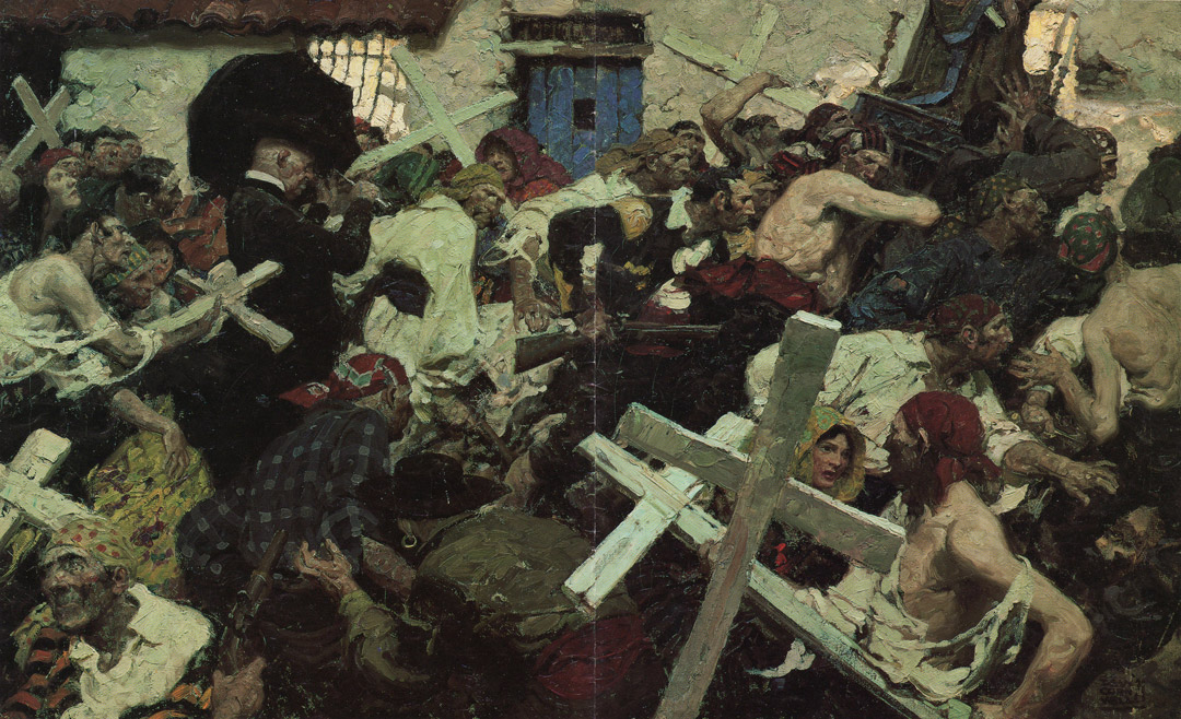
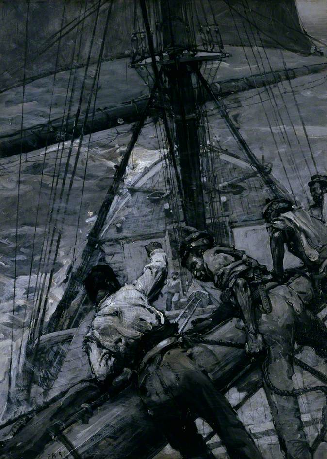
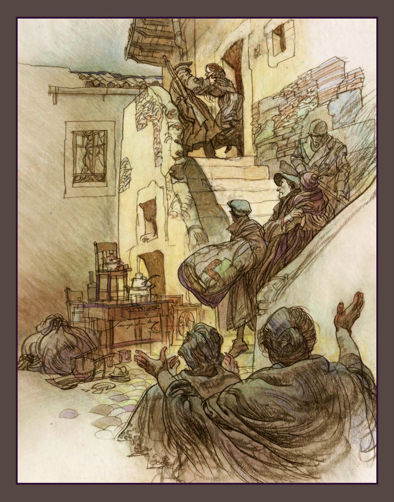
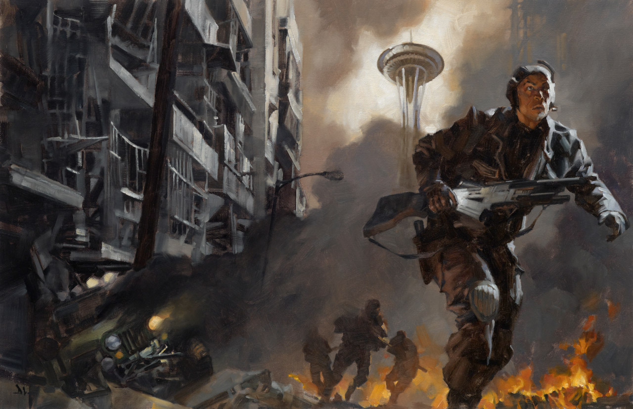
If nothing overlaps, pictures feel static. Conversely, too much overlap can obscure your subject, like too many branches or too many mechanical structures, or too many figures. The viewer must be able to spot the important silhouette of your main subject and discern it’s shapes and importance.
Seems simple, yes? It will eventually get that way. But you’ll only learn to recognize it by experiencing it, and most artists fear that challenge. To get a grasp on this, while sketching overwhelm the subject to know just how much to edit, or get away with.
(battle scene)
6. Think 3D.
We see depth in a three dimensional world because we have two perspectives, one from each eye, which we blend in our minds to perceive dimension. (it’s amazingly simple, and yet astonishing)
Get out some binoculars, or a long lens and study your surroundings. Notice how they reduce the feeling of depth, and flatten some elements like trees (cutouts!) and how they cover other things; how you have to move around to ‘unveil’ what you are trying to see. (you can train yourself to see how these lenses see, but it takes a little time to recognize it.) You can use those spatial clues to design interesting compositions.
Don’t clean up the world in your pictures. Things naturally overlap other things. This will bring a sense of authenticity to your compositions.
7. Tangents
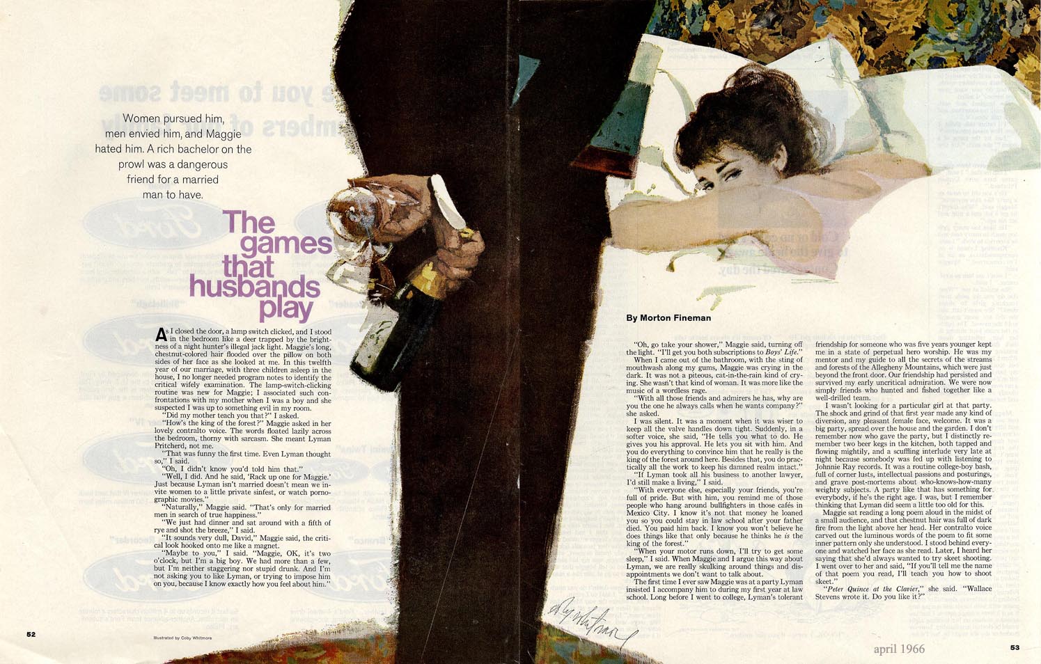
Because tangents are everywhere, they will plague you as you go along, especially once you reduce reality to two dimensions. Once you understand them, once you see them, they seem viral. How close does a finger get to a face; where does the sword tip end up; does this figure nearly touch that figure, etc.
Think of the picture plane as a cube: from front to back, side to side, top to bottom. To fit things well into space, you have to pay attention to how much you inadvertently keep them from overlapping. Then push them over edges to overlap them comfortably.
8. Positive or negative: it’s a space problem.
Tangents can make empty or negative spaces. These spaces can commandeer the subject and become positive spaces to the eye where you don’t want them. This is why negative and positive spaces are so important and why you hear artists talk about them all the time. It is important to a balanced composition.
Learn to spot them and control them. An artist who misses this doesn’t get to communicate what they want because these problems will zap a picture’s strength.
It’s not that hard. Study the artists you love and notice how they use space. The answers are right. there.
9. Don’t get cornered.
Corners are convenient. Corners are important. And generally there’s four of ‘em. “Gee, look at all that empty space I can fill just for the hell of it.” Resist filling space because it’s there. You’ll need those corners to add to the overall space a subject sits inside of.
Again: front to back, side to side, top to bottom.
10. Overlap light.
Yes, light sources can overlap, too. Multiple lighting creates depth; know when to use it or lose it. Lighting from one direction can supersede or support another source. For instance, a figure in the woods can be lit by the sun, and the bounce light from a tree or the ground can lighten the shadows.
Cinematographers go to great lengths to create this depth and get light to read naturally. Be careful when lighting your subject in the studio. You can create conditions which don’t seem natural. You are an entity on this planet, walking about in different lighting conditions, so you already know when something feels ‘off.’ Trust the amount of years your brain has been recording this.
Even so, paintings don’t have to be correct all the time. Knowing how to mimic natural light, you’ll also be able to create situations where you can use light to give an unsettling perspective. It just needs to be believable in the condition you created to communicate with the viewer.
11.Think better than average.
How many people can come up with the idea you just used? Answer: most of them. (that’s ok…we all have similar ideas at times) But, think of the idea, then to make it more personal, more unique, overlap your intentions: blend average ideas with different ideas and create something unique to you.
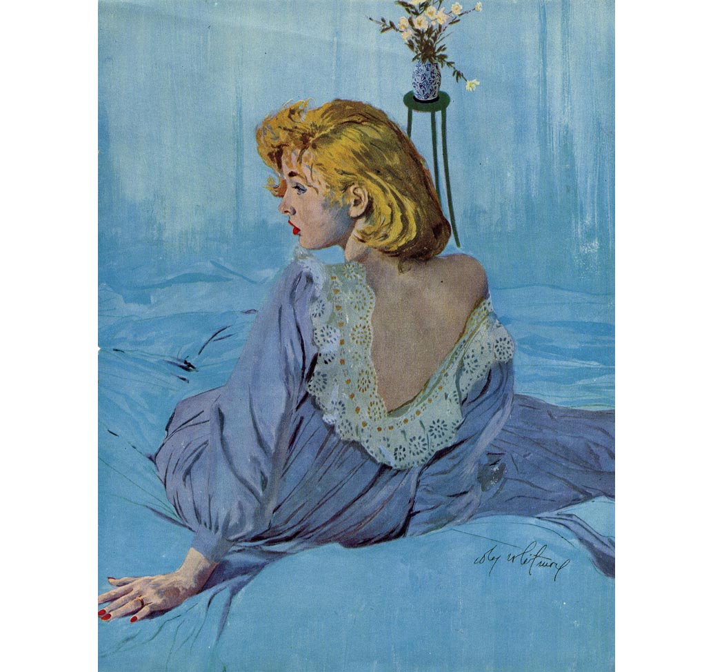
Overlapping elements in a painting create intriguing, thought-provoking space. Once you play with it, you’ll see solutions arise you couldn’t have come up with out of the aether. Your genius talent won’t give you what practical methods can, and with them your confidence just might encourage you to take risks.









Nice, insightful post. Thanks!
One of my favorite things about onion skinning thumbnails is working to get the overlapping figures just right. Or even using the super light notepad paper from CVS or Rite Aid. Some nice happy accidents when you see the overlap from sketches on lower pages building a scene on the ones above.
This is a great (natural) extension of the points in your clumping post too.
Yep, Thomas, this is another in a series of aspects that relate so closely it's tough to separate them. For example, crumping can get confused with overlapping, but they all work together. We usually use all of them simultaneously, no matter what it's called. : ) Next up is cropping. Ooooo…..!
And yeah, me too, I use tracing paper to move subjects around to find the right composition. It's a great way to push toward a better composition. Probably could be done more easily on computer as then they can be resized so quickly…
Heheheh… I almost asked about cropping! It's funny the response viewers will often have when they realize you've chosen to crop figures or elements on purpose. In my experience, it's been almost universally positive. That the artist decided to crop from the frame for the composition just tickles their fancy.
You're right, though. They are distinct aspects of composition, and the more we recognize and use them, the more instinctive it becomes to do so. Sometimes choppy waters getting there when our own preconceptions of what a piece should be run against the wind of what the piece itself “wants to be.” Or the against rocks of what the client wants, counter to all good taste, rationale, and artistic sensibilities (I keed, I keed).
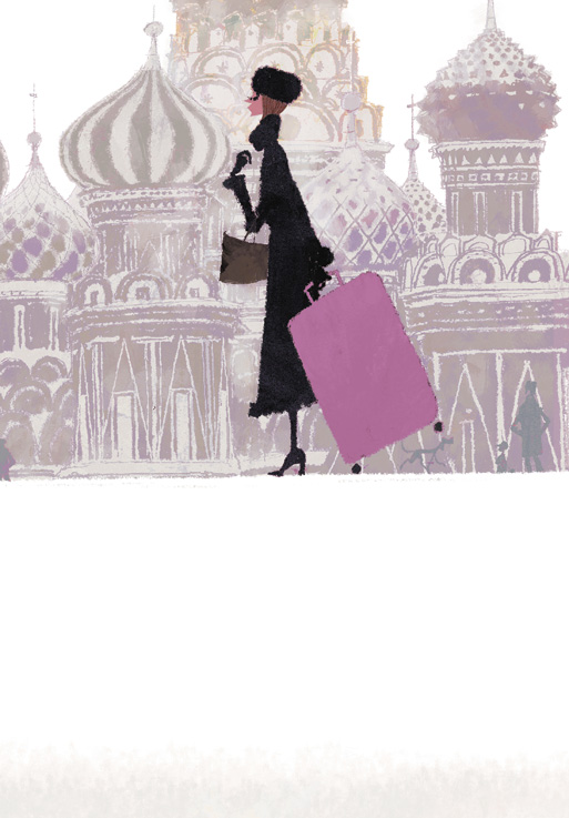
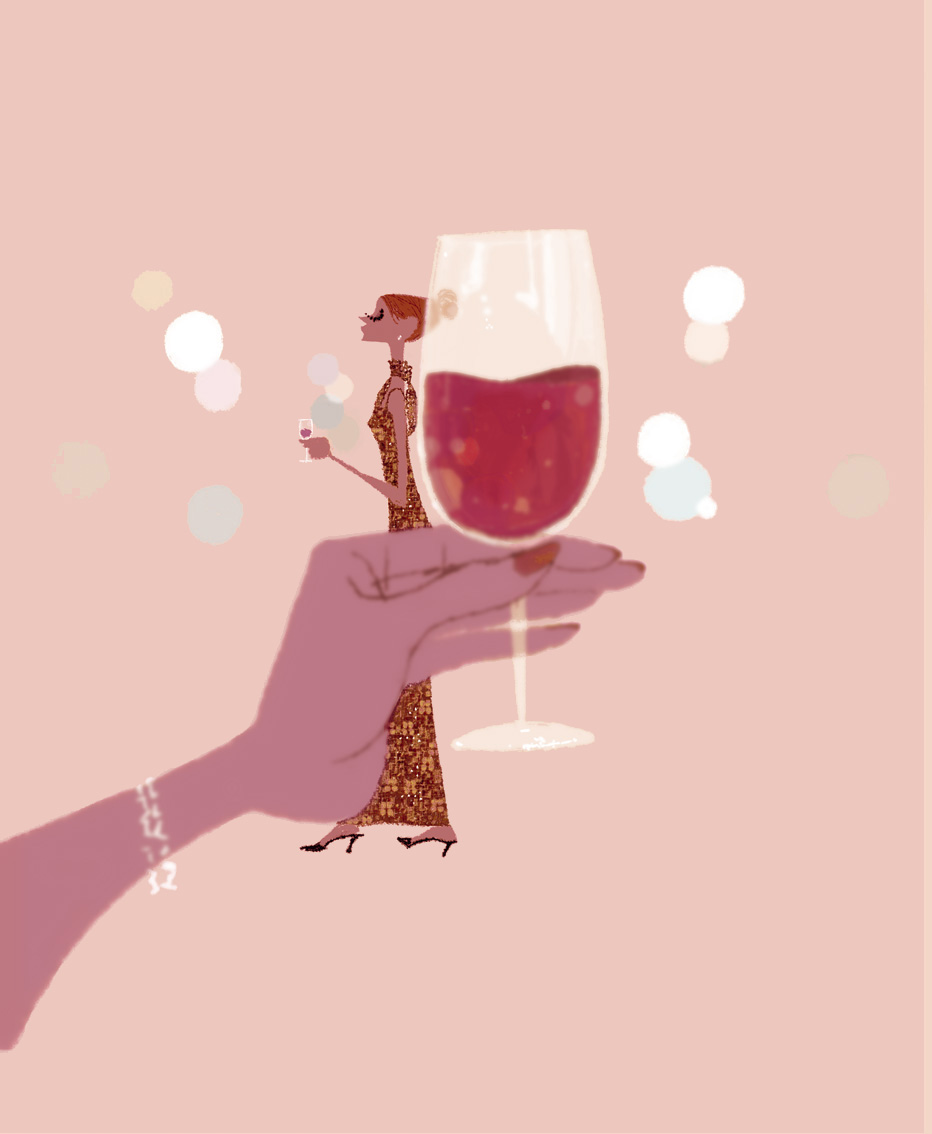
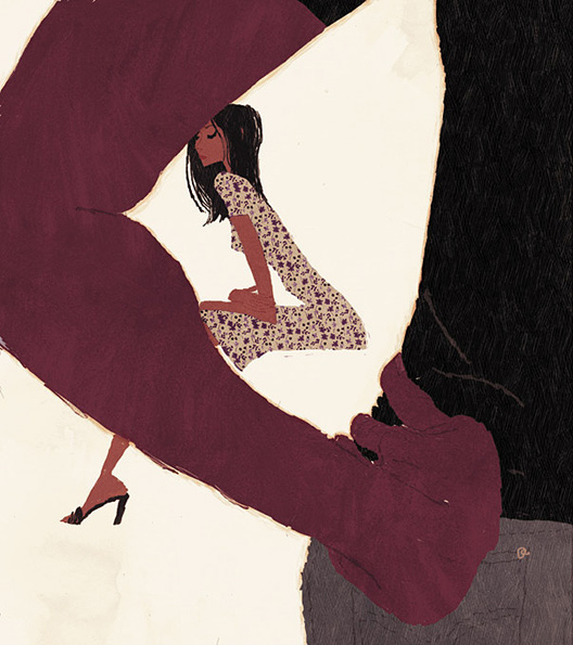
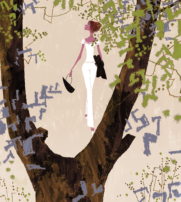
I hadn't seen Tadahiro Uesugi's work before now. Thanks for opening my eyes to his fantastic work Mr. Manchess!
Great post.
When's the Muddy Colours book coming out?!
Posts like these would make for a lovely book.
You'd have to break them up a bit and source replacement image examples here and there, but there's so much material on this blog now I think it's time for a Kickstarter!
Everytime greg puts out a 10 things post I find myself run off and furiously do a ton of thumbnails…. like needing to grab pencil and paper halfway through the post.. and some of those thumbs actually do even work..
it is the therapeutic effect of his composition lessons! I should print them all out and cover the studio walls with them for maximum effect
An excellent post as always.
I'd also like to say a heart felt thankyou for all your incredibly detailed and well presented posts over the years, you don't HAVE to write all these helpful posts, but you take time out of your busy schedule and do it anyway, for no other reason than to help others and give back.
Thankyou.
Excellent¡¡¡¡¡ Thanks ¡¡¡¡