Here is a quick step-by-step on a typical job for me, from thumbs to finish:
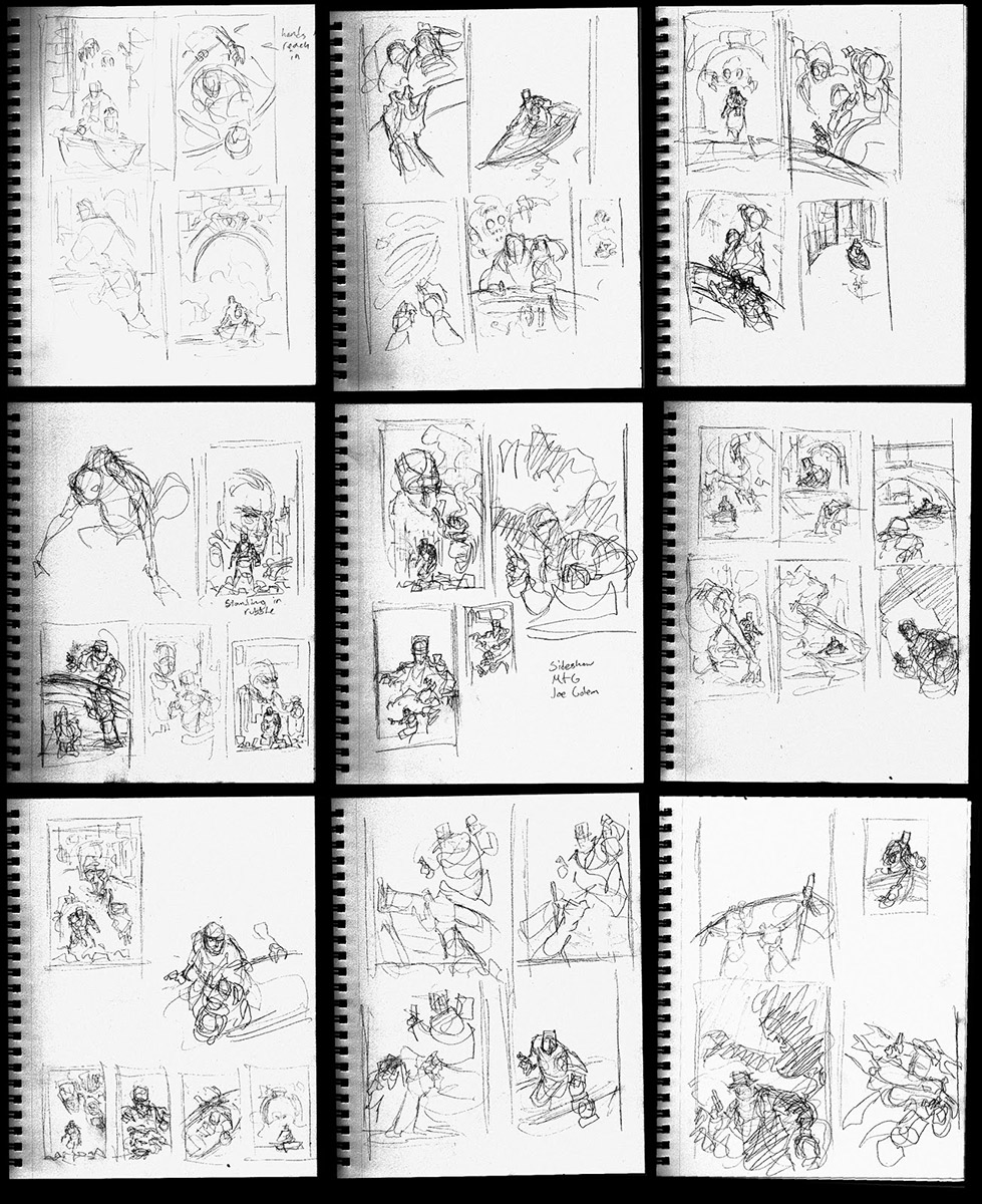
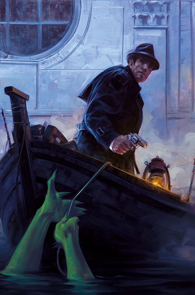
The first thing I do is thumbnail. Depending on the assignment this can be anywhere from two to 12 pages like these above. I’m in a loose frame of mind thinking entirely about shape and message. This particular cover was to be the first in a series and the publisher (Dark Horse Comics) wanted to have a pulpy sort of vibe. In the story, our hero is a hard boiled detective type who faces off against a big green skinned monster in a version of Earth where mid-20th century Manhattan is half underwater. I keyed in mostly on the sinking city and the detective being stalked by the monster.
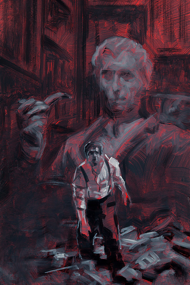
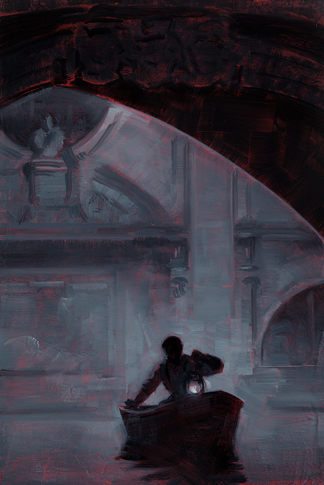
These three sketches were done 4×6 inches each in oil, choosing what I felt were the most promising roughs and developing them. These were all aided by some form of photo referencing. I sent this batch in and received notes to push the pulp further, as well as stick a snub nose in Joe’s hand and a fedora on his head…
The editor liked this one and gave me the green light to move to finish.
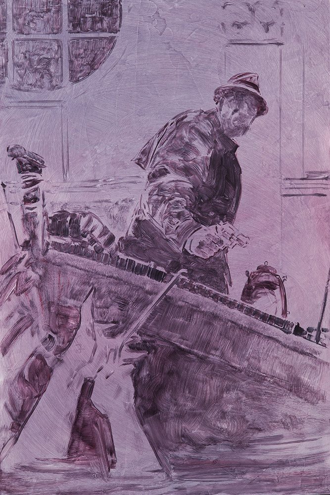
My reference had already been shot during the sketch process, so I was able to dive straight into painting. I printed up my ref and my sketch at the size I would be working to help keep the arrangement accurate as I redrew it onto the full sized panel. I believe that I projected this as well when scaling up, though I may have just hand measured and eyeballed. I tend to switch that up depending how I’m feeling.
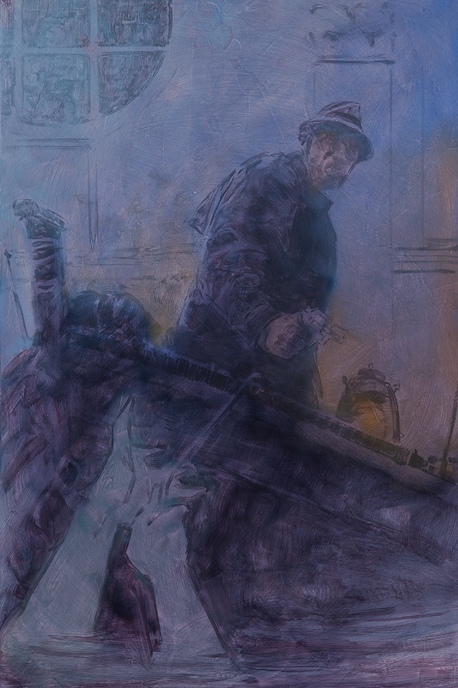
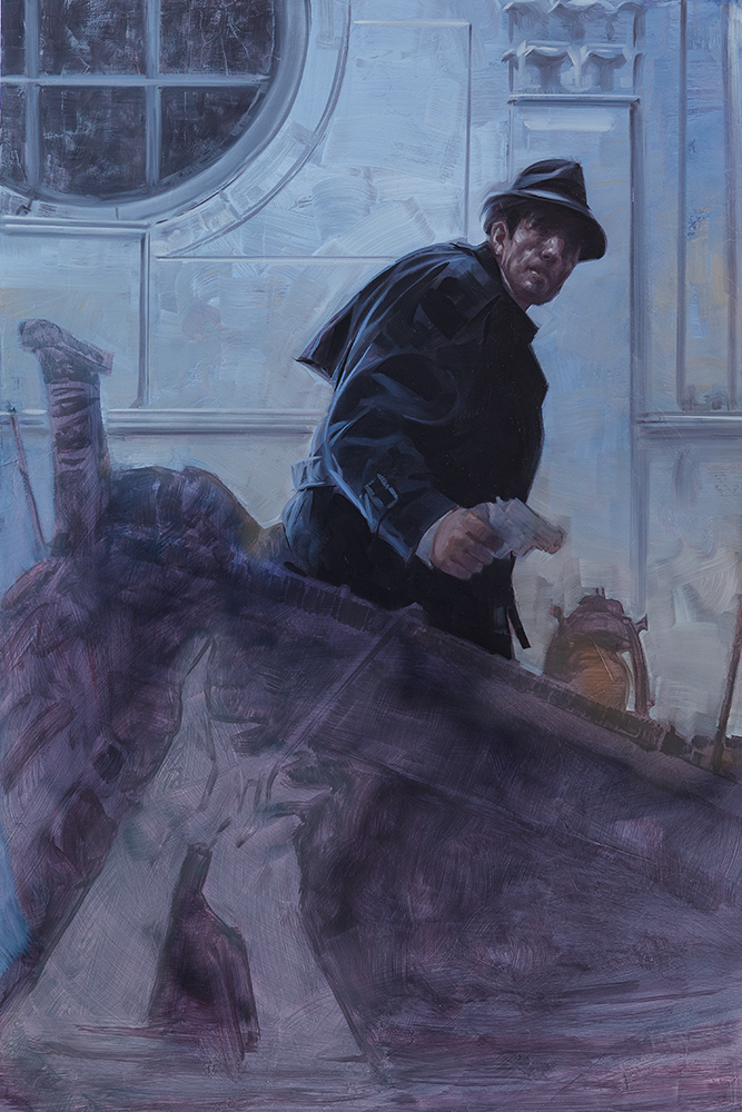
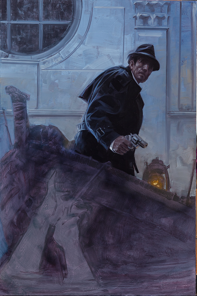
With the underpainting dry, I washed in some thin colors and set straight into defining the focal areas
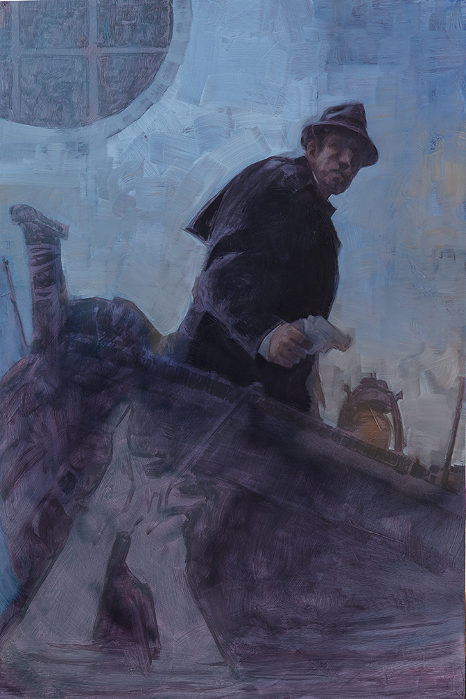
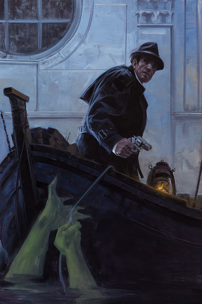
I’m bouncing back and forth a bit between figure and background, letting one inform where the other needs to go
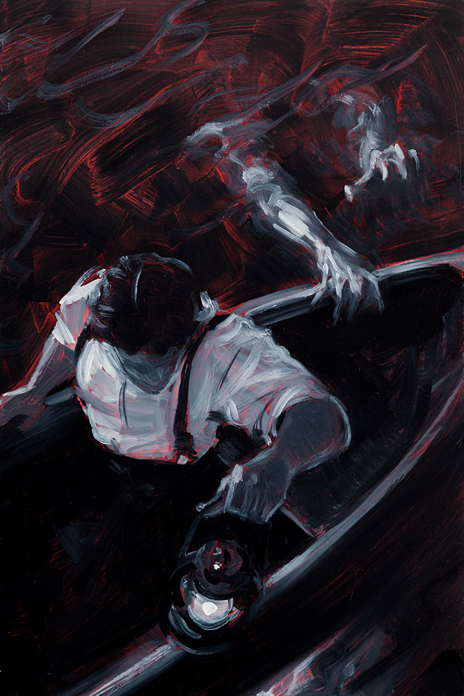
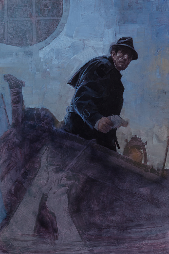
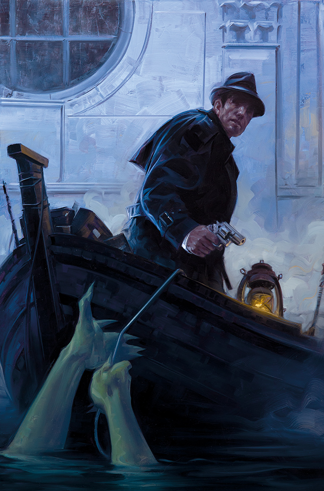
With the piece finished, I did a bit of cleanup and color correcting in Lightroom and Photoshop and sent it in. My editor asked if we could kick the saturation up a bit further so I did some more color tweaking, pumped up the green on the hands, and increased the lantern glow.
And here is the finished piece!







Thanks David! It's so interesting to see how the paintings evolve from the B&W to full color without loosing the energy of the initial studies.
Another great painting, thank you for sharing! I'm very curious, what tools and methods do you use to create the straight lines in the architectural elements while maintaining that loose, painterly feel that always permeates your pieces?
Like the rest of it, it begins with a base middle and then I add highlights and shadows. You can see the step where the background goes from tonal to rendered and the only difference is straight lines, light and dark, it the right places. It maintains the loose feel because the wall itself is brushy, but the structure of it is clean and architectural. The tools are flat tip brushes (the same as I use for the rest of the painting) and a mahl stick to keep my hand steady and/or use as a straightedge
A great post, very illuminating.
How very true. I not only make thumbnails on my own comics but also with my illustrations. When working on color pieces, it's always best to work out the color scheme ahead of time as well as the composition. It's better to fail on the sketches than on the final piece.
Great, well thought out behind the scenes article David. Your posts are always good. The finished piece has a lot going for it: strong composition that leads the eye to the focal point, stark silhouetted main character, painterly with just the right amount of detail.
There is one thing though, and I wanted to get your take on it… The concept of brush strokes of the background going “around” the foreground subject. Your use is fairly subtle, I have seen a lot of artists do the same thing far more blatantly. I can understand doing that in a study, but this is a more major piece, so you are clearly doing it deliberately for an aesthetic look. However, to me anyway, it kinda takes me out of the picture and makes aware of your painting craft. But there is the bigger issue, that you are portraying the background as being influenced by a subject that is way in front of it; brush strokes swerving out of its way. The same idea works great for adjoining, contacting objects, like the different parts of the background wall itself. But not so much for objects separated in space.
I guess my take on it is kind of a shrug.
When I first started working I was really driven to create clean, tight rendered pieces and had little interest in brush strokes. I went to great lengths to make backgrounds appear smooth and continuous behind foreground figures and objects. I can't say where or why my taste changed, but along the way I just kind of got bored with that. Looking at the artists who have influenced my mark making over the years, one thing that really caught my attention was seeing how some of them played with the graphic quality of visible strokes (Leyendecker, Cornwell, Shaeffer, Ashley Wood) and with the self aware nature of having abstract marks coexist with realism (Richard Schmidd, Greg Machess). Seeing that sort of thing in studies as well as finished works just appealed to me more than constant clean render.
I also think it can be an interesting way of working with space and completely disagree about how it fits with objects separated in space. It absolutely can flatten things (which is often something you might want to do for a graphic vibe), but with a softer touch it can also be a way of placing air between the figure and the environment. Relating it to photography, it can have a similar effect to depth of field where we sense that separation in distances. Used one way, contouring a figure with strokes can flatten things out. Used another (usually much more subtle) way, it can enhance the depth. I think it's a really fun thing to play with depending on which effect the piece needs.
Of course, it's all about person taste. Half the painters who most excite me at the moment would not have interested me in the least fifteen years ago. So I guess the short answer is I just dig it.