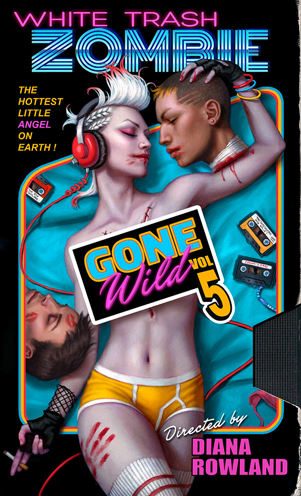
Here is a piece I recently finished for Diana Rowland’s upcoming novel, ‘White Trash Zombie Gone Wild’.
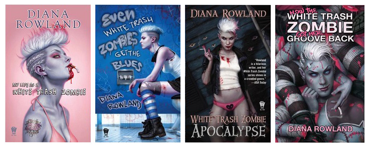
We’ve always tried to push the envelope with this series of covers, depicting a bit more smoking, nudity and violence than we probably should. The real challenge though, has always been in making those themes come off as edgy and slightly humorous, rather than gratuitous and grotesque.
This latest installment was no different.
When I was given this assignment, the Publisher and the Author had already decided on the title ‘White Trash Zombie Gone Wild’, and knew they wanted the cover to parody a classic ‘Girls Gone Wild’ video. This was fairly appropriate since the novel takes place in New Orleans, as did the now defunct series of adult videos.
This posed some interesting opportunities, as well as some interesting problems, both anticipated and unanticipated.
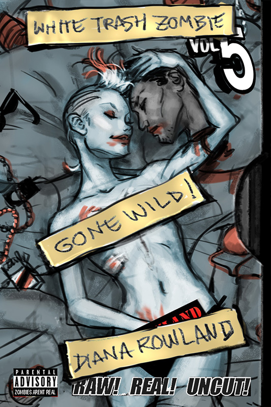
Firstly, I couldn’t just depict the lead character, Angel, taking her top off in drunken debauchery. Not only would it be too blatant, but it would be pretty darn boring as far as covers go. It would tell us absolutely nothing about the book. We needed to find a way to incorporate the sex theme, while still capturing some of the flavor of the actual book.
Secondly, the type design on the real ‘Girls Gone Wild’ videos is absolutely horrid. Parody or not, I didn’t want to imitate bad design. If someone didn’t get the concept, it would only serve to make us look bad, not ‘Girls Gone Wild’.
 |
| An atrocity in more ways than one. |
Early on, I latched on to the idea of making the the entire cover look like a faux VHS cassette. I decided to go for an amateurish ‘home made’ look to the cassette, in keeping with the vibe of ‘Girls Gone Wild’, while not directly imitating it. And like the covers before it, I tried to push the envelope of what was acceptable.
Surprisingly, my sketch was approved, with the one exception of Angel’s hand in her pants. Even with it covered up by type, the mere implication of masturbation was enough to make the Editor cringe. I suspect the Barnes and Noble Buyer would feel the same.
But despite getting approval I still felt it lacked something. Yeah, there was something kind of naughty and quirky about it all, but after the initial shock value wore off, it really wasn’t very exciting. It needed something more.
Eventually, I found that the solution was not in trying to imitate a specific video series, but instead trying to imitate an entire era of pornography. I needed to play up the design, and take advantage of certain colors more.
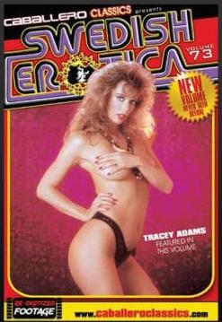 |
| One of my inspirations for the type design |
I tried to illicit a ‘retro’ vibe by playing with cliche type designs from the 80’s and using a lot of bright colors that I associate with the era. I also tossed in some 80’s fashion trends as well as old cassette tapes to really drive the concept home.
Typically I don’t do the type design for a cover, few illustrators do. But in this case, the design was so integral to the concept, that not only did I do it myself, but I designed the majority of it before I even painted the image, to ensure that all the proper naughty bits would all get covered up.
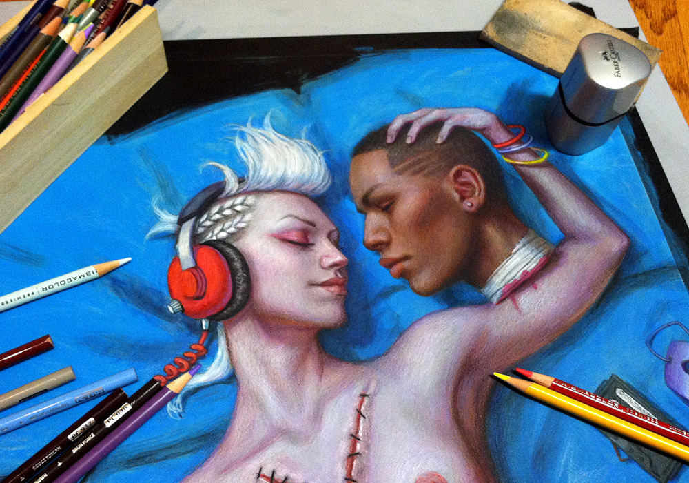
I did this painting using acrylic washes and colored pencil, a technique I’ve been using more and more lately because of how fast it is.
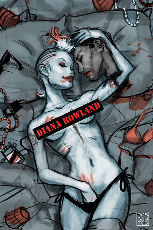
You can see in the progress pic above that the original painting differed some from the final art.
I had originally decided to make the head Angel was kissing a black man, primarily because I thought his complexion would complement hers really well, making her look even more pale. Plus, from an entirely selfish stand point, I think painting black people’s skin is just a lot more fun.
Unfortunately, my Editor feared that too many people would misconstrue the image as being intentionally racist, especially given the title of the book and the violent implications of the scene. And although this series has always been a bit controversial, that’s definitely not the kind of controversy we wanted. So, in her wisdom, she asked me to change it.
But that was easier said than done. What were we to do? Make him White?
That seemed even worse!!!
‘Hey, people might think this image is racist, so let’s just make everyone white. Problem solved!’
No way.
I have to say, this really tore me up for several days. I liked having a black guy on the cover, and I’ve never been one to edit myself for the sake of other people’s biases. But I wasn’t about to risk someone else’s career because of my stubbornness.
Finally, after a lot of brain storming, we all came up with what I think is a pretty good solution.
We decided to give the severed head a more mixed race look, and also add a second head of a differing race.
Our hope was that having multiple heads, of multiple races, would make the color of their skin seem more random and totally irrelevant…
You know, as it should be in an ideal world.


Great cover Dan! I like hearing about the process too, very interesting 🙂
Dan… I greatly admire you as an artist… but please move on to something else! Once you've made enough money to pay the rent, hospital bill or whatever drove you to take on this project… move quickly in a more refined direction. This in now part of your legacy… one day you'll have grandkids!
I love these posts! Keep them coming!
I'm certain that it's the fun and the challenge of this project that “drove” Dan to take it on, the chance to push an envelope and break some ground. It's nothing to be ashamed of, and I bet it's rewarding as heck for him to see it in a bookstore.
Arturo, I appreciate the sentiment, but no one is forcing me to do this this kind of work. I do it because I enjoy it.
Trust me, if I was worried about paying the bills, I wouldn't have chosen this as my career.
My young children are in my studio all the time, and I have NO shame in showing them my work, including the uncensored version of this piece.
Further more, I think of illustration as 'conversation'. And like good conversation, I don't think it always needs to have some deeply serious, thought provoking sentiment behind it. It's OK to be frivolous and fun at times. Maybe that's not your idea of what art should be… but for me, it is. And if I'm going to leave a 'legacy' for my children, I'll take 'fun' over 'refined' any day.
I totally look forward to these covers – please continue compromising your highbrow artistic integrity for our enjoyment 🙂
Any tips for painting darker skin tones?
I'd also love to know more about darker skin tones! They always seem so varied in saturation and how reflective it is depending on the person..
And I'd enjoy seeing some of that color pencil action! Have you annexed the airbrush and oils completely?
Nice work as usual, Dan. Your dilemma about the skin color of the severed heads had me laughing and shaking my head. The term “white trash” is inherently racist. Why qualify the word “trash” with the word “white” unless all non-whites are automatically trash? Your publishers' squeamishness about racial imagery on the cover of their book seems hypocritical, since they approved the title of the series and have published four volumes of it already.
Thanks, Wylie. In a nutshell… Blue highlights. Black people's skin is so much more reflective that you tend to get really blue highlights, most likely a reflection of the sky.
Allen, I usually like to finish an acrylic/colored pencil piece off with a thin coat of oils, just to give it a smoother finish. This job was under a tight deadline though, so I didn't get around to it. But I'm not setting them aside in the least. As for the airbrush, I find I enjoy it when working at a large scale. If I work too small, I have to start making friskets, and that's so tedious it just sucks the fun out of it for me.
Thanks, Gorgon. I feel much the same, and trust me, the irony was not missed on me.
I hate when I see the term 'Black Entrepreneur', or something of the like. Why not just 'Entrepreneur'?
That said, I think when they use the term 'White Trash', they are sincerely intending it as slander against the white character, not everyone else (despite the literary implications). Which I think would STILL be equally bad, if not for the humorous intent.
We've always tried to embrace the character's 'trashiness' in humorous ways, Such as the smoking, which I absolutely ABHOR and really don't like depicting in any attractive manner. It was always intended as a way to make her LESS appealing.
The problem was that they feared a lot of people just couldn't look past the arbitrary race enough to see a beheading as humorous. And once the humor is gone from a joke, especially a racial one, all that's left is malice, and that's not OK.
FYI, “White trash” was a term coined for white slaves by black slaves. The black slaves apparently held white slaves in contempt. The phrase certainly does not imply that all other non-whites are trash. That's like saying that by calling one person a “genius” you are calling everybody else a dummy. Bad logic there.
I imagine Dan's grandkids are going to be cool enough to appreciate that Pappy Dos Santos once painted an illustration humorously inspired by “Sweedish Erotica vol. 73.” Seriously, that's bragging rights where I come from.
the problem in that definition is it isn't how modifiers normally work. More direct than “genius”/”dummy”, “Black police officer” it doesn't imply that all non-blacks are automatically police officers. “rightwing nutjob” does not imply all those with leftist politics are nutjobs. Along those lines, I've never understood “white trash” to mean all non-whites were trash.
Growing up as a white person, I would generally hear other white people say it in a way interchangeable with “hick” or “redneck.” I've always understood it as shorthand for a collection of cultural stereotypes where being white and poor (and probably rural) intersect (Nascar for example).
loved it. dan you rock!
I love your work, not just these (though I think they are my favorite), but also the demon series by Ms. Rowland, Patricia Briggs and the newest ones that I've seen, Trailer Park Fae by Lilith Saintcrow. They are all great works.
These images, whatever their justification, I did not need in my head.
This is the one part of this blog, and this industry, that I struggle with. It has nothing to do with the nudity, it has to do with its effect. I spend a good deal of my time trying to mend relations that have been savaged by this kind of content. One very close friend is starting an 18-year prison sentence for child pornography. The police surprised everyone with the results of their investigation and he has now lost his job, his wife, his children, his respect, and his freedom in several ways. His addictions started with content like this.
Whatever the reason for the subject matter on this cover, anything that promotes violence toward women or families — which is what promiscuity ultimately is — has to be very, very carefully approached. Yes, I believe I understand all the other intentionally offensive aspects of this cover, and that I chose to focus on only one. Yes, I believe I get the author's intent. My point is that not everyone will. For some it will be an opportunity.
Dan, I hope you know my respect for you as a great illustrator and an expert, caring, sacrificing teacher. You have made amazing differences for good in the lives of many, many people, including myself. This blog is part of that. Thank you for your excellence.
I love this cover Dan! That's some great design work in this piece.
This cover is really well composed, Dan, and is urging a bold conversation. Also, love the type! I'm definitely in the cheer squad. It takes a lot of guts to paint an edgy piece like this because there's always moral backlash, but that's missing that this is a sardonic romp. Sexuality has always saturated and often defined human culture- it's about time we're openly frank about it and unafraid to engage with the less lofty and romantized aspects.
It's a cool cover, I like the approach to the retro logo and with the exception of that underwear (I hate those but that's just me) this piece could have been made in the 80's. Some tech would make it a cyberpunk piece right on the spot. Really cool.
What's not cool tho, is the slavish bending to the PC thought police. An autopsy 'Y' on her chest and making out with severed heads is 'OK', but masturbation…hey man, that's “evil”…and the whole skin color deal, what a joke…and all this so one special little fruitcake doesn't get “offended”?…
In any case, it's a cool cover, and I like the thumbnails too, very didactic.
Relax, guys. Hopefully your thought police will tolerate a variety of views.
Dan — like Dave Palombo and Lauren Palepinto, among others — was asking a simple question: where are we going with this blog? What are the bounds? Is it frontal nudity? Is it crude language? Is it white trash? In an era of earnest non-discrimination against women, can we depict them as sex objects? What is our market: is it elementary school artists, highschoolers, or so-called “adults”? Can we fit them all in? It's a simple, ongoing market test. I responded, as did you. They will measure the results and proceed based on their goals. A simple business process.
I really like your new mixed media technique.
Hey Lester,
I know you're sensitive to this stuff (I think it's fair to say overly sensitive, perhaps), and that you sincerely feel deeply distraught over certain moral issues. I think that's a good thing, so I don't take offense to our dialog any way, and I hope you don't either.
But in the scope of things you're going to stumble across on the internet, I think this illustration is actually pretty mild. My character is showing WAY less skin than any modern beach goer would nowadays. And the violence, which is only implied, is also much milder than any typical commercial for a modern video game.
Which is not to say that those things aren't issues too, but rather to say, you need to be able block out certain things if they bother you THAT much. We simply can not cater to every single person's individual morality. That said, I certainly hope you wouldn't stop reading the entire blog just to avoid seeing something you find objectionable.
To answer your question more specifically, I don't know exactly where this blog is headed. But I can tell you a few things:
As a rule, I do NOT curate or edit our contributors. Each contributor is allowed to post whatever they see fit. We DO have a few hard rules though: No politics, No Religion, No Trash-talk.
In general, everything you see on this blog, including this post, falls under an American 'PG-13' rating so to speak. Which I think is fair.
So you should be prepared to see stuff probably as far crude language, mild violence, and toplessness. And please keep in mind, in many of our reader's cultures, including mine, toplessness is hardly even a PG rating. And really, what museum could you walk into and NOT see a woman's breasts?
I can tell you though, what you will NOT see is anything with hatred or malice behind it's intent.
Our demographic is pretty broad, and varies from contributor to contributor. The only real consistent factor is that they take an interest in an honest, behind-the-scenes look at what this industry entails.
I think this post is a fair example of that. This is not just some pervvy picture I had in my sketchbook that I'm making people look at. This a REAL job, that brought up REAL issues for me, and I thought it important enough to share. If someone wants to do this for a living, they can expect to encounter similar situations like this from time to time.
I know you have some fairly strict views on what constitutes indecency, and I sincerely don't want to see you unhappy. So if some random posts that include nudity (like this one, or Dave Palumbo's paintings) are making you upset, all I suggest is that you curate yourself. Every contributor posts on a schedule. For instance, Greg Manchess is every other Wednesday, alternating Wednesdays with Jesper. You may need to decide what days of the week you want to read this blog, and just avoid certain people's posts.
Hey Mike,
That's how I initially felt too, but it's not so simple.
It's never just ONE person when something gets momentum on the Internet. If you don't believe me, just Google “Rabid Puppies”. They're a group of unyeilding conservatives who have completely ruined the SFF's industry's most prestigious award.
And still, that wouldn't bother me, if not for the fact that it's not ME who would feel the repercussions of making a stand. Some bad publicity could ruin sales of the book, and the Author counts on those sales for her livelihood.
If this were a personal piece, it would be a different story. But it's not, it's a professional commission, and it's simply not my call to make.
“Sexuality has always saturated and often defined human culture”…
I think this is so much truer than most people will admit. Sex and pornography have shaped the laws and ideals of beauty for entire nations. I'm always intrigued by the profound affect it has on a culture.
This is really great information, Dan. Thank you so much for posting. I love the concept of tolerance and free expression, within reasonable constraints like those you listed. And I have always and continue to trust your judgment as a professional and as a person. Honestly, I don't post as often as I might want – – I suspect you understand that. 🙂 I recognize I don't hold the majority view on this blog – – at least according to the responses I see here – – and I don't want to stir up dirt. Still, you're right, some things concern me deeply. I believe they concern us all, but that's a different matter. Thank you again. Freedom is a marvelous thing.
Sincerely,
Les
Hey Dan,
I know it's not that simple and I believe you about how this all balloons up. But all this PC enforcement bothers me. And know that they occupy the whole political spectrum, from far right to far left, their “ethical” ideology gives them this notion that they hover above the rest of us.
Recently I experienced it in the form of a commission too. A client needed some black and white ink pieces for an RPG in the old school vein, you know, Conan, Tarzan, the works. One image called for a sort of malevolent priestess, an altar of bones, a victim in the background chained to the wall to be sacrificed, and she's moving toward the viewer with a large ax, to attack. The brief called for armor on her chest. To sell the “priestess” theme I put one of those long loincloth pieces on her, nice full hips and legs etc and on her body a piece of plate armor. The client loved it, but he asked me to cloth her, fill her up with armor fully and make the victim in the background a man, fearing the feminist cyber-mob give the company a bad rep.
Now this client is far from a misogynist but what does it tell us when the mere thought of an attack by the modern version of the Nazi Brown Shirts under the pretense of some higher moral ground makes people self-censor this much, even in the scopes of a theme which has these tropes for a reason?
I can understand that it's hard to counter the shock waves on your own but something's gotta be said at least. The excuse that all this must be “moderated” in some sort of way because it supposedly perpetuates whatever, has been debunked by studies time and time again…Remember, they said the same about rock and heavy metal music. Along with millions I've listened to Iron Maiden all my life and have yet to make a sacrifice to the Beast.
I still love how you handled this all though, and it comes to supplement my own experience as a lesson on where I want to go as an artist under these circumstances. It sure is great you posted this.
The second head does seem a little extraneous, but a lovely cover as always.
Not everyone has the same feeling about artwork, and that's one of the great things about it. I think you're focusing on the wrong thing there. Look at the way he uses light, down to the tiniest blood droplet, look at her face, or the other two faces in the painting, or the shadows on her stomach. Not everyone thinks sex is bad or wrong, and we can appreciate this cover for what it is, one more mind bogglingly awesome piece of art done by the absurdly talented Dan dos Santos.
Not everyone has the same feeling about artwork, and that's one of the great things about it. I think you're focusing on the wrong thing there. Look at the way he uses light, down to the tiniest blood droplet, look at her face, or the other two faces in the painting, or the shadows on her stomach. Not everyone thinks sex is bad or wrong, and we can appreciate this cover for what it is, one more mind bogglingly awesome piece of art done by the absurdly talented Dan dos Santos.