 |
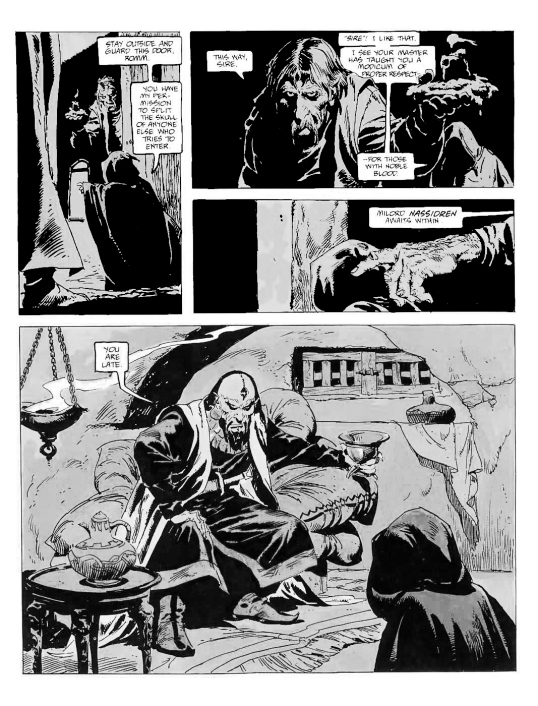
| John Buscema Conan The Barbarian |
A fellow artist put forth a difficult question to me yesterday – how do I know how to make good choices regarding compositions? Given that I have created over a thousand images and teach classes on art principles like composition you would think I have a handle on this subject. But I did not have an answer for him. I believe there is no good answer to this question.
Over the years I have studied some of the greatest art in museums around the world, viewed thousands of images from professionals in juried shows, galleries and art exhibits, and taken in millions of other images as a consumer. The one conclusion I have come to regarding compositions by masterful artists, is that anything goes.
Really, just about anything.
Yes, there seem to be ‘better’ and ‘stronger’ choices for many images that feel as though they make for ‘nicer’ compositions, but there is no set rules for what works, how to correct an image that ‘feels’ off, or criteria that allows for qualitative evaluation of better to worse. So if any thing goes, why aren’t all images perfect and acceptable?
I would argue that all images have the potential to become great/balanced/dynamic/interesting, etc, but ‘weak’ images may lack unity which allows the composition to stay in a tight conversation with all the other parts the content, concept and imagery. These other parts can range from issues as diverse as drawing, value, color, edge control, spacial illusion, graphic design, patterning, lighting, visual density distribution, narrative relationships, etc, or other various criteria we may base an evaluation of a picture on. It is all far too subjective, and thus my seeming lack of an answer to this artist’s question.
But I did have a response. That is to look at art, lots of it.
Go to museums, galleries and exhibits. Flip through magazines, journals and webpages. Take in sculpture, performance art, theater, and movies. Sit and watch nature. See an architectural or graphic design show. I take in content I am not all that familiar with. To see something different. And most importantly, to ‘listen’ to the way an artist ‘speaks a language’ I may have never heard before. To somehow come to an understanding of the dialog they wish to have with me. It is exciting to discover a new way of seeing, to hear a new language, and to understand what that artist is trying to say!
One of the first venues through which I was exposed to a tremendous volume of visual composition problem-solving was in comics. Given that a typical comics page has ~ 5 panels and ~ 32 pages, that leaves the artist with having to solve around 150 compositional challenges in every issue of a magazine! From close ups to action sequences to static talking heads, comics artists display an abundance of ideas on creative compositional design.
I have posted a few excellent page samples below. This is a microscopic drop of the incredible resource that awaits you at the nearest comic book shop.
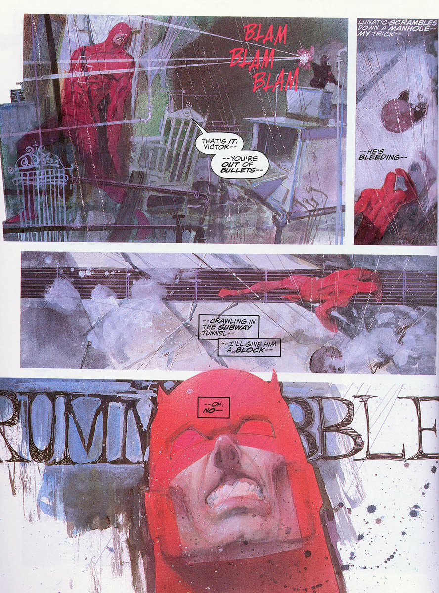 |
| Bill Sienkiewicz Marvel Graphic Novel #24 Daredevil |
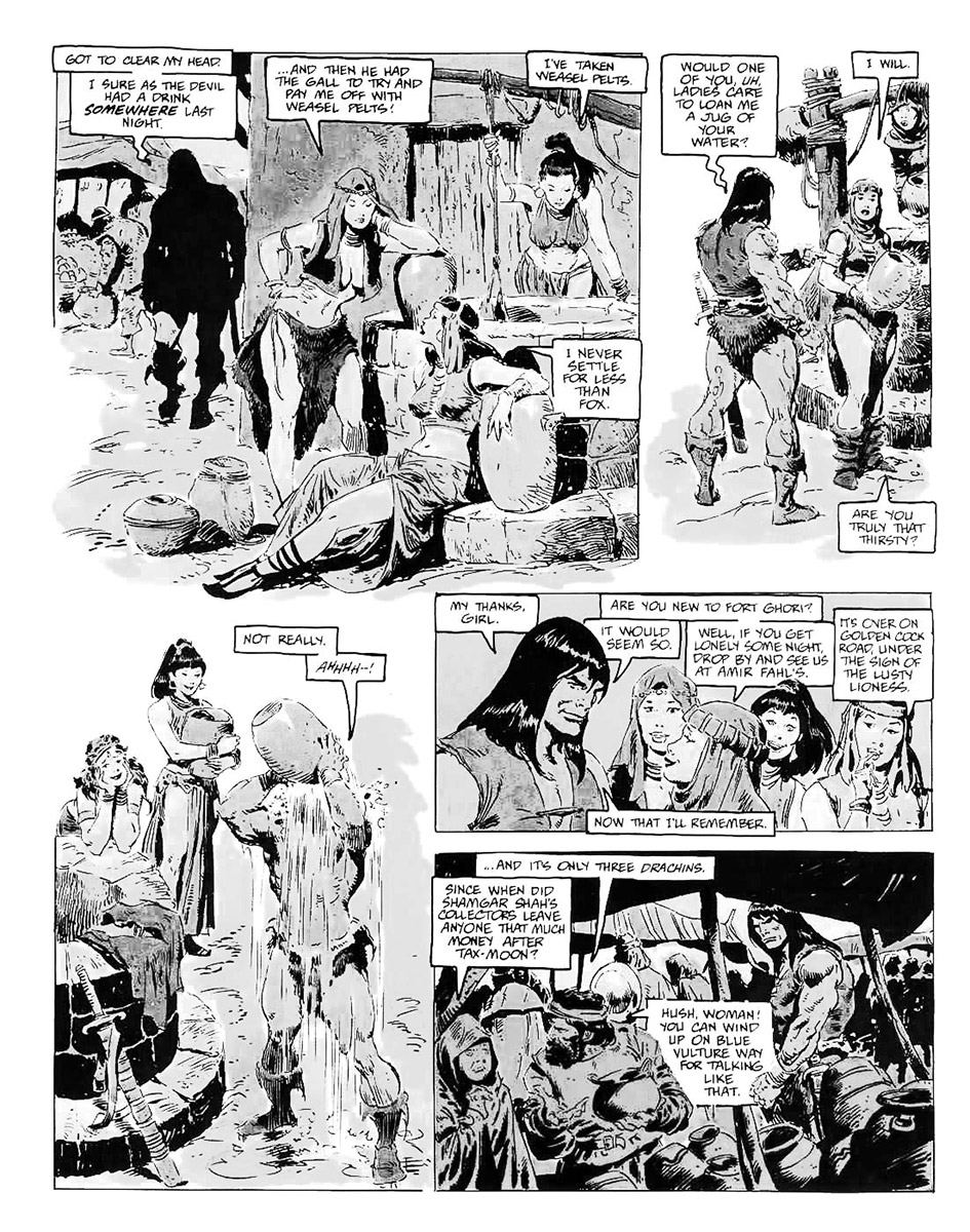 |
| John Buscema Conan the Barbarian |
 |
| Sergio Toppi Sharaz-De |
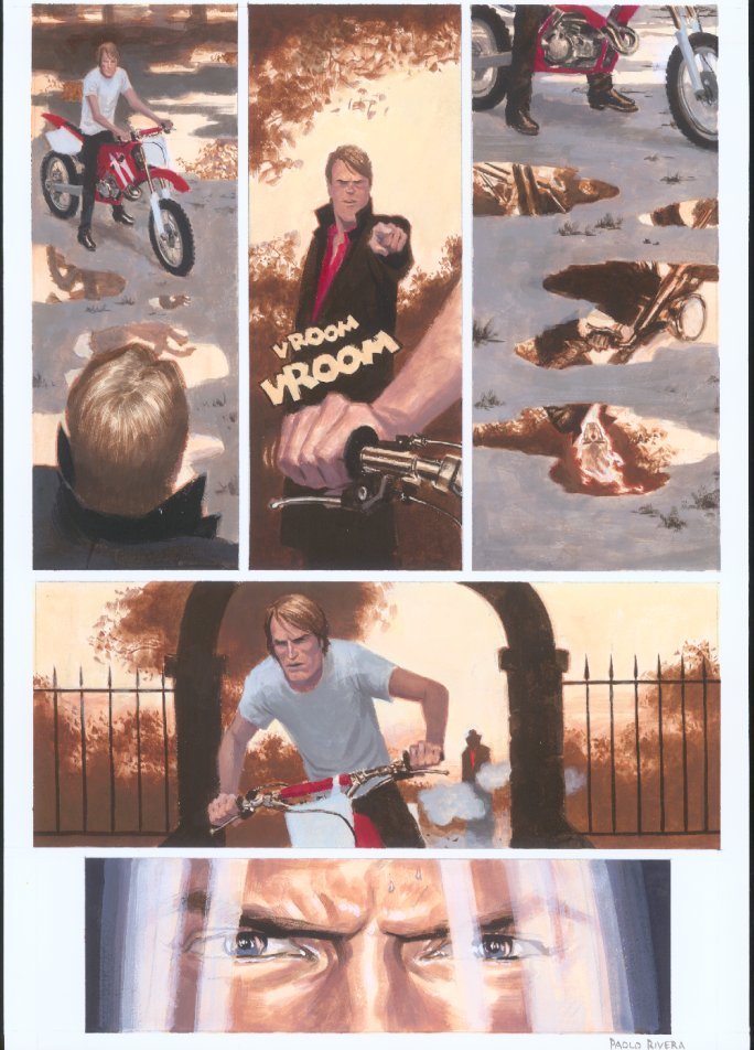 |
| Paolo Rivera Ghost Rider MYTHOS GHOST 3 Page18 |


Something very much on my mind this morning. Thank you.
Thank you for giving posts and articles were very amazing. I really liked as a part of the article. With a nice and interesting topics. Has helped a lot of people who do not challenge things people should know. You need more publicize this because many people. Who know about it very few people know this. Success for you....!!!
Oh – Donato!!! I am so glad you posted this!! – I use comic books to teach composition to my teenage art students – it is so perfect for this because as you mention each little box must have a good composition and comic books really holds their attention. Thanks so much!!!
I find that I learn a lot about composition through *drawing* comics as well. After cranking through hundreds of panels of composition, working out the composition of a painting doesn't seem half as daunting!
I've also found that drawing comics has broadened my mind to compositional possibilities in single images as well. Comics pretty much force you to get creative with framing and points of view in the effort to communicate the narrative and keep it all visually interesting, (even in long “boring” talking heads sequences,) and that creative approach to composition can start spilling over into non-comic work.
I bought Sharaz-De by Sergio Toppi a while back. Every time I look through that beautiful book, I am amazed. His arrangements of shapes, textures, and values is extraordinary in an abstract sense, even before you get into the content, the exquisite line work, the characterization of faces, animals, and forms, the story…
It is beautiful on so many levels.
Thank you Donato for writing this praising an under appreciated media source. I have been studying art since age five and have since taken over forty art classes and done umpteen drawings and in spite of that composition is a big challenge. Comics have always been to me the most economical way to get a lot of well drawn and composed images for relatively very little. Comics will always be a big inspiration for me and that's why I have a large collection of them.