I have to confess. In my years of painting acrylics I have overused and exhausted the use of rimlight. I have been doing it for so long that when I find myself doing a figure on white background I freeze up and do not know what to do. I NEED that second light source. I cannot shape figures into believable 3d shapes without a cold and a warm light source. I really am dependant of rimlight.
But I have had a long history of not knowing what I did.
The wrong thing:
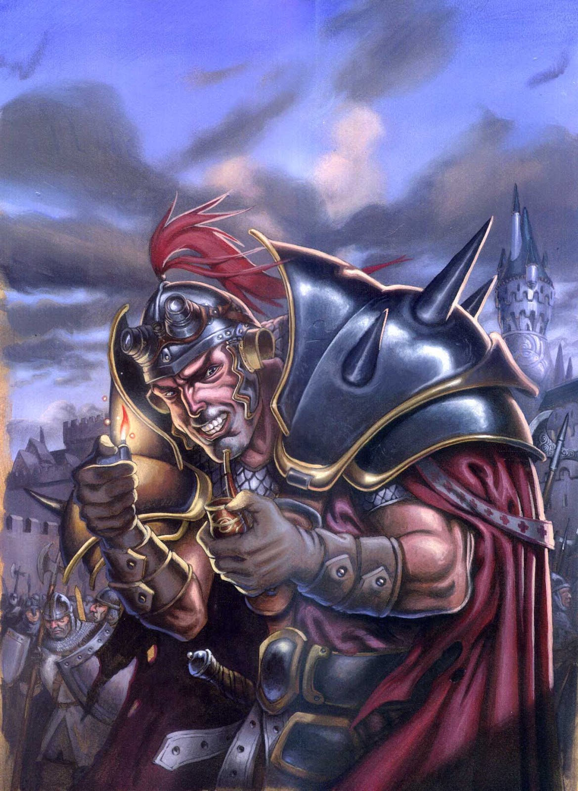
What I did in the beginning was using the rimlight as a sort of colored outline on the shadow side of a figure to pull him away from the background. I painted – usually a blue line – along the full side of a figure in the same size from top to bottom. I completely ignored the fact that I was painting light from a second source. I just added the rimlight effect to a figure lit with soft light from one side. I did this because of one little thing I had read in the Art of Tim Hildebrandt. He said that “if you use primary light source in a warm colour, make the rimlight cold and visa versa” It did wonders for me in the way it shaped figures. having two different temperatures gives a very 3d feeling and pulls a figure out from flatness.
If you look at the Knight figure I did 15 years ago you can see how stupidly I have added the “light source” of a completely sky colored rimlight evenly along the backside of the figure. Metal shoulder plates and cape are getting evenly amount of light ignoring that they are different materials. What is worse is I also added a blue rimlight from the bottom. What strikes me as the worst is that the shape of the rimlight is a line. When not shaping the light around the shapes of the figure it looks more like it is paint on the sleeve of the figure. It is ofuttermost importance that that acts as light creeping into the shapes explaining soft and sharp edges.
The right thing:
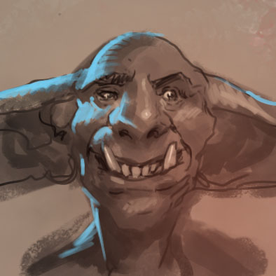
As a quick example I have made a goblin face with bluish rimlight. Notice that the forehead, chin and upper lip are round ball like shapes and has a fading rimlight , whereas the nose, ear and neck are sharper shapes that gets the more outlined version.
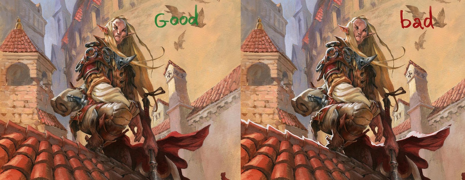
Also I have lately tried to use the rimlight only as a marker for focus. In the Elf on the rooftop, you can see how subtle the rimlight is. I used it mainly around the face creeping into the ball shaped parts of his face and to some degree sharply on metal and leather around his shoulders. I only want to draw attention to the face and have maxed out my use of rimlight up there. Look at the example of Bad Rimlight next to it, where I have disregarded focus and just painted rimlight all over the place.
From now on I am using it with caution, using it as a projector pointing at my focal point, and using it as light, not as a mindless special effect.


Simple and great advice. Thanks!
Thank you for the advice!
Great post, I definitely needed to see this.